


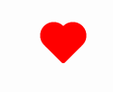
使用伪元素实现
使用一个div
1 <div class="heart-shape"></div>
css样式设置
1 .heart-shape{position:relative;width:30px;height:30px;background-color:red;border-radius:3px;transform:rotate(45deg);top:50%;left:50%;margin:-15px;}
2 .heart-shape:before{content:'';position:absolute;width:30px;height:30px;background-color:red;border-radius:50%;top:0px;left:-15px;}
3 .heart-shape:after{position:absolute;width:30px;height:30px;content:'';background-color:red;border-radius:50%;left:0px;top:-15px;}


 扫一扫
扫一扫


 1747
1747

 被折叠的 条评论
为什么被折叠?
被折叠的 条评论
为什么被折叠?
 到【灌水乐园】发言


