


 本文详细介绍了Android中layout_margin和layout_padding的区别,以及如何使用match_parent和wrap_content实现灵活布局。通过实例演示了如何创建四行按钮布局,利用weight属性实现等宽分布,并在values文件中定义统一的按钮样式。
知识点:
android:layout_margin:设置当前布局与屏幕边界,周围布局或控件的距离,有android:layout_marginTop上边界、android:layout_marginBottom下边界、android:layout_marginLeft左边界、android:layout_marginRight有边界
android:layout_padding:设置当前布局与该布局控件的距离
android:layout_width:match_parent:表示该布局宽度跟父容器相同
android:layout_height:wrap_content:表示该布局高度恰好能包裹他的内容
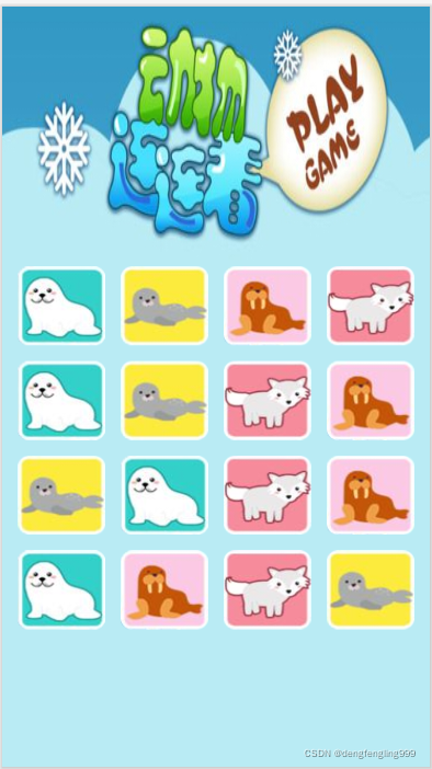
首先把需要的图片复制到drawable目录下:
编写布局文件activity_main.xml,代码如下:
首先把外围打布局更改为线性布局LinearLayout,添加背景:android:background="@drawable/two",在其中再添加4行线性布局LinearLayout,在每个线性布局里面添加4个按钮
<?xml version="1.0" encoding="utf-8"?>
<LinearLayout xmlns:android="http://schemas.android.com/apk/res/android"
    xmlns:app="http://schemas.android.com/apk/res-auto"
    xmlns:tools="http://schemas.android.com/tools"
    android:layout_width="match_parent"
    android:layout_height="match_parent"
    android:orientation="vertical"
    android:paddingLeft="15dp"
    tools:context=".MainActivity"
    android:background="@drawable/animal_bg"
    >


    <LinearLayout
    android:layout_width="match_parent"
    android:layout_height="wrap_content"
    android:layout_marginTop="250dp">
    <Button
        style="@style/btnStyle"
        android:background="@drawable/two">
    </Button>
    <Button
        style="@style/btnStyle"
        android:background="@drawable/one">
    </Button>
    <Button
        style="@style/btnStyle"
        android:background="@drawable/three">
    </Button>
    <Button
        style="@style/btnStyle"
        android:background="@drawable/four">
    </Button>
    </LinearLayout>
    <LinearLayout
        android:layout_width="match_parent"
        android:layout_height="wrap_content"
        >
        <Button
            style="@style/btnStyle"
            android:background="@drawable/two">
        </Button>
        <Button
            style="@style/btnStyle"
            android:background="@drawable/one">
        </Button>
        <Button
            style="@style/btnStyle"
            android:background="@drawable/four">
        </Button>
        <Button
            style="@style/btnStyle"
            android:background="@drawable/three">
        </Button>
    </LinearLayout>
    <LinearLayout
        android:layout_width="match_parent"
        android:layout_height="wrap_content"
        >
        <Button
            style="@style/btnStyle"
            android:background="@drawable/one">
        </Button>
        <Button
            style="@style/btnStyle"
            android:background="@drawable/two">
        </Button>
        <Button
            style="@style/btnStyle"
            android:background="@drawable/four">
        </Button>
        <Button
            style="@style/btnStyle"
            android:background="@drawable/three">
        </Button>
    </LinearLayout>
    <LinearLayout
        android:layout_width="match_parent"
        android:layout_height="wrap_content"
        >
        <Button
            style="@style/btnStyle"
            android:background="@drawable/two">
        </Button>
        <Button
            style="@style/btnStyle"
            android:background="@drawable/three">
        </Button>
        <Button
            style="@style/btnStyle"
            android:background="@drawable/four">
        </Button>
        <Button
            style="@style/btnStyle"
            android:background="@drawable/one">
        </Button>
    </LinearLayout>
</LinearLayout>
按钮的样式都是相同的所以在values文件夹下,style.xml里添加样式:在用的时候调用就可以了,来简化代码。
把宽度设为0dp,权重设为1,就是设置以上一个线性布局里面的4个按钮控件平分线性布局,每个所占比例相等
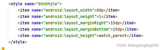
style.xml详细代码如下:
<resources>

    <!-- Base application theme. -->
    <style name="AppTheme" parent="Theme.AppCompat.Light.DarkActionBar">
        <!-- Customize your theme here. -->
        <item name="colorPrimary">@color/colorPrimary</item>
        <item name="colorPrimaryDark">@color/colorPrimaryDark</item>
        <item name="colorAccent">@color/colorAccent</item>
    </style>
    <style name="btnStyle">
        <item name="android:layout_width">0dp</item>
        <item name="android:layout_weight">1</item>
        <item name="android:layout_marginRight">15dp</item>
        <item name="android:layout_marginBottom">15dp</item>
        <item name="android:layout_height">match_parent</item>
    </style>

</resources>
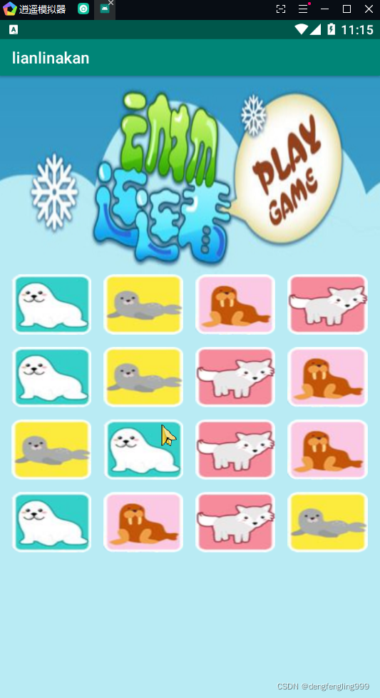
打开逍遥模拟器,运行项目结果:


 扫一扫
扫一扫


 2309
2309

 被折叠的 条评论
为什么被折叠?
被折叠的 条评论
为什么被折叠?
 到【灌水乐园】发言


