


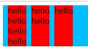
 在CSS布局中,当父元素内的多个子元素根据内容动态调整高度时,通常难以实现所有子元素与最高子元素保持等高。通过采用Flex布局,可以简便地解决这一问题,使得子元素能自动拉伸至与内容最多的子元素相同的高度。
父元素内多个子元素,子元素根据内容确定高度,子元素和最高的子元素等高
父元素中有多个子元素,父元素高度不确定,子元素高度不确定以内容的高度确定,但是这时候要求子元素等高,也就是按照子元素中内容最多的那个元素的高度确定所有元素的高度,这种需求以普通的布局是很难实现的.
<body>
  <div class="father">
    <div class="child"><span>hello</span><br><span>hello</span><br><span>hello</span><br></div>
    <div class="child"><span>hello</span><br><span>hello</span><br></div>
    <div class="child"><span>hello</span><br></div>
    <div class="child"></div>
  </div>
</body>
<style>
  .father {
    display: inline-block;
    background-color: deepskyblue;
  }

  .child {
    vertical-align: top;
    display: inline-block;
    margin-left: 10px;
    background-color: red;
  }
</style>
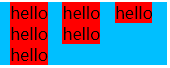
这种情况下要实现三者登高,很麻烦,因为无法使用height:100%,因为父元素高度.但是用flex布局就很高解决,设置子元素align-items:stretch,也就是拉升子元素到父元素高度
<body>
  <div class="father">
    <div class="child"><span>hello</span><br><span>hello</span><br><span>hello</span><br><span>hello</span><br></div>
    <div class="child"><span>hello</span><br><span>hello</span><br></div>
    <div class="child"><span>hello</span><br></div>
    <div class="child"></div>
  </div>
</body>
<style>
  .father {
    display: flex;
    background-color: deepskyblue;
  }

  .child {
    display: inline-block;
    align-items: stretch;
    vertical-align: top;
    margin-left: 10px;
    background-color: red;
  }
</style>


 扫一扫
扫一扫


 1591
1591

 被折叠的 条评论
为什么被折叠?
被折叠的 条评论
为什么被折叠?
 到【灌水乐园】发言


