


 本文详细介绍如何使用CSS处理文本的单行和多行溢出,包括使用text-overflow、overflow、white-space等属性实现优雅的省略效果,以及解决不同浏览器兼容性的方法。
单行溢出
  /*单行溢出,显示省略号,用text-overflow属性,需要增加宽度*/
    /*溢出隐藏*/
    overflow: hidden;
    /*隐藏的部分用...表示*/
    text-overflow: ellipsis;
    /*文字不能转行*/
    white-space: nowrap;
    width: 244px;
用text-overflow:ellipsis属性,需要加宽度width属来兼容部分浏览。
- overflow: hidden;溢出隐藏
- white-space: nowrap;文字不能转行
- text-overflow:ellipsis;隐藏的部分用...表示
效果图:
多行溢出
方法一:
/*多行溢出,使用Css的扩展属性*/

    /*溢出隐藏*/
    overflow: hidden;
    /*弹性盒模型显示,讲对象作为弹性伸缩盒子模型显示*/
    display: -webkit-box;
    /*盒模型元素的排列方式,设置伸缩盒对象的子元素的排列方式*/
    -webkit-box-orient: vertical;
    /*显示行数,限制块元素显示的文本行数,必须结合其他属性*/
    -webkit-line-clamp: 3;
- overflow: hidden;首先是溢出隐藏,不可或缺
- display: -webkit-box;弹性盒模型显示
- -webkit-box-orient: vertical;盒模型元素的排列方式
- -webkit-line-clamp: 3;显示行数
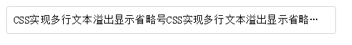
效果图:

方法二暂时没测试,copy的别人的总结
另一种方法,适合各种终端,但有一个bug:文字未超出行的情况下也会出现省略号,可结合js优化该方法。

代码如下:

.text {

  position: relative;

  line-height: 30px;

  max-height: 60px;

  overflow: hidden;

  width: 400px;

  margin: 20% 30%;

  border: 1px solid #ccc;

}

.text::after{

  content: "...";

  position: absolute;

  bottom: 0;

  right: 0;

  padding-left: 40px;

  background: -webkit-linear-gradient(left, transparent, red 50%);

  background: -o-linear-gradient(right, transparent, red 50%);

  background: -moz-linear-gradient(right, transparent, red 50%);

  background: linear-gradient(to right, transparent, red 50%);

}

需要注意的事项:

1.将height设置为line-height的整数倍,防止超出的文字露出。

2.给p::after添加渐变背景可避免文字只显示一半。

3.由于ie6-7不显示content内容,所以要添加标签兼容ie6-7(如:<span>…<span/>);兼容ie8需要将::after替换成:after。


 扫一扫
扫一扫


 1286
1286

 被折叠的 条评论
为什么被折叠?
被折叠的 条评论
为什么被折叠?
 到【灌水乐园】发言


