


 本文详细介绍如何使用CSS3技术美化jQuery插件jPaginator,包括渐变背景、圆角、阴影效果等,适用于现代浏览器。
jPaginator是Remy Elazare的漂亮jQuery插件,它在简单的用户界面中将分页和滚动结合在一起。 雷米(Remy)最近问我,是否要在Webdesigntuts +上使用它,我认为这将是样式转换的理想选择。
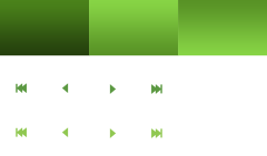
分页通常涉及许多页面链接,它们本身需要导航才能选择它们。 jPaginator旨在通过提供一个滑块来左右链接的动画来改善长分页列表的用户体验。 您还可以在分页的两侧使用控制链接,甚至可以依靠良好的箭头键。
介绍
以原始状态签出jPaginator。 简单易用,可以完美使用,但让我们看看我们是否能对此一点点讲究。 我们将使用一些CSS3技术,这就是我们打算在本教程中实践的技术,但是我们将确保所得到的界面至少可用于不支持的浏览器。
涵盖了什么?
值得注意CSS:
文字阴影
渐变
边界半径
盒子阴影
多种背景
:after选择器:after
精灵表使用
浏览器支持(无替代方法):
IE9 +
火狐3.6
Safari 1.0
Chrome 1.3
歌剧10.5
步骤1:PSD
我可以写一篇有关如何将.psd组合在一起的教程,然后继续说明标记和样式,但是那样长的时间您将无法引起任何注意! 相反,只需获取源代码下载并自己播放文件即可。
值得一提的是从Atle Mo的非常有用的subtlepatterns.com下载的“触觉噪声”背景纹理。
步骤2:新HTML文件
让我们创建一个新文档,然后引用几个使用jPaginator插件所需的文件。
<!DOCTYPE html>
<html lang="en">

	<head>

		<meta charset="utf-8">

		<title>jPaginator - jQuery plugin</title>
		<meta name="description" content="">
	  	<meta name="author" content="">

		<script src="http://ajax.googleapis.com/ajax/libs/jquery/1.5.1/jquery.min.js" type="text/javascript"></script>
		<script type="text/javascript" src="jquery-ui-1.8.13.slider.min.js"></script>
		<script src="jPaginator-min.js"></script>

		<style type="text/css" media="all">
			@import url(jPaginator.css);
			@import url(custom.css);
		</style>

</head>我们从一个基本HTML5文档开始,先参考jQuery(在本例中为Google托管),然后是依赖jPaginator的jQuery UI滑块插件 ,最后是jPaginator.js脚本本身。
完成此操作后,我们链接到jPaginator.css文件(该文件为我们提供了工作的滑块基础),最后是我们自己的custom.css ,我们将使用该文件对整个样式进行调整以符合我们的内心需求。
此时,您的文档结构应如下所示:

步骤3:启动jPaginator
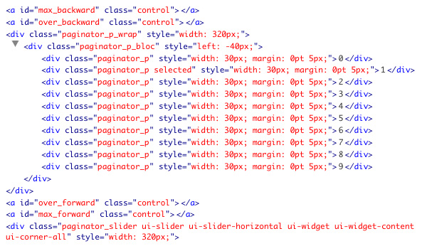
是时候将我们的jPaginator添加到页面了。 我们从标记开始,插入到文档正文中:
<div id="container">

			<!--include a div which we'll use to illustrate jPaginator doing its job-->
			<div id="page"></div>

			<div id="pagination">

				<!-- optional left control buttons-->
				<a class="control" id="max_backward"></a>

				<a class="control" id="over_backward"></a>

				<div class='paginator_p_wrap'>

					<div class='paginator_p_bloc'>

						<!--<div class='paginator_p'></div> // page number : dynamically added -->

					</div>

				</div>

				<!-- optional right control buttons-->
				<a class="control" id="over_forward"></a>

				<a class="control" id="max_forward"></a>

				<!-- slider -->
				<div class='paginator_slider' class='ui-slider ui-slider-horizontal ui-widget ui-widget-content ui-corner-all'>

					<a class='ui-slider-handle ui-state-default ui-corner-all' href='#'></a>

				</div>

			</div>

		</div>
div “分页”是我们要定位的目标,这是我们的jPaginator的添加位置。 “分页”之前的div元素不是至关重要的,但是我们将使用它来说明分页实际上是在做某事,方法是每次单击按钮时更改其中的内容。
同样值得注意的是控制按钮,“ paginator_p_wrap”两侧的两个链接,我们将使用它们来控制分页。 这些完全是可选的-调用jPaginator时,我们将在参数中为其分配角色。 最后,我们包括滑块的标记。
然后将整个包装包裹在“容器” div中,以帮助我们更好地显示事物。
现在我们需要在<head>内调用jPaginator:
<script type="text/javascript">
	// Initial call
	$(document).ready(function(){

		$("#pagination").jPaginator({
			nbPages:64,
			marginPx:5,
			length:8,
			overBtnLeft:'#over_backward',
			overBtnRight:'#over_forward',
			maxBtnLeft:'#max_backward',
			maxBtnRight:'#max_forward',
			onPageClicked: function(a,num) {
				$("#page").html("Page "+num);
			}
		});

	});

	</script>
在这里,您可以看到jPaginator已应用于我们的div“分页”,仅通过提供给我们的许多参数中的几个进行了微调。 我们将页面数量设置为64,将每个链接的边距设置为5px,将长度(无论多少链接可见)设置为8。接下来,我们列出添加到标记中的4个控件元素-现在它们是我实际上会做某事。 最后,一个函数(由Remy提供)在单击时更改div“页面”的内容。
到目前为止,已经完成了所有步骤,您应该使整个工作以最基本的形式进行 。
步骤4:让游戏开始
为了准确地构建我们的元素,我们首先应该确保我们知道所有事物的大小。 让我们看一下设计的各个方面:
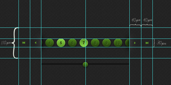
总而言之,我们有分页按钮(它们不是按钮元素,但是从现在开始我们将它们称为按钮),它们是30x30px,容器(包括高亮和阴影)是110px高,并且导航宽40像素的链接。
涵盖了,让我们继续进行一些修饰。
步骤5:样式表
用于分页的按钮是动态创建的,因此,如果删除注释掉的示例,则需要使用Firebug或其他一些浏览器检查器来查看如何将它们组合在一起。
确定按钮实际上是带有“ paginator_p”类的div之后,我们至少知道我们将要设置样式。 我们还可以看到jPaginator向这些元素添加了很多内联样式,尽管它们都决定布局而不是美观。
让我们在样式表中添加一些规则,以使工作顺利进行。
body {
	background: url(img/bg.png) #242424;
	}

#container {
	padding: 20px;
	width: 480px;
	margin: 100px auto 0 auto;
	font-family: Arial, sans-serif;
	}

.paginator_p {
	height: 30px;
	width: 30px;
	line-height: 30px;
	text-align: center;

	font-size: 13px;
	font-weight: bold;
	color: #26430c;
	}
一个坚实的开始。 在开始弄乱按钮之前,我们为主体设置背景图像,并在“容器” div中添加一些样式。 我们已指定按钮的大小为30x30px,已将其中的行高设置为匹配(这将使我们的数字或多或少地垂直居中放置),并应用了text-align:center来处理数字的水平对齐方式。 因此,我们有漂亮的方形按钮和完美居中的数字。 然后,根据我们的设计对文本进行着色和着色。
第6步:漂亮的色彩
继续,让我们为按钮应用正确的背景。 我们将使用CSS3渐变,这将使我们看到所有现代浏览器(甚至是IE10)都能满足我们的需求。 为了保护,对于不合作的浏览器,我们将使用纯色和渐变图像后备 。 根据设计的要求,我们还将在按钮内的文本上添加一个细微的阴影。
/*1px right and down offset, no blur and offwhite*/
	text-shadow: 1px 1px 0px #5a8332; /* FF3.5+, Opera 9+, Saf1+, Chrome */

   	background-color: #4A821B;
   	background-image: url(img/sprite.png) no-repeat 0 0; /*image fallback for none supporting browsers*/
  	background-image: -webkit-gradient(linear, left top, left bottom, from(#4a821b), to(#243f0d)); /* Saf4+, Chrome */
  	background-image: -webkit-linear-gradient(top, #4a821b, #243f0d); /* Chrome 10+, Saf5.1+ */
  	background-image:    -moz-linear-gradient(top, #4a821b, #243f0d); /* FF3.6 */
  	background-image:     -ms-linear-gradient(top, #4a821b, #243f0d); /* IE10 */
  	background-image:      -o-linear-gradient(top, #4a821b, #243f0d); /* Opera 11.10+ */
background-image: linear-gradient(top, #4a821b, #243f0d);注意:如果您有5分钟的时间,请查看Paul Irish的CSS3! 有关CSS3和支持的浏览器的更多信息。
步骤7:生活圈
我们已经指定链接为30px正方形,因此添加15px的圆角将为我们提供完美的圆。 那你走吧..
/*border radius half the width and height of our links to create a circle*/
    -moz-border-radius: 	15px; /* FF1-3.6 */
  	-webkit-border-radius: 	15px; /* Saf3-4, iOS 1-3.2, Android <1.6 */
    border-radius: 			15px; /* Opera 10.5, IE9, Saf5, Chrome, FF4, iOS 4, Android 2.1+ */
步骤8:流行!
与.psd中的按钮一样,我们只是几个小细节。 让我们添加一个盒子阴影,使我们的元素pop 。 实际上,让我们添加两个。
我们给每个链接一个Undertow,充当圆圈周围的暗光。 它们将从圆上传播1像素,然后再模糊4像素。 我已经精确地指定了颜色(由于Photoshop中的滴管工具),但是我们在这里也可以使用具有不透明度的rgb值。
应用了第一个框阴影之后,我们现在可以应用第二个(“ gotta love box”阴影)作为高光对象。 您将看到第二组值,其前面带有“插入”,它将强制发光向内。 没有模糊,没有x轴偏移,但是向下偏移了1px,因此辉光只是掠过了圆的顶部。
/*box shadow - no offset, but a blur of 4px and spread of 1px*/
  	/*plus an additional box-shadow to create the glow*/
	-moz-box-shadow: 		0 0 4px 1px #191919, inset 0 1px 0 #7ead42;	/* FF3.5+ */
	-webkit-box-shadow: 	0 0 4px 1px #191919, inset 0 1px 0 #7ead42;	/* Saf3.0+, Chrome */
	box-shadow: 			0 0 4px 1px #191919, inset 0 1px 0 #7ead42;	/* Opera 10.5, IE9, Chrome 10+ */
这是我们的“ paginator_p” div的结果css的样子:
.paginator_p {
	height: 30px;
	width: 30px;
	line-height: 30px;
	text-align: center;

	font-size: 13px;
	font-weight: bold;
	color: #26430c;

	/*1px right and down offset, no blur and offwhite*/
	text-shadow: 1px 1px 0px #5a8332; /* FF3.5+, Opera 9+, Saf1+, Chrome */

   	background-color: #4A821B;
   	background-image: url(img/sprite.png) no-repeat 0 0; /*image fallback for none supporting browsers*/
  	background-image: -webkit-gradient(linear, left top, left bottom, from(#4a821b), to(#243f0d)); /* Saf4+, Chrome */
  	background-image: -webkit-linear-gradient(top, #4a821b, #243f0d); /* Chrome 10+, Saf5.1+ */
  	background-image:    -moz-linear-gradient(top, #4a821b, #243f0d); /* FF3.6 */
  	background-image:     -ms-linear-gradient(top, #4a821b, #243f0d); /* IE10 */
  	background-image:      -o-linear-gradient(top, #4a821b, #243f0d); /* Opera 11.10+ */
  	background-image:         linear-gradient(top, #4a821b, #243f0d);

	/*border radius half the width and height of our links to create a circle*/
    -moz-border-radius: 	15px; /* FF1-3.6 */
  	-webkit-border-radius: 	15px; /* Saf3-4, iOS 1-3.2, Android <1.6 */
    border-radius: 			15px; /* Opera 10.5, IE9, Saf5, Chrome, FF4, iOS 4, Android 2.1+ */

    /*box shadow - no offset, but a blur of 4px and spread of 1px*/
  	/*plus an additional box-shadow to create the glow*/
	-moz-box-shadow: 		0 0 4px 1px #191919, inset 0 1px 0 #7ead42;	/* FF3.5+ */
	-webkit-box-shadow: 	0 0 4px 1px #191919, inset 0 1px 0 #7ead42;	/* Saf3.0+, Chrome */
	box-shadow: 			0 0 4px 1px #191919, inset 0 1px 0 #7ead42;	/* Opera 10.5, IE9, Chrome 10+ */
	}
步骤9: 里程碑1
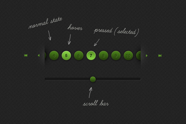
此时,我们的链接处于默认状态-看起来不错! 现在,我们需要为链接周围的元素添加一些喘息的空间:
/*container for buttons - add some padding so we can see the drop shadow*/
.paginator_p_bloc {
	padding: 5px 0;
	}
“ paginator_p_bloc”是我们所有按钮的父级,需要一些填充(顶部和底部)以允许我们在它们周围应用阴影。 您现在拥有的东西应该看起来像我们的第一个里程碑 。
步骤10:悬停状态
就像在.psd中设置的那样,让我们对按钮应用良好的悬停状态。
.paginator_p:hover {
	color: #0d1804;

	/*1px right and down offset, no blur and pale green*/
	text-shadow: 1px 1px 0px #8dc953;

   	background-color: #87D445;
   	background-image: url(img/sprite.png) no-repeat -120px 0; /*image fallback for none supporting browsers*/
  	background-image: -webkit-gradient(linear, left top, left bottom, from(#87d445), to(#589225)); /* Saf4+, Chrome */
  	background-image: -webkit-linear-gradient(top, #87d445, #589225); /* Chrome 10+, Saf5.1+ */
  	background-image:    -moz-linear-gradient(top, #87d445, #589225); /* FF3.6 */
  	background-image:     -ms-linear-gradient(top, #87d445, #589225); /* IE10 */
  	background-image:      -o-linear-gradient(top, #87d445, #589225); /* Opera 11.10+ */
  	background-image:         linear-gradient(top, #87d445, #589225);

	/*box shadow - no offset, but a blur of 2px and spread of 1px*/
  	/*plus an additional box-shadow to create the glow - slightly brighter than normal state*/
	-moz-box-shadow: 		0 0 4px 1px #191919, inset 0 1px 0 #cff3a2;	/* FF3.5+ */
	-webkit-box-shadow: 	0 0 4px 1px #191919, inset 0 1px 0 #cff3a2;	/* Saf3.0+, Chrome */
	box-shadow: 			0 0 4px 1px #191919, inset 0 1px 0 #cff3a2;	/* Opera 10.5, IE9, Chrome 10+ */
	}
那么我们在这里做了什么? 好吧,我们使数字的颜色变暗了,并给了它们淡淡的阴影。 我们更改了背景渐变的值(以使内容变亮),并且巧妙地更改了链接顶部的高亮框阴影。 黑暗的发光阴影保持不变,但是如果不忽略它,我们必须再次声明它。
步骤11:选定状态( 里程碑2 )
我们已经为选定的班级配备了好家具,所以让我们将其设计为好像按钮被按下一样(这意味着它是向内推的,它不是坐在浴室里来回摇动,而是抽入一锅花生酱中)。
/*state for selected, plus hover whilst selected. This can come before or after the general hover state due to outranking specificity*/
.paginator_p.selected,
.paginator_p.selected:hover {
	color: #0d1804;

	/*1px right and down offset, no blur and pale green*/
	text-shadow: 1px 1px 0px #8dc953; /* FF3.5+, Opera 9+, Saf1+, Chrome */

   	background-color: #589225;
   	background-image: url(img/sprite.png) no-repeat -80px 0; /*image fallback for none supporting browsers*/
  	background-image: -webkit-gradient(linear, left top, left bottom, from(#589225), to(#87D445)); /* Saf4+, Chrome */
  	background-image: -webkit-linear-gradient(top, #589225, #87D445); /* Chrome 10+, Saf5.1+ */
  	background-image:    -moz-linear-gradient(top, #589225, #87D445); /* FF3.6 */
  	background-image:     -ms-linear-gradient(top, #589225, #87D445); /* IE10 */
  	background-image:      -o-linear-gradient(top, #589225, #87D445); /* Opera 11.10+ */
  	background-image:         linear-gradient(top, #589225, #87D445);

	/*box shadow - no offset, but a blur of 2px and spread of 1px*/
  	/*plus an additional box-shadow to create the glow - slightly brighter than normal state*/
	-moz-box-shadow: 		0 0 2px 1px #191919, inset 0 1px 0 #cff3a2;	/* FF3.5+ */
	-webkit-box-shadow: 	0 0 2px 1px #191919, inset 0 1px 0 #cff3a2;	/* Saf3.0+, Chrome */
	box-shadow: 			0 0 2px 1px #191919, inset 0 1px 0 #cff3a2;	/* Opera 10.5, IE9, Chrome 10+ */
} 我们包含了selected:hover状态,因此selected:hover时按钮不会改变。 那么我们在这里还做了什么? 我们再次更改了颜色和文本阴影,反转了渐变以提供凹入的感觉并减少了暗光(建议它不再突出太多)。 简单。 您现在拥有的应该看起来像我们的第二个里程碑
第12步:滑块
整理完按钮后,我们将注意力转移到滑块上。 这是相对简单的。 我们需要更改页边距以使其间距适当,为其提供背景并使其具有正确的高度。 根据我们的设计,它的高度必须为10像素,因此我们将其高度设为8像素,周围再加上1像素的边框以将其填充。 我们给顶部和左侧边框添加深色,然后为底部和右侧边框添加浅色,以给人以缓解的印象。
最后,在任一端都圆角-我们现在有了一个不错的滑轨。
/*the slider rail*/
.paginator_slider {
	/*margin on the left pushes it past the nav buttons,
	so make the distance the total width, including margins of the nav buttons*/
	margin: 20px 0 20px 80px;

	/*with height of 8px, plus border of 1px all round our hight totals 10px*/
	height: 8px;

	background: #181818;

	border: 1px solid #393939;
	border-top-color: #0f0f0f;
	border-left-color: #0f0f0f;

	/*border radius for ff, safari + chrome, css3*/
	/*half the total height of our element to create rounded ends*/
	-moz-border-radius: 	5px; /* FF1-3.6 */
  	-webkit-border-radius: 	5px; /* Saf3-4, iOS 1-3.2, Android <1.6 */
  	border-radius: 			5px; /* Opera 10.5, IE9, Saf5, Chrome, FF4, iOS 4, Android 2.1+ */
	}
第13步:旋钮
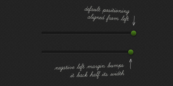
是的,把手。 当时似乎是个好名字,但我想我应该坚持使用“句柄”。 无论如何,让我们为您单击并沿着滑轨拖动的东西添加一些样式。
/*the slider, er, knob?*/
.paginator_slider .ui-slider-handle {
	height: 20px;
	width: 20px;
        margin-left: -10px; /*nudges the knob left, half its width*/

	/*remove outline in ff*/
	outline: none;

	/*border radius for ff, safari + chrome, css3*/
	/*half the width and height of knob to create a circle*/
	-moz-border-radius: 	10px; /* FF1-3.6 */
  	-webkit-border-radius: 	10px; /* Saf3-4, iOS 1-3.2, Android <1.6 */
  	border-radius: 			10px; /* Opera 10.5, IE9, Saf5, Chrome, FF4, iOS 4, Android 2.1+ */

	/*alter the positioning to bring it centred to rail*/
	top: -7px;

	/*same styling as links*/
   	background-color: #4A821B;
   	background-image: url(img/sprite.png) no-repeat 0 0; /*image fallback for none supporting browsers*/
  	background-image: -webkit-gradient(linear, left top, left bottom, from(#4a821b), to(#243f0d)); /* Saf4+, Chrome */
  	background-image: -webkit-linear-gradient(top, #4a821b, #243f0d); /* Chrome 10+, Saf5.1+ */
  	background-image:    -moz-linear-gradient(top, #4a821b, #243f0d); /* FF3.6 */
  	background-image:     -ms-linear-gradient(top, #4a821b, #243f0d); /* IE10 */
  	background-image:      -o-linear-gradient(top, #4a821b, #243f0d); /* Opera 11.10+ */
  	background-image:         linear-gradient(top, #4a821b, #243f0d);


  	/*box shadow - no offset, but a blur of 4px and spread of 1px*/
  	/*plus an additional box-shadow to create the glow*/
	-moz-box-shadow: 		0 0 4px 1px #191919, inset 0 1px 0 #7ead42;	/* FF3.5+ */
	-webkit-box-shadow: 	0 0 4px 1px #191919, inset 0 1px 0 #7ead42;	/* Saf3.0+, Chrome */
	box-shadow: 			0 0 4px 1px #191919, inset 0 1px 0 #7ead42;	/* Opera 10.5, IE9, Chrome 10+ */
	}
大多数样式看起来都是熟悉的,因为它基于按钮的默认状态。 预定义的宽度和高度,渐变背景,圆角和各种框阴影。
唯一值得注意的其他规则是outline:none ,不会删除Firefox中的虚线轮廓,y轴位置可更改旋钮在滑轨上的垂直位置, margin-left: -10px; 从而将旋钮向左精确推到宽度的一半。 查看下面的图片以找出原因:
感谢Alex指出此错误!
我们正在取得进展,请查看我们的第三个里程碑 。
步骤14:控制项
继续,让我们整理一下分页容器两侧的控件。
为了简单起见,我们将使用图像,因此跳回Photoshop会为链接图标准备一张精灵表。 我已经开始使用后备渐变来编译spritesheet,因此我将添加它,将所有内容合理地放置在CSS中进行引用。 如果您选择将所有内容随机放入Spritesheet中,则可以使用Sprite Cow等服务来始终定位图像。
每个图标状态均为40x40px,我们将垂直反对悬停状态。 从下面的样式可以看到,每个按钮都是40x40px的块,并根据其位置和状态应用了适当的图像。 该CSS已发表评论,所以我现在闭嘴。
/*let's deal with the control buttons*/
/*general styles for controls*/
.control {
	float: left;
	width: 40px;
	height: 40px;
	margin: 35px 0 0 0;
	position: relative; /*you'll see why in a bit*/
	cursor: pointer;
	}

#max_backward {
	background: url(img/sprite.png) no-repeat 0 -60px;
	}

#over_backward {
	background: url(img/sprite.png) no-repeat -40px -60px;
	}

#over_forward {
	background: url(img/sprite.png) no-repeat -80px -60px;
	}

#max_forward {
	background: url(img/sprite.png) no-repeat -120px -60px;
	}


/*hovers*/
#max_backward:hover {
	background: url(img/sprite.png) no-repeat 0 -100px;
	}

#over_backward:hover {
	background: url(img/sprite.png) no-repeat -40px -100px;
	}

#over_forward:hover {
	background: url(img/sprite.png) no-repeat -80px -100px;
	}

#max_forward:hover {
	background: url(img/sprite.png) no-repeat -120px -100px;
}很好,看看到目前为止在里程碑4中所做的事情。
步骤15:沉没感
实际上,我们还需要处理几个细节。 我们的按钮过高,当它们碰到父容器的边缘时,它们消失了,变成了虚无。 我们的设计通过建议将它们塞入背景中的插槽下方来解决此问题,因此让我们看看是否可以将其转换为浏览器。
看看下面的图片。 在其中,您将看到我们需要四个图像来处理每个高光和阴影。 高光除了位于容器两侧的控件之外,还属于容器本身的阴影,因此我们需要将其设置为110px高。
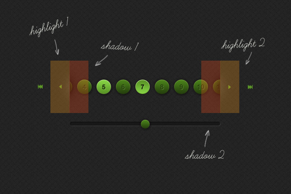
首先,让我们注意(增加)容器元素上的填充:
.paginator_p_wrap {
	margin: 0;
	padding: 35px 0;
	}
这样做之后,我们的分页就被推到了正确的位置。
第16步:捏和塞
OK,让我们将这些阴影放入其中(我再次将它们添加到了Sprite工作表中):
.paginator_p_wrap {
	margin: 0;
	padding: 35px 0;

	/*multiple background images, one for the left, one for the right*/
	background: 	url(img/shadow_sprite.png) left -220px no-repeat,
					url(img/shadow_sprite.png) right -330px no-repeat
} ..现在,让我们使用:after选择器(所有主要浏览器都支持)来处理重点内容
/*highlights*/
#over_backward:after {
	content: '';
    background: url(img/sprite.png) -40px -140px no-repeat;
    display: block;
    height: 110px;
    width: 30px;

    /*position the highlight owing to awkward inherited floats and margins from .control*/
    position: absolute;
    right: 0px;
    top: -35px;
    }

#over_forward:after {
	content: '';
    background: url(img/sprite.png) -80px -140px no-repeat;
    display: block;
    height: 110px;
    width: 30px;

    /*position the highlight owing to awkward inherited floats and margins from .control*/
    position: absolute;
    left: 0px;
    top: -35px;
    }
:after选择器有效地在页面内生成一个对象。 然后,我们可以像对待其他任何元素一样操作该元素,请牢记该元素从其父元素继承属性。 在本例中,由于父对象具有广泛的样式,因此我们选择了绝对位置定位,以便我们可以精确定位突出显示的位置。
一些其他样式可以整理页面内容,然后完成。
优秀的! 除非您想迎合较早的浏览器,否则我们已经到达了里程碑5的终点。
步骤17:向后兼容
我要把这个留给你。 我们实践的技术就是这样。 练习技巧,并且在引言中列出了浏览器的兼容性。 但是,如果您想更进一步,并确保所有内容在较旧的浏览器中都是ticket-boo,那么您可以使用一些选择。 我们确保通过在Sprite工作表中包含后备图片来覆盖渐变。 但是,修复多个背景图像,框阴影,文本阴影和边框半径并不那么简单。
使用CSS3PIE可以帮助您解决大多数这些问题(除了文本阴影之外),或者您可以将按钮添加到Spritesheet中(实际上,我已经为您完成了此操作),并使用特定于浏览器的样式表来应用它们。 使用条件语句(例如下面的条件语句)定位IE8及更低版本,而现代浏览器则不明智。
<!--[if lte IE 8]>
		<style type="text/css" media="all">
			@import url(ie.css);
		</style><![endif]-->
结论
感谢您的关注,希望您能从阅读的内容中汲取一些有用的想法。 另外,非常感谢Remy自愿将jPaginator用作豚鼠-请记住在GitHub上查看其开发!
翻译自: https://webdesign.tutsplus.com/tutorials/extreme-makeover-jpaginator-css3-edition--webdesign-3620


 扫一扫
扫一扫


 8万+
8万+

 被折叠的 条评论
为什么被折叠?
被折叠的 条评论
为什么被折叠?
 到【灌水乐园】发言


