


前端实现弹性布局 flex换行后靠左排列
一. 弹性布局的实现水平均匀排列,换行后不靠左排列。
 <div style={{ display: 'flex', background: '#40feee', width: 800, height: 240, flexWrap: 'wrap', justifyContent: 'space-between' }}>
   <div style={{ width: 120, height: 80, background: '#fff', margin: 16 }}>1</div>
   <div style={{ width: 120, height: 80, background: '#fff', margin: 16 }}>1</div>
   <div style={{ width: 120, height: 80, background: '#fff', margin: 16 }}>1</div>
   <div style={{ width: 120, height: 80, background: '#fff', margin: 16 }}>1</div>
   <div style={{ width: 120, height: 80, background: '#fff', margin: 16 }}>1</div>
 </div>
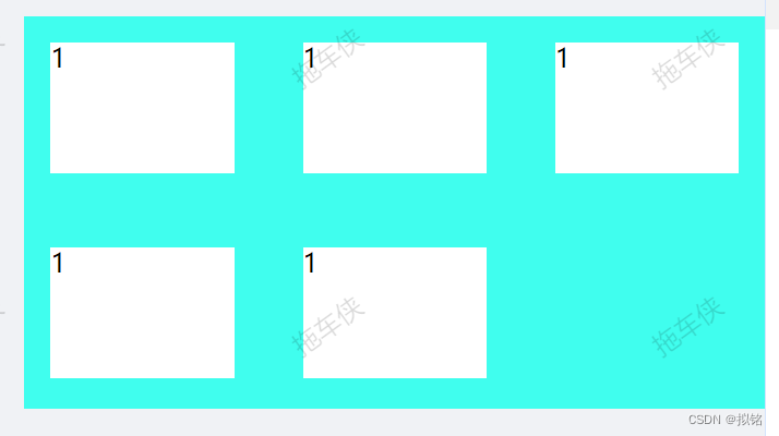
flex换行后效果如下:

二、 实现弹性布局 flex换行后靠左排列 使用grid网格实现
步骤:
- 设置父元素dispaly: grid
- 设置父元素justify-content: space-between
- 设置父元素:grid-template-columns: repeat(auto-fit, minmax(120px, 1fr))
使用repeat函数minmax来设置子元素的最大最小宽度,auto-fit设置填充模式。具体参数:repeat函数
  <div style={{
    background: '#40feee',
    width: 800, height: 240, flexWrap: 'wrap',
    display: 'grid',
    gridGap: "10px",
    justifyContent: 'space-between',
    gridTemplateColumns: 'repeat(auto-fit, minmax(120px, 1fr))',
  }}>
    <div style={{ height: 80, background: '#fff', margin: 16 }}>1</div>
    <div style={{ height: 80, background: '#fff', margin: 16 }}>1</div>
    <div style={{ height: 80, background: '#fff', margin: 16 }}>1</div>
    <div style={{ height: 80, background: '#fff', margin: 16 }}>1</div>
    <div style={{ height: 80, background: '#fff', margin: 16 }}>1</div>
  </div>
使用grid后效果如下


 扫一扫
扫一扫


 859
859

 被折叠的 条评论
为什么被折叠?
被折叠的 条评论
为什么被折叠?
 到【灌水乐园】发言


