


 本文介绍如何使用CSS伪元素实现多种视觉效果,包括清除浮动、制作三角形、气泡框、阴影、扩大点击区域等,展示了丰富的网页设计技巧。
1.content
- [String] - 使用引号包括一段字符串,将会向元素内容中添加字符串。
- [attr()] – 调用当前元素的属性,可以方便的比如将图片的 Alt 提示文字或者链接的 Href 地址显示出来。
- [url()]– 用于引用媒体文件。
2.清除浮动
- 清除浮动的原因(子元素在父元素内使用了float后,脱离标准流,不占用位置,当父元素高度没有设置时,会影响后续元素的排版,清除浮动的目的就是在于为父元素撑开高度,将浮动元素包裹在其中,避免浮动元素影响父元素外部的元素排列)
- css代码
/* 清除浮动 */
.clearfix::after {
    content: ".";
    clear: both;
    display: block;
    overflow: hidden;
    font-size: 0;
    height: 0;
}

.clearfix {
    zoom: 1;  /* 用于兼容低版本的浏览器 */
}
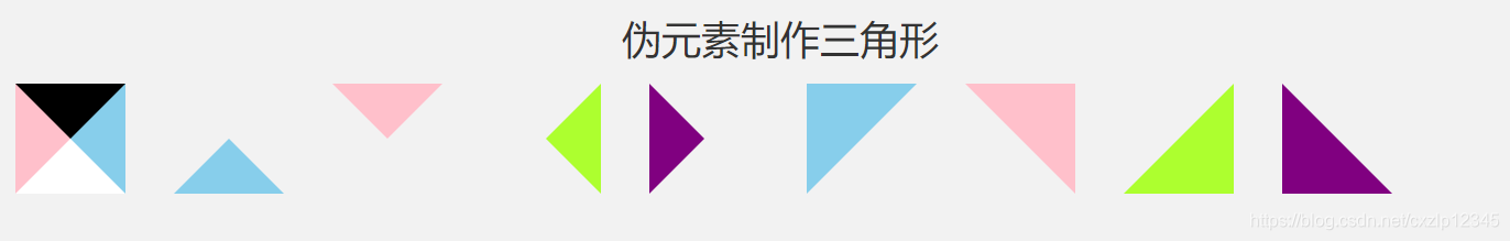
3.伪元素制作三角形
- 效果展示
- html代码
<div> <div class="triangle-theory"> </div> <div class="triangle-theory triangle-top"> </div> <div class="triangle-theory triangle-bottom"> </div> <div class="triangle-theory triangle-left"> </div> <div class="triangle-theory triangle-right"> </div> <div class="triangle-theory triangle-left-top"> </div> <div class="triangle-theory triangle-right-top"> </div> <div class="triangle-theory triangle-right-bottom"> </div> <div class="triangle-theory triangle-left-bottom"> </div> </div> - css代码
/* 三角形 */


.triangle-theory {
    width: 100px;
    height: 100px;
    margin: 10px 20px;
    text-align: center;
    display: inline-block;
}

.triangle-theory::after {
    content: '';
    display: block;
    width: 0;
    height: 0;
    margin: 0 auto;
    border-width: 50px;  /* 边框长度 */
    border-style: solid;
    border-color: #000 skyblue #fff pink;/* 可通过设置border-color颜色来获取相应的三角形  */
}

.triangle-top::after {
    border-color: transparent transparent skyblue transparent;
}

.triangle-bottom::after {
    border-color: pink transparent transparent transparent;
}

.triangle-left::after {
    border-color: transparent greenyellow transparent transparent;
}

.triangle-right::after {
    border-color: transparent transparent transparent purple;
}

.triangle-left-top::after {
    border-color: skyblue transparent transparent skyblue;
}

.triangle-right-top::after {
    border-color: pink pink transparent transparent;
}

.triangle-right-bottom::after {
    border-color: transparent greenyellow greenyellow transparent;
}

.triangle-left-bottom::after {
    border-color: transparent transparent purple purple;
}
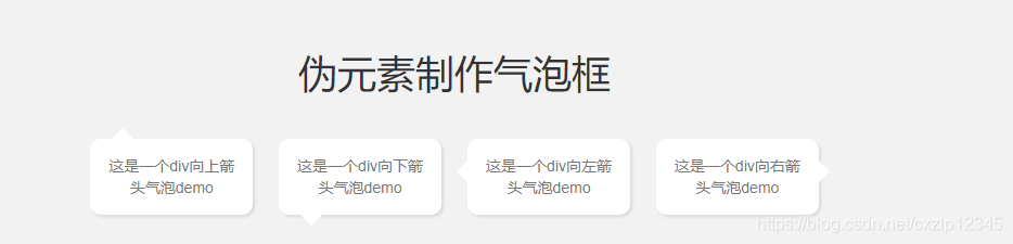
3.伪元素制作气泡框
- 效果展示
- html代码
<div> <div class="bubble bubble-up"> <span>这是一个div向上箭头气泡demo</span> </div> <div class="bubble bubble-down"> <span>这是一个div向下箭头气泡demo</span> </div> <div class="bubble bubble-left"> <span>这是一个div向左箭头气泡demo</span> </div> <div class="bubble bubble-right"> <span>这是一个div向右箭头气泡demo</span> </div> </div> - css代码
.bubble {
    display: inline-block;
    position: relative;
    width: 150px;
    padding: 15px;
    margin: 30px 10px;
    color: #777;
    background-color: #fff;
    border-radius: 10px;
    box-shadow: 2px 2px 3px rgba(0, 0, 0, 0.1);
}


.bubble-up::after {
    content: "";
    width: 0;
    height: 0;
    display: block;
    border-style: solid;
    border-width: 10px;    /* 箭头长度 */
    border-color: transparent transparent #fff transparent;
    position: absolute;
    top: -20px;    /* 该数值为border-width的一倍 */
    left: 20px;
}

.bubble-down::after {
    content: "";
    width: 0;
    height: 0;
    display: block;
    border-style: solid;
    border-width: 10px;    /* 箭头长度 */
    border-color: #fff transparent transparent transparent;
    position: absolute;
    bottom: -20px;    /* 该数值为border-width的一倍 */
    left: 20px;
}

.bubble-left::after {
    content: "";
    width: 0;
    height: 0;
    display: block;
    border-style: solid;
    border-width: 10px;    /* 箭头长度 */
    border-color: transparent #fff transparent transparent;
    position: absolute;
    z-index: -1;
    top: 20px;
    left: -20px;    /* 该数值为border-width的一倍 */
}

.bubble-right::after {
    content: "";
    width: 0;
    height: 0;
    display: block;
    border-style: solid;
    border-width: 10px;    /* 箭头长度 */
    border-color: transparent transparent transparent #fff;
    position: absolute;
    top: 20px;
    right: -20px;    /* 该数值为border-width的一倍 */
}
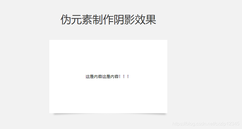
4.伪元素制作阴影效果
- 效果展示
- html代码
<div> <div class="outer"> <div class="inter"> 这是内容这是内容!!! </div> </div> </div> - css代码
/* 阴影效果 */
.outer {
    width: 400px;
    height: 250px;
    padding: 5px;
    margin: 50px auto;
    position: relative;
}

.inter {
    position: absolute;
    top: 0px;
    left: 0px;
    right: 0px;
    bottom: 0px;
    background-color: #fff;
    color: #000;
    line-height: 250px;    /* 文字垂直居中 */
    text-align: center;
    z-index: 2;
}
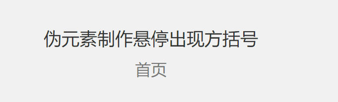
5.伪元素制作悬停出现方括号
- 效果展示
- html代码
<div class="a-hover"> <a href="">首页</a> </div> - css代码
/* 悬停方括号 */

.a-hover {
    width: 100px;
    margin: 16px auto;
}

.a-hover a {
    position: relative;
    display: inline-block;
    outline: none;
    text-decoration: none;
    color: #777;
    font-size: 32px;
    padding: 5px 10px;
    cursor: pointer;
    width: 100px;
    text-align: center;
    box-sizing: border-box;
}

.a-hover a:hover::before,
.a-hover a:hover::after {
    position: absolute;    /* 子绝父相 */
}

a:hover::before {
    content: "[";
    left: -10px;
    color: yellowgreen;
}

a:hover::after {
    content: "]";
    right: -10px;
    color: yellowgreen;
}
6.伪元素实现悬停特效
- 效果展示
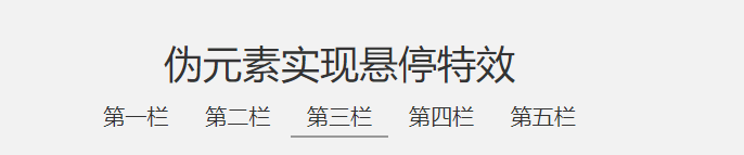
- html代码
<div class="col-lg-12 text-center"> <ul> <li>第一栏</li> <li>第二栏</li> <li class="active current">第三栏</li> <li>第四栏</li> <li>第五栏</li> </ul> </div> - css代码
/* 悬停特效 */ li { font-size: 20px; padding: 5px 15px; display: inline-block; position: relative; cursor: pointer; transition: all 0.5s; /*all 0.5秒 表示所有类型的过渡动画都在0.5秒内完成*/ } /*在最后一个li元素添加一个底部横线,宽度为0,不显示*/ li:last-child::after { content: ''; display: block; position: absolute; /* 子绝父相 */ width: 0%; bottom: 0; right: 0; border-bottom: 2px solid #999; transition: all 0.5s; /*all 0.5秒 表示所有类型的过渡动画都在0.5秒内完成*/ } /*鼠标hover到li上去的时候width从0变化至100,位置向左移 */ /* 鼠标hover到第一个li时 */ li:nth-child(1):hover~li:last-child::after { right: 400%; width: 100%; } /* 鼠标hover到第二个li时 */ li:nth-child(2):hover~li:last-child::after { right: 300%; width: 100%; } /* 鼠标hover到第三个li时 */ li:nth-child(3):hover~li:last-child::after { right: 200%; width: 100%; } /* 鼠标hover到第四个li时 */ li:nth-child(4):hover~li:last-child::after { right: 100%; width: 100%; } /* 鼠标hover到第五个li时 */ li:last-child:hover::after { right: 0; width: 100%; } /* 设置选中的li,默认底部有横线 */ li.current::after { content: ''; display: block; position: absolute; width: 100%; bottom: 0; right: 0; border-bottom: 2px solid #999; z-index: 5; } -
js代码(使用到jquery,需要引入)
    <script>
        // 通过jq设置当鼠标移动到其他li时,隐藏选中li的横线
        $(function () {
            $('li').stop().mouseenter(function () {
                $('li.active').removeClass('current');
            })
            $('li').stop().mouseout(function () {
                $('li.active').addClass('current');
            })
        })
    </script>
7.伪元素制作美化文字(使用content中的attr来设置)
- 效果展示
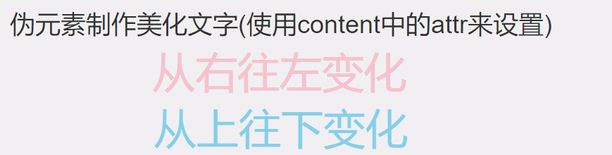
- html代码
<div class="col-lg-12 text-center"> <span class="beautify-text beautify-text-row" data-text='从右往左变化'>从右往左变化</span> <br> <span class="beautify-text beautify-text-col" data-text='从上往下变化'>从上往下变化</span> </div> - css代码
/* 美化文字 */
.beautify-text {
    position: relative;
    font-size: 6rem;
    color: skyblue;
    line-height: 80px;
}

.beautify-text::after {
    position: absolute;
    font-size: 6rem;
    color: pink;
    content: attr(data-text);    /* 显示属性的值 */
    white-space: nowrap;
    transition: all 1.5s;
    left: 0;
    display: inline-block;
    overflow: hidden;
    z-index: 99;
}

.beautify-text-row::after {
    width: 100%;
}

.beautify-text-col::after {
    height: 0;
}

.beautify-text-row:hover::after {
    width: 0;
}

.beautify-text-col:hover::after {
    height: 100%;
}
9.伪元素实现图片背景文字
- 效果展示
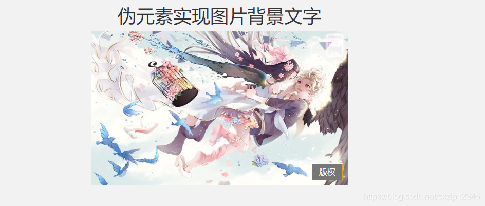
- html代码
<div class="text-center bg-img"> <img src="https://timgsa.baidu.com/timg?image&quality=80&size=b9999_10000&sec=1548409034837&di=cc37b6fb49ec8e20b9555ae54969b841&imgtype=0&src=http%3A%2F%2Fh.hiphotos.baidu.com%2Fzhidao%2Fpic%2Fitem%2Fd043ad4bd11373f0b54de92ba00f4bfbfbed0417.jpg" alt=""> </div> - css代码
/* 背景图 */
.bg-img {
    position: relative;
    width: 500px;
    height: 300px;
    color: #777;
    font-size: 60px;
    text-align: center;
    margin: 0 auto;
    transition: all 0.5s;
}

.bg-img img {
    width: 100%;
    height: 100%;
}

/* 不能再img上添加伪元素 */
.bg-img::before {
    position: absolute;
    right: 10px;
    bottom: 10px;
    content: '版权';
    background-color: #777;
    border: 1px solid goldenrod;
    color: #fff;
    width: 60px;
    font-size: 16px;
    line-height: 30px;
    text-align: center;
    z-index: 1002;
}

.bg-img:hover {
    transform: scale(1.05);
}
10.伪元素实现扩大可点击区域
- 效果展示
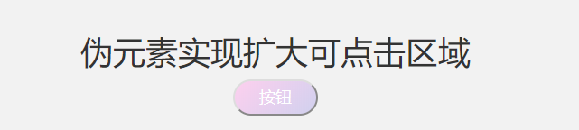
- html代码
<button type="button" class="lg-click">按钮</button> - css代码
/* 扩大点击区域 */
.lg-click {
    font-size: 18px;
    font-family: Helvetica, Tahoma, Arial;
    line-height: 1em;    /*使用em作为单位,即使字体变化,按钮的整体样式也会按比例跟随变化*/
    color: #fff;
    background: linear-gradient(135deg, rgb(254, 204, 238, .9), rgb(205, 205, 238, .9));
    padding: .5em 1.5em;
    border-radius: 2em;
    display: inline-block;
    position: relative;
    transition: all .5s;
}

.lg-click::before {
    content: '';
    position: absolute;
    left: -50px;
    right: -50px;
    top: -50px;
    bottom: -50px;
}

.lg-click:hover {
    background: linear-gradient(135deg, rgb(254, 204, 238, .4), rgb(205, 205, 238, .4));
}
11.伪元素添加标签
- 效果展示
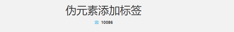
- html代码
<div class='phone-number'> 10086</div> - css代码
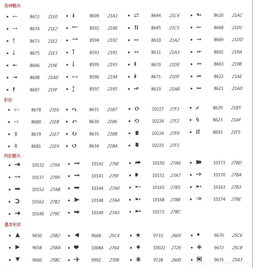
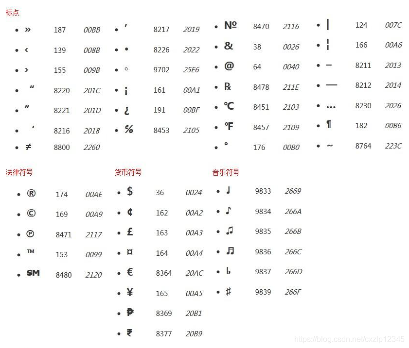
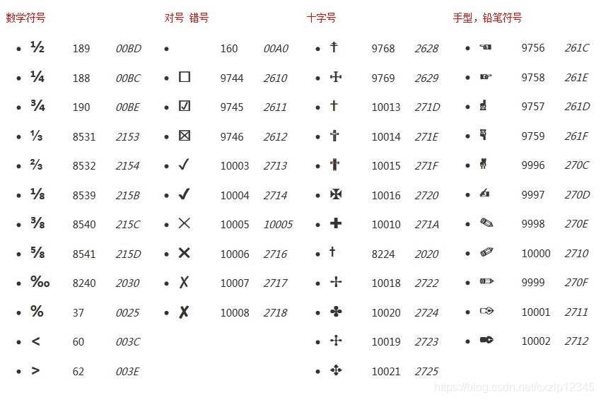
/* 添加标签 */ .phone-number { font-size: 14px; font-weight: 600; } .phone-number::before { content: '\260E '; font-size: 14px; color: skyblue; } - 常用标签码(使用时添加对应符号第二行的代码到content中,如 '\260E','\'不可少)
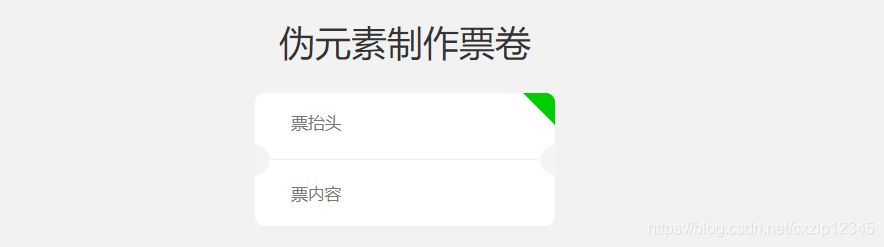
12.伪元素制作票卷
- 效果展示
- html代码
<div class='coupon'> <div class='triangle-top-right'> <text class='coupon-title'>票抬头</text> <hr> <div> <span class='coupon-num'>票内容 </span> </div> </div> </div> - css代码
/* 票券 */
.coupon {
    width: 300px;
    margin: 30px auto;
    color: #777;
    font-size: 1.2em;
    line-height: 30px;
    background-color: #fff;
    position: relative;
    padding: 16px 16px;
    border-radius: 10px;
}

.coupon::before {
    width: 15px;
    height: 30px;
    content: "";
    right: 0;
    top: 52px;
    position: absolute;
    display: block;
    background: #f4f4f4;
    border-radius: 15px 0 0 15px;
    z-index: 99;
}

.coupon::after {
    width: 15px;
    height: 30px;
    content: "";
    left: 0;
    top: 52px;
    position: absolute;
    display: block;
    background: #f4f4f4;
    border-radius: 0 15px 15px 0;
    z-index: 99;
}

.coupon-title,
.coupon-num {
    padding-left: 20px;
}

.triangle-top-right::after {
    content: '';
    position: absolute;
    height: 0;
    width: 0;
    top: 0;
    right: 0;
    border-color: transparent;
    border-style: solid;
}

.triangle-top-right::after {
    border-width: 16px;
    border-radius: 0 10px 0 0;
    border-right-color: #0c0;
    border-top-color: #0c0;
}


 扫一扫
扫一扫


 535
535

 被折叠的 条评论
为什么被折叠?
被折叠的 条评论
为什么被折叠?
 到【灌水乐园】发言


