


大家好,Seaborn 是基于 Matplotlib 的扩展库,Pandas 的可视化功能同样也依赖于 Matplotlib。尽管二者都使用相同的底层图形库,但绘制图表的方法却各有千秋。本文将介绍各种柱状图的绘制,比较 Matplotlib、Pandas 和 Seaborn 在数据可视化方面的功能、优势和局限。
1.构建数据图表的基础
先从定义一些虚拟数据和导入所需库开始:
import pandas as pd
import matplotlib.pyplot as plt
import seaborn as sb
import numpy as np

data = {
    'label': ['I', 'II', 'III', 'IV', 'V', 'VI', 'VII', 'VIII', 'IX', 'X'],
    'percent': [0.1, 0.2, 0.3, 0.4, 0.5, 0.6, 0.7, 0.8, 0.9, 1.0],
    'remaining': [0.9, 0.8, 0.7, 0.6, 0.5, 0.4, 0.3, 0.2, 0.1, 0.0],
}

df = pd.DataFrame(data)
创建一个包含三个子图的 Matplotlib 图形,然后分别用 Matplotlib、Pandas 和 Seaborn 绘制三个柱状图。
f, (ax1, ax2, ax3) = plt.subplots(3, figsize=(12, 8))  # matplotlib
ax1.bar(df.label, df.percent)  # pandas
df.plot(x='label', y='percent', kind='bar', ax=ax2)  # seaborn
sb.barplot(x=df.label, y=df.percent, ax=ax3)
plt.show()
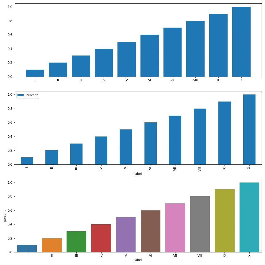
虽然绘制的图表在
 最低0.47元/天 解锁文章


 3万+
3万+

 被折叠的 条评论
为什么被折叠?
被折叠的 条评论
为什么被折叠?
 到【灌水乐园】发言


