抖音上很火的3D立体动态相册实现代码!

前端实现3D立体动态相册
本文介绍如何使用HTML和CSS创建一个3D立体动态相册,通过调整图片尺寸和角度,实现旋转展示效果。步骤包括设置HTML结构、CSS样式以及处理可能出现的展示问题。适合前端开发者学习,也可直接获取代码包替换图片使用。
该文章已生成可运行项目,

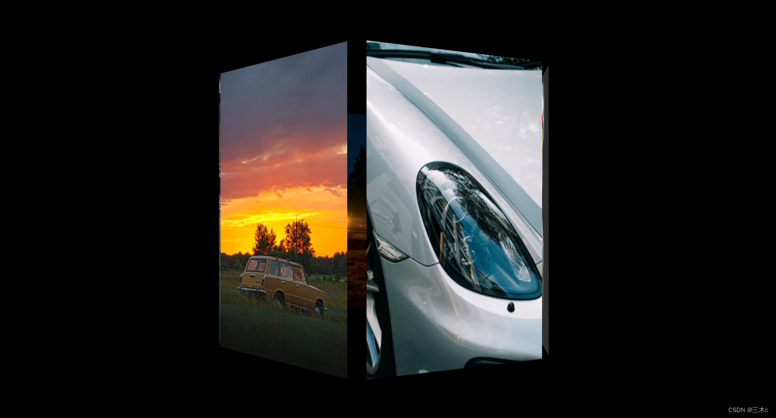
今天这篇博客就分享下前端代码如何实现3D立体动态相册。赶紧学会了,来制作属于我们程序员的浪漫吧!先上效果图,来引起下你们的兴趣。

  正文:
一、新建一个index.html的文件,代码如下

<!DOCTYPE html>
<html lang="en">
  <head>
    <meta charset="UTF-8" />
    <meta http-equiv="X-UA-Compatible" content="IE=edge" />
    <meta name="viewport" content="width=device-width, initial-scale=1.0" />
    <title>Document</title>
    <link rel="stylesheet" href="./3D.css" />
  </head>
  <body>
    <section>
        <img src="./img/01.jpeg" alt="">
        <img src="./img/06.jpeg" alt="">
        <img src="./img/03.jpeg" alt="">
        <img src="./img/04.jpeg" alt="">
        <img src="./img/05.jpeg" alt="">
        <img src="./img/02.jpeg" alt="">
      </section>
  </body>
</html>

二、css样式的代码

body {
    background-color: #000;
    /* 视距 */
    perspective: 900px;
  }

  section {
    margin: 20vh auto;
    position: relative;
    width: 200px;
    height: 400px;
    /* 开启3D空间 */
    transform-style: preserve-3d;
    /* 动画:动画名 一次动画时间 平稳 无限循环 */
    animation: rotate 20s linear infinite;
  }
  section img {
    width: 250px;
    height: 400px;
    /* 设置定位,先将图片都放在同一位置 */
    position: absolute;
    left: 0;
    top: 0;
  }

  /* 让第一个img子元素竖直旋转0度,向外推100px(因为盒子边长200px),其他同理 */
  section img:nth-child(1) {
    transform: rotateY(0deg) translateZ(100px);
  }

  section img:nth-child(2) {
    transform: rotateY(90deg) translateZ(100px);
  }

  section img:nth-child(3) {
    transform: rotateY(180deg) translateZ(100px);
  }

  section img:nth-child(4) {
    transform: rotateY(270deg) translateZ(100px);
  }

  section img:nth-child(5) {
    transform: rotateX(90deg) translateZ(100px);
  }

  section img:nth-child(6) {
    transform: rotateX(-90deg) translateZ(100px);
  }
section img:nth-child(1) {
    transform: rotateY(0deg) translateZ(240px);
  }

  section img:nth-child(2) {
    transform: rotateY(60deg) translateZ(240px);
  }

  section img:nth-child(3) {
    transform: rotateY(120deg) translateZ(240px);
  }

  section img:nth-child(4) {
    transform: rotateY(180deg) translateZ(240px);
  }

  section img:nth-child(5) {
    transform: rotateY(240deg) translateZ(240px);
  }

  section img:nth-child(6) {
    transform: rotateY(300deg) translateZ(240px);
  }

  @keyframes rotate {
    0% {
      transform: rotateY(0deg);
    }

    100% {
      transform: rotateY(360deg);
    }
  } 

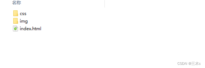
 三、文件的目录结构,把css文件放到css文件夹里,图片放到img文件夹里。

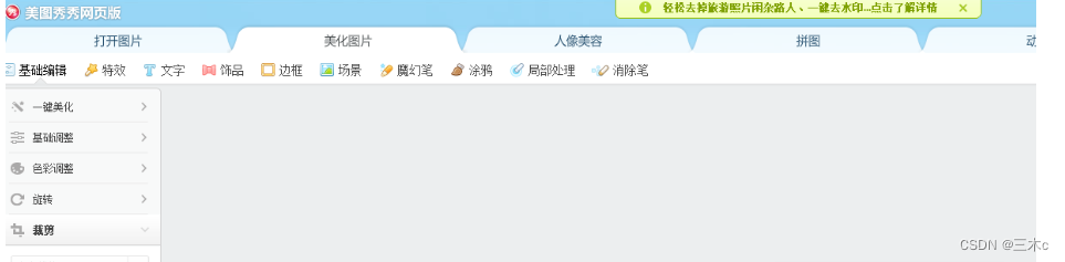
四、图片尺寸不会修改的,可以选择使用美图秀秀网页版很简单

五、容易出现的问题 ,图片展示不全或展示的方向不对

1.图片尺寸需要修改 (解决展示不全的情况)

上图是我的图片文件夹里放的图片 ,首先01-06编号命名的图片尺寸是100x100px的大小的,1-6编号是400x400px,如果效果想展示最佳,100x100px的图片是以头部特写的照片最好,因为01-06是立体照片内部小正方体的照片,1-6编号是外部正方体的照片。

2.图片的方向需要修改(解决头朝下的问题)

修改的方向如上图展示所示,比如第三张头就应该朝下,否则形成的效果图像会出现头是倒着的情况。
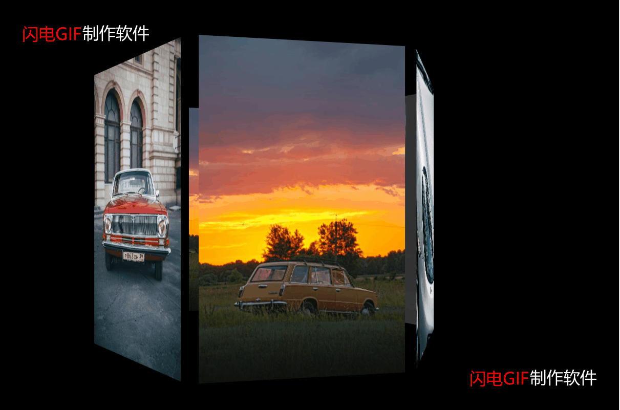

六、放一下动态效果图


总结:

 生活虽然总有辛酸,但是我们不应该减少去创造生活的乐趣,不断寻找属于自己的那份快乐,才应该是我们生活的态度。如果是非技术的朋友看到这篇博客,发现不会弄,可以直接留言要代码包,自己替换下图片就可以啦。

我是三木c,一名喜欢分享知识的程序员,时不时的也会荒腔走板的聊一聊电影、电视剧、音乐、漫画,这里已经有525位小伙伴在等你们啦,感兴趣的就赶紧来点击关注我把,哪里有不明白或有不同观点的地方欢迎留言!


本文章已经生成可运行项目
纯CSS实现鼠标经过3D立体动态展示图片特效代码 @charset "utf-8"; *{ margin:0; padding:0; } body{ max-width: 100%; min-width: 100%; height: 100%; background-size: cover; background-repeat: no-repeat; background-attachment: fixed; background-size:100% 100%; position: absolute; margin-left: auto; margin-right: auto; } li{ list-style: none; } .box{ width:200px; height:200px; background-size: cover; background-repeat: no-repeat; background-attachment: fixed; background-size:100% 100%; position: absolute; margin-left: 42%; margin-top: 22%; -webkit-transform-style:preserve-3d; -webkit-transform:rotateX(13deg); -webkit-animation:move 5s linear infinite; } .minbox{ width:100px; height:100px; position: absolute; left:50px; top:30px; -webkit-transform-style:preserve-3d; } .minbox li{ width:100px; height:100px; position: absolute; left:0; top:0; } .minbox li:nth-child(1){ background: url(img/01.png) no-repeat 0 0; -webkit-transform:translateZ(50px); } .minbox li:nth-child(2){ background: url(img/02.png) no-repeat 0 0; -webkit-transform:rotateX(180deg) translateZ(50px); } .minbox li:nth-child(3){ background: url(img/03.png) no-repeat 0 0; -webkit-transform:rotateX(-90deg) translateZ(50px); } .minbox li:nth-child(4){ background: url(img/04.png) no-repeat 0 0; -webkit-transform:rotateX(90deg) translateZ(50px); } .minbox li:nth-child(5){ background: url(img/05.png) no-repeat 0 0; -webkit-transform:rotateY(-90deg) translateZ(50px); } .minbox li:nth-child(6){ background: url(img/06.png) no-repeat 0 0; -webkit-transform:rotateY(90deg) translateZ(50px); } .maxbox li:nth-child(1){ background: url(img/1.png) no-repeat 0 0; -webkit-transform:translateZ(50px); } .maxbox li:nth-child(2){ background: url(img/2.png) no-repeat 0 0; -webkit-transform:translateZ(50px); } .maxbox li:nth-child(3){ background: url(img/3.png) no-repeat 0 0; -webkit-transform:rotateX(-90deg) translateZ(50px); } .maxbox li:nth-child(4){ background: url(img/4.png) no-repeat 0 0; -webkit-transform:rotateX(90deg) translateZ(50px); } .maxbox li:nth-child(5){ background: url(img/5.png) no-repeat 0 0; -webkit-transform:rotateY(-90deg) translateZ(50px); } .maxbox li:nth-child(6){ background: url(img/6.png) no-repeat 0 0; -webkit-transform:rotateY(90deg) translateZ(50px); } .maxbox{ width: 800px; height: 400px; position: absolute; left: 0; top: -20px; -webkit-transform-style: preserve-3d; } .maxbox li{ width: 200px; height: 200px; background: #fff; border:1px solid #ccc; position: absolute; left: 0; top: 0; opacity: 0.2; -webkit-transition:all 1s ease; } .maxbox li:nth-child(1){ -webkit-transform:translateZ(100px); } .maxbox li:nth-child(2){ -webkit-transform:rotateX(180deg) translateZ(100px); } .maxbox li:nth-child(3){ -webkit-transform:rotateX(-90deg) translateZ(100px); } .maxbox li:nth-child(4){ -webkit-transform:rotateX(90deg) translateZ(100px); } .maxbox li:nth-child(5){ -webkit-transform:rotateY(-90deg) translateZ(100px); } .maxbox li:nth-child(6){ -webkit-transform:rotateY(90deg) translateZ(100px); } .box:hover ol li:nth-child(1){ -webkit-transform:translateZ(300px); width: 400px; height: 400px; opacity: 0.8; left: -100px; top: -100px; } .box:hover ol li:nth-child(2){ -webkit-transform:rotateX(180deg) translateZ(300px); width: 400px; height: 400px; opacity: 0.8; left: -100px; top: -100px; } .box:hover ol li:nth-child(3){ -webkit-transform:rotateX(-90deg) translateZ(300px); width: 400px; height: 400px; opacity: 0.8; left: -100px; top: -100px; } .box:hover ol li:nth-child(4){ -webkit-transform:rotateX(90deg) translateZ(300px); width: 400px; height: 400px; opacity: 0.8; left: -100px; top: -100px; } .box:hover ol li:nth-child(5){ -webkit-transform:rotateY(-90deg) translateZ(300px); width: 400px; height: 400px; opacity: 0
评论 1
成就一亿技术人!
拼手气红包6.0元
还能输入1000个字符
 
红包 添加红包
表情包 插入表情
 条评论被折叠 查看
添加红包

请填写红包祝福语或标题

红包个数最小为10个

红包金额最低5元

当前余额3.43前往充值 >
需支付:10.00
成就一亿技术人!
领取后你会自动成为博主和红包主的粉丝 规则
hope_wisdom
发出的红包
实付
使用余额支付
点击重新获取
扫码支付
钱包余额 0

抵扣说明:

1.余额是钱包充值的虚拟货币,按照1:1的比例进行支付金额的抵扣。
2.余额无法直接购买下载,可以购买VIP、付费专栏及课程。

余额充值