 CSS样式详解:盒子模型、边框、定位与浮动


 本文深入探讨了CSS中的盒子模型,包括边框的粗细、样式和颜色设置,以及如何通过内外边距实现元素居中。同时,介绍了圆角边框、阴影效果的创建。接着,详细阐述了浮动元素的影响,如标准文档流、display属性和解决父级边框塌陷问题的方法。最后,讨论了相对、绝对和固定定位,以及z-index在图层堆叠中的作用。
文章目录
1.什么是盒子模型
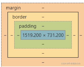
margin:外边距
border:边框
padding:内边距
2.边框(border)
1.边框的粗细
2.边框的样式
3.边框的颜色
<!DOCTYPE html>
<html lang="en">
<head>
<meta charset="UTF-8">
<title>Title</title>
<style>
/*body.总有一个默认的外边出margin: e,常见操作*/
/*h1,ul,li,a,bodyi{*/
/*margin: e;*/
/*padding: B;*/
/*text-decoration: none;*/
/*}*/
/*border:粗细,样式:颜色*/
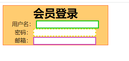
.first{
text-align: center;
width: 300px;
border: orangered 1px solid;
}
form{
background: #FFCC70;
}
#uesr input{
border: red 2px solid;
}
h1{
background: #FFCC70;
margin: 0;
}
/*实线*/
div:nth-of-type(1) input{
border: #13c915 3px solid;
}
/*虚线*/
div:nth-of-type(2) input{
border: #ecda1e 3px dashed;
}
div:nth-of-type(3) input{
border: #C850C0 3px solid;
}
</style>
</head>
<body>
<div class="first">
<h1>会员登录</h1>
<form action="#">
<div id="user">
<span>用户名:</span>
<input type="text">
</div>
<div>
<span>密码:</span>
<input type="text">
</div>
<div>
<span>邮箱:</span>
<input type="text">
</div>
</form>
</div>
</body>
</html>
效果图
3.内外边距及div居中
margin:0 0 0 0/*分别表示上、右、下、左;从上开始顺时针*/
/*例1:居中*/
margin:0 auto /*auto表示左右自动*/
/*例2:*/
margin:4px/*表示上、右、下、左都为4px*/
/*例3*/
margin:10px 20px 30px/*表示上为10px,左右为20px,下为30px*/
盒子的计算方式:
margin+border+padding+内容的大小
总结:
body总有一个默认的外边距 margin:0
常见操作:初始化
margin:0;
padding:0;
text-decoration:none;
4.圆角边框及阴影
border-radius有四个参数(顺时针),左上->右上->右下->左下
圆圈:圆角=半径+边框
<style>
        div{
            width: 100px;
            height: 100px;
            border: 10px solid red;
            /*一个border-radius只管一个圆的1/4*/
            border-radius: 50px 20px 20px 30px;/*左上 右上 右下 左下 ,顺时针方向*/
        }
</style>
阴影
 #first{
            width: 25px;
            height: 25px;
            border: red 2px solid;
            box-shadow: 10px 10px 1px orange;
        }
5.浮动
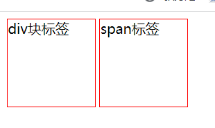
块级元素:独占一行
h1~h2 p div 列表(ul li)…
行内元素:不独占一行
img span a strong…
块级元素可以包含行内元素,但是反过来则不行
5.1标准文档流
5.2display(非常重要)
display:
block:块元素
inline:行内元素
inline-block:行内块元素
<style>
        div{
            width: 100px;
            height: 100px;
            border: red 1px solid;
            display: inline-block;
        }
        span{
            width: 100px;
            height: 100px;
            border: red 1px solid;
            display: inline-block;
        }
    </style>
效果演示:
5.3Float(浮动)
float: left;
float: right;
这种浮动有弊端:他会随着页面的变化,布局也发生变化
5.4父级边框塌陷的问题
clear: right; 右侧不允许有浮动元素
clear: left; 左侧不允许有浮动元素
clear: both; 两侧不允许有浮动元素
解决方案:
1.增加父级元素的高度
#father{
height :800px
}
简单,但是代码中尽量避免空div
2.增加一个空的div标签,清除浮动
<div class="clear"></div>
.clear{
clear:both;
margin:0;
padding:0;
}
简单,元素要是有了固定高度,就会被限制
3.在父级元素中添加overflow方法
overflow:hidden;
简单,下拉的一些场景中避免使用
4.在父类中添加一个伪类
#father:after{
content: '';
display:block;
clear:both;
}
写法虽然复杂了一点,但是没有副作用, 推荐使用!
display:方向不可以控制
float:浮动起来的话会脱离标准文档流,所以要解决父级边框塌陷的问题。
6.定位
相对定位:positon:relstive;
相对于原来的位置,进行指定的偏移,相对定位的话,它仍然在标准文档流中!原来的位置会被保留
top:-20px;/向上偏移20px/
left:20px;/向右偏移20px/
bottom:10px;/向上偏移10px/
right:20px;/向左偏移20px/
<!DOCTYPE html>
<html lang="en">
<head>
    <meta charset="UTF-8">
    <title>Title</title>
    <style>
        body{
            margin: 10px;
            padding: 10px;
            font-size: 30px;
            line-height: 25px;
        }
        #father{
            border: red 1px solid;
            padding: 0;
        }
        #first{
            background: orange;
            border: #f5f526 1px dashed;
            position: relative;
            top: -20px;
            left: 20px;
        }
        #second{
            background: #13c915;
            border: green 1px dashed;
            position: relative;
            top: -20px;
            right: 20px;
        }
        #third{
            background: #165175;
            border: blue 1px dashed;
            position: relative;
            bottom: -20px;
            left: 20px;
        }
    </style>
</head>
<body>
<div id="father">
    <div id="first">第一个盒子</div>
    <div id ="second">第二个盒子</div>
    <div id="third">第三个盒子</div>
</div>
</body>
</html>
代码如下:
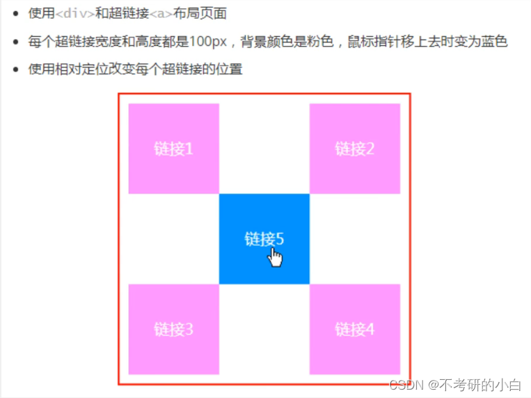
<!DOCTYPE html>
<html lang="en">
<head>
    <meta charset="UTF-8">
    <title>Title</title>
    <style>
        #father{
            border: 2px red solid;
            height: 300px;
            width: 300px;
            padding: 10px;
        }
        a{
            /*背景颜色*/
            background: pink;
            /*文字居中*/
            text-align: center;
            /*宽度*/
            width: 100px;
            /*高度*/
            height: 100px;
            /*字体颜色*/
            color: white;
            /*去下划线*/
            text-decoration: none;
            /*块级元素*/
            display:block;
            /*行高*/
            line-height:100px;
        }
        a:hover{
            background: blue;
        }
        #a2,#a4{
            position: relative;
            top:-100px;
            right: -200px;
        }
        #a5{
            position: relative;
            bottom:300px;
            right: -100px;
        }

    </style>
</head>
<body>
<div id="father">
        <a href="#" id="a1">连接一</a>
        <a href="#" id="a2">连接二</a>
        <a href="#" id="a3">连接三</a>
        <a href="#" id="a4">连接四</a>
        <a href="#" id="a5">连接五</a>
</div>
</body>
</html>
绝对定位 position: absolute;
定位:基于xxx定位,上下左右~
1、没有父级元素定位的前提下,相对于浏览器定位
2、假设父级元素存在定位,我们通常会相对于父级元素进行偏移
3、在父级元素范围内移动
总结:相对一父级或浏览器的位置,进行指定的偏移,绝对定位的话,它不在标准文档流中,原来的位置不会被保留
子级元素用绝对定位,父级元素要用相对定位
固定定位
<style>
        body{
            height: 300px;
        }
        /*绝对定位,相对于浏览器*/
        div:nth-of-type(1){
            background: lime;
            width: 200px;
            height: 100px;
            position: absolute;
            bottom: 0;
            right: 0;
        }
        /*固定定位*/
        div:nth-of-type(2){
            background: #C850C0;
            width: 200px;
            height: 100px;
            position: fixed;
            bottom: 0;
            right: 0;
        }
    </style>
z-index
图层-z-index:默认是0,最高无限~999
index.html代码:
<!DOCTYPE html>
<html lang="en">
<head>
    <meta charset="UTF-8">
    <title>Title</title>
    <style>
        #context{
            width: 100px;
            padding: 0px;
            margin: 0px;
            overflow: hidden;
            font-size: 12px;
            line-height: 25px;
            border: 1px solid yellow;
        }
        /*父级相对定位*/
        #context,ul{
            position: relative;
        }
        ul,li{
            padding: 0px;
            margin: 0px;
            list-style: none;
        }
        .tipBg,.tipText{
            position: absolute;
            width: 50px;
            height: 25px;
            top:50px
        }
        .tipText{
            color: #ff4d00;
            z-index: 999;
        }
        .tipBg{
            background: #165175;
            opacity: 0.5;/*背景透明度*/
            filter: alpha(opacity=50);
        }

    </style>
</head>
<body>
<div id="context">
    <ul>
        <li><img src="1.png" alt=""></li>
        <li class="tipText">滑稽</li>
        <li class="tipBg"></li>
        <li>地点:sd</li>
    </ul>
</div>
</body>
</html>


 扫一扫
扫一扫


 2462
2462

 被折叠的 条评论
为什么被折叠?
被折叠的 条评论
为什么被折叠?
 到【灌水乐园】发言


