


零、常见颜色
color_a = '#252525' #black
color_b = '#969696' #grey
color_c = '#ca0020' #red
color_d = '#2171b5' #blue
color_e = '#636363' #dark grey
color_dict = {"red":'#ca0020',"blue":'#2171b5',"black":'#252525',"grey":'#969696'}配色:ColorBrewer: Color Advice for Maps
一、折线图
效果图1:
def bg_compare_gpu_cpu_e2e():
    legend_font = {'family': 'Arial',
               'weight': 'normal',
               'size': 26,
               }

    label_font = {'family': "Arial",
                  'weight': 'normal',
                  'size': 26,
                  }

    tick_font = {'family': 'Arial',
             'weight': 'normal',
             'size': 26
             }
    plt.rcParams["figure.figsize"] = [6, 4]
    ##Create a figure and a set of subplots.

    fig,ax =plt.subplots()

    # read the data
    data = pd.read_excel("./data/bg_compare_gpu_cpu.xlsx", index_col=0, sheet_name="inception")
    CPU_e2e = data["CPU_e2e"]
    GPU_e2e = data["GPU_e2e"]
    net = data["net"]
    # plot the lines
    x_range = np.arange(len(net.values))
    plt.plot(x_range,0.2*np.ones(len(net.values)),"-",linewidth=line_width*2,color=color_dict["red"],label="SLA")
    plt.plot(x_range, data["CPU_e2e"]/1000,":",linewidth=line_width*2,color=color_dict["blue"],label="CPU")
    plt.plot(x_range, data["GPU_e2e"]/1000,"-.",linewidth=line_width*2,color=color_dict["black"],label="GPU")

    # set labels
    ax.set_ylabel('Latency (s)', label_font)
    ax.set_xlabel('Timestamp', label_font)

    # set the ticks and it can limit the usage scope of the tick_font to the x_axis or the y_axis
    ax.tick_params(labelsize=tick_font["size"])
    ax.set_xlim(0,50)
    ax.set_ylim(0.05,0.21)
    y_major_locator = MultipleLocator(0.05) # set the intervel between ticks
    ax.yaxis.set_major_locator(y_major_locator)

    # set the legend and the relative area of the subplots
    fig.legend(prop=legend_font,loc="upper center",ncol=3,columnspacing=0.1)
    '''
    A rectangle (left, bottom, right, top) in the normalized figure coordinate that
    the whole subplots area (including labels) will fit into. Default is (0, 0, 1, 1).
    '''
    fig.tight_layout(rect=(0,0,1,0.7))# it can control the space between the figure body and the legend
plt.savefig("../image/bg_compare_gpu_cpu_e2e_second.pdf",bbox_inches ='tight',pad_inches = 0)- rect控制subfigure的有效区域,调整subfigure与legend的距离。
- fig.legend()和fig.tight_layout()调整对换不影响效果
- subplots的详细说明:matplotlib.pyplot.subplots — Matplotlib 3.1.2 documentation
效果图2:多图共享x轴
def latency_ratio():
    marker_size = 0
    legend_font = {'family': 'Arial',
               'weight': 'normal',
               'size': 14,
               }

    label_font = {'family': "Arial",
              'weight': 'normal',
              'size': 14,
              }

    tick_font = {'family': 'Arial',
         'weight': 'normal',
         'size': 14
         }

    title_font = {'family': 'Arial',
         'weight': 'normal',
         'size': 14}
    plt.rcParams["figure.figsize"] = [6,4]
    marker_shape = ['o','v','^','<','>','s','p','*']
    fig, axes = plt.subplots(3,1,sharex='col') #note here
    # read the data
    inception = pd.read_excel("./data/perf_latency_ratio.xlsx",index_col=0,sheet_name="inception")
    inception_std = pd.read_excel("./data/perf_latency_ratio_std.xlsx",index_col=0,sheet_name="inception")

    resnet = pd.read_excel("./data/perf_latency_ratio.xlsx",index_col=0,sheet_name="resnet")
    resnet_std = pd.read_excel("./data/perf_latency_ratio_std.xlsx",index_col=0,sheet_name="resnet")

    mobilenet = pd.read_excel("./data/perf_latency_ratio.xlsx",index_col=0,sheet_name="mobilenet")
    mobilenet_std = pd.read_excel("./data/perf_latency_ratio_std.xlsx",index_col=0,sheet_name="mobilenet")


    ax = axes[0]
    ax.set_ylim(0,1.2)
    split_layer = inception.keys()

    # write the text
    ax.text(.85,.6,'Inception', title_font,
        horizontalalignment='center',
        transform=ax.transAxes)

    # plot the lines and fill lines with std
    for intra in range(8):
        ax.plot(np.linspace(0,1,len(split_layer)),inception.iloc[intra,:],marker_shape[intra]+"--", markerfacecolor='none',markersize=marker_size,markeredgewidth=2)
        ax.fill_between(np.linspace(0,1,len(split_layer)),inception.iloc[intra,:]-inception_std[intra+1].values,inception.iloc[intra,:]+inception_std[intra+1].values,alpha=0.2)

    # set the y ticks
    y_major_locator = MultipleLocator(0.5)
    ax.yaxis.set_major_locator(y_major_locator)
    ax.tick_params(axis='y', labelsize= tick_font["size"])

    ax = axes[1]
    split_layer = resnet.keys()
    ax.text(.85,.6,'ResNet', title_font,
        horizontalalignment='center',
        transform=ax.transAxes)
    ax.set_ylim(0,1.2)
    for intra in range(8):
        ax.plot(np.linspace(0,1,len(split_layer)),resnet.iloc[intra,:],marker_shape[intra]+"--", markerfacecolor='none',markersize=marker_size,markeredgewidth=2,label=str(intra+1)+" Cores")
        ax.fill_between(np.linspace(0,1,len(split_layer)),resnet.iloc[intra,:]-resnet_std[intra+1].values,resnet.iloc[intra,:]+resnet_std[intra+1].values,alpha=0.2)
    ax.set_ylabel("Latency ratio",label_font)
    ax.yaxis.set_major_locator(y_major_locator)
    ax.tick_params(axis='y', labelsize= tick_font["size"])

    ax = axes[2]
    split_layer = mobilenet.keys()
    ax.set_ylim(0,1.2)
    ax.text(.85,.6,'MobileNet', title_font,
        horizontalalignment='center',
        transform=ax.transAxes)
    for intra in range(8):
        ax.plot(np.linspace(0,1,len(split_layer)),mobilenet.iloc[intra,:],marker_shape[intra]+"--", markerfacecolor='none',markersize=marker_size,markeredgewidth=2)
        ax.fill_between(np.linspace(0,1,len(split_layer)),mobilenet.iloc[intra,:]-mobilenet_std[intra+1].values,
                        mobilenet.iloc[intra,:]+mobilenet_std[intra+1].values,alpha=0.2)
    ax.yaxis.set_major_locator(y_major_locator)
    ax.tick_params(axis='y', labelsize= tick_font["size"])

    # all the subfigures share the x-axis
    ax.tick_params(axis='x', labelsize= tick_font["size"])
    ax.set_xlabel("Partition point (proportion)",label_font)
    fig.tight_layout()
    plt.savefig("../image/perf_latency_ratio.pdf",bbox_inches = 'tight',pad_inches = 0)
    plt.show()
效果图 3:多图垂直排布且不共享任何轴
def plot_cdf_latency():
    # 1.read the overall latency data of inception, resnet and mobilenet from different strategy
    # 2. 不同策略在相同模型下的延迟画到同一张图例
    color_style = ["red","tab:blue","tab:purple","tab:orange","tab:green","tab:pink","black"]
    plt.rcParams["figure.figsize"] = [8, 5.5]
    fig, axes = plt.subplots(3, 1)#
    inception_upper = 0.21
    resnet_upper = 0.18
    mobilnet_upper = 0.155

    axes[0].set_yticks(np.around(np.linspace(0,1,4),2))
    axes[1].set_yticks(np.around(np.linspace(0,1,4),2))
    axes[2].set_yticks(np.around(np.linspace(0,1,4),2))

    axes[0].set_yticklabels(np.around(np.linspace(0,1,4),2))
    axes[1].set_yticklabels(np.around(np.linspace(0,1,4),2))
    axes[2].set_yticklabels(np.around(np.linspace(0,1,4),2))
    ''''''
    axes[0].set_xticks(np.around(np.linspace(0,inception_upper,5),3))
    axes[1].set_xticks(np.around(np.linspace(0,resnet_upper,5),3))
    axes[2].set_xticks(np.around(np.linspace(0,mobilnet_upper,5),3))

    axes[0].set_xticklabels(np.around(np.linspace(0,inception_upper,5),3))
    axes[1].set_xticklabels(np.around(np.linspace(0,resnet_upper,5),3))
    axes[2].set_xticklabels(np.around(np.linspace(0,mobilnet_upper,5),3))


    axes[0].tick_params(axis="both",labelsize=tick_font["size"])
    axes[1].tick_params(axis="both",labelsize=tick_font["size"])
    axes[2].tick_params(axis="both",labelsize=tick_font["size"])

    axes[0].grid(linestyle="-.")
    axes[1].grid(linestyle="-.")
    axes[2].grid(linestyle="-.")

    axes[0].set_ylabel("Inception"+'\n'+"CDF", label_font)
    axes[1].set_ylabel("ResNet"+'\n'+"CDF", label_font)
    axes[2].set_ylabel("MobileNet"+'\n'+"CDF", label_font)
    axes[2].set_xlabel("Latency (s)", label_font)
    k = 0
    legend_name =["HiTDL","Efficiency-MCKP","Input-MCKP",
                  "Neurosurgeon-MCKP","Efficiency-Weighted","Input-Weighted","Neurosurgeon-Weighted"]
    n_bins = 100
    model_SLA_limit = {"inception":0.199,"rasp":0.148,"resnet":0.174}
    for strategy_name in ["HM","HE", "HI","HN","WE", "WI", "WN" ]:
        file_path = "./data/exp_hybrid_test/latency_cdf/" + strategy_name

        for model_name in ["rasp", "inception", "resnet"]:
            overall_latency_name = model_name+"_e2e_total.xlsx"
            if model_name == "inception":
                stats_data = pd.read_excel(file_path + "/" + overall_latency_name, index_col=0)["e2e_latency"].values
                ax = axes[0]
                if len(stats_data)==0:
                    #ax.plot(x, np.zeros((x.shape)[0]), marker_style[k], markersize=marker_size, markerfacecolor='none',
                    #        linewidth=line_width,label=legend_name[k])
                    pass
                else:
                    stats_data = stats_data-0.035
                    n, bins,patches = ax.hist(stats_data, n_bins,density=True, histtype='step',range=(0,inception_upper),
                                               cumulative=True, label=legend_name[k],linestyle=line_style[k],linewidth=line_width,color=color_style[k])
                    ax.axvline(model_SLA_limit["inception"],0,1,color="darkred",linestyle="--",linewidth=line_width+2)
            elif model_name == "resnet":
                stats_data = pd.read_excel(file_path + "/" + overall_latency_name, index_col=0)["e2e_latency"].values
                ax = axes[1]
                if len(stats_data)==0:
                    #ax.plot(x, np.zeros((x.shape)[0]), marker_style[k], markersize=marker_size, markerfacecolor='none',
                    #        linewidth=line_width)
                    pass
                else:
                    stats_data = stats_data#-0.03
                    n, bins,patches = ax.hist(stats_data, n_bins, density=True,cumulative=True,range=(0,resnet_upper),
                                              histtype='step',linestyle=line_style[k],linewidth=line_width,color=color_style[k]) #
                    ax.axvline(model_SLA_limit["resnet"],0,1,color="darkred",linestyle="--",linewidth=line_width+2)
            else:
                ax = axes[2]
                stats_data = pd.read_excel(file_path + "/" + overall_latency_name, index_col=0)["e2e_latency"].values[:50]

                if len(stats_data)==0:
                    #ax.plot(x, np.zeros((x.shape)[0]), marker_style[k], markersize=marker_size, markerfacecolor='none',
                    #        linewidth=line_width)
                    pass
                else:
                    if "E" in strategy_name or "M" in strategy_name:
                        stats_data = stats_data-0.03-0.02
                    else:
                        stats_data = stats_data-0.02-0.02
                    n, bins,patches = ax.hist(stats_data,2*n_bins,density=True,cumulative=True,range=(0,mobilnet_upper)
                                              ,histtype='step',linestyle=line_style[k],linewidth=line_width,color=color_style[k])
                    ax.axvline(model_SLA_limit["rasp"],0,1,color="darkred",linestyle="--",linewidth=line_width+2)
        k = k + 1
    fig.tight_layout()
    fig.legend(loc='upper center', ncol=3, prop=legend_font,framealpha=0,columnspacing=0.5)
    fig.subplots_adjust(hspace=0.4, top=0.8)
    plt.savefig("../image/exp_hybrid_test_latency_cdf.pdf",bbox_inches='tight', pad_inches=0)
    plt.show()
效果图4:X轴以log为基本单位
I_cores.set_xlim(10 ** 0-0.02, 10 ** 3+0.02)
I_cores.set_xscale('log')
I_cores.xaxis.set_major_locator(ticker.LogLocator(base=10.0, numticks=15))
二、legend位置控制
三、坐标轴设置
效果1:基本单位是log
I_cores.set_xlim(10 ** 0-0.02, 10 ** 3+0.02)
I_cores.set_xscale('log')
I_cores.xaxis.set_major_locator(ticker.LogLocator(base=10.0, numticks=15))
四、bar
效果图1:多bar紧邻
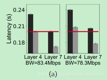
def bg_model_partition_latency():
    bd_20 = pd.read_excel("./data/bg_model_partition_fig1.xlsx", index_col=0, sheet_name="P20")
    bd_50 = pd.read_excel("./data/bg_model_partition_fig1.xlsx",index_col=0,sheet_name="P50")
    plt.rcParams["figure.figsize"] = [6, 4]
    fig, axes = plt.subplots(1,2,sharey="row")
    width = 0.5
    x = [0, 2]

    ax = axes[0]
    ax.set_ylim(0.16,0.25)
    I2_K4 = bd_50["e2e"][0]
    I4_K4 = bd_50["e2e"][1]
    SLA = bd_50["SLA"][1]
    ax.yaxis.set_major_locator(MultipleLocator(0.03))
    ax.bar(x[0]-width/2, I2_K4, width,yerr=0.001,error_kw = err_bar_kw,color=color_a,label="#cores:2")
    ax.bar(x[0]+width/2, I4_K4, width,yerr=0.001,error_kw = err_bar_kw,color=color_b,hatch="",label="#cores:4")

    I2_K7 = bd_50["e2e"][2]
    I4_K7 = bd_50["e2e"][3]
    ax.bar(x[1]-width/2, I2_K7, width,yerr=0.001,error_kw = err_bar_kw,color=color_a)
    ax.bar(x[1]+width/2, I4_K7,width,yerr=0.001,error_kw = err_bar_kw,color=color_b,hatch="")
    ax.set_ylabel("Latency (s)",label_font)
    ax.tick_params(axis='y', labelsize= tick_font["size"])
    ax.plot([x[0]-width,x[1]+width],[SLA,SLA],"-",markersize=marker_size,color=color_c,linewidth=line_width*2)
    ax.set_xlabel("BW=83.4Mbps",tick_font)
    ax.set_xticks(x)
    ax.set_xticklabels(["Layer 4","Layer 7"],tick_font)

    ax = axes[1]
    I2_K4 = bd_20["e2e"][0]
    I4_K4 = bd_20["e2e"][1]
    ax.bar(x[0]-width/2, I2_K4, width,yerr=0.001,error_kw = err_bar_kw,color=color_a)
    ax.bar(x[0]+width/2, I4_K4, width,yerr=0.001,error_kw = err_bar_kw,color=color_b,hatch="")
    I2_K7 = bd_20["e2e"][2]
    I4_K7 = bd_20["e2e"][3]
    ax.bar(x[1]-width/2, I2_K7, width,yerr=0.001,error_kw = err_bar_kw,color=color_a)
    ax.bar(x[1]+width/2, I4_K7, width,yerr=0.001,error_kw = err_bar_kw,color=color_b,hatch="")
    ax.plot([x[0]-width,x[1]+width],[SLA,SLA],"-",markersize=marker_size,color=color_c,label='SLA',linewidth=line_width*2)

    ax.set_xticks(x)
    ax.set_xticklabels(["Layer 4","Layer 7"],tick_font)
    ax.set_xlabel("BW=78.3Mbps", tick_font)

    fig.tight_layout()
    plt.savefig("../image/bg_inception_partition_factors_latency.pdf",bbox_inches = 'tight',pad_inches = 0)
    plt.show()
tips:
1. ax.set_xticks(x)和ax.set_xticklabels(["Layer 4","Layer 7"],tick_font) 是独立存在的,可以和坐标轴解耦(当然要保证xticks是xlim内的有效值)
五、热力图
效果图1:
    def partition_efficiency(self):
        name ="inception"
        plt.rcParams["figure.figsize"] = [6, 4]
        fig = plt.figure()
        # 1. create a plot that includes 3 subplots
        gs_partition_point = gridspec.GridSpec(1,3)
        SLA_ax=fig.add_subplot(gs_partition_point[0])
        BW_ax=fig.add_subplot(gs_partition_point[1])
        fair_ax=fig.add_subplot(gs_partition_point[2])

        PP_ticks = np.arange(0,self.layer_nums[name]+1,2)# ticks show in the y axis
        PP_range = np.arange(0,self.layer_nums[name]+1) # use to generate y grid
        intra_max = 3.5

        #2. read the data and transform into the grid-based data
        I_SLA = pd.read_excel("./data/exp_feasible_plan/feasible_plans_SLA.xlsx",index_col=0,sheet_name=name)
        I_BW = pd.read_excel("./data/exp_feasible_plan/feasible_plans_network.xlsx",index_col=0,sheet_name=name)
        I_fair= pd.read_excel("./data/exp_feasible_plan/feasible_plans_fairness.xlsx",index_col=0,sheet_name=name)
        I_grid_SLA = self.get_grid_SLA(I_SLA,name)
        I_grid_BW = self.get_grid_network(I_BW,name)
        I_grid_fair = self.get_grid_fairness(I_fair,name)

        #3. plot partition point (PP) under different SLA
        SLA_range = np.around(np.arange(0.4, 1.01, 0.01), 2)
        SLA_grid, PP_grid = np.meshgrid(SLA_range, PP_range)
        c = SLA_ax.pcolormesh(SLA_grid, PP_grid, I_grid_SLA["E"].T, cmap='Blues', vmin=0, vmax=intra_max)

        # 4. set label and ticks
        SLA_ax.set_ylabel("Layer index",label_font)
        SLA_ax.set_xlabel("SLA factor",title_font)

        SLA_ax.set_yticks(PP_ticks)
        SLA_ax.set_yticklabels(PP_ticks,tick_font)
        SLA_ticks = np.around(np.arange(0.4, 1.01, 0.2), 2)
        SLA_ax.set_xticks(SLA_ticks)
        SLA_ax.set_xticklabels(SLA_ticks,tick_font)
        SLA_ax.grid(True,ls="dashed")


        BW_range = np.linspace(1, 1000, 1000)
        BW_grid,PP_grid = np.meshgrid(BW_range, PP_range)
        c = BW_ax.pcolormesh (BW_grid, PP_grid, I_grid_BW["E"].T, cmap='Blues', vmin=0, vmax=intra_max)

        BW_ax.set_xlabel("BW (Mbps)",title_font)
        BW_ax.set_xticks(BW_range)
        BW_ax.set_xticklabels(BW_range,tick_font)
        BW_ax.set_xlim(9, 10 ** 3+0.2)
        BW_ax.set_xscale('log')
        BW_ax.set_yticks(PP_ticks)
        BW_ax.yaxis.set_ticklabels([]) #share the yticks with SLA_ax
        BW_ax.grid(True,ls="dashed")

        fair_range = np.around(np.arange(0.1,1.01,0.05), 2)
        fair_grid, PP_grid= np.meshgrid(fair_range, PP_range)
        c_I = fair_ax.pcolormesh(fair_grid, PP_grid, I_grid_fair["E"].T, cmap='Blues', vmin=0, vmax=intra_max)
        fair_ax.set_yticks(PP_ticks)
        fair_ax.yaxis.set_ticklabels([])
        #I_k_fairness.tick_params( axis='x', which='both',bottom=False, top=False,labelbottom=False)
        fair_ticks = np.around(np.arange(0.1, 1.01, 0.3), 1)
        fair_ax.set_xticks(fair_ticks)
        fair_ax.set_xticklabels(fair_ticks,tick_font)
        fair_ax.set_xlabel("Fairness",title_font)
        fair_ax.grid(True,ls="dashed")

        temp = fig.colorbar(c_I, ax=[SLA_ax,BW_ax,fair_ax],location="right",ticks=[0,intra_max])
        temp.ax.set_yticklabels([0,intra_max])
        temp.ax.tick_params(labelsize=tick_font["size"])

        #plt.show()
        plt.savefig("../image/exp_feasible_plans_efficiency.pdf",bbox_inches = 'tight',pad_inches = 0)
tips:
1. 生成和sharey相似的效果
BW_ax.set_yticks(PP_ticks)
BW_ax.yaxis.set_ticklabels([]) #share the yticks with SLA_ax
2. 设置被多个子图共享的bar
temp = fig.colorbar(c_I, ax=[SLA_ax,BW_ax,fair_ax],location="right",ticks=[0,intra_max])
temp.ax.set_yticklabels([0,intra_max])
temp.ax.tick_params(labelsize=tick_font["size"])
效果图2:
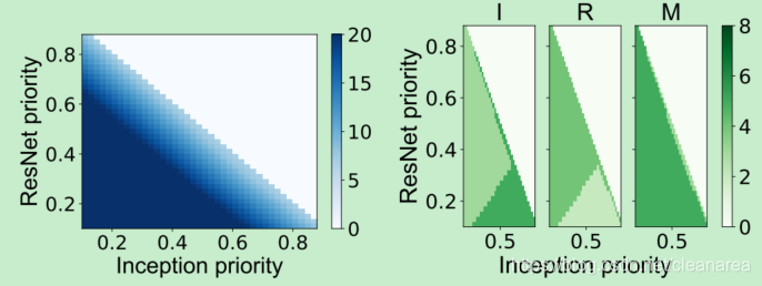
    def plot_model_resource_weight(self):
        label_font = {'family': "Arial",
              'weight': 'normal',
              'size': 26,
              }

        tick_font = {'family': 'Arial',
                 'weight': 'normal',
                 'size': 22
                 }
        title_font= {'family': 'Arial',
                 'weight': 'normal',
                 'size': 26
                 }
        plt.rcParams["figure.figsize"] = [6, 4]
        fig = plt.figure()
        gs_cores = gridspec.GridSpec(1, 3)
        axs = []
        axs.append([fig.add_subplot(gs_cores[0]),fig.add_subplot(gs_cores[1]),fig.add_subplot(gs_cores[2])])
        gs_cores.update(hspace=0.2)
        H_M = pd.read_excel("./data/exp_resource_allocation/model_weight/mckp_M_model_weight.xlsx",index_col=0)
        # = plt.subplots(3,7,sharex='all',sharey='row')
        x = H_M["I_W"].values #I_W
        y = H_M["R_W"].values #R_W
        z = H_M["sys_u"].values
        x_ticks = np.around(np.arange(0.1+0.01,0.9,0.2),1)
        z_min, z_max = 0,8
        ax = axs[0][0]
        x1 = np.around(np.arange(0.1,0.9,0.02),2)#np.around(np.linspace(x.min(), x.max(), len(np.unique(x))),2)
        y1 = np.around(np.arange(0.1,0.9,0.02),2)#np.around(np.linspace(y.min(), y.max(), len(np.unique(y))),2)
        x2, y2 = np.meshgrid(x1, y1)
        cores = self.get_model_resource(H_M,x1,y1,"Inception")

        c = ax.pcolor(x2, y2, cores, cmap='Greens', vmin=z_min, vmax=z_max)
        ax.set_title('I',title_font)
        ax.set_ylabel("ResNet priority", label_font)
        ax.tick_params(labelsize=tick_font["size"])
        ax.xaxis.set_major_locator(MultipleLocator(0.5))

        ax = axs[0][1]
        cores = self.get_model_resource(H_M,x1,y1,"ResNet")
        c = ax.pcolor(x2, y2, cores, cmap='Greens', vmin=z_min, vmax=z_max)
        ax.set_title("R", title_font)
        ax.set_xlabel("Inception priority", label_font)
        ax.tick_params(labelsize=tick_font["size"])
        ax.yaxis.set_ticklabels([])
        ax.xaxis.set_major_locator(MultipleLocator(0.5))


        ax = axs[0][2]
        cores = self.get_model_resource(H_M, x1, y1, "MobileNet")
        c = ax.pcolor(x2, y2, cores, cmap='Greens', vmin=z_min, vmax=z_max)
        ax.set_title("M", title_font)
        ax.tick_params(labelsize=tick_font["size"])
        ax.yaxis.set_ticklabels([])
        ax.xaxis.set_major_locator(MultipleLocator(0.5))

        temp = fig.colorbar(c,ax=np.array(axs)[:,:])
        temp.ax.tick_params(labelsize=tick_font["size"])
        plt.savefig("../image/exp_resource_allocation_weight_cores.pdf",bbox_inches = 'tight',pad_inches = 0)
六、画图理论
1. Ten rules for better figures【1】
Rule 2: Identify Your Message
Only after identifying the message will it be worth the time to develop your figure, just as you would take the time to craft your words and sentences when writing an article only after deciding on the main points of the text. If your figure is able to convey a striking message at first glance, chances are increased that your article will draw more attention from the community.
Rule 3: Adapt the Figure to the Support Medium
For a journal article, the situation is totally different, because the reader is able to view the figure as long as necessary. This means a lot of details can be added, along with complementary explanations in the caption. If we take into account the fact that more and more people now read articles on computer screens, they also have the possibility to zoom and drag the figure.
要给出尽可能多的细节,同时把caption中的内容作为补充解释
Rule 6: Use Color Effectively
Color is an important dimension in human vision and is consequently equally important in the design of a scientific figure. However, as explained by Edward Tufte [1], color can be either your greatest ally or your worst enemy if not used properly. If you decide to use color, you should consider which colors to use and where to use them. For example, to highlight some element of a figure, you can use color for this element while keeping other elements gray or black. This provides an enhancing effect. However, if you have no such need, you need to ask yourself, “Is there any reason this plot is blue and not black?” If you don't know the answer, just keep it black. The same holds true for colormaps. Do not use the default colormap (e.g., jet or rainbow) unless there is an explicit reason to do so (see Figure 5 and [5]). Colormaps are traditionally classified into three main categories:
当决定用彩色时,问自己为什么要用彩色,为什么要化成蓝色,而不是黑色的;如果自己也不确定,就化成黑色的。
Rule 7: Do Not Mislead the Reader
As a rule of thumb, make sure to always use the simplest type of plots that can convey your message and make sure to use labels, ticks, title, and the full range of values when relevant. Lastly, do not hesitate to ask colleagues about their interpretation of your figures.
Rule 8: Avoid “Chartjunk”
Chartjunk refers to all the unnecessary or confusing visual elements found in a figure that do not improve the message (in the best case) or add confusion (in the worst case). For example, chartjunk may include the use of too many colors, too many labels, gratuitously colored backgrounds, useless grid lines, etc. (see left part of the following figures). The term was first coined by Edward Tutfe in [1], in which he argues that any decorations that do not tell the viewer something new must be banned: “Regardless of the cause, it is all non-data-ink or redundant data-ink, and it is often chartjunk.” Thus, in order to avoid chartjunk, try to save ink, or electrons in the computing era. Stephen Few reminds us in [7] that graphs should ideally “represent all the data that is needed to see and understand what's meaningful.” However, an element that could be considered chartjunk in one figure can be justified in another. For example, the use of a background color in a regular plot is generally a bad idea because it does not bring useful information. However, in the right part of Figure 7, we use a gray background box to indicate the range [−1,+1] as described in the caption. If you're in doubt, do not hesitate to consult the excellent blog of Kaiser Fung [8], which explains quite clearly the concept of chartjunk through the study of many examples.
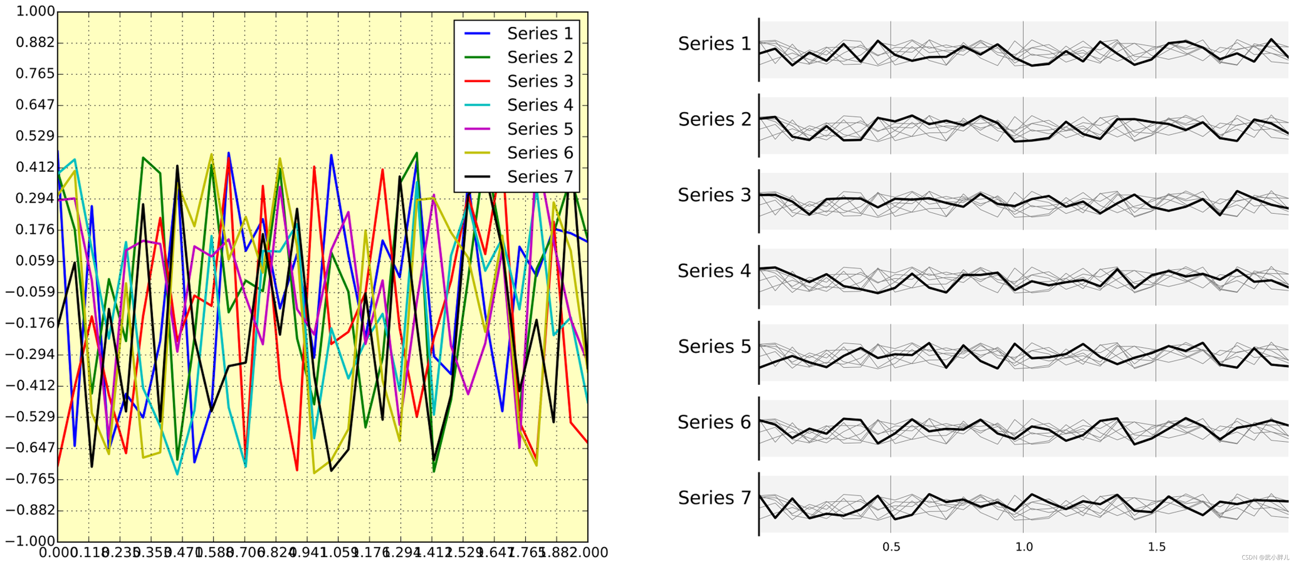
We have seven series of samples that are equally important, and we would like to show them all in order to visually compare them (exact signal values are supposed to be given elsewhere). The left figure demonstrates what is certainly one of the worst possible designs. All the curves cover each other and the different colors (that have been badly and automatically chosen by the software) do not help to distinguish them. The legend box overlaps part of the graphic, making it impossible to check if there is any interesting information in this area. There are far too many ticks: x labels overlap each other, making them unreadable, and the three-digit precision does not seem to carry any significant information. Finally, the grid does not help because (among other criticisms) it is not aligned with the signal, which can be considered discrete given the small number of sample points. The right figure adopts a radically different layout while using the same area on the sheet of paper. Series have been split into seven plots, each of them showing one series, while other series are drawn very lightly behind the main one. Series labels have been put on the left of each plot, avoiding the use of colors and a legend box. The number of x ticks has been reduced to three, and a thin line indicates these three values for all plots. Finally, y ticks have been completely removed and the height of the gray background boxes indicate the [−1,+1] range (this should also be indicated in the figure caption if it were to be used in an article).
[1]Ten Simple Rules for Better Figures
2. 示例图
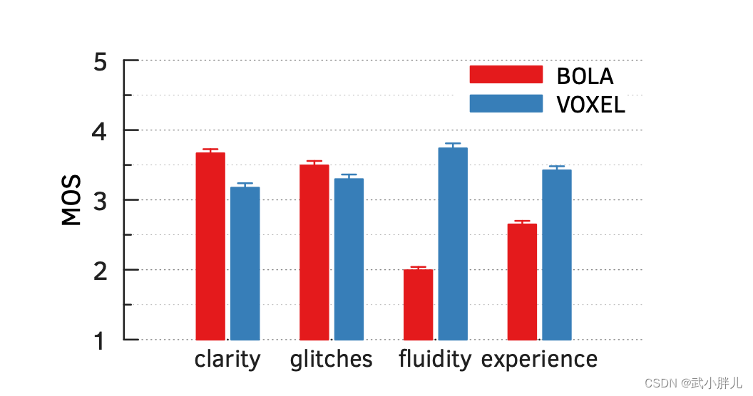
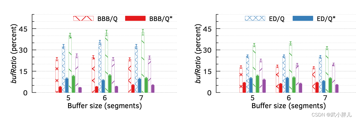
1)画方差bar的时候让error bar和bar保持相同的样式
2)注意不同legend的放置位置,没有必要把所有legend都放到同一个figure里
3)注意不同bar的样式(配色,hatch)=> 同类采用相同的颜色,但是不同的样式
4)画箱型图的时候,横着放比竖着放能体现更多的信息
5)折线图尽量用marker来区分,而不是line_style


 360
360

 被折叠的 条评论
为什么被折叠?
被折叠的 条评论
为什么被折叠?
 到【灌水乐园】发言


