


 在前端开发中,CSS常用于构建等分布局,通过百分比布局或利用Flexbox进行灵活分配。例如,使用Flexbox时,可以设置flex属性为1、2、3等来按比例分配元素宽度,实现不同比例的等宽布局。
css画页面的时候,喜欢使用百分比实现等分布局

<!DOCTYPE html>
<html lang="en">

<head>
    <meta charset="UTF-8">
    <meta name="viewport" content="width=device-width, initial-scale=1.0">
    <title>Document</title>
    <style>
        * {
            margin: 0;
            padding: 0;
            box-sizing: border-box;
        }

        ul {
            width: 100%;
            height: 200px;
            background-color: #ccc;
        }

        ul li {
            width: 33.3%;
            height: 200px;
            list-style: none;
            float: left;
            padding: 0 10px;
        }

        ul li div {
            width: 100%;
            height: 200px;
            background-color: blue;
        }

        ul li:nth-child(2),
        ul li:nth-child(3) {
            padding-left: 0px;
        }
    </style>
</head>

<body>
    <ul>
        <li>
            <div></div>
        </li>
        <li>
            <div></div>
        </li>
        <li>
            <div></div>
        </li>
    </ul>
</body>

</html>
上述是规则的,还有一种不规则 使用flex盒子比较好 flex:1 flex:2 flex :3 宽度分别占1份 2份 3份
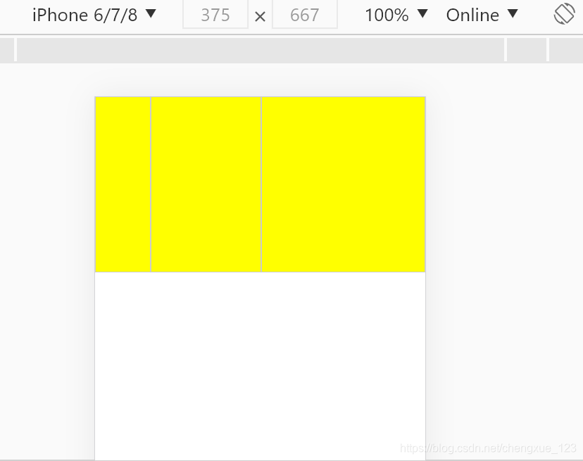
<!DOCTYPE html>
<html lang="en">

<head>
    <meta charset="UTF-8">
    <meta name="viewport" content="width=device-width, initial-scale=1.0">
    <title>Document</title>
    <style>
        * {
            margin: 0;
            padding: 0;
            box-sizing: border-box;
        }

        ul {
            width: 100%;
            height: 200px;
            background-color: brown;
            display: flex;
        }

        ul li {
            flex: 1;
            height: 200px;
            background-color: yellow;
            list-style: none;
            border: 1px solid #ccc;
        }

        ul li:nth-child(2) {
            flex: 2;
            height: 200px;
        }

        ul li:nth-child(3) {
            flex: 3;
            height: 200px;
        }
    </style>
</head>

<body>
    <ul>
        <li>
            <div></div>
        </li>
        <li>
            <div></div>
        </li>
        <li>
            <div></div>
        </li>
    </ul>
</body>

</html>


 扫一扫
扫一扫


 753
753

 被折叠的 条评论
为什么被折叠?
被折叠的 条评论
为什么被折叠?
 到【灌水乐园】发言


