


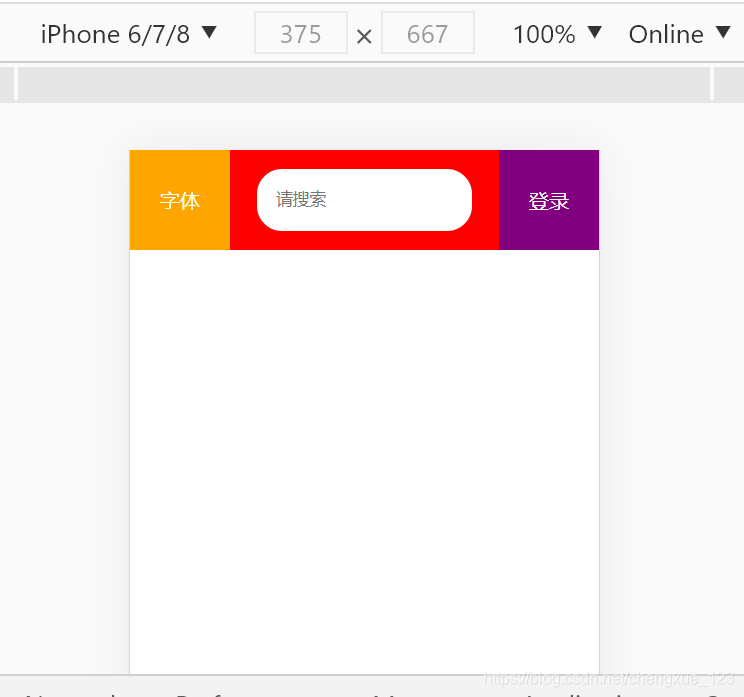
<!DOCTYPE html>
<html lang="en">

<head>
    <meta charset="UTF-8">
    <meta name="viewport" content="width=device-width, initial-scale=1.0">
    <title>Document</title>
    <style>
        * {
            margin: 0;
            padding: 0;
            box-sizing: border-box;
        }

        a {
            text-decoration: none;
            color: #fff;
        }

        .header {
            width: 100%;
            height: 80px;
            background-color: red;
            display: flex;
        }

        .header .left {
            width: 80px;
            height: 80px;
            background-color: orange;
            text-align: center;
            line-height: 80px;
        }

        .center {
            flex: 1;
            height: 80px;
            display: flex;
            justify-content: center;
            align-items: center;
        }

        .center input {
            padding-left: 15px;
            height: 50px;
            border: 0;
            border-radius: 20px;
            outline: none;
        }

        .header .right {
            width: 80px;
            height: 80px;
            background-color: purple;
            text-align: center;
            line-height: 80px;
        }
    </style>
</head>

<body>
    <div>
        <div class="header">
            <div class="left">
                <a href="#">字体</a>
            </div>
            <div class="center">
                <input type="text" placeholder="请搜索">
            </div>
            <div class="right">
                <a href="#">登录</a>
            </div>
        </div>
    </div>
</body>

</html>
核心思想:用到flex弹性盒子布局 左右盒子各自给宽度的情况下 flex:1 占剩下的部分 中间盒子里input框在盒子中居中


 扫一扫
扫一扫


 2456
2456

 被折叠的 条评论
为什么被折叠?
被折叠的 条评论
为什么被折叠?
 到【灌水乐园】发言


