


16个ggplot图形及源码
加载相关R包
library(ggplot2)
library(reshape2)
library(lattice)
library(car)
library(tidyverse)
library(giscoR)
library(dplyr)
library(sf)
library(ggbeeswarm)
library(ridgeline)
library(treemapify)
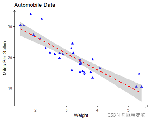
1、散点图
ggplot(data=mtcars, aes(x=wt, y=mpg)) +
  geom_point(pch=17, color="blue", size=2) +
  geom_smooth(method="lm", color="red", linetype=2) +
  labs(title="Automobile Data", x="Weight", y="Miles Per Gallon")+
  theme_classic()+
  theme(axis.line = element_line(arrow = arrow(length = unit(0.2, 'cm'))))
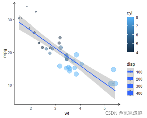
2、气泡图
ggplot(mtcars, aes(x=wt, y=mpg, size=disp,color=cyl))+
  geom_point(alpha=.5) +
  geom_smooth(method="lm", linetype=1)+
  theme_classic()+
  theme(axis.line = element_line(arrow = arrow(length = unit(0.2, 'cm'))))
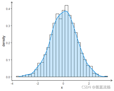
3、直方图
# Data
set.seed(5)
x <- rnorm(1000)
df <- data.frame(x)
#histogram
ggplot(df, aes(x = x)) +
  geom_histogram(aes(y = ..density..),
                 colour = 1, fill = "white") +
  geom_density(lwd = 1, colour = 4,
               fill = 4, alpha = 0.25)+
  theme_classic()+
  theme(axis.line = element_line(arrow = arrow(length = unit(0.2, 'cm')))) #添加箭头
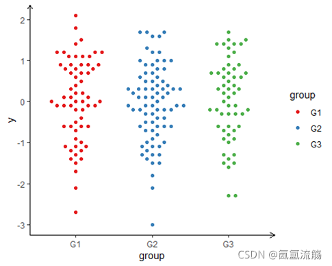
4、蜜蜂图
# Data
set.seed(1995)
y <- round(rnorm(200), 1)
beeswarm <- data.frame(y = y,group = sample(c("G1", "G2", "G3"),
                               size = 200,
                               replace = TRUE))
# Beeswarm
ggplot(beeswarm, aes(x = group, y = y, color = group)) +
  geom_beeswarm(cex = 3) +
  scale_color_brewer(palette = "Set1")+
  theme_classic()+
  theme(axis.line = element_line(arrow = arrow(length = unit(0.2, 'cm'))))
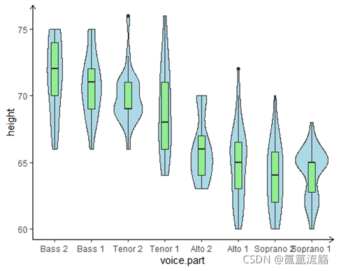
5、小提琴图
ggplot(singer, aes(x=voice.part, y=height)) +
  geom_violin(fill="lightblue") +
  geom_boxplot(fill="lightgreen", width=.2) +
  theme_classic()+
  theme(axis.line = element_line(arrow = arrow(length = unit(0.2, 'cm'))))
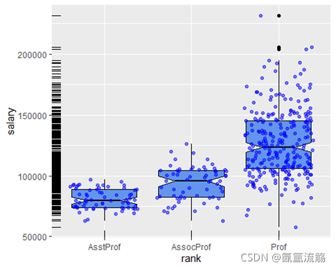
6、地毯图
ggplot(Salaries, aes(x=rank, y=salary)) +
  geom_boxplot(fill="cornflowerblue", color="black", notch=TRUE)+
  geom_point(position="jitter", color="blue", alpha=.5)+
  geom_rug(side="l", color="black")#地毯图
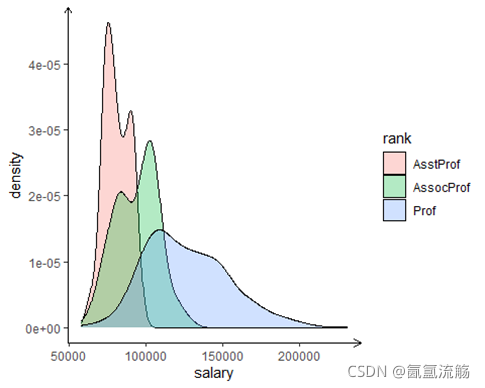
7、密度图
ggplot(data=Salaries, aes(x=salary, fill=rank)) +
  geom_density(alpha=.3)+
  theme_classic()+
  theme(axis.line = element_line(arrow = arrow(length = unit(0.2, 'cm')))) #添加箭头
8、分组密度图
remotes::install_github("R-CoderDotCom/ridgeline@main")
ridgeline(chickwts$weight, chickwts$feed)

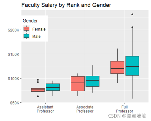
9、箱图
ggplot(data=Salaries, aes(x=rank, y=salary, fill=sex)) +
    geom_boxplot() +
    scale_x_discrete(breaks=c("AsstProf", "AssocProf", "Prof"),
                     labels=c("Assistant\nProfessor",
                              "Associate\nProfessor",
                              "Full\nProfessor")) +
    scale_y_continuous(breaks=c(50000, 100000, 150000, 200000),
                       labels=c("$50K", "$100K", "$150K", "$200K")) +
    labs(title="Faculty Salary by Rank and Gender",
         x="", y="", fill="Gender") +
    theme(legend.position=c(.1,.8))
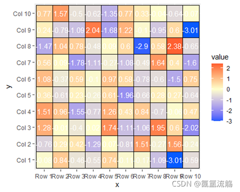
10、热图
# Data
set.seed(8)
m <- matrix(round(rnorm(200), 2), 10, 10)
colnames(m) <- paste("Col", 1:10)
rownames(m) <- paste("Row", 1:10)
# Transform the matrix in long format
heat <- melt(m)
colnames(heat) <- c("x", "y", "value")

ggplot(heat, aes(x = x, y = y, fill = value)) +
  geom_tile(color = "black") +
  geom_text(aes(label = value), color = "white", size = 4) +
  scale_fill_gradient2(low = "#075AFF",
                       mid = "#FFFFCC",
                       high = "#FF0000") +
  coord_fixed()
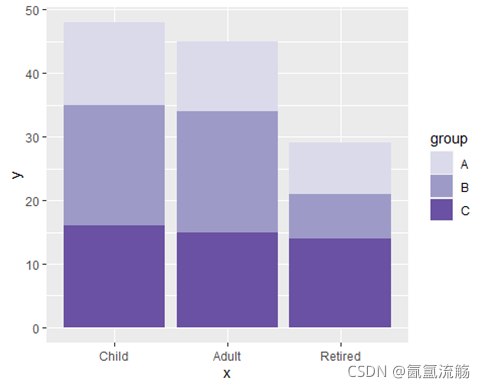
11、堆积条形图
# Data
set.seed(1)
age <- factor(sample(c("Child", "Adult", "Retired"),
              size = 50, replace = TRUE),
              levels = c("Child", "Adult", "Retired"))
hours <- sample(1:4, size = 50, replace = TRUE)
city <- sample(c("A", "B", "C"),
               size = 50, replace = TRUE)
df <- data.frame(x = age, y = hours, group = city)

ggplot(df, aes(x = x, y = y, fill = group)) +
  geom_bar(stat = "identity") +
  scale_fill_manual(values = c("#DADAEB", "#9E9AC8", "#6A51A3"))
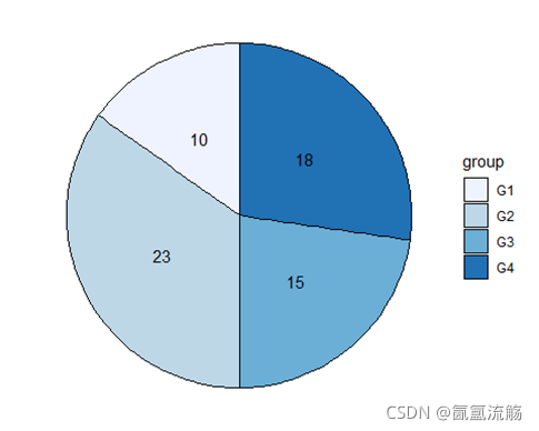
12、饼图
df <- data.frame(value = c(10, 23, 15, 18),
                 group = paste0("G", 1:4))

ggplot(df, aes(x = "", y = value, fill = group)) +
  geom_col(color = "black") +
  geom_text(aes(label = value),
            position = position_stack(vjust = 0.5)) +
  coord_polar(theta = "y") +
  scale_fill_brewer() +
  theme_void()
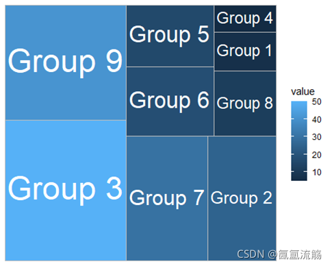
13、树图
group <- paste("Group", 1:9)
subgroup <- c("A", "C", "B", "A", "A",
              "C", "C", "B", "B")
value <- c(7, 25, 50, 5, 16,
           18, 30, 12, 41)
df <- data.frame(group, subgroup, value)

ggplot(df, aes(area = value, fill = value, label = group)) +
  geom_treemap() +
  geom_treemap_text(colour = "white",
                    place = "centre",
                    size = 15,
                    grow = TRUE)
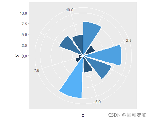
14、玫瑰图
set.seed(4)
df <- data.frame(x = 1:10,
                 y = sample(1:10))
ggplot(df, aes(x = x, y = y, fill = y)) +
  geom_bar(stat = "identity", color = "white",
           lwd = 1, show.legend = FALSE)+
           coord_polar()
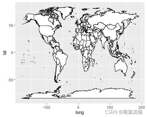
15、地图
ggplot(map_data("world"),
            aes(long, lat, group = group)) +
      geom_polygon(fill = "white", colour = 1)
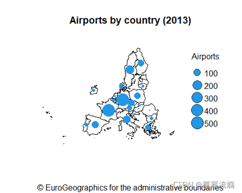
16、地图
# CRS
epsg_code <- 3035
# Countries
EU_countries <- gisco_get_countries(region = "EU") %>%
  st_transform(epsg_code)
# Centroids for each country
symbol_pos <- st_centroid(EU_countries, of_largest_polygon = TRUE)
# Airports
airports <- gisco_get_airports(country = EU_countries$ISO3_CODE) %>%
  st_transform(epsg_code)
number_airports <- airports %>%
  st_drop_geometry() %>%
  group_by(CNTR_CODE) %>%
  summarise(n = n())
labels_n <-
  symbol_pos %>%
  left_join(number_airports,
            by = c("CNTR_ID" = "CNTR_CODE")) %>%
  arrange(desc(n))
# Rescale sizes with log
labels_n$size <- log(labels_n$n / 15)
plot(st_geometry(EU_countries),
     main = "Airports by country (2013)",
     sub = gisco_attributions(),
     col = "white", border = 1,
     xlim = c(2200000, 7150000),
     ylim = c(1380000, 5500000))
plot(st_geometry(labels_n),
     pch = 21, bg = 4,    # Symbol type and color
     col = 4,             # Symbol border color
     cex = labels_n$size, # Symbol sizes
     add = TRUE)
legend("right",
       xjust = 1,
       y.intersp = 1.3,
       bty = "n",
       legend = seq(100, 500, 100),
       col = "grey20",
       pt.bg = 4,
       pt.cex = log(seq(100, 500, 100) / 15),
       pch = 21,
       title = "Airports")


 被折叠的 条评论
为什么被折叠?
被折叠的 条评论
为什么被折叠?
 到【灌水乐园】发言


