


 本文详细介绍了CSS中绝对定位与相对定位的区别及应用场合,展示了如何实现块级元素的居中显示,并提供了两种常见的布局方式——两栏布局的具体实现方案。此外,还列举并解释了margin塌陷与margin合并这两种典型的CSS布局问题及其解决方案。
目录
1、绝对定位
(1)脱离原来位置进行定位,
(2)相对于最近的有定位的父级元素进行定位,若没有存在定位的父级,则相对于整个文档定位。
div{
    width:100px;
    height:100;
    background-color:red;
    position: absolute;
    left:100px;
    right:100px;
}
2、相对定位
(1)保留原来位置进行定位,
(2)相对于自己原来的位置进行定位。
3、选择定位的要点
根据absolute,relative特点,对其选择需遵循:将relative作为参照物,absolute进行定位。
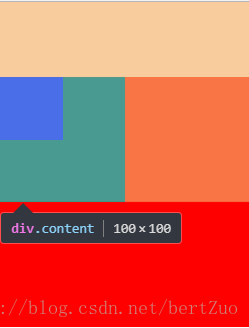
<div class="wrapper">
    <div class="content">
        <div class="box"></div>
    </div>
</div>
.wrapper{
width:200px;
height:200px;
background-color:red;
}
.content{
position:relative; /*参考*/
width:100px;
height:100px;
background-color: green;
}
.box{
position: absolute; /*定位*/
left:50px;
width:50px;
height:50px;
background-color: blue;
}4、块级元素在页面居中
div{
    /*固定定位*/
    position: fixed;
    /*以块级元素左上顶点定位页面中央*/
    left:50%;
    top:50%;
    width:100px;
    height:100px;
    background-color:red;
    /*块级元素偏移半个身位,使块级元素的中心移到原来的左上顶点位置*/
    margin-left: -50px;
    margin-top: -50px;
}
5、两栏布局
<div class="right"></div>
<div class="left"></div>
.right{
position: absolute;
right: 0;
width: 100px;
height: 100px;
background-color: #fcc;
}
.left{
margin-right: 100px;
height: 100px;
background-color: #123;
}两个div的right和left的顺序不能改变,而且通过实验发现,如果设置了left的宽度为100px,当设置margin-right的值时无论是多少,都是两个div紧贴着页面两边,效果等同于margin-left:0。
6、经典bug
(1)margin塌陷
譬如,父子嵌套的元素的margin-top,会取的其中移动的最大值,
<div class="wrapper">
    <div class="content">
        <div class="box"></div>
    </div>
</div>
.wrapper{
margin-top:40px;
width:200px;
height:200px;
background-color:red;
}
.content{
margin-top:60px;
width:100px;
height:100px;
background-color: green;
}
.box{
margin-top:50px;
width:50px;
height:50px;
background-color: blue;
}
解决办法,
bfc,block format context块级格式化,可以改变某一或某几个盒子的渲染规则。那如何触发一个盒子的bfc,
(1)position:absolute,
(2)display:inline-block,
(3)float:left / right,
(4)overflow:hidden。
(2)margin合并
两个并列的盒子元素之间的间距会大的间距合并了小的间距,
<div class="demo1">1</div>
<div class="demo2">2</div>
.demo1{
background-color: red;
margin-bottom: 50px;
}
.demo2{
background-color: #ccc;
margin-top: 100px;
}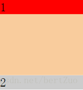
demo1距离下50px,demo2距离上100px,原本希望1,2之间撑起的距离为150px,但现在1,2之间的距离为demo2距离上的100px。
解决办法,没有根本解决方法,只能通过数值计算避免这样的bug,直接让demo1距离下150px就好咯。


 扫一扫
扫一扫


 1302
1302

 被折叠的 条评论
为什么被折叠?
被折叠的 条评论
为什么被折叠?
 到【灌水乐园】发言


