


 这篇博客主要介绍了BootStrap中的表格和表单布局。内容包括表格元素、表格类以及用于表格的行和单元格的类的详细说明。在表单部分,讲解了垂直表单、内联表单和水平表单的创建步骤,提供了实例代码,并强调熟练掌握垂直表单的重要性。
表格
表格元素
BootStrap提供了一个清晰的创建表格的布局。
| 标签 | 描述 |
|---|---|
<table> | 为表格添加基础样式 |
<thead> | 表格标题行的容器元素,用来标识表格列 |
<tbody> | 表格主体中的表格行的容器元素 |
<tr> | 一组出现在单行上的表格单元格的容器元素 |
<td> | 默认的表格单元格 |
<th> | 特殊的表格单元格,用来标识列或行(取决于范围和位置)。必须在<thead>中使用 |
<caption> | 关于表格存储内容的描述或总结 |
表格类
| 类 | 描述 |
|---|---|
| .table | 为任意<table>添加基本样式(只有横向分割线) |
| .table-striped | 在<tbody>内添加斑马形状的条纹 |
| .table-bordered | 为所有表格的单元格添加边框 |
| .table-hover | 在<tbody>的任意一行启用鼠标悬停状态 |
| .table-condensed | 让表格更加紧凑 |
用于表格的行或者单元格的类
| 类 | 描述 |
|---|---|
| .active | 将悬停的颜色应用在行或单元格上 |
| .success | 表示成功的操作 |
| .info | 表示信息变化的操作 |
| .warning | 表示一个警告的操作 |
| .danger | 表示一个危险的操作 |
个例分析
<!DOCTYPE html>
<html lang="en">
<head>
<meta charset="UTF-8">
<meta name="viewport" content="width=device-width, initial-scale=1.0">
<link rel="stylesheet" href="https://cdn.staticfile.org/twitter-bootstrap/3.3.7/css/bootstrap.min.css">      <title>Document</title>
</head>
<body>
<table class="table table-striped table-bordered table-hover">        <caption>电话黄页</caption>
<thead>
<tr>
<th>所属单位</th>
<th>电话</th>
</tr>
</thead>
<tr>
<td>消防局</td>
<td>119</td>
</tr>
<tr>
<td>公安局</td>
<td>110</td>
</tr>
</table>
</body>
</html>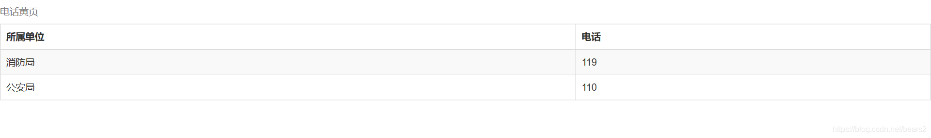
表单
BootStrap提供了下列类型的表单布局
- 垂直或基本表单(默认)
创建步骤:
1.向父元素<form>添加role="form"
2.把标签和控件放在一个带有class="form-group"的<div>中。这是获取最佳间距所必需的。
3.向所有的文本元素<input>、<textarea>和<select>添加class="form-control" - 内联表单
实例:
<form class="form-inline" role="form">
  <div class="form-group">
    <label class="sr-only" for="name">名称</label>
    <input type="text" class="form-control" id="name" placeholder="请输入名称">
  </div>
  <div class="form-group">
    <label class="sr-only" for="inputfile">文件输入</label>
    <input type="file" id="inputfile">
  </div>
  <div class="checkbox">
    <label>
      <input type="checkbox">请打勾
    </label>
  </div>
  <button type="submit" class="btn btn-default">提交</button>
</form>
结果展示:
注意:在使用内联表单时,需要在表单控件上设置一个宽度。使用class="sr-only"可以隐藏内联表单的标签。
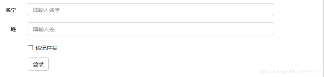
- 水平表单
要点:
向父元素<form>添加class="form-horizontal"
把标签和控件放在一个带有class="form-group"的<div>中
向标签添加calss="control-label"
实例:
<form class="form-horizontal" role="form">
  <div class="form-group">
    <label for="firstname" class="col-sm-2 control-label">名字</label>
    <div class="col-sm-10">
      <input type="text" class="form-control" id="firstname" placeholder="请输入名字">
    </div>
  </div>
  <div class="form-group">
    <label for="lastname" class="col-sm-2 control-label">姓</label>
    <div class="col-sm-10">
      <input type="text" class="form-control" id="lastname" placeholder="请输入姓">
    </div>
  </div>
  <div class="form-group">
    <div class="col-sm-offset-2 col-sm-10">
      <div class="checkbox">
        <label>
          <input type="checkbox">请记住我
        </label>
      </div>
    </div>
  </div>
  <div class="form-group">
    <div class="col-sm-offset-2 col-sm-10">
      <button type="submit" class="btn btn-default">登录</button>
    </div>
  </div>
</form>
结果展示:


 扫一扫
扫一扫


 4493
4493

 被折叠的 条评论
为什么被折叠?
被折叠的 条评论
为什么被折叠?
 到【灌水乐园】发言


