


 本文详细介绍了如何在小程序中通过组件化的方式实现底部导航栏的定制,包括创建 tabBar 组件、配置 index.json、wxml、wxss,并在多个页面间切换。展示了在iOS和Android风格间切换的实现步骤。
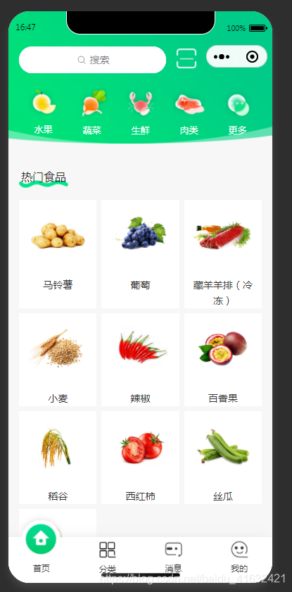
先看效果图
实现方式为将底部导航栏封装成组件, 在tabBar界面中引用, 下面是步骤和代码:
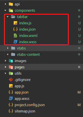
1.在根目录, 也就是pages同级目录下创建components文件夹, 然后在components文件夹下创建tabBar文件夹, tabBar文件夹下新建index.js, index.json, index.wxml, index.wxss这四个文件, 如图:
2.tabBar/index.json的代码
{
  "component": true
}
3.tabBar/index.wxml的代码(data-tab的值为对应的页面)
<tabBar class="tabBar">
  <view data-tab="index" bindtap="onTab">
    <image class="tab-img" hidden="{{tab == 'index'}}" src="/images/green/index2.png" mode="widthFix" style="width: 50rpx;"></image>
    <image class="img2 tab-img" hidden="{{tab != 'index'}}" src="/images/green/index1.png" mode="widthFix"></image>
    <view class="tab-title">首页</view>
  </view>
  <!-- network -->
  <view data-tab="category" bindtap="onTab">
    <image hidden="{{tab == 'category'}}" src="/images/fenlei1.png" mode="widthFix" style="width: 50rpx;"></image>
    <image class="img2" hidden="{{tab != 'category'}}" src="/images/fenlei2.png" mode="widthFix"></image>
    <view>分类</view>
  </view>
  <view data-tab="msg" bindtap="onTab">
    <image hidden="{{tab == 'msg'}}" src="/images/green/xiaoxi2.png" mode="widthFix" style="width: 50rpx;"></image>
    <image class="img2" hidden="{{tab != 'msg'}}" src="/images/green/xiaoxi1.png" mode="widthFix"></image>
    <view>消息</view>
  </view>
  <view data-tab="admin" bindtap="onTab">
    <image hidden="{{tab == 'admin'}}" src="/images/green/wode2.png" mode="widthFix" style="width: 50rpx;"></image>
    <image class="img2" hidden="{{tab != 'admin'}}" src="/images/green/wode1.png" mode="widthFix"></image>
    <view>我的</view>
  </view>
</tabBar>
3.tabBar/index.wxss的代码
.tabBar{
  position:fixed;
  width: 100%;
  height: 100rpx;
  bottom: 0;
  color: #333;
  font-size: 24rpx;
  display: flex;
  justify-content: space-around;
  padding:  10rpx 0 20rpx 0;
  background-color: #fff !important;
  /* border-top: solid 1rpx #ccc; */
  box-shadow: -10rpx -3rpx 30rpx #EAEAEA;
  text-align: center;
}
.img2{
  width: 150rpx;
  height: 150rpx;
  margin-top: -80rpx;
}
.tabBar > view{
  width: 150rpx;
}
4.tabBar/index.js的代码
const app = getApp()
Component({
  properties: {
    tab: String
  },
  observers:{ //监听数据的更改
    "tab"(data){
      this.data.tab = data //这里不要写this.setData({})
    }
  },
  externalClasses: ['my-class'],
  methods: {
    data: {
      tab: ''
    },
    onTab: function (e) {
      wx.switchTab({
        url: '/pages/' + e.currentTarget.dataset.tab + '/' + e.currentTarget.dataset.tab
      })
    }
  }
})
5.剩下的就是引入, 以index示例.
index.json中的代码:
"usingComponents": {

    "tabBar":"../../components/tabBar/index"

  }
index.wxml中的代码(在最下方添加):
<tabBar tab="index"></tabBar>
图片换成自己的图片就行, 现在切换页面的时候, 文本还是会出现轻微移动, 以后有时间会再去完善它. 或者大家有办法, 也可以写出来.
差点忘了写, 大家记得在app.json中添加tabBar页面
"tabBar": {
    "custom": true,
    "color": "#000000",
    "selectedColor": "#000000",
    "backgroundColor": "#000000",
    "list": [
      {
        "pagePath": "pages/index/index",  //你自己的页面
        "text": "组件"
      },
      {
        "pagePath": "pages/logs/logs",
        "text": "接口"
      },
      {
        "pagePath":"pages/category/category",
        "text":"分类"
      }
    ]
  }


 扫一扫
扫一扫


 被折叠的 条评论
为什么被折叠?
被折叠的 条评论
为什么被折叠?
 到【灌水乐园】发言


