


作者:浪浪山齐天大圣
描述:深入理解Matplotlib架构的核心 - Figure和Axes的本质、关系与实践应用
🎯 引言
在数据可视化的世界里,理解Matplotlib的核心架构是掌握高质量图表制作的关键。Figure和Axes作为Matplotlib的两大核心组件,构成了整个绘图系统的基础架构。
下面我将介绍:
- Figure和Axes的层次结构和设计理念
- 多种创建方法的适用场景和最佳实践
- 布局控制和样式定制的高级技巧
- 性能优化和常见问题的解决方案
如果说Matplotlib是一座大厦,那么Figure就是地基,Axes就是房间,而我们要绘制的图表元素就是房间里的家具。
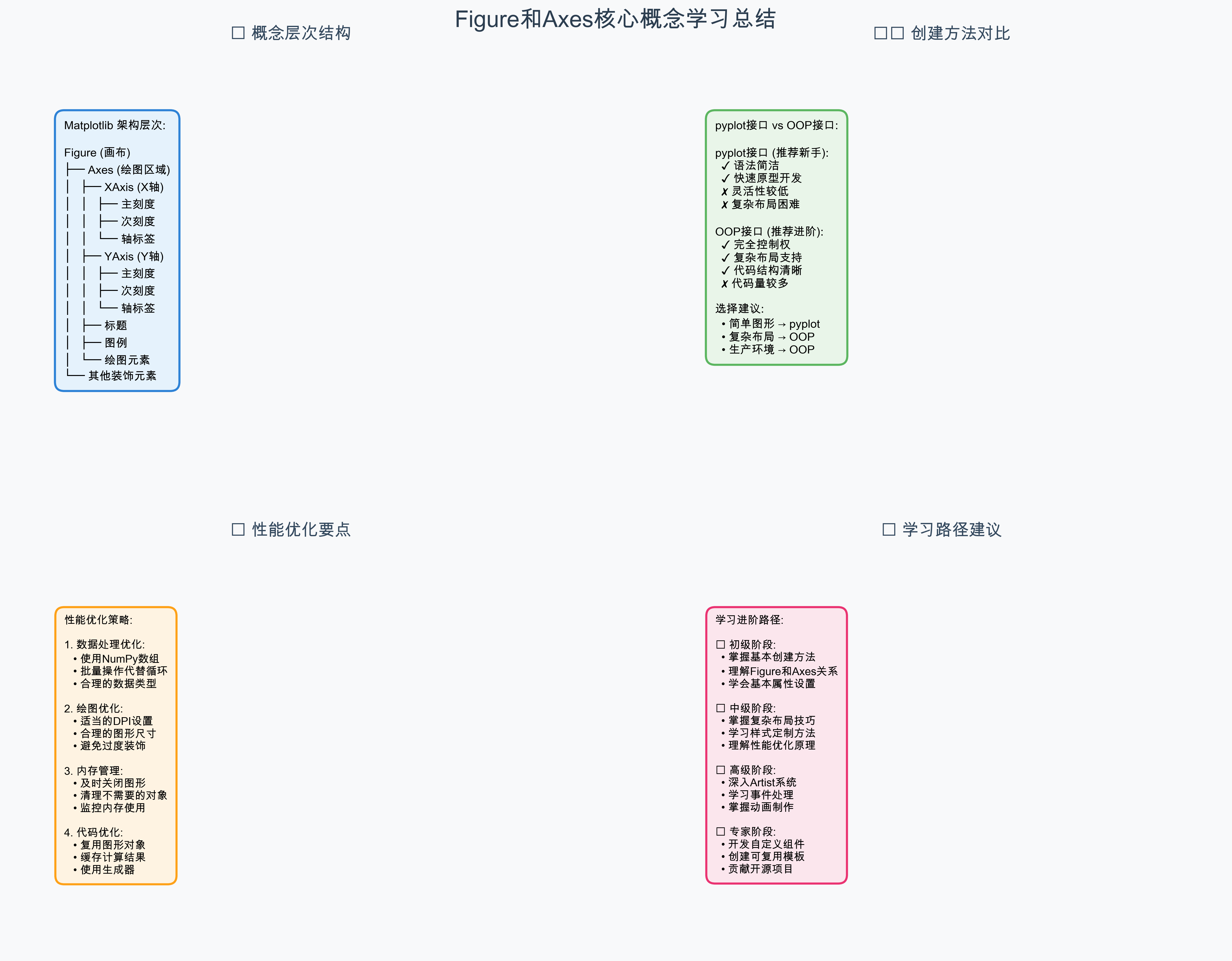
📚 核心概念解析
1. Figure:画布的主宰者
Figure是Matplotlib中的顶层容器,可以理解为我们的"画布"或"画板"。每一个可视化作品都需要一个Figure作为载体。
Figure的核心特征:
- 唯一性:每个绘图窗口对应一个Figure对象
- 容器性:可以包含一个或多个Axes(子图)
- 全局性:控制整个图形的尺寸、分辨率、背景色等属性
- 输出性:负责最终的图形保存和显示
Figure的主要属性:
# Figure的关键属性
figsize=(width, height)    # 图形尺寸(英寸)
dpi=100                    # 分辨率(每英寸点数)
facecolor='white'          # 背景颜色
edgecolor='black'          # 边框颜色
tight_layout=True          # 自动调整布局
2. Axes:绘图的核心舞台
Axes是真正进行数据绘制的区域,包含了坐标轴、刻度、标签等所有绘图元素。一个Figure可以包含多个Axes,形成子图布局。
Axes的核心特征:
- 绘图性:所有的plot、scatter、bar等绘图命令都作用于Axes
- 坐标性:管理x轴、y轴的范围、刻度、标签
- 装饰性:控制标题、图例、网格等装饰元素
- 交互性:处理鼠标事件、缩放、平移等交互操作
Axes的层次结构:
Axes
├── XAxis (x轴)
│   ├── 主刻度 (Major Ticks)
│   ├── 次刻度 (Minor Ticks)
│   └── 轴标签 (Axis Label)
├── YAxis (y轴)
│   ├── 主刻度 (Major Ticks)
│   ├── 次刻度 (Minor Ticks)
│   └── 轴标签 (Axis Label)
├── 标题 (Title)
├── 图例 (Legend)
└── 绘图元素 (Artists)
    ├── 线条 (Lines)
    ├── 散点 (Scatter)
    ├── 柱状图 (Bars)
    └── 其他图形元素
🔧 创建方法详解
方法一:pyplot接口(推荐新手)
import matplotlib.pyplot as plt
import numpy as np

# 最简单的创建方式
fig, ax = plt.subplots()

# 指定图形尺寸
fig, ax = plt.subplots(figsize=(10, 6))

# 创建多个子图
fig, (ax1, ax2) = plt.subplots(1, 2, figsize=(12, 5))

# 创建复杂的子图布局
fig, axes = plt.subplots(2, 3, figsize=(15, 10))
优点:
- 语法简洁,一行代码搞定
- 自动处理Figure和Axes的关联
- 适合快速原型开发
缺点:
- 灵活性相对较低
- 复杂布局时代码可读性下降
方法二:面向对象接口(推荐进阶)
import matplotlib.pyplot as plt
from matplotlib.figure import Figure

# 先创建Figure
fig = plt.figure(figsize=(12, 8), dpi=100)

# 添加Axes的多种方式
# 方式1:add_subplot(网格布局)
ax1 = fig.add_subplot(2, 2, 1)  # 2x2网格的第1个位置
ax2 = fig.add_subplot(2, 2, 2)  # 2x2网格的第2个位置

# 方式2:add_axes(精确位置)
ax3 = fig.add_axes([0.1, 0.1, 0.8, 0.3])  # [left, bottom, width, height]

# 方式3:subplot_mosaic(灵活布局)
fig, axes = plt.subplot_mosaic([
    ['A', 'B'],
    ['C', 'C']
], figsize=(10, 8))
优点:
- 完全的控制权
- 支持复杂的自定义布局
- 代码结构清晰,易于维护
缺点:
- 代码量相对较多
- 需要更深入的理解
💻 实战代码示例
基础创建方法
Matplotlib提供了多种创建Figure和Axes的方法,每种方法都有其适用场景:
方法1:使用plt.subplots()(推荐)
import matplotlib.pyplot as plt
import numpy as np
# 最简单的创建方式
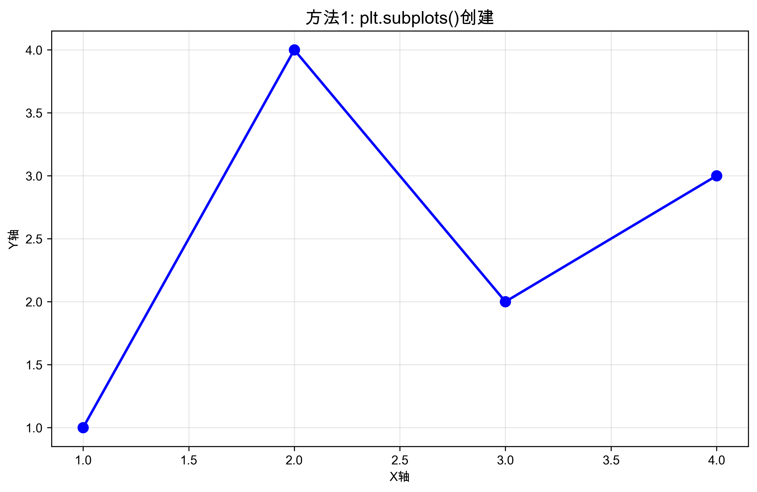
fig, ax = plt.subplots(figsize=(10, 6))
ax.plot([1, 2, 3, 4], [1, 4, 2, 3], 'bo-', linewidth=2, markersize=8)
ax.set_title('方法1: plt.subplots()创建', fontsize=14, fontweight='bold')
ax.set_xlabel('X轴')
ax.set_ylabel('Y轴')
ax.grid(True, alpha=0.3)
plt.show()
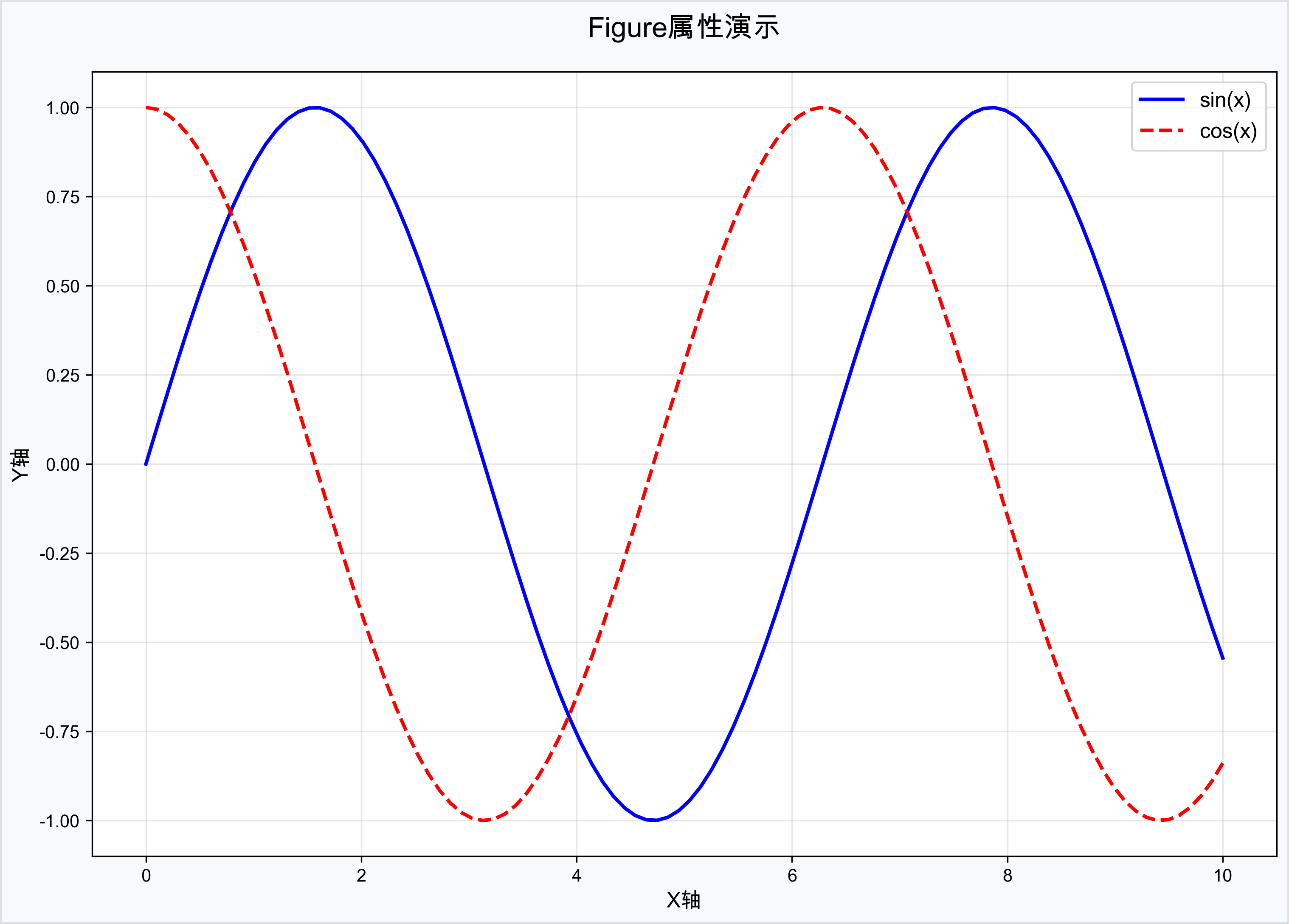
方法2:面向对象方式创建
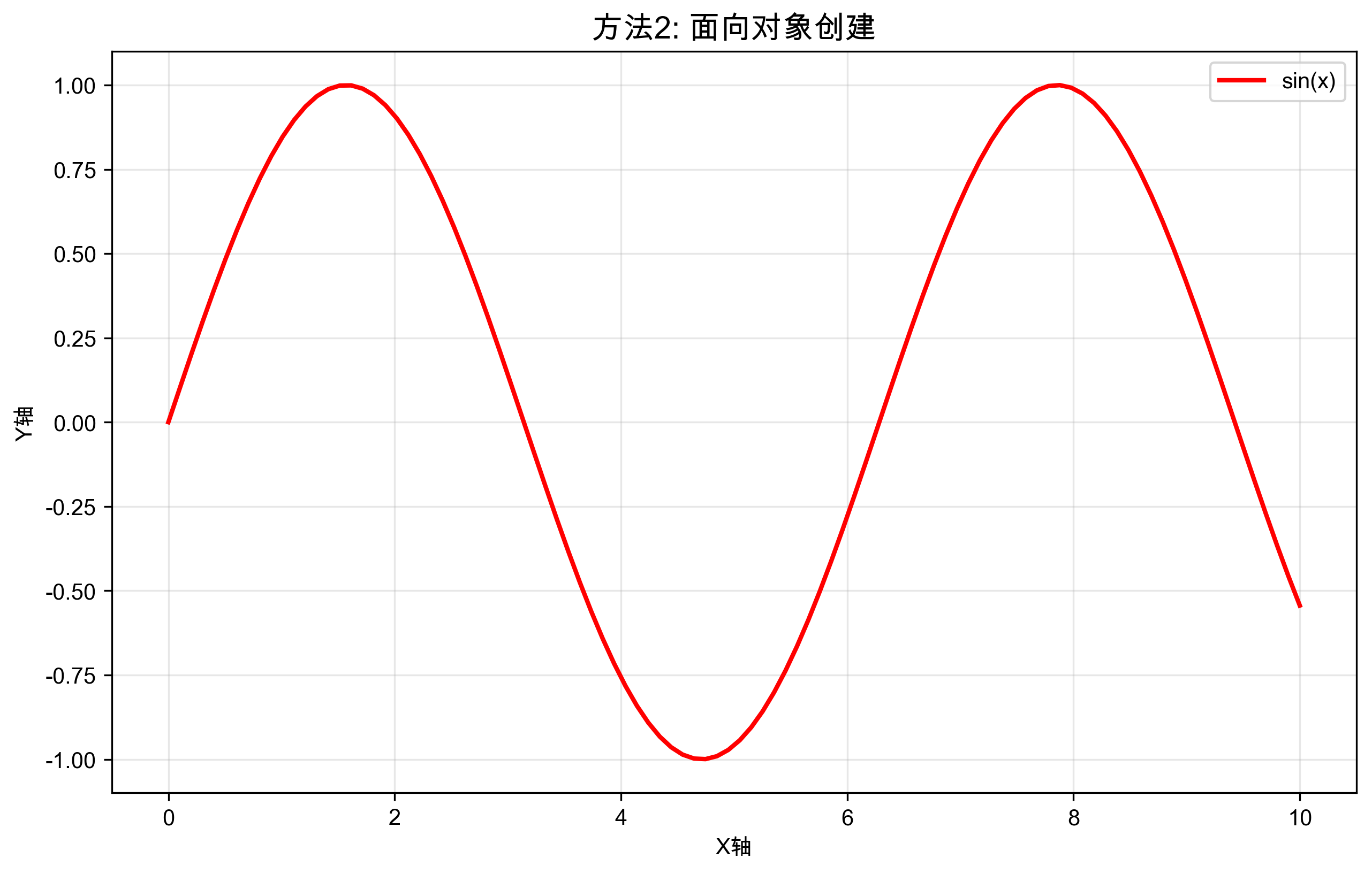
# 面向对象方式创建
fig = plt.figure(figsize=(10, 6), dpi=100)
ax = fig.add_subplot(111)

x = np.linspace(0, 10, 100)
y = np.sin(x)
ax.plot(x, y, 'r-', linewidth=2, label='sin(x)')
ax.set_title('方法2: 面向对象创建', fontsize=14, fontweight='bold')
ax.set_xlabel('X轴')
ax.set_ylabel('Y轴')
ax.legend()
ax.grid(True, alpha=0.3)
plt.show()
子图布局管理
Matplotlib支持多种子图布局方式,从简单的网格到复杂的自定义布局:
# 方法1:规则网格布局
fig, axes = plt.subplots(2, 2, figsize=(12, 8))
fig.suptitle('2x2网格布局示例', fontsize=16)

# 为每个子图添加不同的内容
data_sets = [
    {'x': [1, 2, 3, 4], 'y': [1, 4, 2, 3], 'title': '数据集1'},
    {'x': [1, 2, 3, 4], 'y': [2, 1, 4, 3], 'title': '数据集2'},
    {'x': [1, 2, 3, 4], 'y': [3, 2, 1, 4], 'title': '数据集3'},
    {'x': [1, 2, 3, 4], 'y': [4, 3, 2, 1], 'title': '数据集4'}
]

for i, (ax, data) in enumerate(zip(axes.flat, data_sets)):
    ax.plot(data['x'], data['y'], 'o-', linewidth=2)
    ax.set_title(data['title'])
    ax.grid(True, alpha=0.3)

plt.tight_layout()
plt.show()
不规则布局示例
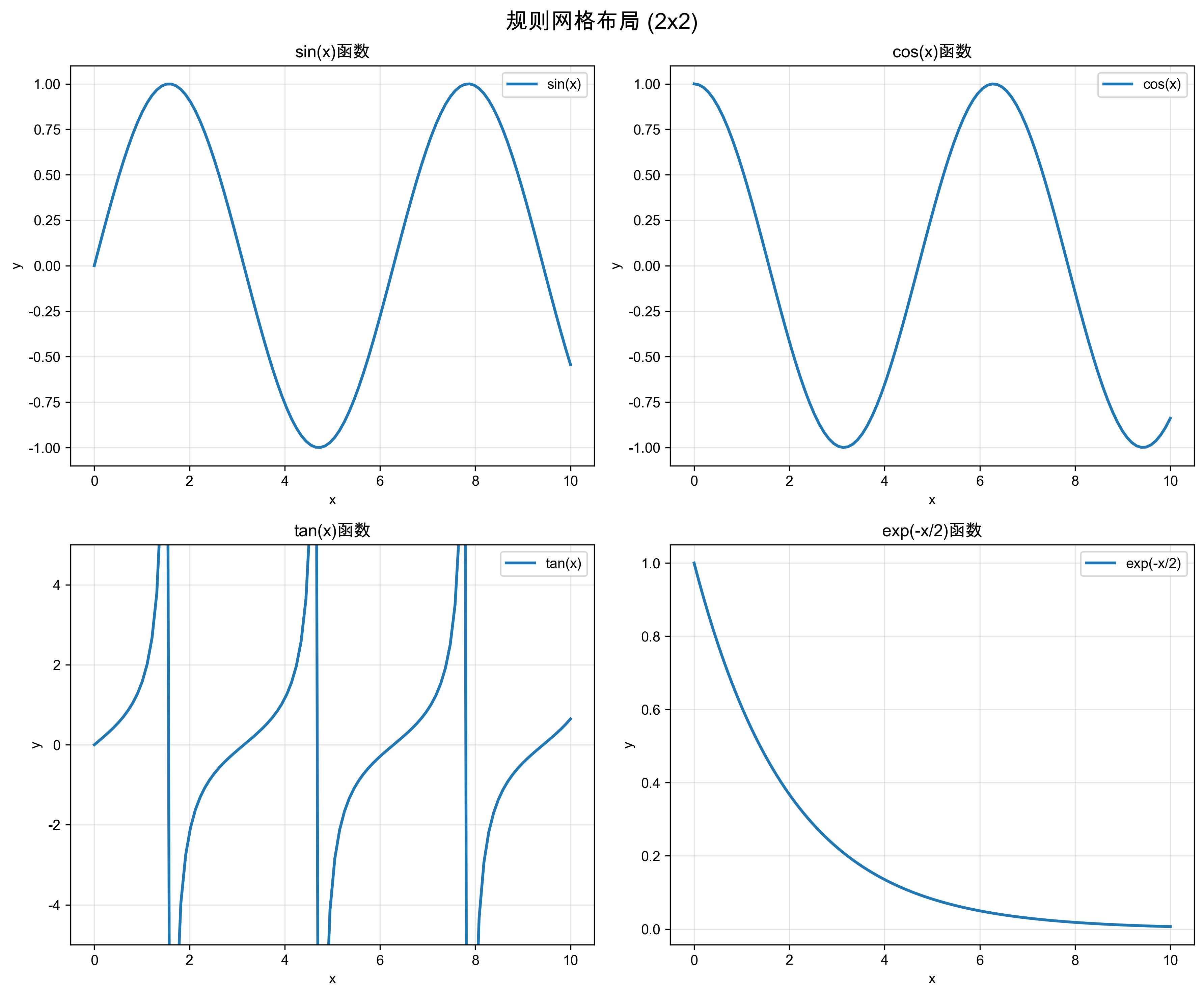
# 方法2:不规则布局(使用GridSpec)
from matplotlib.gridspec import GridSpec

fig = plt.figure(figsize=(12, 8))
gs = GridSpec(3, 3, figure=fig)

# 创建不同大小的子图
ax1 = fig.add_subplot(gs[0, :])    # 第一行,跨所有列
ax2 = fig.add_subplot(gs[1, :2])   # 第二行,前两列
ax3 = fig.add_subplot(gs[1, 2])    # 第二行,第三列
ax4 = fig.add_subplot(gs[2, :])    # 第三行,跨所有列

# 为每个子图添加内容
x = np.linspace(0, 10, 100)
ax1.plot(x, np.sin(x), 'b-', linewidth=2)
ax1.set_title('主图:sin(x)')

ax2.plot(x, np.cos(x), 'r-', linewidth=2)
ax2.set_title('cos(x)')

ax3.hist(np.random.randn(100), bins=20, alpha=0.7)
ax3.set_title('随机数分布')

ax4.plot(x, np.tan(x), 'g-', linewidth=2)
ax4.set_ylim(-5, 5)
ax4.set_title('tan(x)')

plt.tight_layout()
plt.show()
💡 实战应用场景
场景1:单图快速绘制
def demonstrate_single_plot(self) -> None:
    """演示单图快速绘制"""
    # 生成示例数据
    x = np.linspace(0, 10, 100)
    y = np.sin(x)

    # 快速创建并绘制
    fig, ax = plt.subplots(figsize=(10, 6))
    ax.plot(x, y, linewidth=2, color='blue', label='sin(x)')
    ax.set_xlabel('X轴')
    ax.set_ylabel('Y轴')
    ax.set_title('正弦函数图像')
    ax.legend()
    ax.grid(True, alpha=0.3)

    plt.tight_layout()
    plt.savefig('resources/charts/single_plot_example.png', dpi=300, bbox_inches='tight')
    plt.close()
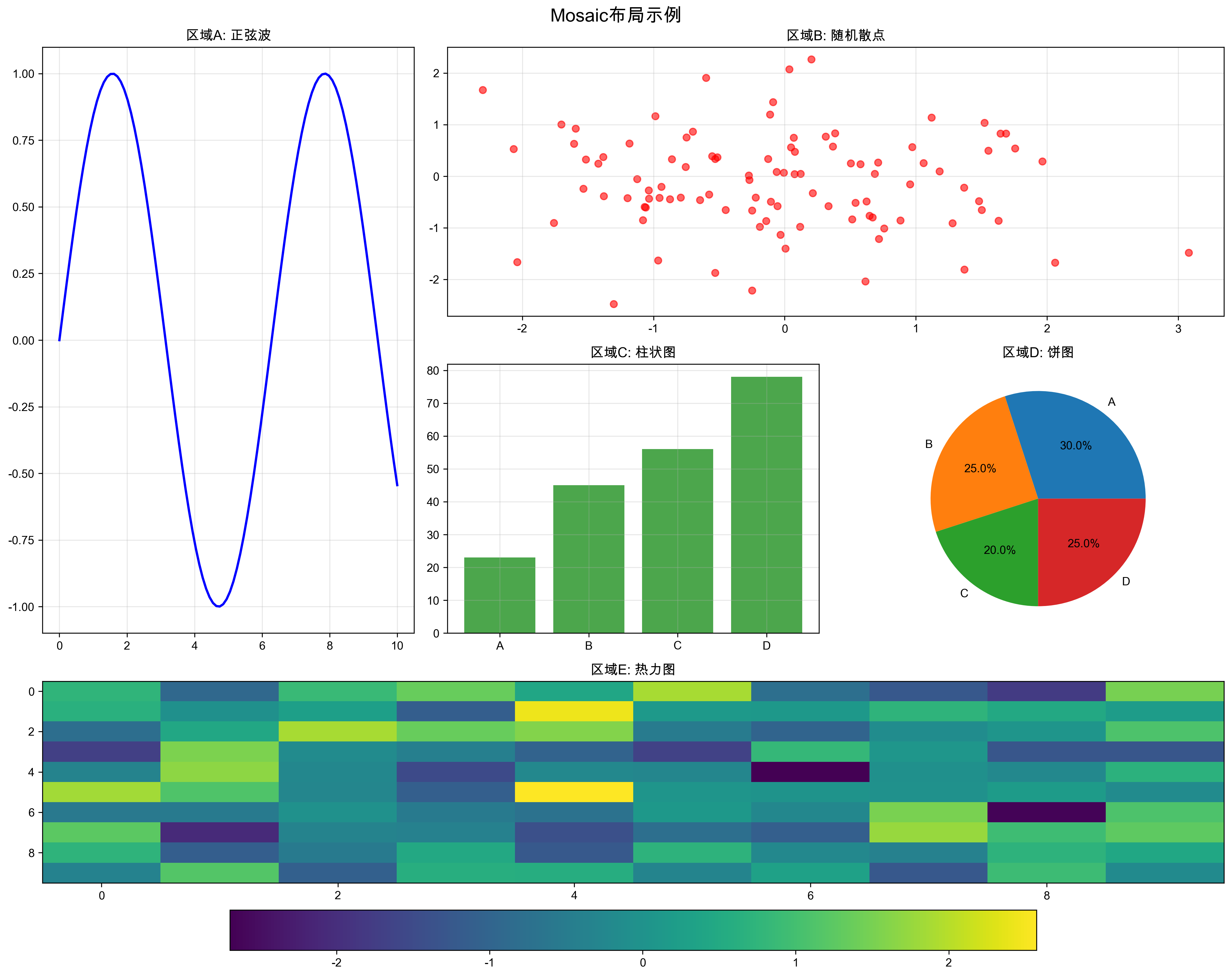
Mosaic布局(推荐)
# 方法3:使用subplot_mosaic创建灵活布局
fig, axes = plt.subplot_mosaic([
    ['A', 'B', 'B'],
    ['A', 'C', 'D'],
    ['E', 'E', 'E']
], figsize=(12, 10))

# 为每个命名的子图添加内容
axes['A'].plot([1, 2, 3], [1, 4, 2], 'ro-')
axes['A'].set_title('区域A')

axes['B'].bar(['X', 'Y', 'Z'], [3, 7, 5])
axes['B'].set_title('区域B - 柱状图')

axes['C'].scatter([1, 2, 3, 4], [2, 3, 1, 4])
axes['C'].set_title('区域C - 散点图')

axes['D'].pie([30, 25, 20, 25], labels=['A', 'B', 'C', 'D'])
axes['D'].set_title('区域D - 饼图')

x = np.linspace(0, 10, 100)
axes['E'].plot(x, np.sin(x), 'b-', linewidth=2)
axes['E'].set_title('区域E - 底部长条图')

plt.tight_layout()
plt.show()
精确位置控制
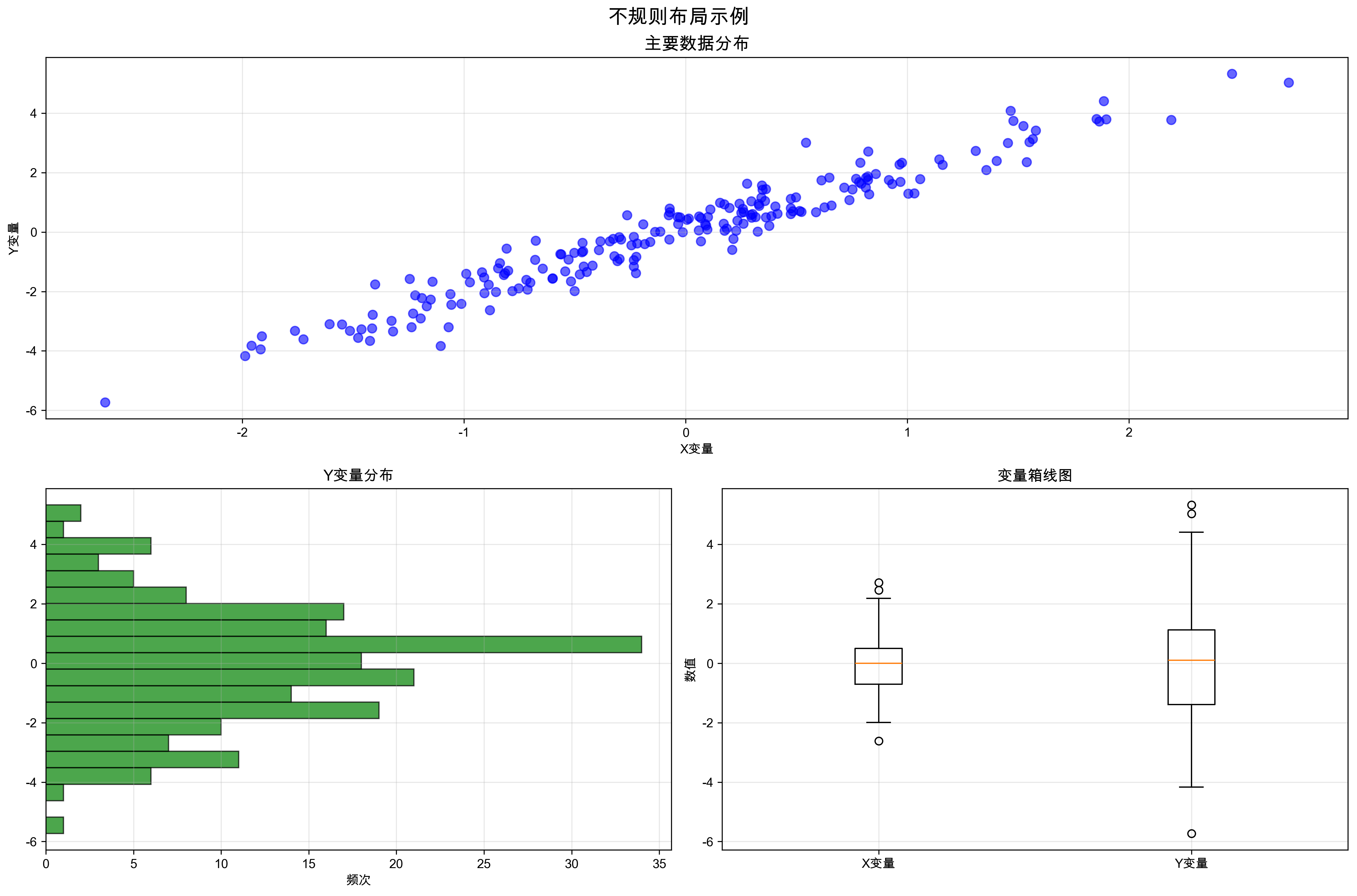
# 方法4:使用add_axes精确控制位置
fig = plt.figure(figsize=(12, 8))

# 主图
ax_main = fig.add_axes([0.1, 0.3, 0.6, 0.6])  # [left, bottom, width, height]
ax_main.plot([1, 2, 3, 4], [1, 4, 2, 3], 'bo-', linewidth=2)
ax_main.set_title('主图')

# 右侧小图
ax_right = fig.add_axes([0.75, 0.5, 0.2, 0.3])
ax_right.bar(['A', 'B', 'C'], [2, 5, 3])
ax_right.set_title('侧图')

# 底部小图
ax_bottom = fig.add_axes([0.1, 0.05, 0.6, 0.2])
ax_bottom.hist([1, 2, 2, 3, 3, 3, 4, 4, 5], bins=5, alpha=0.7)
ax_bottom.set_title('底图')

plt.show()
⚡ 高级技巧与最佳实践
1. Figure和Axes的属性访问
def demonstrate_properties_access(self) -> None:
    """演示Figure和Axes属性访问"""
    # 创建图形
    fig, ax = plt.subplots(figsize=(10, 6))

    # 访问Figure属性
    print(f"Figure尺寸: {fig.get_size_inches()}")
    print(f"Figure DPI: {fig.dpi}")
    print(f"Figure中的Axes数量: {len(fig.axes)}")

    # 访问Axes属性
    print(f"X轴范围: {ax.get_xlim()}")
    print(f"Y轴范围: {ax.get_ylim()}")
    print(f"Axes位置: {ax.get_position()}")

    # 动态修改属性
    fig.patch.set_facecolor('lightgray')  # 设置Figure背景色
    ax.set_facecolor('white')             # 设置Axes背景色

    # 添加一些内容以便查看效果
    ax.plot([1, 2, 3, 4], [1, 4, 2, 3], 'bo-', linewidth=2)
    ax.set_title('属性访问演示')

    plt.savefig('resources/charts/properties_access_demo.png', dpi=300, bbox_inches='tight')
    plt.close()
2. 子图间距调整
def demonstrate_subplot_spacing(self) -> None:
    """演示子图间距调整的多种方法"""
    # 方法1:使用subplots_adjust
    fig, axes = plt.subplots(2, 2, figsize=(12, 10))

    # 为每个子图添加内容
    for i, ax in enumerate(axes.flat):
        ax.plot([1, 2, 3, 4], [i+1, (i+1)*2, i+1, (i+1)*3], 'o-')
        ax.set_title(f'子图 {i+1}')

    fig.subplots_adjust(
        left=0.1,    # 左边距
        bottom=0.1,  # 下边距
        right=0.9,   # 右边距
        top=0.9,     # 上边距
        wspace=0.3,  # 子图间水平间距
        hspace=0.3   # 子图间垂直间距
    )

    plt.savefig('resources/charts/subplot_spacing_adjust.png', dpi=300, bbox_inches='tight')
    plt.close()

    # 方法2:使用tight_layout(推荐)
    fig, axes = plt.subplots(2, 2, figsize=(12, 10))

    for i, ax in enumerate(axes.flat):
        ax.plot([1, 2, 3, 4], [i+1, (i+1)*2, i+1, (i+1)*3], 's-')
        ax.set_title(f'Tight Layout 子图 {i+1}')

    plt.tight_layout(pad=2.0)  # pad参数控制整体边距
    plt.savefig('resources/charts/subplot_spacing_tight.png', dpi=300, bbox_inches='tight')
    plt.close()

    # 方法3:使用constrained_layout(最新推荐)
    fig, axes = plt.subplots(2, 2, figsize=(12, 10), layout='constrained')

    for i, ax in enumerate(axes.flat):
        ax.plot([1, 2, 3, 4], [i+1, (i+1)*2, i+1, (i+1)*3], '^-')
        ax.set_title(f'Constrained Layout 子图 {i+1}')

    plt.savefig('resources/charts/subplot_spacing_constrained.png', dpi=300, bbox_inches='tight')
    plt.close()
3. 动态添加和删除子图
import matplotlib.pyplot as plt
import numpy as np

# 创建空的Figure
fig = plt.figure(figsize=(15, 10))

# 动态添加子图
subplots_data = [
    {'pos': 221, 'data': np.random.randn(100), 'title': '数据集1'},
    {'pos': 222, 'data': np.random.randn(100), 'title': '数据集2'},
    {'pos': 223, 'data': np.random.randn(100), 'title': '数据集3'},
]

axes_list = []
for subplot_info in subplots_data:
    ax = fig.add_subplot(subplot_info['pos'])
    ax.hist(subplot_info['data'], bins=20, alpha=0.7)
    ax.set_title(subplot_info['title'])
    axes_list.append(ax)

# 动态添加第四个子图
ax4 = fig.add_subplot(224)
ax4.plot(np.cumsum(np.random.randn(100)))
ax4.set_title('随机游走')

# 如果需要删除某个子图
# fig.delaxes(axes_list[0])  # 删除第一个子图

plt.tight_layout()
plt.show()
🚨 常见陷阱与解决方案
陷阱1:混淆plt和ax的方法
# ❌ 错误示例:混用pyplot和Axes方法
import matplotlib.pyplot as plt

fig, ax = plt.subplots()
ax.plot([1, 2, 3], [1, 4, 2])
plt.xlabel('X轴')  # 错误:应该使用ax.set_xlabel()
plt.title('标题')  # 错误:应该使用ax.set_title()

# ✅ 正确示例:统一使用Axes方法
fig, ax = plt.subplots()
ax.plot([1, 2, 3], [1, 4, 2])
ax.set_xlabel('X轴')
ax.set_title('标题')
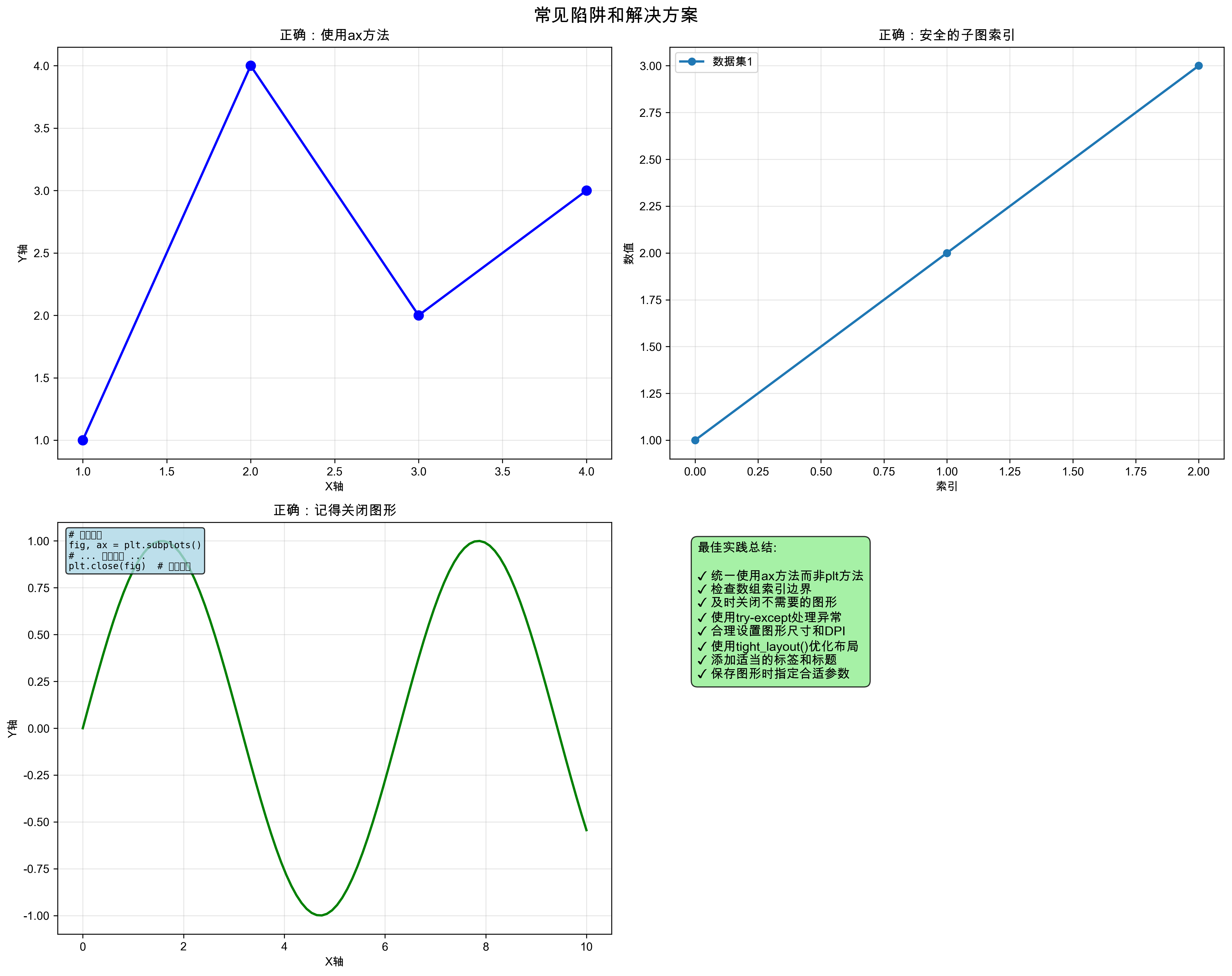
陷阱2:子图索引错误
# ❌ 错误示例:索引越界
fig, axes = plt.subplots(2, 2)
axes[2, 0].plot([1, 2, 3])  # 错误:索引超出范围

# ✅ 正确示例:使用flatten()或正确索引
fig, axes = plt.subplots(2, 2)
axes_flat = axes.flatten()  # 展平为一维数组
for i, ax in enumerate(axes_flat):
    ax.plot([1, 2, 3], [i, i+1, i+2])
    ax.set_title(f'子图 {i+1}')
陷阱3:忘记调用show()或保存
# ❌ 错误示例:创建了图形但没有显示
fig, ax = plt.subplots()
ax.plot([1, 2, 3], [1, 4, 2])
# 缺少plt.show()或fig.savefig()

# ✅ 正确示例:记得显示或保存
fig, ax = plt.subplots()
ax.plot([1, 2, 3], [1, 4, 2])

# 选择一种方式
plt.show()  # 显示图形
# 或者
# fig.savefig('my_plot.png', dpi=300, bbox_inches='tight')
🎨 样式定制技巧
1. Figure级别的样式设置
import matplotlib.pyplot as plt
import matplotlib as mpl

# 设置全局样式
mpl.rcParams['figure.figsize'] = (12, 8)
mpl.rcParams['figure.dpi'] = 100
mpl.rcParams['figure.facecolor'] = 'white'
mpl.rcParams['figure.edgecolor'] = 'black'

# 或者使用样式表
plt.style.use('seaborn-v0_8')  # 使用seaborn样式
# plt.style.use('ggplot')      # 使用ggplot样式
# plt.style.use('dark_background')  # 使用深色背景

# 创建图形时的个性化设置
fig = plt.figure(
    figsize=(14, 10),
    dpi=120,
    facecolor='#f8f9fa',
    edgecolor='#dee2e6',
    linewidth=2
)
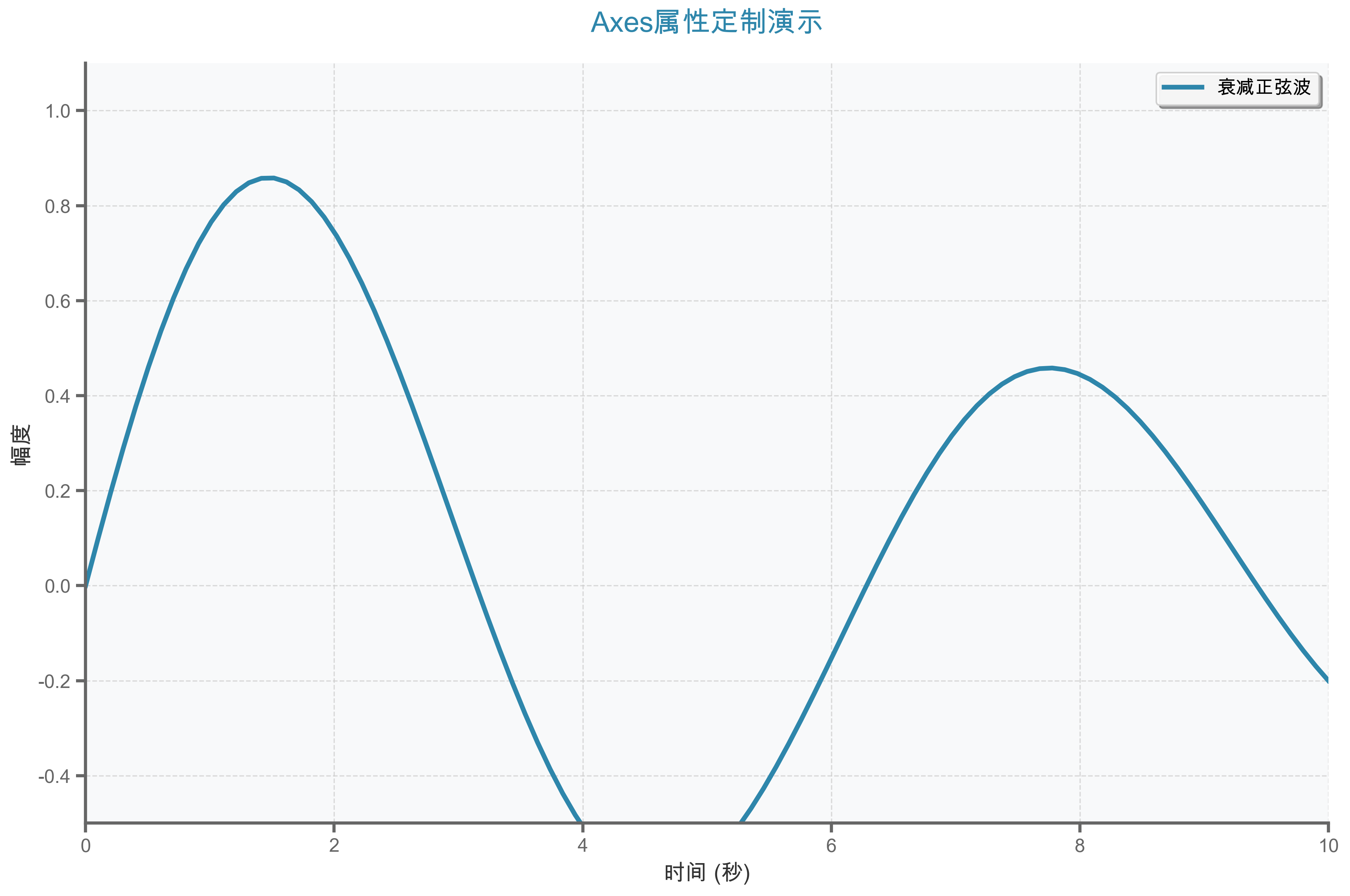
2. Axes级别的样式定制
import matplotlib.pyplot as plt
import numpy as np

# 创建数据
x = np.linspace(0, 10, 100)
y = np.sin(x)

# 创建图形
fig, ax = plt.subplots(figsize=(12, 8))

# 绘制数据
ax.plot(x, y, linewidth=3, color='#2E86AB', label='sin(x)')

# 详细的Axes样式定制
ax.set_facecolor('#f8f9fa')  # 背景色
ax.grid(True, linestyle='--', alpha=0.7, color='#cccccc')  # 网格
ax.spines['top'].set_visible(False)    # 隐藏上边框
ax.spines['right'].set_visible(False)  # 隐藏右边框
ax.spines['left'].set_color('#666666')   # 左边框颜色
ax.spines['bottom'].set_color('#666666') # 下边框颜色

# 坐标轴标签样式
ax.set_xlabel('时间 (秒)', fontsize=14, fontweight='bold', color='#333333')
ax.set_ylabel('幅度', fontsize=14, fontweight='bold', color='#333333')
ax.set_title('正弦波形图', fontsize=18, fontweight='bold',
            color='#2E86AB', pad=20)

# 刻度样式
ax.tick_params(axis='both', which='major', labelsize=12,
              colors='#666666', width=1.5)

# 图例样式
ax.legend(fontsize=12, frameon=True, fancybox=True,
         shadow=True, framealpha=0.9)

plt.tight_layout()
plt.show()
📊 性能优化建议
1. 批量操作优化
import matplotlib.pyplot as plt
import numpy as np
import time

# ❌ 低效方式:逐个添加数据点
def slow_plotting():
    fig, ax = plt.subplots()
    start_time = time.time()

    for i in range(1000):
        ax.plot(i, np.sin(i/10), 'bo')

    end_time = time.time()
    print(f"慢速绘制耗时: {end_time - start_time:.3f}秒")
    plt.close(fig)

# ✅ 高效方式:批量绘制
def fast_plotting():
    fig, ax = plt.subplots()
    start_time = time.time()

    x = np.arange(1000)
    y = np.sin(x/10)
    ax.plot(x, y, 'bo')

    end_time = time.time()
    print(f"快速绘制耗时: {end_time - start_time:.3f}秒")
    plt.close(fig)

# 测试性能差异
slow_plotting()
fast_plotting()
2. 内存管理
import matplotlib.pyplot as plt
import numpy as np

# 创建大量图形时的内存管理
def create_multiple_plots():
    for i in range(10):
        fig, ax = plt.subplots(figsize=(10, 6))

        # 绘制数据
        x = np.linspace(0, 10, 1000)
        y = np.sin(x + i)
        ax.plot(x, y)

        # 保存图形
        fig.savefig(f'plot_{i}.png', dpi=150, bbox_inches='tight')

        # 重要:关闭图形释放内存
        plt.close(fig)

        print(f"已创建并保存图形 {i+1}/10")

create_multiple_plots()
🔍 调试技巧
1. 图形对象检查
import matplotlib.pyplot as plt

# 创建图形
fig, axes = plt.subplots(2, 2, figsize=(12, 10))

# 检查Figure信息
print("=== Figure信息 ===")
print(f"Figure对象: {fig}")
print(f"Figure尺寸: {fig.get_size_inches()}")
print(f"Figure DPI: {fig.dpi}")
print(f"包含的Axes数量: {len(fig.axes)}")

# 检查Axes信息
print("\n=== Axes信息 ===")
for i, ax in enumerate(fig.axes):
    print(f"Axes {i+1}:")
    print(f"  位置: {ax.get_position()}")
    print(f"  X轴范围: {ax.get_xlim()}")
    print(f"  Y轴范围: {ax.get_ylim()}")
    print(f"  标题: '{ax.get_title()}'")

# 检查当前活动的图形和轴
print(f"\n当前活动Figure: {plt.gcf()}")
print(f"当前活动Axes: {plt.gca()}")

plt.close(fig)
2. 交互式调试
import matplotlib.pyplot as plt
import numpy as np

# 启用交互模式
plt.ion()

# 创建图形
fig, ax = plt.subplots()
x = np.linspace(0, 10, 100)

# 动态更新图形
for phase in np.linspace(0, 2*np.pi, 50):
    ax.clear()  # 清除之前的内容
    y = np.sin(x + phase)
    ax.plot(x, y, 'b-', linewidth=2)
    ax.set_ylim(-1.5, 1.5)
    ax.set_title(f'动态正弦波 (相位: {phase:.2f})')

    plt.pause(0.1)  # 暂停以显示动画效果

# 关闭交互模式
plt.ioff()
plt.show()
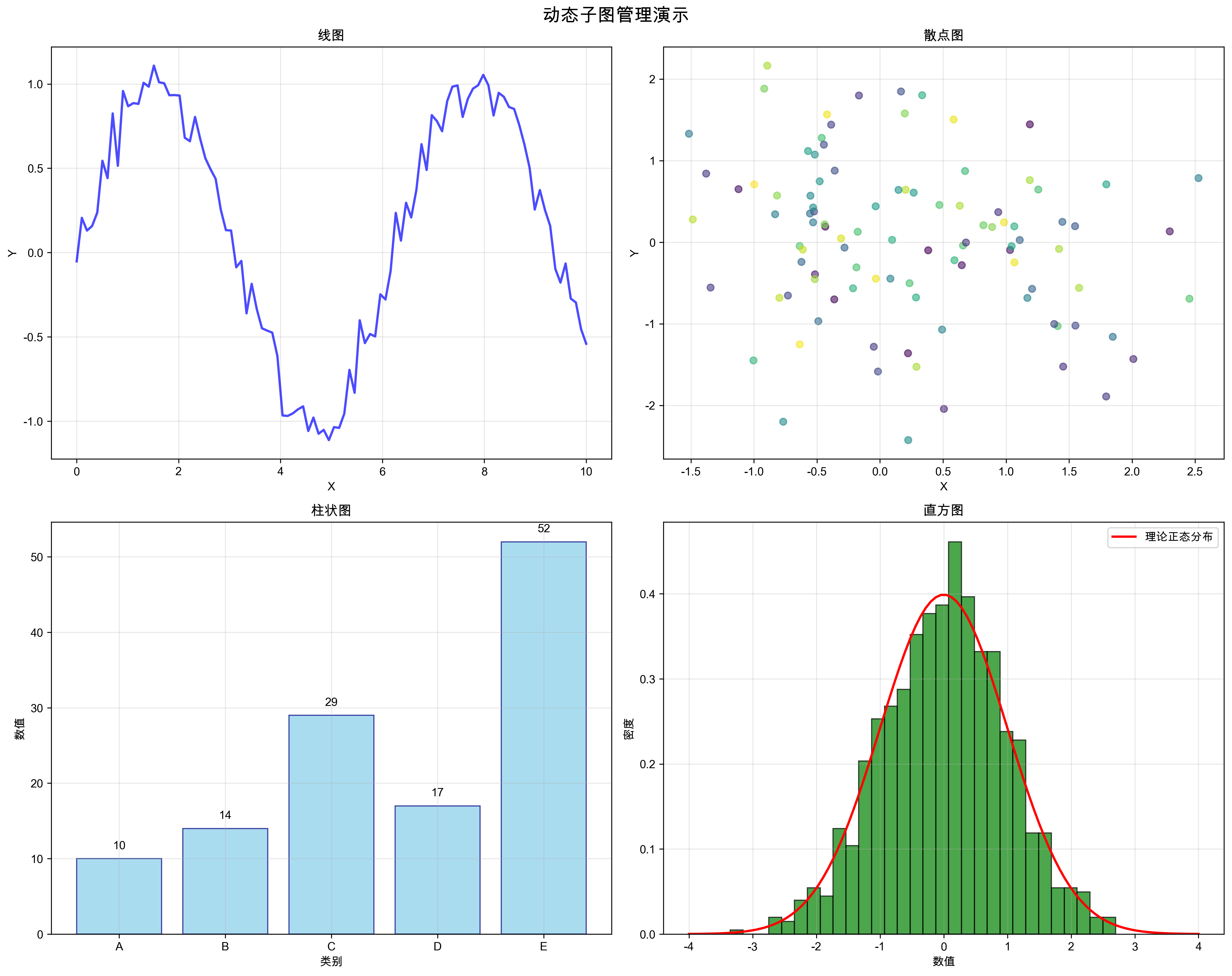
动态子图管理
在实际应用中,我们经常需要动态地添加或删除子图:
# 动态添加子图
fig = plt.figure(figsize=(12, 8))

# 初始创建一个子图
ax1 = fig.add_subplot(2, 2, 1)
ax1.plot([1, 2, 3], [1, 4, 2], 'bo-')
ax1.set_title('子图1')

# 动态添加更多子图
ax2 = fig.add_subplot(2, 2, 2)
ax2.bar(['A', 'B', 'C'], [3, 7, 5])
ax2.set_title('子图2')

# 跨越多个位置的子图
ax3 = fig.add_subplot(2, 1, 2)  # 占据底部整行
ax3.plot(np.linspace(0, 10, 100), np.sin(np.linspace(0, 10, 100)))
ax3.set_title('跨越子图')

plt.tight_layout()
plt.show()
🔑 关键要点回顾
你觉得这篇文章对你有帮助吗? 在评论区分享你的学习心得,或者提出你在使用Figure和Axes时遇到的问题。你也可以直接运行提供的完整代码,所有示例都经过测试,确保可以正常运行并生成预期的图表效果。
如果你想看到更多深入的Matplotlib教程,请点赞👍、收藏⭐、关注🔔,你的支持是我持续创作的动力!


 1594
1594

 被折叠的 条评论
为什么被折叠?
被折叠的 条评论
为什么被折叠?
 到【灌水乐园】发言


