


 本文详细介绍了多种让网页元素居中的CSS技术,包括text-align、line-height、margin: 0 auto、flexbox布局以及绝对定位结合负margin等方法。这些技巧适用于行内元素、行内块元素和块级元素的居中对齐,为网页设计提供了灵活的解决方案。
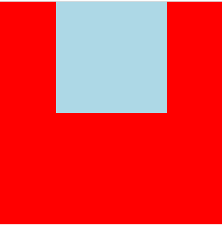
text-align行内元素或行内块元素的居中
<style>
	.parent{
	    width: 200px;
	    height: 200px;
		text-align: center;
	    background: red;
	}
	.children{
		/*
			行内块也具有行内元素的特性
			因此使用text-align也有效果
		*/
	    display: inline-block;
	    width: 100px;
	    height: 100px;
	    background: lightblue;
	}
</style>
<div class="parent">
	<div class="children"></div>
</div>
效果:
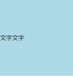
line-height文字垂直居中
<style>
	.parent{
	    width: 200px;
	    height: 200px;
		line-height: 200px;
	    background: lightblue;
	}
</style>
<div class="parent">
	文字文字
</div>
margin: 0 auto 块级元素的居中
<style>
	.parent{
	    width: 200px;
	    height: 200px;
		text-align: center;
	    background: red;
	}
	.children{
		/*
			平方包含块可用空间
		*/
		margint:0 auto;
	    width: 100px;
	    height: 100px;
	    background: lightblue;
	}
</style>
<div class="parent">
	<div class="children"></div>
</div>
flex居中
<style>
	.parent{
		display: flex;
		justify-content: center;
		align-items: center;
	    width: 200px;
	    height: 200px;
	    background: red;
	}
	.children{
	    width: 100px;
	    height: 100px;
	    background: lightblue;
	}
</style>
<div class="parent">
	<div class="children"></div>
</div>
效果:
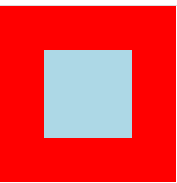
绝对定位居中:
<style>
	.parent{
	    position: relative;
	    width: 200px;
	    height: 200px;
	    background: red;
	}
	.children{
	    position: absolute;
	    left: 0px;
	    right: 0px;
	    top: 0px;
	    bottom: 0px;
	    margin: auto;
	    width: 100px;
	    height: 100px;
	    background: lightblue;
	}
</style>
<div class="parent">
	<div class="children"></div>
</div>
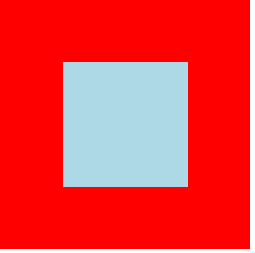
绝对定位+负margin
 <style>
	.parent{
     position: relative;
     width: 200px;
     height: 200px;
     background: red;
	}
	.children{
     position: absolute;
     top: 50%;
     left: 50%;
     width: 100px;
     height: 100px;
     margin: -50px;
     background: lightblue;
   }
</style>
<div class="parent">
	<div class="children"></div>
</div>
table-cell居中
 <style>
	.parent{
	     display: table-cell;
	     text-align: center;
	     vertical-align: middle;
	     text-align: center;
	     width: 200px;
	     height: 200px;
	     background: red;
	}
	.children{
	     display: inline-block;
	     width: 100px;
	     height: 100px;
	     background: lightblue;
	}
</style>
<div class="parent">
	<div class="children"></div>
</div>


 扫一扫
扫一扫


 604
604

 被折叠的 条评论
为什么被折叠?
被折叠的 条评论
为什么被折叠?
 到【灌水乐园】发言


