转场基本介绍
半模态转场通过bindSheet属性为组件绑定半模态页面,在组件插入时可通过设置自定义或默认的内置高度确定半模态大小。
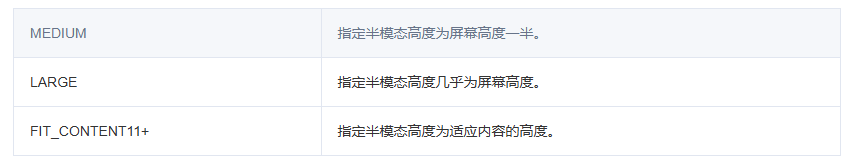
可以通过设置height属性来实现自定义高度;也可以通过设置height属性的SheetSize枚举类型,默认是LARGE。
@Entry
@Component
struct Index {
@State isShow: boolean = false;
@Builder
myBuilder() {
...
... //半模态弹窗页面内容
}
build() {
Row() {
Column() {
...
... //通过事件打开半模态弹窗
}
.bindSheet($$this.isShow, this.myBuilder(), {
backgroundColor: Color.Gray,
blurStyle: BlurStyle.Thick,
})
}
}
}
场景描述
-
场景一:基于bindSheet半模态弹窗dragBar控制条对手势的判断
-
场景二:基于bindSheet半模态弹窗系统提供的能力(关闭图标和点击蒙层)和自定义的能力来关闭弹窗
方案描述
场景一:基于 bindSheet 半模态弹窗 dragBar 控制条对手势的判断
半模态bindSheet属性dragBar控制条添加了对手势的判断,在上滑,下滑或者点击控制条时,不会关闭面板。
说明:dragBar默认支持手势的判断
效果图
DD一下:在探索鸿蒙系统的学习过程中,不少人都曾遇到过各种棘手问题。小编结合自身学习与实践经历,将容易踩坑的环节和对应的解决思路整理成攻略,希望这些经验分享能为同样在
学习鸿蒙的伙伴们提供一些参考和帮助:请移步前往小编:鸿蒙全栈开发学习指南
1.鸿蒙全栈开发学习路线
2.OpenHarmony开发基础
3.OpenHarmony北向开发环境搭建
4.鸿蒙南向开发环境的搭建
5.鸿蒙生态应用开发白皮书V2.0 & V3.0
6.鸿蒙开发面试真题(含参考答案)
7.TypeScript入门学习手册
8.OpenHarmony 经典面试题(含参考答案)
9.OpenHarmony设备开发入门【最新版】
10.沉浸式剖析OpenHarmony源代码
11.系统定制指南
12.【OpenHarmony】Uboot 驱动加载流程
13.OpenHarmony构建系统--GN与子系统、部件、模块详解
14.ohos开机init启动流程
15.鸿蒙版性能优化指南
......
鸿蒙全栈开发技术栈:
核心代码
@Entry
@Component
struct bindsheet {
@State isShow: boolean = false;
@Builder
myBuilder() {
Column() {
Text('Hello Word')
.fontSize(50)
.fontWeight(FontWeight.Bold)
.margin(10)
}
}
build() {
Row() {
Column() {
Button("打开bindsheet弹窗")
.onClick(() => {
this.isShow = true
})
.fontSize(20)
.margin(10)
}
.width("100%")
.height("100%")
.bindSheet($$this.isShow, this.myBuilder(), {
detents: [SheetSize.MEDIUM, SheetSize.LARGE, 200],
backgroundColor: Color.White,
blurStyle: BlurStyle.Thick,
showClose: false,
dragBar: true, //默认显示控制条
})
}.width("100%")
.backgroundColor("#ff578ddd")
}
}
场景二:基于bindSheet半模态弹窗系统提供的能力(关闭图标和点击蒙层)和自定义的能力来关闭弹窗
方案一
希望弹出半模态之后,能实现点击背景,控制面板关闭的效果,根据系统提供的能力,通过点击蒙层和半模态弹窗中关闭图标来实现关闭半模态弹窗。
bindsheet半模态弹窗中showClose属性控制显示关闭图标,默认是显示;enableOutsideInteractive属性控制半模态所在页面是否允许交互。
核心代码
showClose:true,//显示关闭按钮
enableOutsideInteractive:false,//不允许交互,显示蒙层
@Entry
@Component
struct bindsheet {
@State isShow: boolean = false
@State sheetHeight: number = 300;
@State showDragBar: boolean = true;
@Builder
myBuilder() {
Column() {
Button("关闭关闭按钮")
.margin(10)
.fontSize(20)
.onClick(() => {
this.showDragBar = false;
})
Button("打开关闭按钮")
.margin(10)
.fontSize(20)
.onClick(() => {
this.showDragBar = true;
})
// Button("关闭弹窗")
// .margin(10)
// .fontSize(20)
// .onClick(() => {
// this.isShow = false;
// })
}
.width('100%')
.height('100%')
}
build() {
Column() {
Button("打开弹窗")
.onClick(() => {
this.isShow = true
})
.fontSize(20)
.margin(10)
.bindSheet($$this.isShow, this.myBuilder(), {
detents: [SheetSize.MEDIUM, SheetSize.LARGE, 200],
backgroundColor: Color.Gray,
blurStyle: BlurStyle.Thick,
showClose: this.showDragBar,
// showClose属性为true时显示关闭按钮,开发者不想通过关闭按钮来关闭bindsheet弹窗的话,可以将showClose属性变为false
enableOutsideInteractive: false, //不允许交互,显示蒙层
preferType: SheetType.CENTER,
shouldDismiss: ((sheetDismiss: SheetDismiss) => {
console.log("bind sheet shouldDismiss")
sheetDismiss.dismiss()
})
})
}
.justifyContent(FlexAlign.Start)
.backgroundColor("#ff578ddd")
.width('100%')
.height('100%')
}
}
效果图
方案二
bindsheet的isShow属性可以控制半模态页面是否显示,isShow是boolean类型,因此可以通过Button的点击事件来控制半模态弹窗的弹出和关闭。
核心代码
@Entry
@Component
struct bindsheet {
@State isShow: boolean = false
@Builder
myBuilder() {
Column() {
Button("关闭弹窗")
.margin(10)
.fontSize(20)
.onClick(() => {
this.isShow = false;
})//通过点击事件将isShow属性变为false,bindSheet弹窗关闭
}
.width('100%')
.height('100%')
}
build() {
Column() {
Button("打开弹窗")
.onClick(() => {
this.isShow = true
})
//通过点击事件将isShow属性变为true,bindSheet弹窗弹出
.fontSize(20)
.margin(10)
.bindSheet($$this.isShow, this.myBuilder(), {
detents: [SheetSize.MEDIUM, SheetSize.LARGE, 200],
backgroundColor: Color.Gray,
showClose:false, //不显示关闭按钮
enableOutsideInteractive: true, //允许交互,不显示蒙层
blurStyle: BlurStyle.Thick,
preferType: SheetType.CENTER,
shouldDismiss: ((sheetDismiss: SheetDismiss) => {
console.log("bind sheet shouldDismiss")
sheetDismiss.dismiss()
})
})
}
.backgroundColor("#ff578ddd")
.justifyContent(FlexAlign.Start)
.width('100%')
.height('100%')
}
}
效果图