


文章的目的为了记录使用QT QML开发学习的经历。开发流程和要点有些记忆模糊,赶紧记录,防止忘记。
相关链接:
开源 C++ QT QML 开发(四)复杂控件--Listview
开源 C++ QT QML 开发(五)复杂控件--Gridview
开源 C++ QT QML 开发(十一)通讯--TCP服务器端
开源 C++ QT QML 开发(十二)通讯--TCP客户端
开源 C++ QT QML 开发(十五)通讯--http下载
推荐链接:
开源 C# 快速开发(十六)数据库--sqlserver增删改查
本章节主要内容是:介绍常用控件,文本,输入,选择,布局容器等控件。
1.控件介绍
2.综合源码
3.效果演示
一、控件介绍
1.文本相关
Text {  // 文本显示
    text: "Hello World"
    font.pixelSize: 16
}

TextInput {  // 单行文本输入
    text: "可编辑文本"
}

TextEdit {  // 多行文本编辑
    text: "多行文本编辑区域"
}
2.按钮类
Button {
    text: "普通按钮"
    onClicked: console.log("点击")
}

RoundButton {  // 圆形按钮
    text: "圆形"
}

ToolButton {  // 工具按钮
    text: "工具"
}

CheckBox {  // 复选框
    text: "选项"
    checked: true
}

RadioButton {  // 单选框
    text: "单选选项"
}
3.输入控件
TextField {  // 文本输入框
    placeholderText: "请输入文本"
}

TextArea {  // 多行文本区域
    placeholderText: "多行文本"
}

SpinBox {  // 数字调节框
    from: 0
    to: 100
    value: 50
}

Slider {  // 滑块
    from: 0
    to: 100
    value: 50
}
4.选择控件
ComboBox {  // 下拉框
    model: ["选项1", "选项2", "选项3"]
}

Switch {  // 开关
    checked: true
}
布局和容器控件
布局控件

Row {  // 水平布局
    Button { text: "按钮1" }
    Button { text: "按钮2" }
}

Column {  // 垂直布局
    Button { text: "按钮1" }
    Button { text: "按钮2" }
}

Grid {  // 网格布局
    columns: 2
    Button { text: "按钮1" }
    Button { text: "按钮2" }
}
5.容器控件
Page {  // 页面容器
    header: Label { text: "标题" }
    // 内容
}

GroupBox {  // 分组框
    title: "设置组"
    // 子控件
}

ScrollView {  // 滚动视图
    TextArea {
        text: "长文本内容..."
    }
}

TabBar {  // 标签栏
    TabButton { text: "标签1" }
    TabButton { text: "标签2" }
}

SwipeView {  // 滑动视图
    Page { /* 页面1 */ }
    Page { /* 页面2 */ }
}
高级控件
对话框
Dialog {  // 对话框
    title: "提示"
    standardButtons: Dialog.Ok | Dialog.Cancel
    onAccepted: console.log("确认")
}

Menu {  // 菜单
    MenuItem { text: "选项1" }
    MenuItem { text: "选项2" }
}
进度指示

ProgressBar {  // 进度条
    from: 0
    to: 100
    value: 75
}

BusyIndicator {  // 忙碌指示器
    running: true
}
二、综合源码
main.qml文件源码
import QtQuick 2.14
import QtQuick.Controls 2.14
import QtQuick.Layouts 1.14
ApplicationWindow {
id: window
visible: true
width: 800
height: 600
title: "Qt 5.14 QML 控件示例"
color: "#f8f9fa" // 浅灰色背景
// 标签页控件
// 标签页控件
TabBar {
id: tabBar
width: parent.width
background: Rectangle {
color: "#ffffff"
border.color: "#dee2e6"
}
TabButton {
text: "基础控件"
background: Rectangle {
color: tabBar.currentIndex === 0 ? "#007bff" : "transparent"
radius: 5
}
contentItem: Text {
text: parent.text
color: tabBar.currentIndex === 0 ? "white" : "#007bff"
horizontalAlignment: Text.AlignHCenter
verticalAlignment: Text.AlignVCenter
font.bold: true
}
}
TabButton {
text: "输入控件"
background: Rectangle {
color: tabBar.currentIndex === 1 ? "#28a745" : "transparent"
radius: 5
}
contentItem: Text {
text: parent.text
color: tabBar.currentIndex === 1 ? "white" : "#28a745"
horizontalAlignment: Text.AlignHCenter
verticalAlignment: Text.AlignVCenter
font.bold: true
}
}
TabButton {
text: "布局容器"
background: Rectangle {
color: tabBar.currentIndex === 2 ? "#dc3545" : "transparent"
radius: 5
}
contentItem: Text {
text: parent.text
color: tabBar.currentIndex === 2 ? "white" : "#dc3545"
horizontalAlignment: Text.AlignHCenter
verticalAlignment: Text.AlignVCenter
font.bold: true
}
}
TabButton {
text: "高级控件"
background: Rectangle {
color: tabBar.currentIndex === 3 ? "#ffc107" : "transparent"
radius: 5
}
contentItem: Text {
text: parent.text
color: tabBar.currentIndex === 3 ? "black" : "#ffc107"
horizontalAlignment: Text.AlignHCenter
verticalAlignment: Text.AlignVCenter
font.bold: true
}
}
}
// 滑动视图
SwipeView {
id: swipeView
anchors.top: tabBar.bottom
anchors.bottom: parent.bottom
width: parent.width
currentIndex: tabBar.currentIndex
// 第一页:基础控件
ScrollView {
id: page1
clip: true
ColumnLayout {
width: parent.width
spacing: 10
Text {
text: "🎨 彩色文本显示"
font.pixelSize: 18
color: "#d32f2f"
font.bold: true
}
// 修复:使用 Rectangle 包装 TextInput 来添加背景
Rectangle {
Layout.fillWidth: true
height: 40
color: "#f1f8e9"
border.color: "#c5e1a5"
radius: 4
TextInput {
anchors.fill: parent
anchors.margins: 8
text: "💬 单行文本输入"
font.pixelSize: 14
color: "#2e7d32"
verticalAlignment: TextInput.AlignVCenter
}
}
// 修复:TextEdit 使用 Rectangle 包装
Rectangle {
Layout.fillWidth: true
Layout.preferredHeight: 80
color: "#fff3e0"
border.color: "#ffcc80"
radius: 4
TextEdit {
anchors.fill: parent
anchors.margins: 8
text: "📄 多行文本编辑区域...\n可以输入多行彩色文本内容..."
font.pixelSize: 14
color: "#5d4037"
wrapMode: TextEdit.Wrap
}
}
// 按钮控件
GroupBox {
title: "🔘 按钮控件"
Layout.fillWidth: true
background: Rectangle {
color: "#f3e5f5"
border.color: "#ce93d8"
radius: 8
}
label: Label {
text: parent.title
color: "#7b1fa2"
font.bold: true
padding: 5
}
RowLayout {
width: parent.width
spacing: 5
Button {
text: "普通按钮"
onClicked: console.log("普通按钮点击")
background: Rectangle {
color: parent.down ? "#0056b3" : "#007bff"
radius: 6
}
contentItem: Text {
text: parent.text
color: "white"
font.bold: true
horizontalAlignment: Text.AlignHCenter
verticalAlignment: Text.AlignVCenter
}
}
RoundButton {
text: "⭕"
onClicked: console.log("圆形按钮点击")
background: Rectangle {
color: parent.down ? "#c62828" : "#f44336"
radius: width / 2
}
contentItem: Text {
text: parent.text
color: "white"
font.bold: true
horizontalAlignment: Text.AlignHCenter
verticalAlignment: Text.AlignVCenter
}
}
ToolButton {
text: "🛠️"
onClicked: console.log("工具按钮点击")
background: Rectangle {
color: parent.down ? "#388e3c" : "#4caf50"
radius: 4
}
contentItem: Text {
text: parent.text
color: "white"
font.bold: true
horizontalAlignment: Text.AlignHCenter
verticalAlignment: Text.AlignVCenter
}
}
}
}
// 选择控件
GroupBox {
title: "选择控件"
Layout.fillWidth: true
ColumnLayout {
width: parent.width
spacing: 5
RowLayout {
CheckBox {
id: checkBox1
text: "选项1"
checked: true
}
CheckBox {
text: "选项2"
}
}
ColumnLayout {
RadioButton {
text: "单选选项1"
checked: true
}
RadioButton {
text: "单选选项2"
}
RadioButton {
text: "单选选项3"
}
}
}
}
}
}
// 第二页:输入控件
ScrollView {
id: page2
clip: true
ColumnLayout {
width: page2.width
spacing: 15
anchors.margins: 15
GroupBox {
title: "⌨️ 文本输入"
Layout.fillWidth: true
background: Rectangle {
color: "#e0f2f1"
border.color: "#80cbc4"
radius: 8
}
label: Label {
text: parent.title
color: "#00796b"
font.bold: true
padding: 5
}
ColumnLayout {
width: parent.width
spacing: 10
TextField {
placeholderText: "👤 请输入用户名..."
Layout.fillWidth: true
color: "#00695c"
background: Rectangle {
color: "#ffffff"
border.color: parent.activeFocus ? "#26a69a" : "#b2dfdb"
radius: 6
}
}
TextArea {
placeholderText: "📝 请输入描述文本..."
Layout.fillWidth: true
Layout.preferredHeight: 100
color: "#004d40"
background: Rectangle {
color: "#ffffff"
border.color: parent.activeFocus ? "#26a69a" : "#b2dfdb"
radius: 6
}
}
}
}
GroupBox {
title: "🎚️ 数值输入"
Layout.fillWidth: true
background: Rectangle {
color: "#fff3e0"
border.color: "#ffcc80"
radius: 8
}
label: Label {
text: parent.title
color: "#ef6c00"
font.bold: true
padding: 5
}
ColumnLayout {
width: parent.width
spacing: 15
SpinBox {
from: 0
to: 100
value: 50
Layout.fillWidth: true
background: Rectangle {
color: "#fff8e1"
border.color: "#ffd54f"
radius: 4
}
}
Slider {
id: slider
from: 0
to: 100
value: 50
Layout.fillWidth: true
background: Rectangle {
color: "#ffecb3"
radius: 4
height: 6
}
handle: Rectangle {
x: slider.visualPosition * (slider.width - width)
y: (slider.height - height) / 2
width: 20
height: 20
radius: 10
color: slider.pressed ? "#ff6d00" : "#ff9800"
border.color: "#e65100"
}
}
Label {
text: "📊 当前值: " + slider.value
color: "#e65100"
font.bold: true
}
}
}
GroupBox {
title: "⚙️ 其他输入"
Layout.fillWidth: true
background: Rectangle {
color: "#fce4ec"
border.color: "#f48fb1"
radius: 8
}
label: Label {
text: parent.title
color: "#c2185b"
font.bold: true
padding: 5
}
ColumnLayout {
width: parent.width
spacing: 15
ComboBox {
model: ["🎨 红色主题", "🌊 蓝色主题", "🌿 绿色主题", "🌞 黄色主题"]
currentIndex: 0
Layout.fillWidth: true
background: Rectangle {
color: "#ffffff"
border.color: "#f48fb1"
radius: 6
}
}
RowLayout {
Switch {
id: switchControl
checked: true
contentItem: Text {
text: "夜间模式 🌙"
color: "#c2185b"
font.bold: true
}
}
Label {
text: switchControl.checked ? "🌙 夜间模式开启" : "☀️ 日间模式开启"
color: switchControl.checked ? "#7b1fa2" : "#f57c00"
font.bold: true
}
}
}
}
}
}
// 第三页:布局容器
ScrollView {
id: page3
clip: true
ColumnLayout {
width: page3.width
spacing: 10
anchors.margins: 10
GroupBox {
title: "布局示例"
Layout.fillWidth: true
ColumnLayout {
width: parent.width
spacing: 10
// 水平布局示例
GroupBox {
title: "水平布局 (Row)"
Layout.fillWidth: true
Row {
spacing: 5
Button { text: "按钮1" }
Button { text: "按钮2" }
Button { text: "按钮3" }
}
}
// 垂直布局示例
GroupBox {
title: "垂直布局 (Column)"
Layout.fillWidth: true
Column {
spacing: 5
Button { text: "按钮A" }
Button { text: "按钮B" }
Button { text: "按钮C" }
}
}
// 网格布局示例
GroupBox {
title: "网格布局 (Grid)"
Layout.fillWidth: true
Grid {
columns: 3
spacing: 5
Button { text: "1" }
Button { text: "2" }
Button { text: "3" }
Button { text: "4" }
Button { text: "5" }
Button { text: "6" }
}
}
}
}
GroupBox {
title: "Frame 容器"
Layout.fillWidth: true
Frame {
width: parent.width
height: 60
Label {
anchors.centerIn: parent
text: "这是一个 Frame 容器"
font.bold: true
}
}
}
}
}
// 第四页:高级控件
ScrollView {
id: page4
clip: true
ColumnLayout {
width: page4.width
spacing: 10
anchors.margins: 10
GroupBox {
title: "进度指示器"
Layout.fillWidth: true
ColumnLayout {
width: parent.width
spacing: 10
ProgressBar {
value: 0.6
Layout.fillWidth: true
}
BusyIndicator {
running: true
Layout.alignment: Qt.AlignHCenter
}
}
}
GroupBox {
title: "特殊按钮"
Layout.fillWidth: true
ColumnLayout {
width: parent.width
spacing: 10
DelayButton {
text: "长按生效"
delay: 1000
Layout.fillWidth: true
}
Button {
text: "打开菜单"
onClicked: menu.open()
Menu {
id: menu
y: parent.height
MenuItem {
text: "菜单项1"
onTriggered: console.log("菜单1点击")
}
MenuItem {
text: "菜单项2"
onTriggered: console.log("菜单2点击")
}
MenuSeparator {}
MenuItem {
text: "菜单项3"
onTriggered: console.log("菜单3点击")
}
}
}
}
}
GroupBox {
title: "范围控件"
Layout.fillWidth: true
ColumnLayout {
width: parent.width
spacing: 10
RangeSlider {
id: rangeSlider
from: 0
to: 100
first.value: 25
second.value: 75
Layout.fillWidth: true
}
Label {
text: "范围: " + rangeSlider.first.value + " - " + rangeSlider.second.value
}
Tumbler {
model: 10
Layout.alignment: Qt.AlignHCenter
}
}
}
GroupBox {
title: "对话框示例"
Layout.fillWidth: true
Button {
text: "打开对话框"
onClicked: dialog.open()
Dialog {
id: dialog
title: "提示对话框"
modal: true
standardButtons: Dialog.Ok | Dialog.Cancel
Label {
text: "这是一个对话框示例内容"
padding: 10
}
onAccepted: console.log("对话框确认")
onRejected: console.log("对话框取消")
}
}
}
}
}
}
// 状态栏
footer: Label {
text: "Qt 5.14 QML 控件演示 - 当前页面: " + (tabBar.currentIndex + 1)
padding: 5
horizontalAlignment: Text.AlignHCenter
background: Rectangle {
color: "#f0f0f0"
}
}
}
三、效果演示
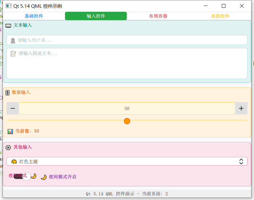
控件示例总共有4个页面,演示了文本,按钮,输入,布局等控件


 扫一扫
扫一扫


 1140
1140

 被折叠的 条评论
为什么被折叠?
被折叠的 条评论
为什么被折叠?
 到【灌水乐园】发言


