


 本文详细介绍Bootstrap框架中的表单设计,包括基础表单、水平表单、内联表单的使用方法,以及表单控件如输入框、下拉选择框等的定制样式。此外,还介绍了如何处理表单禁用状态、表单验证状态和表单提示信息。
一、表单
1、基础表单
编译后的Bootstrap版本,可以查阅bootstrap.css文件第1630行~第1991行
不过在样式表中,还对表单做了一些初始化,详细代码可以查阅bootstrap.css文件第110行~第178行。
对于基础表单,Bootstrap并未对其做太多的定制性效果设计,仅仅对表单内的fieldset、legend、label标签进行了定制。
在Bootstrap框架中,通过定制了一个类名"form-control",也就是说,如果这几个元素使用了类名“form-control”,将会实现一些设计上的定制效果。
1、宽度变成了100%
2、设置了一个浅灰色(#ccc)的边框
3、具有4px的圆角
4、设置阴影效果,并且元素得到焦点之时,阴影和边框效果会有所变化
5、设置了placeholder的颜色为#999
2、水平表单
Bootstrap框架默认的表单是垂直显示风格,但很多时候我们需要的水平表单风格(标签居左,表单控件居右)
在Bootstrap框架中要实现水平表单效果,必须满足以下两个条件:
1、在<form>元素是使用类名“form-horizontal”。
(在<form>元素上使用类名“form-horizontal”主要有以下几个作用:
1、设置表单控件padding和margin值。
2、改变“form-group”的表现形式,类似于网格系统的“row”。)
2、配合Bootstrap框架的网格系统。(网格布局会在以后的章节中详细讲解)
3、内联表单
内联表单实现原理非常简单,欲将表单控件在一行显示,就需要将表单控件设置成内联块元素(display:inline-block)。在Bootstrap框架中实现这样的表单效果是轻而易举的,你只需要在<form>元素中添加类名“form-inline”即可。
如果要在input前面添加一个label标签时,会导致input换行显示。如果必须添加这样的一个label标签,并且不想让input换行,需要将label标签也放在容器“form-group”中。
<form class="form-inline" role="form">
  <div class="form-group">
    <label class="sr-only" for="exampleInputEmail2">邮箱</label>
    <input type="email" class="form-control" id="exampleInputEmail2" placeholder="请输入你的邮箱地址">
  </div>
  <div class="form-group">
    <label class="sr-only" for="exampleInputPassword2">密码</label>
    <input type="password" class="form-control" id="exampleInputPassword2" placeholder="请输入你的邮箱密码">
  </div>
  <div class="checkbox">
    <label>
      <input type="checkbox"> 记住密码
    </label>
  </div>
  <button type="submit" class="btn btn-default">进入邮箱</button>
</form>
回过头来看示例,你或许会问,为什么添加了label标签,而且没有放置在”form-group”这样的容器中,input也不会换行;还有label标签怎么没显示出来。如果你仔细看,在label标签运用了一个类名“sr-only”,标签没显示就是这个样式将标签隐藏了。那么Bootstrap为什么要这么做呢?这样不是多此一举吗?其实不是的,如果没有为输入控件设置label标签,屏幕阅读器将无法正确识别。这也是Bootstrap框架另一个优点之处,为残障人员进行了一定的考虑。
二、label中for属性
for 属性规定 label 与哪个表单元素绑定。
隐式和显式的联系
标记通常以下面两种方式中的一种来和表单控件相联系:将表单控件作为标记标签的内容,这样的就是隐式形式,或者为 <label> 标签下的 for 属性命名一个目标表单 id,这样就是显式形式。
显式的联系:
<label for="SSN">Social Security Number:</label>
<input type="text" name="SocSecNum" id="SSN" />

隐式的联系:
<label>Date of Birth: <input type="text" name="DofB" /></label>
三、表单控件
1、输入框(input)
单行输入框,常见的文本输入框,也就是input的type属性值为text。在Bootstrap中使用input时也必须添加type类型,如果没有指定type类型,将无法得到正确的样式,因为Bootstrap框架都是通过input[type=“?”](其中?号代表type类型,比如说text类型,对应的是input[type=“text”])的形式来定义样式的。为了让控件在各种表单风格中样式不出错,需要添加类名“form-control”。
<form role="form">
  <div class="form-group">
    <input type="email" class="form-control" placeholder="Enter email">
    <input type="text" class="form-control" placeholder="请输入用户名">
  </div>
</form>
2、下拉选择框(select)
Bootstrap框架中的下拉选择框使用和原始的一致,多行选择设置multiple属性的值为multiple。Bootstrap框架会为这些元素提供统一的样式风格。
<form role="form">
<div class="form-group">
  <select class="form-control">
    <option>1</option>
    <option>2</option>
    <option>3</option>
    <option>4</option>
    <option>5</option>
  </select>
  </div>
  <div class="form-group">
  <select multiple class="form-control">
    <option>1</option>
    <option>2</option>
    <option>3</option>
    <option>4</option>
    <option>5</option>
  </select>
</div>
</form>
3、文本域(textarea)
文本域和原始使用方法一样,设置rows可定义其高度,设置cols可以设置其宽度。但如果textarea元素中添加了类名“form-control”类名,则无需设置cols属性。因为Bootstrap框架中的“form-control”样式的表单控件宽度为100%或auto。
<form role="form">
  <div class="form-group">
    <textarea class="form-control" rows="3"></textarea>
  </div>
</form>
4、复选框checkbox和单选择按钮radio
<form role="form">
  <div class="checkbox">
    <label>
      <input type="checkbox" value="">
      记住密码
    </label>
  </div>
  <div class="radio">
    <label>
      <input type="radio" name="optionsRadios" id="optionsRadios1" value="love" checked>
      喜欢
    </label>
  </div>
  <div class="radio">
    <label>
      <input type="radio" name="optionsRadios" id="optionsRadios2" value="hate">
      不喜欢
    </label>
  </div>
</form>
从上面的示例,我们可以得知:
1、不管是checkbox还是radio都使用label包起来了
2、checkbox连同label标签放置在一个名为“.checkbox”的容器内
3、radio连同label标签放置在一个名为“.radio”的容器内
在Bootstrap框架中,主要借助“.checkbox”和“.radio”样式,来处理复选框、单选按钮与标签的对齐方式。源码请查看bootstrap.css文件第1742行~第1762行。
5、复选框和单选按钮水平排列
1、如果checkbox需要水平排列,只需要在label标签上添加类名“checkbox-inline”
2、如果radio需要水平排列,只需要在label标签上添加类名“radio-inline”
6、按钮
按钮也是表单重要控件之一,制作按钮通常使用下面代码来实现:
☑ input[type=“submit”]
☑ input[type=“button”]
☑ input[type=“reset”]
☑ <button>
7、表单控件大小
前面看到的表单控件都正常的大小。可以通过设置控件的height,line-height,padding和font-size等属性来实现控件的高度设置。不过Bootstrap框架还提供了两个不同的类名,用来控制表单控件的高度。这两个类名是:
1、input-sm:让控件比正常大小更小
2、input-lg:让控件比正常大小更大
这两个类适用于表单中的input,textarea和select控件
<input class="form-control input-lg" type="text" placeholder="添加.input-lg,控件变大">
<input class="form-control" type="text" placeholder="正常大小">
<input class="form-control input-sm" type="text" placeholder="添加.input-sm,控件变小">
8、表单禁用状态
Bootstrap框架的表单控件的禁用状态和普通的表单禁用状态实现方法是一样的,在相应的表单控件上添加属性“disabled”。和其他表单的禁用状态不同的是,Bootstrap框架做了一些样式风格的处理。
使用方法为:只需要在需要禁用的表单控件上加上“disabled”即可
<input class="form-control" type="text" placeholder="表单已禁用,不能输入" disabled>
1、在使用了“form-control”的表单控件中,样式设置了禁用表单背景色为灰色,而且手型变成了不准输入的形状。
2、如果控件中不使用类名“form-control”,禁用的控件只会有一个不准输入的手型出来。
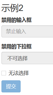
3、在Bootstrap框架中,如果fieldset设置了disabled属性,整个域都将处于被禁用状态。
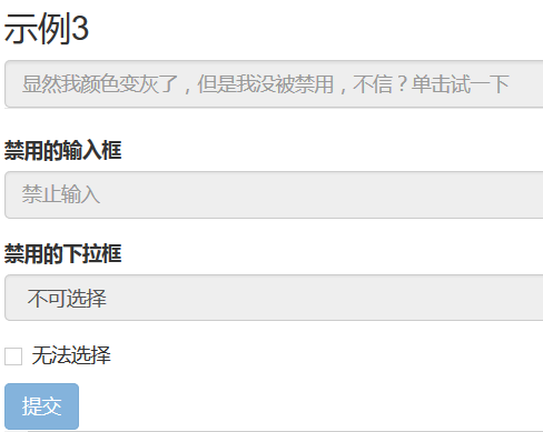
4、对于整个禁用的域中,如果legend中有输入框的话,这个输入框是无法被禁用的。
fieldset设置了disabled属性:
<form role="form">
  <fieldset disabled>
    <div class="form-group">
      <label for="disabledTextInput">禁用的输入框</label>
      <input type="text" id="disabledTextInput" class="form-control" placeholder="禁止输入">
    </div>
    <div class="form-group">
      <label for="disabledSelect">禁用的下拉框</label>
       <select id="disabledSelect" class="form-control">
        <option>不可选择</option>
      </select>
    </div>
    <div class="checkbox">
      <label>
        <input type="checkbox">无法选择
      </label>
    </div>
  <button type="submit" class="btnbtn-primary">提交</button>
</fieldset>
</form>
legend中有输入框:
<form role="form">
  <fieldset disabled>
  <legend><input type="text" class="form-control" placeholder="显然我颜色变灰了,但是我没被禁用,不信?单击试一下" /></legend>
      …
  </fieldset>
</form>
9、表单验证状态
在制作表单时,不免要做表单验证。同样也需要提供验证状态样式,在Bootstrap框架中同样提供这几种效果。
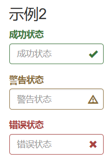
1、.has-warning:警告状态(黄色)
2、.has-error:错误状态(红色)
3、.has-success:成功状态(绿色)
使用的时候只需要在form-group容器上对应添加状态类名。
很多时候,在表单验证的时候,不同的状态会提供不同的 icon,比如成功是一个对号(√),错误是一个叉号(×)等。在Bootstrap框中也提供了这样的效果。如果你想让表单在对应的状态下显示 icon 出来,只需要在对应的状态下添加类名“has-feedback”。请注意,此类名要与“has-error”、“has-warning”和“has-success”在一起
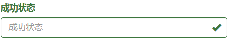
<form role="form">
  <div class="form-group has-success has-feedback">
    <label class="control-label" for="inputSuccess1">成功状态</label>
    <input type="text" class="form-control" id="inputSuccess1" placeholder="成功状态" >
    <span class="glyphicon glyphicon-ok form-control-feedback"></span>
  </div>
  <div class="form-group has-warning has-feedback">
    <label class="control-label" for="inputWarning1">警告状态</label>
    <input type="text" class="form-control" id="inputWarning1" placeholder="警告状态">
    <span class="glyphicon glyphicon-warning-sign form-control-feedback"></span>
  </div>
  <div class="form-group has-error has-feedback">
    <label class="control-label" for="inputError1">错误状态</label>
    <input type="text" class="form-control" id="inputError1" placeholder="错误状态">
    <span class="glyphicon glyphicon-remove form-control-feedback"></span>
  </div>
</form>
1、label要加入control-label类,以保持一致的样式
2、包裹form组件的div要加入has-success/waring/error和has-feedback
3、最后必须加入一个<span class="glyphicon glyphicon-remove form-control-feedback"></span>以显示反馈信息
10、表单提示信息
平常在制作表单验证时,要提供不同的提示信息。在Bootstrap框架中也提供了这样的效果。使用了一个"help-block"样式,将提示信息以块状显示,并且显示在控件底部。
<form role="form">
  <div class="form-group has-success has-feedback">
    <label class="control-label" for="inputSuccess1">成功状态</label>
    <input type="text" class="form-control" id="inputSuccess1" placeholder="成功状态" >
    <span class="help-block">你输入的信息是正确的</span>
    <span class="glyphicon glyphicon-ok form-control-feedback"></span>
  </div>
</form>
在Bootstrap V2.x版本中还提供了一个行内提示信息,其使用了类名“help-inline”。一般让提示信息显示在控件的后面,也就是同一水平显示。
<form role="form">
  <div class="form-group">
    <label class="control-label" for="inputSuccess1">成功状态</label>
    <div class="row">
      <div class="col-xs-6">
        <input type="text" class="form-control" id="inputSuccess1" placeholder="成功状态" >
      </div>
       <span class="help-inline">你输入的信息是正确的</span>
    </div>
  </div>
</form>
如果你想在BootstrapV3.x版本也有这样的效果,你可以添加这段代码:
.help-inline{
  display:inline-block;
  padding-left:5px;
  color: #737373;
}
如果你不想为bootstrap.css增加自己的代码,而且设计又有这种样的需求,那么只能借助于Bootstrap的网格系统。
<form role="form">
  <div class="form-group">
    <label class="control-label" for="inputSuccess1">成功状态</label>
    <div class="row">
      <div class="col-xs-6">
        <input type="text" class="form-control" id="inputSuccess1" placeholder="成功状态" >
      </div>
       <span class="col-xs-6 help-block">你输入的信息是正确的</span>
    </div>
  </div>
</form>


 扫一扫
扫一扫


 683
683

 被折叠的 条评论
为什么被折叠?
被折叠的 条评论
为什么被折叠?
 到【灌水乐园】发言


