


 本文详细介绍了Element UI中的Progress进度条组件,包括线形、环形和仪表盘形三种类型,并通过代码示例展示了如何设置百分比、颜色、状态、宽度等属性。同时,还提供了自定义颜色和动态变化的进度条效果。
1. Progress进度条
1.1. Progress进度条, 用于展示操作进度, 告知用户当前状态和预期。
1.2. Attributes
|
参数 |
说明 |
类型 |
可选值 |
默认值 |
|
percentage |
百分比(必填) |
number |
0-100 |
0 |
|
type |
进度条类型 |
string |
line/circle/dashboard |
line |
|
stroke-width |
进度条的宽度, 单位px |
number |
无 |
6 |
|
text-inside |
进度条显示文字内置在进度条内(只在type=line时可用) |
boolean |
无 |
false |
|
status |
进度条当前状态 |
string |
success/exception/warning |
无 |
|
color |
进度条背景色(会覆盖status状态颜色) |
string/function/array |
无 |
'' |
|
width |
环形进度条画布宽度(只在type为circle或dashboard时可用) |
number |
无 |
126 |
|
show-text |
是否显示进度条文字内容 |
boolean |
无 |
true |
|
stroke-linecap |
circle/dashboard类型路径两端的形状 |
string |
butt/round/square |
round |
|
format |
指定进度条文字内容 |
function(percentage) |
无 |
无 |
2. Progress进度条例子
2.1. 使用脚手架新建一个名为element-ui-progress的前端项目, 同时安装Element插件。

2.2. 编写index.js
import Vue from 'vue'
import VueRouter from 'vue-router'
import Progress from '../components/Progress.vue'
import ColorProgress from '../components/ColorProgress.vue'
import DashboardProgress from '../components/DashboardProgress.vue'

Vue.use(VueRouter)

const routes = [
  { path: '/', redirect: '/Progress' },
  { path: '/Progress', component: Progress },
  { path: '/ColorProgress', component: ColorProgress },
  { path: '/DashboardProgress', component: DashboardProgress }
]

const router = new VueRouter({
  routes
})

export default router
2.3. 在components在新建Progress.vue
<template>
<div>
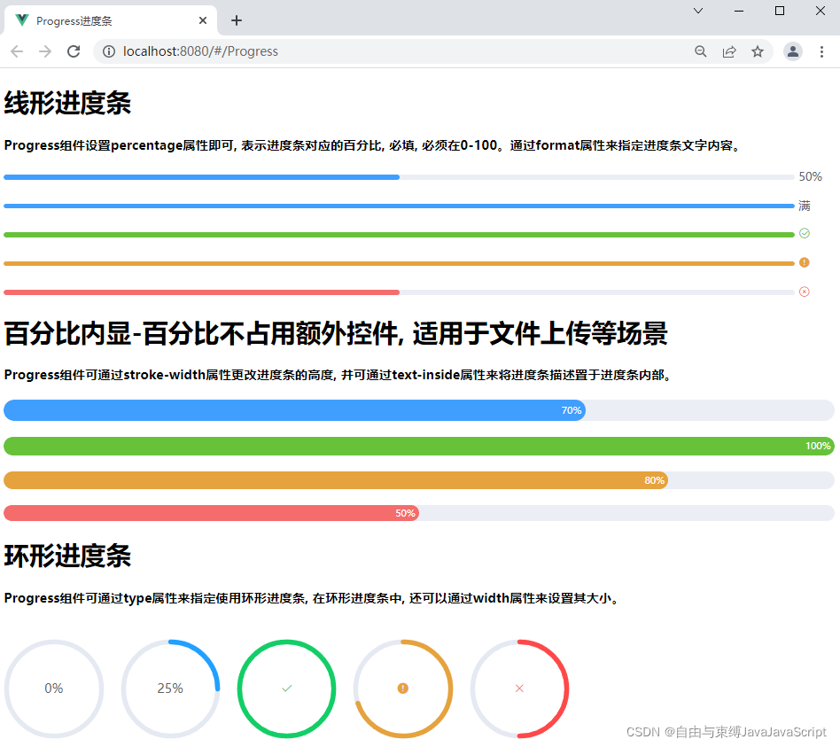
<h1>线形进度条</h1>
<h4>Progress组件设置percentage属性即可, 表示进度条对应的百分比, 必填, 必须在0-100。通过format属性来指定进度条文字内容。</h4>
<el-progress :percentage="50"></el-progress>
<el-progress :percentage="100" :format="format"></el-progress>
<el-progress :percentage="100" status="success"></el-progress>
<el-progress :percentage="100" status="warning"></el-progress>
<el-progress :percentage="50" status="exception"></el-progress>
<h1>百分比内显-百分比不占用额外控件, 适用于文件上传等场景</h1>
<h4>Progress组件可通过stroke-width属性更改进度条的高度, 并可通过text-inside属性来将进度条描述置于进度条内部。</h4>
<el-progress :text-inside="true" :stroke-width="26" :percentage="70"></el-progress>
<el-progress :text-inside="true" :stroke-width="24" :percentage="100" status="success"></el-progress>
<el-progress :text-inside="true" :stroke-width="22" :percentage="80" status="warning"></el-progress>
<el-progress :text-inside="true" :stroke-width="20" :percentage="50" status="exception"></el-progress>
<h1>环形进度条</h1>
<h4>Progress组件可通过type属性来指定使用环形进度条, 在环形进度条中, 还可以通过width属性来设置其大小。</h4>
<el-progress type="circle" :percentage="0"></el-progress>
<el-progress type="circle" :percentage="25"></el-progress>
<el-progress type="circle" :percentage="100" status="success"></el-progress>
<el-progress type="circle" :percentage="70" status="warning"></el-progress>
<el-progress type="circle" :percentage="50" status="exception"></el-progress>
</div>
</template>
<script>
export default {
methods: {
format (percentage) {
return percentage === 100 ? '满' : `${percentage}%`
}
}
}
</script>
<style scoped>
.el-progress + .el-progress {
margin-top: 20px;
}
.el-progress--circle + .el-progress--circle {
margin-left: 20px;
}
</style>
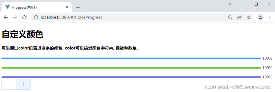
2.4. 在components在新建ColorProgress.vue
<template>
  <div>
    <h1>自定义颜色</h1>
    <h4>可以通过color设置进度条的颜色, color可以接受颜色字符串, 函数和数组。</h4>
    <el-progress :percentage="percentage" :color="customColor"></el-progress>
    <el-progress :percentage="percentage" :color="customColorMethod"></el-progress>
    <el-progress :percentage="percentage" :color="customColors"></el-progress>
    <div>
      <el-button-group>
        <el-button icon="el-icon-minus" @click="decrease"></el-button>
        <el-button icon="el-icon-plus" @click="increase"></el-button>
      </el-button-group>
    </div>
  </div>
</template>

<script>
export default {
  data () {
    return {
      percentage: 20,
      customColor: '#409eff',
      customColors: [
        { color: '#f56c6c', percentage: 20 },
        { color: '#e6a23c', percentage: 40 },
        { color: '#5cb87a', percentage: 60 },
        { color: '#1989fa', percentage: 80 },
        { color: '#6f7ad3', percentage: 100 }
      ]
    }
  },
  methods: {
    customColorMethod (percentage) {
      if (percentage < 30) {
        return '#909399'
      } else if (percentage < 70) {
        return '#e6a23c'
      } else {
        return '#67c23a'
      }
    },
    increase () {
      this.percentage += 10
      if (this.percentage > 100) {
        this.percentage = 100
      }
    },
    decrease () {
      this.percentage -= 10
      if (this.percentage < 0) {
        this.percentage = 0
      }
    }
  }
}
</script>

<style scoped>
.el-progress + .el-progress {
  margin-top: 20px;
}
</style>
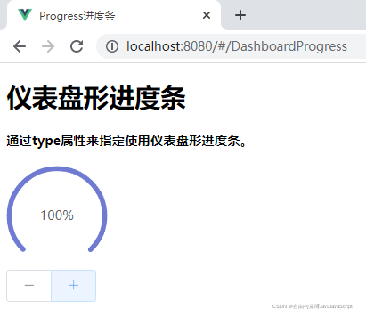
2.5. 在components在新建DashboardProgress.vue
<template>
  <div>
    <h1>仪表盘形进度条</h1>
    <h4>通过type属性来指定使用仪表盘形进度条。</h4>
    <el-progress type="dashboard" :percentage="percentage" :color="colors"></el-progress>
    <div>
      <el-button-group>
        <el-button icon="el-icon-minus" @click="decrease"></el-button>
        <el-button icon="el-icon-plus" @click="increase"></el-button>
      </el-button-group>
    </div>
  </div>
</template>

<script>
export default {
  data () {
    return {
      percentage: 10,
      colors: [
        { color: '#f56c6c', percentage: 20 },
        { color: '#e6a23c', percentage: 40 },
        { color: '#5cb87a', percentage: 60 },
        { color: '#1989fa', percentage: 80 },
        { color: '#6f7ad3', percentage: 100 }
      ]
    }
  },
  methods: {
    increase () {
      this.percentage += 10
      if (this.percentage > 100) {
        this.percentage = 100
      }
    },
    decrease () {
      this.percentage -= 10
      if (this.percentage < 0) {
        this.percentage = 0
      }
    }
  }
}
</script>
2.6. 访问http://localhost:8080/#/Progress
2.7. 访问http://localhost:8080/#/ColorProgress
2.8. 访问http://localhost:8080/#/DashboardProgress


 扫一扫
扫一扫


 1723
1723

 被折叠的 条评论
为什么被折叠?
被折叠的 条评论
为什么被折叠?
 到【灌水乐园】发言


