实现效果
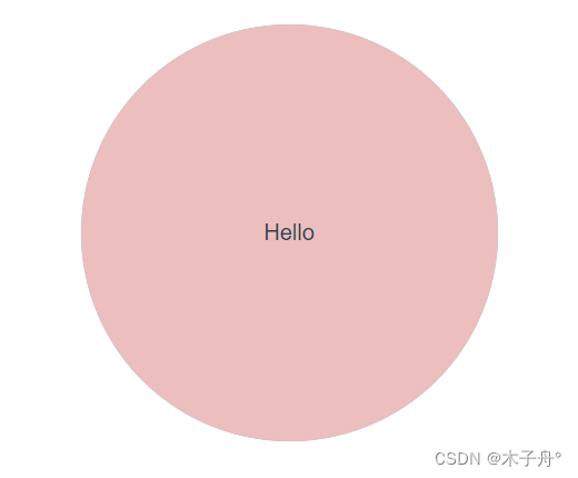
正面
<template>
<div class="circle">
<div>Hello</div>
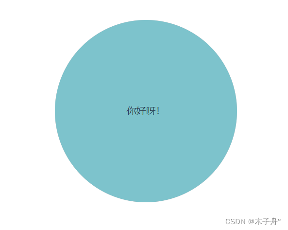
<div>你好呀!</div>
</div>
</template>
<style lang="scss" scoped>
#id {
perspective: 500px;
.circle {
position: relative;
height: 300px;
width: 300px;
transition: all 0.4s;
margin: 30px auto;
transform-style: preserve-3d;
div {
position: absolute;
line-height: 300px;
width: 100%;
height: 100%;
border-radius: 50%;
&:first-child {
background: rgb(236, 190, 190);
transform: translateZ(1px);
}
&:last-child {
background: rgb(125, 195, 204);
transform: rotateY(180deg);
}
}
&:hover {
transform: rotateY(180deg);
}
}
}
</style>


 扫一扫
扫一扫


 979
979


 到【灌水乐园】发言


