


uview中获取自定义tabbar组件高度
业务场景
- tabbar动态内容,各页面独立tabbar
- 多选框吸附底部tabbar,适配不同设备
技术实现方案
- 获取u-tabbar组件高度,多选框动态样式绑定
- 上代码
# 多选框动态样式绑定
<view class="checked_all" :style="{bottom:onReachBottom + 'px'}">
	<u-checkbox-group>
		<u-checkbox label='全选' :checked="isAllChecked" shape="circle" @change="allChoose">
		</u-checkbox>
	</u-checkbox-group>
	<view class="btn">
		<u-button color="linear-gradient( 270deg, #19D380 0%, #0CBBAA 100%)" shape="circle" text="处理"></u-button>
	</view>
</view>
# 组件加载完成后获取元素高度
onReady() {
			const query = uni.createSelectorQuery().in(this.$refs.customTabBar);
			query
				.select("#customTabBar >>> .u-tabbar__content")//跨自定义组件的后代选择器
				.boundingClientRect((data) => {
					console.log("得到布局位置信息", data);
					this.onReachBottom = data.height
				})
				.exec();
		},
# 自定义tabbar组件
<template>
	<u-tabbar id="customTabBar" :value="currentTab" @change="switchTab" inactiveColor="#A1A1A1" activeColor="#333333">
		<u-tabbar-item :text="item.name" v-for="item,index in list" :key="index">
			<image class="tabbar-cion" slot="active-icon" :src="config.ossUrl + item.activeIcon">
			</image>
			<image class="tabbar-cion" slot="inactive-icon" :src="config.ossUrl +item.inactiveIcon"></image>
		</u-tabbar-item>
	</u-tabbar>
</template>
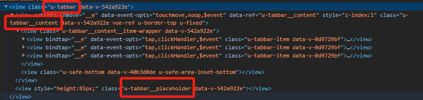
效果图如下

- 使用uni.createSelectorQuery() 获取 u-tabbar组件高度时需要选择.u-tabbar-content类名 ,.u-tabbar获取节点信息会返回null,使用.u-tabbar__placeholder类名可能是渲染问题高度会返回0,需要加定时器延时才能获取真实高度。
- 经测试,iPhone、安卓无底部虚拟按键、有虚拟按键下都可实现吸附效果。


 扫一扫
扫一扫


 3121
3121

 被折叠的 条评论
为什么被折叠?
被折叠的 条评论
为什么被折叠?
 到【灌水乐园】发言


