


一、核心要点
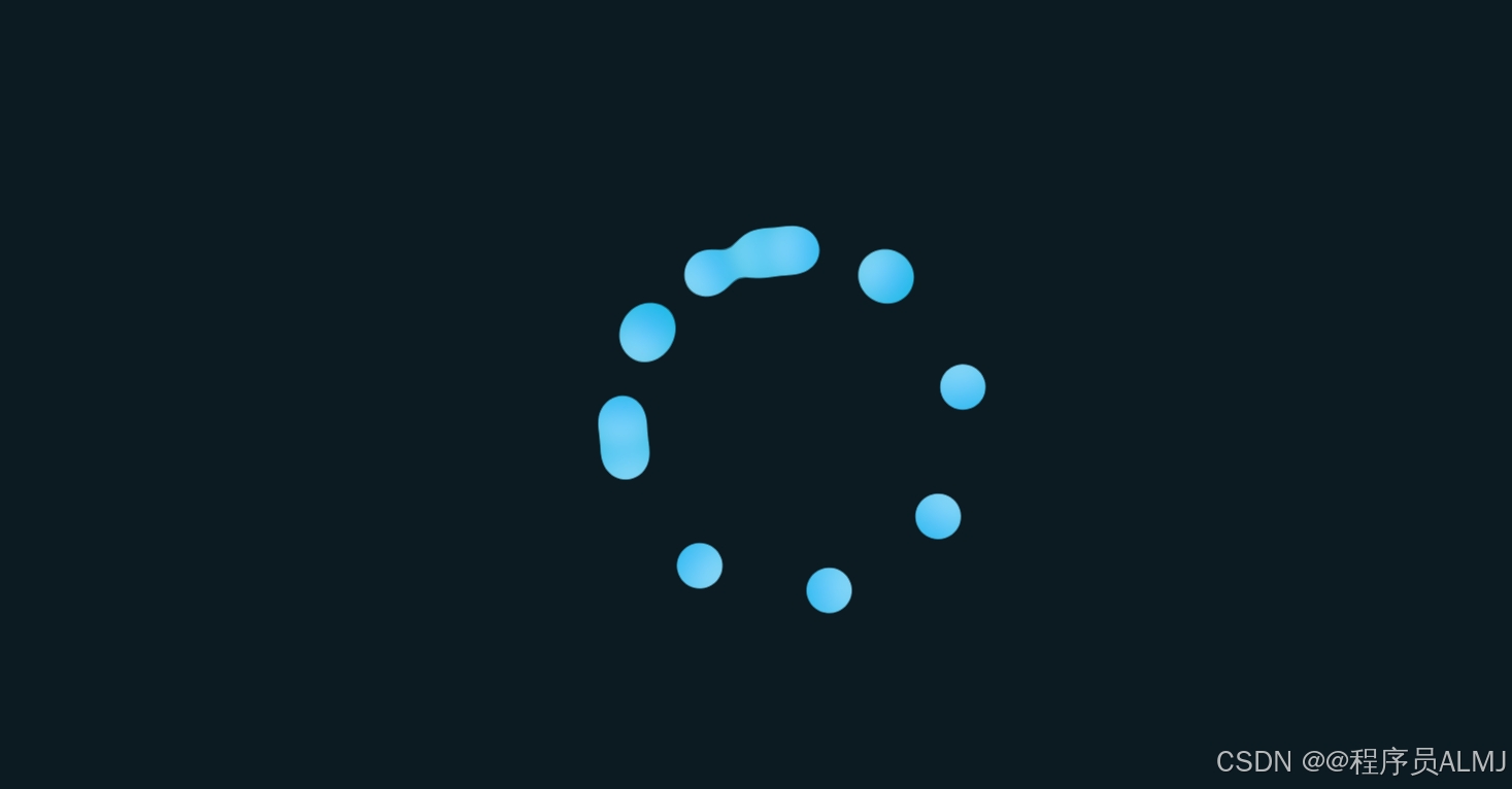
1. 整体效果
-
创建了一个由多个彩色圆点组成的环形加载动画
-
圆点之间有流体般的粘合效果
-
部分圆点有独立的旋转动画,增加了视觉层次感
2. 关键技术
-
SVG滤镜:使用
<feGaussianBlur>和<feColorMatrix>实现流体粘合效果 -
CSS变量:使用
--i和--j自定义属性控制元素位置和动画延迟 -
CSS动画:通过
@keyframes实现旋转动画 -
CSS Flexbox:用于居中布局
二、代码结构解析
1. HTML结构
<section>
  <svg>...</svg> <!-- SVG滤镜定义 -->
  <div class="loader"> <!-- 加载器容器 -->
    <span style="--i:1;"></span> <!-- 静态圆点 -->
    ... <!-- 共8个静态圆点 -->
    <span class="roate" style="--j:0;"></span> <!-- 旋转圆点 -->
    ... <!-- 共5个旋转圆点 -->
  </div>
</section>
2. CSS样式分析
基础样式
* {
  padding: 0;
  margin: 0;
  box-sizing: border-box;
}
section {
  display: flex;
  justify-content: center;
  align-items: center;
  min-height: 100vh;
  background: #0c1b21; /* 深色背景 */
}
加载器容器
.loader {
  position: relative;
  width: 250px;
  height: 250px;
  filter: url(#gooey); /* 应用SVG滤镜 */
  animation: animate 16s linear infinite; /* 整体旋转动画 */
}
.loader span {
position: absolute;
top: 0;
left: 0;
width: 100%;
height: 100%;
display: block;
transform: rotate(calc(45deg*var(--i))); /* 使用CSS变量定位 */
}
.loader span::before {
content: '';
position: absolute;
top: 0;
left: calc(50%-20px);
width: 40px;
height: 40px;
background: linear-gradient(45deg,#c7eeff,#03a9f4); /* 渐变颜色 */
border-radius: 50%; /* 圆形 */
box-shadow: 0 0 30px #00bcd4; /* 发光效果 */
}圆点样式
.loader span {
  position: absolute;
  top: 0;
  left: 0;
  width: 100%;
  height: 100%;
  display: block;
  transform: rotate(calc(45deg*var(--i))); /* 使用CSS变量定位 */
}

.loader span::before {
  content: '';
  position: absolute;
  top: 0;
  left: calc(50%-20px);
  width: 40px;
  height: 40px;
  background: linear-gradient(45deg,#c7eeff,#03a9f4); /* 渐变颜色 */
  border-radius: 50%; /* 圆形 */
  box-shadow: 0 0 30px #00bcd4; /* 发光效果 */
}旋转动画
.roate {
  animation: animate 4s ease-in-out infinite;
  animation-delay: calc(-0.2s*var(--j)); /* 延迟动画 */
}

@keyframes animate {
  0% { transform: rotate(0deg); }
  100% { transform: rotate(360deg); }
}
SVG滤镜
<filter id="gooey">
  <feGaussianBlur in="SourceGraphic" stdDeviation="10" /> <!-- 高斯模糊 -->
  <feColorMatrix values="
    1 0 0 0 0
    0 1 0 0 0
    0 0 1 0 0
    0 0 0 20 -10"></feColorMatrix> <!-- 颜色矩阵增强效果 -->
</filter>
四、实际应用价值
-
用户体验提升
-
比传统旋转图标更具视觉吸引力
-
适合需要长时间等待的操作场景
-
-
技术学习价值
-
学习SVG滤镜的实用案例
-
掌握CSS变量在动画中的应用
-
理解分层动画设计原理
-
-
可扩展性
-
通过调整CSS变量可以轻松改变圆点数量和布局
-
修改SVG滤镜参数可获得不同的流体效果
-
颜色和大小可自定义以适应不同设计风格
-
五、附带的呼吸动画效果
代码注释部分展示了一个简单的呼吸动画效果:
.circle-breath {
  animation: donghua 2.4s infinite;
}
@keyframes donghua {
  0% { transform: scale(0.60); box-shadow: 0 0 0 0 rgba(204, 73, 152, 60%); }
  60% { transform: scale(1); box-shadow: 0 0 0 36px rgba(204, 73, 152, 0%); }
  100% { transform: scale(0.60); box-shadow: 0 0 0 0 rgba(204, 73, 152, 0%); }
}
六,总代码
<%--
    Document   : newjsp流体加载效果
    Created on : 2024-4-3, 22:08:57
    Author     : ALMJ
--%>

<%@page contentType="text/html" pageEncoding="UTF-8"%>
<!DOCTYPE html>
<html>
    <head>
        <!--https://zhuanlan.zhihu.com/p/588739090永远不能忘-->
        <meta http-equiv="Content-Type" content="text/html; charset=UTF-8">
        <title>JSP Page</title>
        <style>
			*{
				padding: 0;
				margin: 0;
				box-sizing: border-box;
			}
			section{
				display: flex;
				justify-content: center;
				align-items: center;
				min-height: 100vh;
				background: #0c1b21;
			}
			.loader{
				position: relative;
				width: 250px;
				height: 250px;
				filter: url(#gooey);
				animation: animate 16s linear infinite;
			}
			.loader span{
				position: absolute;
				top: 0;
				left: 0;
				width: 100%;
				height: 100%;
				display: block;
				transform: rotate(calc(45deg*var(--i)));
			}
			.loader span::before{
				content: '';
				position: absolute;
				top: 0;
				left: calc(50%-20px);
				width: 40px;
				height: 40px;
				background: linear-gradient(45deg,#c7eeff,#03a9f4);
				border-radius: 50%;
				box-shadow: 0 0 30px #00bcd4;
			}
			.roate{
				animation: animate 4s ease-in-out infinite;
				animation-delay: calc(-0.2s*var(--j));
			}
			@keyframes animate{
				0%{
					transform: rotate(0deg);
				}
				100%{
					transform: rotate(360deg);
				}
			}
			svg{
				width: 0;
				height: 0;
			}
		</style>
    </head>
    <body>
		<section>
			<svg>
				<filter id="gooey">
					<feGaussianBlur in="SourceGraphic" stdDeviation="10" />
					<feColorMatrix values="
					1 0 0 0 0
					0 1 0 0 0
					0 0 1 0 0
					0 0 0 20 -10"></feColorMatrix>
				</filter>
			</svg>
			<div class="loader">
				<span style="--i:1;"></span>
				<span style="--i:2;"></span>
				<span style="--i:3;"></span>
				<span style="--i:4;"></span>
				<span style="--i:5;"></span>
				<span style="--i:6;"></span>
				<span style="--i:7;"></span>
				<span style="--i:8;"></span>
				<span class="roate" style="--j:0;"></span>
				<span class="roate" style="--j:1;"></span>
				<span class="roate" style="--j:2;"></span>
				<span class="roate" style="--j:3;"></span>
				<span class="roate" style="--j:4;"></span>
			</div>
		</section>
	</body>
</html>


<!--圆呼吸效果-->
<!--<style>
        body {
            margin: 120px;
        }

        .circle-breath {
            background: pink;
            box-shadow: 0 0 0 0 rgb(204, 73, 152);
            height: 36px;
            width: 36px;
            border-radius: 50%;
            animation: donghua 2.4s infinite;
        }

        @keyframes donghua {
            0% {
                transform: scale(0.60);
                /* 注意rgba中的a的设置 */
                box-shadow: 0 0 0 0 rgba(204, 73, 152, 60%);
            }

            60% {
                transform: scale(1);
                box-shadow: 0 0 0 36px rgba(204, 73, 152, 0%);
            }

            100% {
                transform: scale(0.60);
                box-shadow: 0 0 0 0 rgba(204, 73, 152, 0%);
            }
        }
    </style>
</head>

<body>
    <div class="circle-breath"></div>

        动画中应用背景色阴影,背景色阴影初始透明度为60%,后续为0
        搭配使用scale进行缩放,便可以达到圆圈呼吸扩散效果

</body>-->


 扫一扫
扫一扫


 被折叠的 条评论
为什么被折叠?
被折叠的 条评论
为什么被折叠?
 到【灌水乐园】发言


