


目录
CSS 动画是指使用 CSS 规则让网页元素实现动态变化的效果,例如平移、旋转、缩放、颜色变化等,而无需 JavaScript。
transform
transform 用于2D/3D 变换,对元素进行 旋转(rotate)、缩放(scale)、倾斜(skew)、移动(translate) 等变换。
它不会影响周围元素的布局,而是直接修改元素的视觉表现。
transform 属性
| 变换类型 | 函数 | 说明 |
|---|---|---|
| 平移 | translate(x, y) | 沿 X、Y 轴移动 |
| 旋转 | rotate(angle) | 围绕原点旋转,顺时针正数,逆时针负数,单位deg度 |
| 缩放 | scale(x, y) | 沿 X、Y 轴缩放 |
| 倾斜 | skew(x-angle, y-angle) | 沿 X、Y 轴倾斜 |
| 矩阵 | matrix(a, b, c, d, e, f) | 直接定义 2D 变换矩阵 a:X 轴的缩放系数。 |
| 3D 平移 | translate3d(x, y, z) | x:沿 X 轴(水平方向)平移的距离。 y:沿 Y 轴(垂直方向)平移的距离。 z:沿 Z 轴(深度方向,表示前后平移)的距离。 |
| 3D 旋转 | rotate3d(x, y, z, angle) | x:旋转轴 X 的方向(通常为 0 或 1),表示旋转是否绕 X 轴进行。 y:旋转轴 Y 的方向(通常为 0 或 1),表示旋转是否绕 Y 轴进行。 z:旋转轴 Z 的方向(通常为 0 或 1),表示旋转是否绕 Z 轴进行。 angle:旋转的角度,单位是度(deg),常见的值为 90deg、180deg 等。 |
| 3D 缩放 | scale3d(x, y, z) | x:沿 X 轴 缩放的比例。 y:沿 Y 轴 缩放的比例。 z:沿 Z 轴 缩放的比例。 |
| 3D 视觉效果 | perspective(distance) | 设置视点距离元素的深度距离,单位通常是像素(px)或者其他长度单位(如 em、rem 等)。这个距离值决定了透视效果的强度。 100px:透视过强,可能导致元素消失 300px:透视较强,元素有明显 3D 效果 500px:适中,3D 效果自然 1000px:透视较弱,元素移动时变化较小 |
| 变换中心点 | transform-origin | 设置 CSS 变换的原点,默认是元素的中心(50% 50%) 左上角:(0% 0%) left top |
| 隐藏背面 | backface-visibility | visible(默认):背面可见,元素翻转后仍然能看到背面内容 hidden:背面不可见,元素翻转 180° 后完全隐藏 |
| 保留3D效果 | transform-style | 是否保留子元素的 3D 变换效果。 flat(默认):子元素不继承 3D 变换,所有子元素在 2D 平面上 |
translate 平移示例代码
<style>
.container {
width: 300px;
height: 200px;
border: 2px dashed gray;
}
.box {
width: 100px;
height: 100px;
background-color: skyblue;
text-align: center;
line-height: 100px;
}
/* 鼠标悬停 */
.box:hover {
/* 沿 X、Y 轴移动 */
transform: translate(50px, 20px);
}
</style>
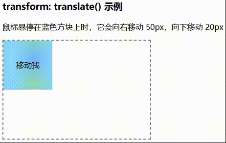
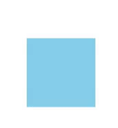
<h3>transform: translate() 示例</h3>
<p>鼠标悬停在蓝色方块上时,它会向右移动 50px,向下移动 20px</p>
<div class="container">
<div class="box">移动我</div>
</div>效果图
translate3d 3D平移示例代码
<style>
.container {
/* 设置透视效果,增强 3D 视觉 */
perspective: 500px;
width: 300px;
height: 200px;
border: 2px dashed gray;
display: flex;
align-items: center;
justify-content: center;
}
.box {
width: 100px;
height: 100px;
background-color: skyblue;
text-align: center;
line-height: 100px;
/* 这个是动画效果 */
transition: transform 0.5s ease-in-out;
}
.box:hover {
/* X 右移 50px,Y 下移 20px,Z 轴前移 100px */
transform: translate3d(50px, 20px, 100px);
}
</style>
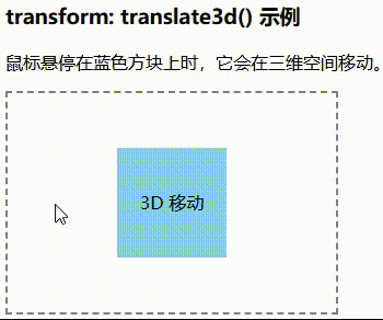
<h3>transform: translate3d() 示例</h3>
<p>鼠标悬停在蓝色方块上时,它会在三维空间移动。</p>
<div class="container">
<div class="box">3D 移动</div>
</div>效果图
rotate 旋转示例代码
<style>
.container {
width: 300px;
height: 200px;
border: 2px dashed gray;
display: flex;
justify-content: center;
align-items: center;
}
.box {
width: 100px;
height: 100px;
background-color: skyblue;
text-align: center;
line-height: 100px;
font-weight: bold;
/* 这是动画效果 */
/* transition: transform 0.5s ease-in-out; */
}
.box:hover {
/* 顺时针旋转 45° ,逆时针就负数*/
transform: rotate(45deg);
}
</style>
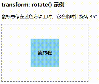
<h3>transform: rotate() 示例</h3>
<p>鼠标悬停在蓝色方块上时,它会顺时针旋转 45°</p>
<div class="container">
<div class="box">旋转我</div>
</div>效果图
rotate3d 3d旋转示例代码
rotate3d(x, y, z),可以用 rotateX、rotateY、rotateZ 代替
<style>
.container {
width: 450px;
height: 250px;
border: 2px dashed gray;
display: grid;
grid-template-columns: 1fr 1fr 1fr 1fr;
grid-template-rows: 1fr 1fr;
align-items: center;
justify-content: center;
gap: 10px;
padding: 10px;
}
.container div {
width: 100px;
height: 100px;
background-color: skyblue;
text-align: center;
line-height: 100px;
/* 动画效果 */
transition: transform 0.5s ease-in-out;
}
.box1:hover {
/* 绕 X、Y、z 轴旋转 */
transform: rotate3d(0, 0, 1, 80deg);
}
.box2:hover {
/* 绕 X、Y、z 轴旋转 */
transform: rotate3d(0, 1, 0, 80deg);
}
.box3:hover {
/* 绕 X、Y、z 轴旋转 */
transform: rotate3d(0, 1, 1, 80deg);
}
.box4:hover {
/* 绕 X、Y、z 轴旋转 */
transform: rotate3d(1, 0, 0, 80deg);
}
.box5:hover {
/* 绕 X、Y、z 轴旋转 */
transform: rotate3d(1, 0, 1, 80deg);
}
.box6:hover {
/* 绕 X、Y、z 轴旋转 */
transform: rotate3d(1, 1, 0, 80deg);
}
.box7:hover {
/* 绕 X、Y、z 轴旋转 */
transform: rotate3d(1, 1, 1, 80deg);
}
</style>
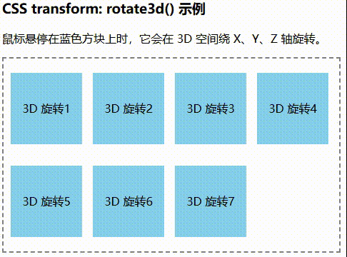
<h3>CSS transform: rotate3d() 示例</h3>
<p>鼠标悬停在蓝色方块上时,它会在 3D 空间绕 X、Y、Z 轴旋转。</p>
<div class="container">
<div class="box1">3D 旋转1</div>
<div class="box2">3D 旋转2</div>
<div class="box3">3D 旋转3</div>
<div class="box4">3D 旋转4</div>
<div class="box5">3D 旋转5</div>
<div class="box6">3D 旋转6</div>
<div class="box7">3D 旋转7</div>
</div>效果图
scale 缩放示例代码
<style>
.container {
width: 300px;
height: 200px;
border: 2px dashed gray;
display: flex;
justify-content: center;
align-items: center;
}
.box {
width: 100px;
height: 100px;
background-color: lightblue;
text-align: center;
line-height: 100px;
/* 动画效果 */
transition: transform 0.5s ease-in-out;
}
.box:hover {
/* X 轴缩小 0.5 倍,Y 轴放大 1.5 倍 */
transform: scale(0.5, 1.5);
}
</style>
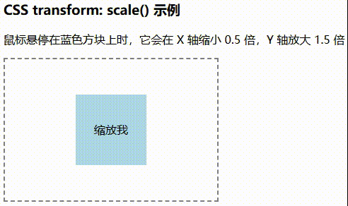
<h3>CSS transform: scale() 示例</h3>
<p>鼠标悬停在蓝色方块上时,它会在 X 轴缩小 0.5 倍,Y 轴放大 1.5 倍</p>
<div class="container">
<div class="box">缩放我</div>
</div>效果图
scale3d 和 scale 类似,示例同上
skew 倾斜代码示例
<style>
.container {
width: 300px;
height: 200px;
border: 2px dashed gray;
display: flex;
justify-content: center;
align-items: center;
}
.box {
width: 100px;
height: 100px;
background-color: skyblue;
text-align: center;
line-height: 100px;
/* 动画效果 */
transition: transform 0.5s ease-in-out;
}
.box:hover {
/* X 轴倾斜 30°,Y 轴倾斜 15° */
transform: skew(30deg, 15deg);
}
</style>
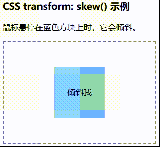
<h3>CSS transform: skew() 示例</h3>
<p>鼠标悬停在蓝色方块上时,它会倾斜。</p>
<div class="container">
<div class="box">倾斜我</div>
</div>效果图
matrix 矩阵示例代码
<style>
.container {
width: 350px;
height: 250px;
margin-left: 10px;
border: 2px dashed gray;
display: grid;
grid-template-columns: 1fr 1fr 1fr;
grid-template-rows: 1fr 1fr;
align-items: center;
justify-content: center;
gap: 10px;
padding: 10px;
}
.container div {
width: 100px;
height: 100px;
text-align: center;
line-height: 100px;
/* 动画效果 */
transition: transform 0.5s ease-in-out;
}
.box1:hover {
/* 复合变换 */
transform: matrix(1, 0.5, -0.5, 1, 50, 100);
}
.box2:hover {
/* 复合变换 */
transform: matrix(1.5, 0.2, -0.2, 1.5, 150, 50);
}
.box3:hover {
/* 复合变换 */
transform: matrix(1, 1, 0, 1, 100, 100);
}
.box4:hover {
/* 复合变换 */
transform: matrix(2, -0.5, 0.5, 2, 50, 150);
}
.box5:hover {
/* 复合变换 */
transform: matrix(1, 0, 0, 1, 100, 100);
}
</style>
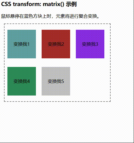
<h3>CSS transform: matrix() 示例</h3>
<p>鼠标悬停在蓝色方块上时,元素将进行复合变换。</p>
<div class="container">
<div class="box1" style="background-color:cadetblue">变换我1</div>
<div class="box2" style="background-color:brown">变换我2</div>
<div class="box3" style="background-color:blueviolet">变换我3</div>
<div class="box4" style="background-color:seagreen">变换我4</div>
<div class="box5" style="background-color:silver">变换我5</div>
</div>效果图
组合示例
.box:hover {
    /* 平移、旋转、放大 */
    transform: translate(50px, 20px) rotate(45deg) scale(1.5);
}
transform-origin 变换中心点示例代码
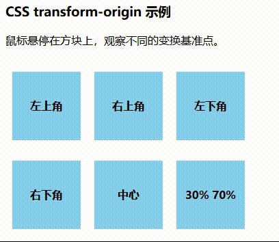
默认情况下,transform-origin 可能只有在 hover 时生效,返回时恢复默认(50% 50%),导致动画不连贯。因此,你需要在默认状态也定义 transform-origin。
<style>
    body {
        margin-left: 100px;
    }

    .container {
        width: 350px;
        height: 250px;
        display: grid;
        grid-template-columns: 1fr 1fr 1fr;
        grid-template-rows: 1fr 1fr;
        align-items: center;
        justify-content: center;
        gap: 10px;
        padding: 10px;
    }

    .box {
        width: 100px;
        height: 100px;
        background-color: skyblue;
        text-align: center;
        line-height: 100px;
        font-weight: bold;
        /* 动画效果 */
        transition: transform 0.5s ease-in-out;
    }

    /* 变换示例 */
    .box1 {
        /* 设置默认变换点状态 */
        transform-origin: left top;
    }

    .box1:hover {
        /* 设置鼠标移动上去时的变化中心点 */
        transform-origin: left top;
        /* 旋转 45度 */
        transform: rotate(45deg);
    }

    .box2 {
        /* 设置默认变换点状态 */
        transform-origin: right top;
    }

    .box2:hover {
        /* 设置鼠标移动上去时的变化中心点 */
        transform-origin: right top;
        transform: rotate(45deg);
    }

    .box3 {
        /* 设置默认变换点状态 */
        transform-origin: left bottom;
    }

    .box3:hover {
        /* 设置鼠标移动上去时的变化中心点 */
        transform-origin: left bottom;
        transform: rotate(45deg);
    }

    .box4 {
        /* 设置默认变换点状态 */
        transform-origin: right bottom;
    }

    .box4:hover {
        /* 设置鼠标移动上去时的变化中心点 */
        transform-origin: right bottom;
        transform: rotate(45deg);
    }

    .box5 {
        /* 设置默认变换点状态 */
        transform-origin: center;
    }

    .box5:hover {
        /* 设置鼠标移动上去时的变化中心点 */
        transform-origin: center;
        transform: rotate(45deg);
    }

    .box6 {
        /* 设置默认变换点状态 */
        transform-origin: 30% 70%;
    }

    .box6:hover {
        /* 设置鼠标移动上去时的变化中心点 */
        transform-origin: 30% 70%;
        transform: rotate(45deg);
    }
</style>


<body>
    <h3>CSS transform-origin 示例</h3>
    <p>鼠标悬停在方块上,观察不同的变换基准点。</p>
    <div class="container">
        <div class="box box1">左上角</div>
        <div class="box box2">右上角</div>
        <div class="box box3">左下角</div>
        <div class="box box4">右下角</div>
        <div class="box box5">中心</div>
        <div class="box box6">30% 70%</div>
    </div>
</body>
效果图
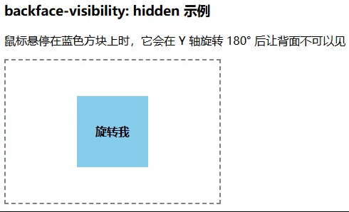
backface-visibility: hidden 隐藏背面示例
<style>
    .container {
        width: 300px;
        height: 200px;
        border: 2px dashed gray;
        display: flex;
        justify-content: center;
        align-items: center;
    }

    .box {
        width: 100px;
        height: 100px;
        background-color: skyblue;
        text-align: center;
        line-height: 100px;
        font-weight: bold;
        /* 这是动画效果 */
        transition: transform 0.5s ease-in-out;
        /* 隐藏背面 */
        backface-visibility: hidden;
    }

    .box:hover {
        /* 旋转 Y 轴 180度 */
        transform: rotateY(180deg);
    }
</style>

<h3>transform: rotateY() 示例</h3>
<p>鼠标悬停在蓝色方块上时,它会在 Y 轴旋转 180° 后让背面不可以见</p>
<div class="container">
    <div class="box">旋转我</div>
</div>
效果图
backface-visibility: hidden 隐藏背面 实战示例
<style>
    .container {
        /* 3D 立体效果,营造出在 3D空间一样的环境 */
        perspective: 1000px;
        /* ---------------- 以下是普通 CSS 样式 ---------------- */
        width: 200px;
        height: 300px;
        margin: 50px;
    }

    .card {
        /* 动画效果 */
        transition: transform 1s;
        /* 让子元素保留3D效果,不然看到不到背面 */
        transform-style: preserve-3d;
        /* ---------------- 以下是普通 CSS 样式 ---------------- */
        width: 100%;
        height: 100%;
        display: flex;
        align-items: center;
        justify-content: center;
    }

    .card:hover {
        /* 鼠标悬停时 Y 轴翻转 180 度 */
        transform: rotateY(180deg);
    }

    .box1 {
        /* 隐藏背面  */
        backface-visibility: hidden;
        /* 绝对定位,让2个div重叠在一起 */
        position: absolute;
        /* ---------------- 以下是普通 CSS 样式 ---------------- */
        width: 100%;
        height: 100%;
        background-color: skyblue;
        border-radius: 10px;
        display: flex;
        align-items: center;
        justify-content: center;
        font-size: 20px;
        font-weight: bold;
    }

    .box2 {
        /* 隐藏背面  */
        backface-visibility: hidden;
        /* 背面 div 直接默认翻转 180 度。相当于在一个立体空间,2个人背靠背 */
        transform: rotateY(180deg);
        /* ---------------- 以下是普通 CSS 样式 ---------------- */
        width: 100%;
        height: 100%;
        background-color: lightcoral;
        border-radius: 10px;
        display: flex;
        align-items: center;
        justify-content: center;
        font-size: 20px;
        font-weight: bold;
    }
</style>
<div class="container">
    <div class="card">
        <div class="box1">正面</div>
        <div class="box2">背面</div>
    </div>
</div>
效果图
transition
transition 用于控制元素状态变化时的过渡动画的属性。它由多个子属性组成,分别控制不同的动画行为。
transition 生效条件
- :hover(鼠标悬停)
- :focus(表单获取焦点)
- :active(元素被点击)
- 通过 JavaScript 修改样式
不是所有 CSS 属性都能使用 transition,只有数值型的属性才可以
- 颜色属性(color, background-color, border-color)
- 大小属性(width, height, max-width, max-height)
- 透明度(opacity)
- 位置(top, left, right, bottom, transform)
transition 不生效的条件
- display(布局)
- visibility(站位可见性)
- position(定位)
- z-index(堆叠顺序)
- 初始值和目标值相同
- 页面渲染未完成之前
will-change 的作用
- will-change 告诉浏览器某个属性即将发生变化,使其提前进行优化,从而减少卡顿。
- 适用于 transition 频繁变化的场景,比如 hover 或 scroll 触发的动画。
- 注意:不要滥用 will-change,否则可能会占用大量 GPU 资源,导致页面变慢。
- auto:默认值,浏览器自行优化
- transform:提示即将有 transform 变换
- opacity:提示即将有透明度变化
- scroll-position:提示即将有滚动变化
- contents:提示即将改变 content(布局)
- unset:取消 will-change
<style>
    .box {
        transition: transform 0.5s;
        /* 提前告诉浏览器即将发生 transform 变化 */
        will-change: transform;
    }

    .box:hover {
        transform: scale(1.5);
    }
</style>
JavaScript 监听动画结束
<script>
    const box = document.querySelector('.box');
    box.addEventListener('transitionend', () => {
        console.log('动画已结束!');
    });
</script>
transition 推荐和 transform 配合使用
transition 属性
transition: property duration timing-function delay;
- transition-property:指定要应用过渡效果的 CSS 属性
- all:所有可过渡的属性都应用动画(默认)。
- none:不应用过渡效果。
- 指定属性,如 background-color, width, opacity 等。
div { transition-property: background-color, width; }- transition-duration:设置过渡动画持续的时间,单位ms或s
div { transition-duration: 0.5s, 1s; } /* 第一个属性(如 background-color)的过渡时间是 0.5s */ /* 第二个属性(如 width)的过渡时间是 1s */- transition-timing-function:设定动画的时间曲线(加速/减速方式)
- ease(默认):开始和结束时慢,中间快。
- ease-in:动画开始时慢,随后加速。
- ease-out:动画开始时快,随后减速。
- ease-in-out:动画开始和结束时慢,中间快。
- linear:匀速变化。
- cubic-bezier(n,n,n,n):自定义贝塞尔曲线。
div { transition-timing-function: ease-in-out; }- transition-delay:设置动画开始前的延迟时间,单位ms或s
div {
    transition-delay: 0.3s;
}
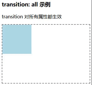
all 代码示例
<style>
    .container {
        width: 300px;
        height: 200px;
        border: 2px dashed gray;
    }

    .box {
        width: 100px;
        height: 100px;
        background: lightblue;
        transition: all 0.5s ease;
    }

    .box:hover {
        width: 150px;
        height: 150px;
        background: tomato;
    }
</style>

<h3>transition: all 示例</h3>
<p>transition 对所有属性都生效</p>
<div class="container">
    <div class="box"></div>
</div>
效果图
opacity 透明度 代码示例
<style>
.container {
width: 300px;
height: 200px;
border: 2px dashed gray;
display: flex;
justify-content: center;
align-items: center;
}
.box {
width: 100px;
height: 100px;
background: skyblue;
transition: opacity 0.5s ease;
}
.box:hover {
opacity: 0;
}
</style>
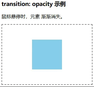
<h3>transition: opacity 示例</h3>
<p>鼠标悬停时,元素 渐渐消失。</p>
<div class="container">
<div class="box"></div>
</div>效果图
展开/折叠 代码示例
<style>
.container {
width: 220px;
}
.toggle-btn {
display: block;
width: 100%;
padding: 10px;
background: steelblue;
color: white;
/* 移除边框效果 */
border: none;
/* 小手鼠标样式 */
cursor: pointer;
text-align: center;
font-size: 16px;
margin-bottom: 5px;
border-radius: 5px;
}
.toggle-btn:hover {
background: darkblue;
}
/* 折叠状态 */
.box {
width: 200px;
background: lightblue;
/* 初始高度为 0 */
max-height: 0;
/* 隐藏溢出部分 */
overflow: hidden;
/* 过渡动画 */
transition: max-height 0.5s ease;
/* 避免内容溢出时产生不自然的动画 */
padding: 0 10px;
}
/* 展开状态 */
.box.open {
/* 设置足够大的高度,确保内容能展开 */
max-height: 200px;
/* 展开时增加内边距 */
padding: 0 10px;
}
</style>
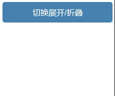
<div class="container">
<button class="toggle-btn">切换展开/折叠</button>
<div class="box">
<p>这是可折叠的内容。点击按钮可以展开或折叠。</p>
<p>你可以放入任何内容,如文本、图片、表格等。</p>
</div>
</div>
<script>
const button = document.querySelector('.toggle-btn');
const box = document.querySelector('.box');
button.addEventListener('click', () => {
// 切换 `open` 类名,实现展开/折叠,toggle:class存在时移除,不存在时添加
box.classList.toggle('open');
});
</script>效果图
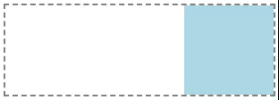
transition + transform 配合 示例代码
<style>
    .box {
        width: 100px;
        height: 100px;
        margin-top: 100px;
        background-color: #3498db;
        /* 动画效果,使用 transform */
        transition: transform 1s ease;
    }

    /* :hover 鼠标悬停时 */
    .box:hover {
        /* 移动并旋转 */
        transform: translate(200px, 0) rotate(720deg);

    }
</style>

<div class="box"></div>
@keyframes
@keyframes 用于定义动画关键帧的规则,它允许你创建复杂的动画效果。
语法:
@keyframes 自定义动画名称 {
    0% { 初始状态 }            /* 第一个关键帧 */
    100% { 结束状态 }          /* 第二个关键帧 */
}

或者

@keyframes 自定义动画名称 {
    from { 初始状态 }
    to { 结束状态 }
}
animation 属性
animation:应用 @keyframes 动画到 HTML 元素上。
语法:
animation: name duration timing-function delay iteration-count direction fill-mode;
参数说明:
- name:指定动画的名字,必须和 @keyframes 中定义的名字一致。
- duration:动画持续时间,指定动画从开始到结束的时间。单位可以是 s(秒)或 ms(毫秒)。
- timing-function:定义动画的缓动函数,决定动画在时间轴上如何变化。
- linear:动画的速度从头到尾始终均匀,速度不会发生变化。
- ease (默认值):动画开始时慢,接着加速,最后再减速。
- ease-in:动画开始时较慢,然后逐渐加速。
- ease-out:动画开始时加速,最后逐渐减速。
- ease-in-out:动画开始和结束时都较慢,中间部分加速。
- steps(n, start | end):通过指定一个步数来控制动画的分步进行,适用于精灵图等需要分步变化的动画。n 表示步数,动画在整个过程中将分成 n 个步骤,通常用于精灵图或帧动画。start:让每个步骤在开始时立即切换到下一个帧或状态。end:默认值,控制动画的切换时机,使得每个步骤的变化会在当前步骤的结束时才切换到下一个状态。
- cubic-bezier(p1, p2, p3, p4):自定义贝塞尔曲线,可以精确控制动画的速度变化。通过四个控制点来定义曲线的形状。
- snap:这个选项适用于快速而准确地切换动画,就像点击了“快进”按钮一样,允许动画快速跳跃至目标位置。snap 是 CSS 动画中的一个新的时间函数,主要用于在动画开始或结束时直接跳转。
- inherit:继承父元素的 timing-function 属性值。
- initial:设置为属性的初始值,即 ease。
- unset:设置为属性的默认值或者继承值。对于 animation,这通常表现为继承父元素的值或其默认值。
- delay:动画开始前的延迟时间,单位为秒(s)或毫秒(ms)。
- iteration-count:动画的播放次数,infinite 表示无限次循环,数字表示播放的具体次数。
- direction:控制动画播放方向,常用值有:normal(正常播放)、reverse(反向播放)、alternate(交替播放)、alternate-reverse(交替反向播放)。
- fill-mode:设置动画结束后的状态,常用值有:forwards(保持动画结束时的样式)、backwards(保持动画开始时的样式)、both(前后都保持)。
- animation-play-state:暂停动画。
- running:(默认值)播放动画
- paused:暂停动画
案例
animation参数说明 代码示例
<style>
    .container {
        width: 300px;
        height: 100px;
        border: 2px dashed gray;
    }

    @keyframes moveRight {
        0% {
            transform: translateX(0);
        }

        100% {
            transform: translateX(200px);
        }
    }

    .box {
        width: 100px;
        height: 100px;
        background: lightblue;
        /* 动画名:moveRight。持续时间:2s。缓动函数:linear,匀速。延迟:0s,立即开始。播放次数:1,只播放一次。播放方向:normal,从头到尾播放。填充模式:forwards,动画结束后停留在结束状态。 */
        animation: moveRight 2s linear 0s 1 normal forwards;
    }
</style>
<div class="container">
    <div class="box"></div>
</div>
效果图
颜色渐变和暂停动画 代码示例
<style>
    @keyframes colorChange {
        0% {
            background-color: red;
        }

        25% {
            background-color: antiquewhite;
        }

        50% {
            background-color: blue;
        }

        75% {
            background-color: chartreuse;
        }

        100% {
            background-color: green;
        }
    }

    .box {
        animation: colorChange 5s linear infinite;
        width: 100px;
        height: 100px;
    }

    /* 暂停动画 */
    .box:hover {
        animation-play-state: paused;
    }
</style>

<div class="box"></div>
效果图
iteration-count: infinite 无限循环动画 代码示例
<style>
    @keyframes spin {
        0% {
            transform: rotate(0deg);
        }

        100% {
            transform: rotate(360deg);
        }
    }

    .box {
        /* @keyframes动画名称,动画持续时间 2s, linear: 均速动画,延迟0s, infinite:无限循环*/
        animation: spin 2s linear 0s infinite;
        width: 100px;
        height: 100px;
        background: skyblue;
        margin: 50px;
    }
</style>

<div class="box"></div>
效果图

抖动效果动画 代码示例
<style>
    @keyframes bounce {
        0% {
            transform: translateY(0);
        }

        50% {
            transform: translateY(-50px);
        }

        100% {
            transform: translateY(0);
        }
    }

    .box {
        /* 速度短些,就抖动很快 animation: bounce 0.3s ease-in-out 0s infinite; */
        animation: bounce 1s ease-in-out 0s infinite;
        width: 100px;
        height: 100px;
        background: skyblue;
        margin: 100px;
    }
</style>

<div class="box"></div>
效果图
timing-function: step-start 文字闪烁动画 代码示例
<style>
    @keyframes blink {

        0%,
        100% {
            opacity: 1;
            color: crimson;
        }

        51% {
            opacity: 0;
        }
    }

    p {
        animation: blink 1s step-start infinite;
        font-size: 20px;
        font-weight: bold;
    }
</style>

<p>文字闪烁</p>
效果图
JavaScript 动态控制 @keyframes 动画
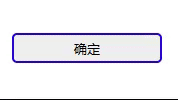
document.querySelector('.box').style.animation = 'fadeIn 2s ease-in-out';边框闪烁动画
<style>
    @keyframes borderFlash {
        0% {
            border-color: red;
        }

        100% {
            border-color: blue;
        }
    }

    button {
        width: 150px;
        height: 30px;
        border: 2px solid red;
        border-radius: 5px;
        /* 初始边框颜色为红色 */
        animation: borderFlash 1s infinite alternate;
        /* 应用动画 */
    }
</style>

<button>确定</button>
效果图
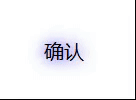
文本阴影闪烁动画
<style>
    @keyframes textGlow {
        0% {
            text-shadow: 0 0 10px red;
        }

        100% {
            text-shadow: 0 0 15px blue;
        }
    }

    .text {
        font-size: 20px;
        animation: textGlow 1s infinite alternate;
    }
</style>
<p class="text">确认</p>
效果图
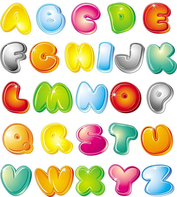
理解 steps 属性、单行
用例图(精灵图),每格是 100px, 100px

例如:steps(5),表示把@keyframes动画的 from(0%) 到 to(100%) 分成了5 帧(走5步)
代码如下:
<style>
    .box {
        width: 100px;
        height: 100px;
        background-image: url(abcde.png);
        animation: sprite 5s steps(5) infinite;
    }

    @keyframes sprite {
        from {
            background-position: 0px 0px;
        }

        to {
            /* 注意,这里 -500 是 第五张图的结尾,不是开头(开头是-400px, 那样结果不是你想要的) */
            background-position: -500px 0px;
        }
    }
</style>

<div class="box"></div>
效果图
理解 steps 属性、多行换行
用例图(多行精灵图),每格是 100px, 100px
例如:多行精灵图,怎么换行?
代码如下:
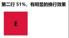
注意:
- 代码第一行是 0% - 50%,正常来说第二行应该是 51%开头。实际正确写法应该是 50.0001%。因为51%有明显的从第一行切换到第二行的换行动画,这不是我们想要的。
- 我们有 2行5列共10 个图片的一张精灵图,正常来说应该是 steps(10) ,10帧动画。 实际正确写法应该是 steps(5),表示了 steps 是作用在一行上的函数,并不是整个精灵图的所有行。
<style>
.box {
width: 100px;
height: 100px;
background-repeat: no-repeat;
background-image: url(abcdefghij.png);
animation: sprite 5s steps(5) infinite;
}
@keyframes sprite {
/* 第一行 开始 */
0% {
background-position: 0px 0px;
}
/* 第一行 结束 */
50% {
background-position: -500px 0px;
}
/* 第二行 开始,要写 50.01 50.001,带234为不等的小数,不能写成 51,那样有明显的换行效果暴露出来 */
50.001% {
background-position: 0px -100px;
}
/* 第二行 结束 */
100% {
background-position: -500px -100px;
}
}
</style>
<div class="box"></div>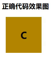 。
。 
理解 step-end 属性、单行
用例图(精灵图),每格的位置不确定
例如:显示 a、b、c、d、e 五张图片,css中的精灵图像是一圈循环,如果你想拿到 5个数,你需要切 6 刀,例如:c d e | a | b | c | d | e | a b... 这样不停的循环。即:关键帧的数量=图片数量+1
代码如下:
<style>
    .box {
        width: 125px;
        height: 125px;
        background-image: url(sprites.jpg);
        animation: sprite 5s step-end infinite;
    }

    @keyframes sprite {
        0% {
            /* 第一张图片 */
            background-position: 8px -6px;
        }

        20% {
            /* 第二张图片 */
            background-position: -112px -6px;
        }

        40% {
            /* 第三张图片 */
            background-position: -224px -6px;
        }

        60% {
            /* 第四张图片 */
            background-position: -352px -6px;
        }

        80% {
            /* 第五张图片 */
            background-position: -466px -6px;
        }

        100% {
            /* 循环回到第一张图片, 内容写什么不重要,重要的是要有这个第 6 帧 */
            background-position: -587px -6px;
        }
    }
</style>

<div class="box"></div>
注意:这里不能使用 steps(n),那就是把 0% 分成 n 帧(走n步),20% 分成 n 帧(走n步),以此类推。step-start 和 step-end 类似,step-end 从第一张图开始,step-start 从第二张图开始
效果图

理解 step-end 属性、多行换行
例如:显示 a、b、c、d、e、f、g、h、i、j、k 十张图片,中间有换行。记住不管有几个图片,关键帧是图片数量+1
代码如下:
<style>
    .box {
        width: 125px;
        height: 125px;
        background-image: url(sprites.jpg);
        animation: sprite 8s step-end infinite;
    }

    @keyframes sprite {
        0% {
            /* A 第一张图片 */
            background-position: 8px -6px;
        }

        9.09% {
            /* B 第二张图片 */
            background-position: -112px -6px;
        }

        18.18% {
            /* C 第三张图片 */
            background-position: -224px -6px;
        }

        27.27% {
            /* D 第四张图片 */
            background-position: -352px -6px;
        }

        36.36% {
            /* E 第五张图片 */
            background-position: -466px -6px;
        }

        /* 第二行 */
        45.45% {
            /* F */
            background-position: 0px -135px;
            width: 95px;
        }

        54.55% {
            /* G */
            background-position: -93px -135px;
            width: 125px;
        }

        63.64% {
            /* H */
            background-position: -208px -135px;
            width: 116px;
        }

        72.73% {
            /* I */
            background-position: -324px -135px;
            width: 64px;
        }

        81.82% {
            /* J */
            background-position: -389px -135px;
            width: 104;
        }

        90.91% {
            /* K */
            background-position: -494px -135px;
            width: 106px;
        }

        /* 循环回到第一张图片,11个图片需要12个点,最后一个点,内容是什么不容要,重要的是一定要有这个点 */
        100% {}
    }
</style>

<div class="box"></div>
效果图
植物大战僵尸
用例图(僵尸精灵图)
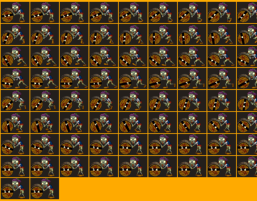
代码示例:
<style>
    .box {
        width: 1400px;
        height: 600px;
        background-image: url(img/bg.png);
        /* 超出div的部分隐藏 */
        overflow: hidden;
        display: flex;
        /* 显示在右下角 */
        justify-content: flex-end;
        align-items: flex-end;
        /* 垂直布局 */
        flex-direction: column;
    }

    .box div {
        position: relative;
        width: 155px;
        height: 115px;
        background-repeat: no-repeat;
        /* 默认出现的位置(默认在背景图外面) */
        background-position: 155px -64px;
        /* 僵尸精灵图 */
        background-image: url(img/js.png);
    }

    .sprite_1 {
        margin-bottom: 70px;
        /* 让精灵连续行走并向前移动 */
        animation: walk-cycle 1500ms step-end 10s infinite, move-forward 50s linear 10s 1 normal forwards;
    }

    .sprite_2 {
        margin-bottom: 55px;
        /* 让精灵连续行走并向前移动 */
        animation: walk-cycle 4s step-end infinite, move-forward 105s linear 1 normal forwards;
    }

    /* 角色行走动画(切换精灵图的帧) */
    @keyframes walk-cycle {
        0% {
            /* 1 */
            background-position: -4px -64px;
        }

        1.25% {
            /* 2 */
            background-position: -163px -64px;
        }

        2.5% {
            /* 3 */
            background-position: -322px -64px;
        }

        3.75% {
            /* 4 */
            background-position: -481px -64px;
        }

        5% {
            /* 5 */
            background-position: -640px -64px;
        }

        6.25% {
            /* 6 */
            background-position: -799px -64px;
        }

        7.5% {
            /* 7 */
            background-position: -958px -64px;
        }

        8.75% {
            /* 8 */
            background-position: -1117px -64px;
        }

        10% {
            /* 9 */
            background-position: -1276px -64px;
        }

        11.25% {
            /* 10 */
            background-position: -1435px -64px;
        }

        12.5% {
            /* 11 */
            background-position: -1594px -64px;
        }

        13.75% {
            /* 12 */
            background-position: -1753px -64px;
        }

        /* 第二行 */
        15% {
            /* 1 */
            background-position: -4px -183px;
        }

        16.25% {
            background-position: -163px -183px;
        }

        17.5% {
            background-position: -322px -183px;
        }

        18.75% {
            background-position: -481px -183px;
        }

        20% {
            background-position: -640px -183px;
        }

        21.25% {
            background-position: -799px -183px;
        }

        22.5% {
            background-position: -958px -183px;
        }

        23.75% {
            background-position: -1117px -183px;
        }

        25% {
            background-position: -1276px -183px;
        }

        26.25% {
            background-position: -1435px -183px;
        }

        27.5% {
            background-position: -1594px -183px;
        }

        28.75% {
            background-position: -1753px -183px;
        }

        /* 第三行 */
        30% {
            background-position: -4px -302px;
        }

        31.25% {
            background-position: -163px -302px;
        }

        32.5% {
            background-position: -322px -302px;
        }

        33.75% {
            background-position: -481px -302px;
        }

        35% {
            background-position: -640px -302px;
        }

        36.25% {
            background-position: -799px -302px;
        }

        37.5% {
            background-position: -958px -302px;
        }

        38.75% {
            background-position: -1117px -302px;
        }

        40% {
            background-position: -1276px -302px;
        }

        41.25% {
            background-position: -1435px -302px;
        }

        42.5% {
            background-position: -1594px -302px;
        }

        43.75% {
            background-position: -1753px -302px;
        }

        /* 第 4 行 */
        45% {
            background-position: -4px -421px;
        }

        46.25% {
            background-position: -163px -421px;
        }

        47.5% {
            background-position: -322px -421px;
        }

        48.75% {
            background-position: -481px -421px;
        }

        50% {
            background-position: -640px -421px;
        }

        51.25% {
            background-position: -799px -421px;
        }

        52.5% {
            background-position: -958px -421px;
        }

        53.75% {
            background-position: -1117px -421px;
        }

        55% {
            background-position: -1276px -421px;
        }

        56.25% {
            background-position: -1435px -421px;
        }

        57.5% {
            background-position: -1594px -421px;
        }

        58.75% {
            background-position: -1753px -421px;
        }

        /* 第 5 行 */
        60% {
            background-position: -4px -540px;
        }

        61.25% {
            background-position: -163px -540px;
        }

        62.5% {
            background-position: -322px -540px;
        }

        63.75% {
            background-position: -481px -540px;
        }

        65% {
            background-position: -640px -540px;
        }

        66.25% {
            background-position: -799px -540px;
        }

        67.5% {
            background-position: -958px -540px;
        }

        68.75% {
            background-position: -1117px -540px;
        }

        70% {
            background-position: -1276px -540px;
        }

        71.25% {
            background-position: -1435px -540px;
        }

        72.5% {
            background-position: -1594px -540px;
        }

        73.75% {
            background-position: -1753px -540px;
        }

        /* 第 6 行 */
        75% {
            background-position: -4px -659px;
        }

        76.25% {
            background-position: -163px -659px;
        }

        77.5% {
            background-position: -322px -659px;
        }

        78.75% {
            background-position: -481px -659px;
        }

        80% {
            background-position: -640px -659px;
        }

        81.25% {
            background-position: -799px -659px;
        }

        82.5% {
            background-position: -958px -659px;
        }

        83.75% {
            background-position: -1117px -659px;
        }

        85% {
            background-position: -1276px -659px;
        }

        86.25% {
            background-position: -1435px -659px;
        }

        87.5% {
            background-position: -1594px -659px;
        }

        88.75% {
            background-position: -1753px -659px;
        }

        /* 第 7 行 */
        90% {
            background-position: -4px -778px;
        }

        91.25% {
            background-position: -163px -778px;
        }

        92.5% {
            background-position: -322px -778px;
        }

        93.75% {
            background-position: -481px -778px;
        }

        95% {
            background-position: -640px -778px;
        }

        96.25% {
            background-position: -799px -778px;
        }

        97.5% {
            background-position: -958px -778px;
        }

        98.75% {
            background-position: -1117px -778px;
        }

        100% {}
    }

    /* 角色前进动画(左右移动) */
    @keyframes move-forward {

        /* 移动到屏幕左侧 */
        from {
            /* 使用 position 非 static 让 left 生效 */
            left: 155px;
        }

        to {
            left: -1400px;
        }
    }
</style>

<div class="box">
    <div class="sprite_1"></div>
    <div class="sprite_2"></div>
</div>
效果图


 扫一扫
扫一扫


 4111
4111

 被折叠的 条评论
为什么被折叠?
被折叠的 条评论
为什么被折叠?
 到【灌水乐园】发言


