


 本文详细介绍了如何使用R语言的ggplot2库进行数据可视化,包括调整边距、创建多面板图、修改条带文本、组合图、颜色调整、主题设置、字体和大小控制以及添加各种图形元素如辅助线、曲线和箭头。
同志们,在这个数据驱动的时代,如何让复杂的数据一目了然、让干燥的统计数字跃然纸上?
今天,我们来深入探索如何使用R语言中的神器ggplot2将你的数据转换为既专业又具有吸引力的图片,解锁可视化的魅力。(前几天已分享过一篇ggplot2入门笔记,本篇内容再其基础上进行扩展。点击查看笔记)
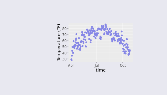
调整边距(Margin)
绘图过程中可以通过margin参数调整图片的边距,比如让图片上下左右留出空白区域。这项设置在theme主题进行修改。
ggplot(chlr, aes(x = date, y = temp)) +
  geom_point(color = "#8687E6") +
  labs(x = "time", y = "Temperature (°F)") +
  theme(plot.background = element_rect(fill = "#E8E8F0"),
        plot.margin = margin(t = 2, r = 3, b = 2, l = 5, unit = "cm"))
多面板图
facet_wrap创建单个变量的图形带,facet_grid生成两个变量的网格。这项功能也可以成为分面,核心函数是facet,能够将不同类别的图形分成若干张子图。
创建两个变量的多面版图
ggplot(chlr, aes(x = date, y = temp)) +
  geom_point(color ="#EA4646", alpha = .5) +
  theme(axis.text.x = element_text(angle = 45, hjust = 1, vjust = 1)) +
  labs(x ="date", y ="Temperature") +
  facet_grid(year ~ season,scales ="free_x")
facet_grid函数中第一个参数用于指定分面的规则,比如这里使用的是年份~季节,在实际使用中需要根据数据进行调整,第二个参数用于设置子图的尺度变换。 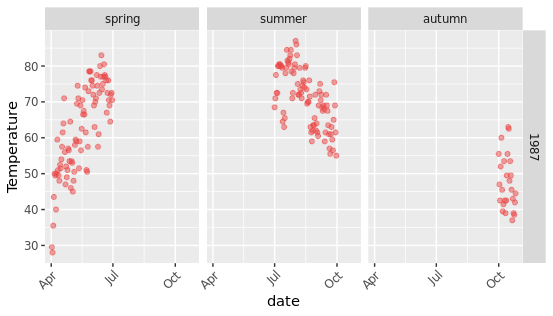
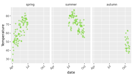
创建单个变量的多面版图
假如有时候想要观察某个变量下不同水平的数据,可以通过分面功能进行指定,例如下面想以季节为区分变量,绘制不同季节的子图:
ggplot(chlr, aes(x = date, y = temp)) +
  geom_point(color = "#79D330", alpha = .5) +
  labs(x = "date", y = "Temperature") +
  theme(
    axis.text.x = element_text(angle = 45, vjust = 1, hjust = 1),
    strip.background = element_blank()# 移除分面标签的背景
  )+
  facet_wrap(~ season,nrow = 1)
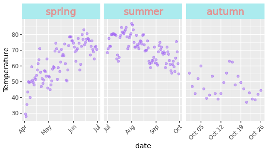
修改条带文本的风格
默认的分面图会在子图的上面添加一个标签注释,我们可以通过修改theme主题中的参数来对其进行修饰,strip.text参数可以控制字体,strip.background可以控制背景颜色。
ggplot(chlr, aes(x = date, y = temp)) +
  geom_point(color = "#A064F3", alpha = .5) +
  labs(x = "date", y = "Temperature") +
  theme(axis.text.x = element_text(angle = 45, vjust = 1, hjust = 1))+
  facet_wrap(~ season, nrow = 1, scales = "free_x") +
  theme(strip.text = element_text(face = "bold", color = "#E39090",
                                  hjust = 0.5, size = 15),
        strip.background = element_rect(fill = "#ABEBEE", linetype = "dotted"))
创建组合图
如果在R语言中绘制了多张图片,现在想将其组合到一起,只需要通过加号连接即可,省去了下载后在Ai里移动拼接的步骤。
p1 <- ggplot(chlr, aes(x = date, y = temp,
                           color = season)) +
      geom_point() +
      geom_rug() +
      labs(x = "date", y = "Temperature")

p2 <- ggplot(chlr, aes(x = date, y = o3)) +
      geom_line(color = "#D2D2D4") +
      geom_point(color = "#D67047") +
      labs(x = "date", y = "zone")

p1 + p2

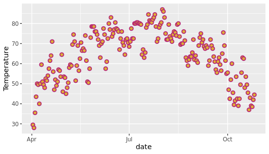
调整颜色
ggplot2绘图可以使用丰富的色彩搭配,在绘图过程中使用color参数能够设置元素描边的颜色,fill参数能够设置填充的颜色,比如下面设置散点图的色彩。
 ggplot(chlr, aes(x = date, y = temp)) +
      geom_point(shape = 21, size = 2, stroke = 1,
                 color = "#B62672", fill = "#DEAE36") +
      labs(x = "date", y = "Temperature")
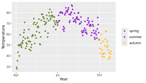
提醒:通过函数scale_*_manual()分配给分类变量(*为color或fill),指定颜色的数量必须与类别的数量相匹配。
ggplot(chlr, aes(x = date, y = temp, color = season)) +
      geom_point() +
      labs(x = "Year", y = "Temperature", color = NULL)+
      scale_color_manual(values = c("darkolivegreen4",
                                    "darkorchid3",
                                    "goldenrod1"))
 还有以下有关颜色的函数可调整颜色:
scale_color_tableau(),scale_color_brewer(palette = "Set1"),scale_color_npg(),scale_color_aaas(),scale_color_gradient2(),这些是系统预设的颜色清单,可以直接进行使用。
修改调色板
刚刚上面提到的修改颜色是针对全局的元素统一设置固定规则,但是有时候我们需要对图中不同的点指定不同的色彩,也就是说图中需要呈现不同的色彩集合。
此时使用scale_color系列函数可以针对颜色创建连续变量,从而实现渐变色的效果,可以根据某列变量对颜色进行映射。
ggplot(chlr, aes(date, temp)) +
      geom_point(aes(color = temp), size = 5) +
      geom_point(aes(color = after_scale(invert_color(color))), size = 2) +  # 修正点
      scale_color_scico(palette = "hawaii", guide = "none") +
      labs(x = "date", y = "Temperature (°F)")
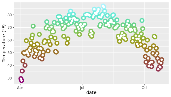
还可使用ggdark和colorspace包中的函数,比如:invert_color()、 lighter()、dark()和desature()更改颜色方案。
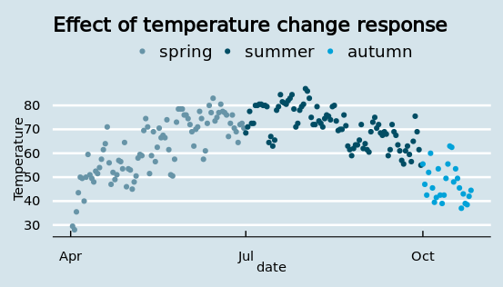
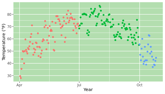
调整主题
ggplot2绘图时可以灵活的切换主题,主要是使用theme系列函数,实现精美图形的绘制,内置了谷歌、BBC、期刊杂志的默认配色风格,开箱即用。
ggplot(chlr, aes(x = date, y = temp, color = season)) +
      geom_point() +
      labs(x = "date", y = "Temperature") +
      ggtitle("Effect of temperature change response") +
      theme_economist() +
      scale_color_economist(name = NULL)
改变所有文本元素的字体
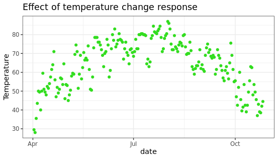
有时候绘制科研图像需要保证字体的统一,可以在主题中通过base_family参数设置固定的字体,方便直接使用。
g <- ggplot(chlr, aes(x = date, y = temp)) +
      geom_point(color = "#32DD1F") +
      labs(x = "date", y = "Temperature",
           title = "Effect of temperature change response")
    g + theme_bw(base_family = "Playfair")
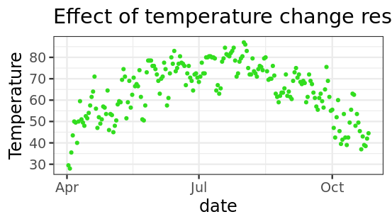
改变所有文本元素的大小
绘制图片时,如果图片的比例比较大,或者横纵坐标轴不适配,可以通过自定义修改图片中文字的大小,另外还有一种方法是在ggsave保存图片时进行长宽限定。
g + theme_bw(base_size = 18, base_family = "Roboto Condensed")
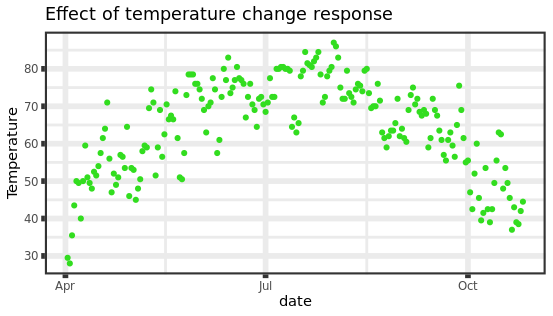
改变矢量元素的大小
图片中背景有浅灰色的辅助线,这些统称为矢量图形,也可以在主题中进行设置,比如使用base_line_size可以设置基础线条的尺寸粗细。
g + theme_bw(base_line_size = 2, base_rect_size = 1.5)
更新当前主题
theme_update函数能够更新主题,在使用时也很方便,用法示例如下:
theme_custom <- theme_update(panel.background = element_rect(fill = "#B3DEAF"))
    ggplot(chlr, aes(x = date, y = temp, color = season)) +
      geom_point() + labs(x = "Year", y = "Temperature (°F)") + guides(color = "none")
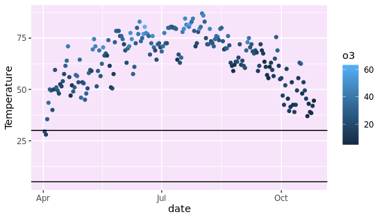
添加辅助线
使用geom_hline()或geom_vline()在坐标上绘制一条辅助线,有时候需要对某些位点做标注时,可以通过这种方式实现,通常用于设置阈值线或者进行分块分组。
ggplot(chlr, aes(x = date, y = temp, color = o3)) +
      geom_point() +
      geom_hline(yintercept = c(5, 30)) +
      labs(x = "date", y = "Temperature")
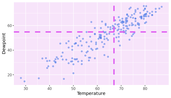
可以同时设置横轴和纵轴的辅助线,并且支持自定义辅助线的大小、颜色、虚线、透明度等参数。
g <- ggplot(chlr, aes(x = temp, y = dewpoint)) +
      geom_point(color = "#4878E6", alpha = .5) +
      labs(x = "Temperature", y = "Dewpoint")
    g +
      geom_vline(aes(xintercept = median(temp)), size = 1.5,
                 color = "#DE5BF1", linetype = "dashed") +
      geom_hline(aes(yintercept = median(dewpoint)), size = 1.5,
                 color = "#DE5BF1", linetype = "dashed")
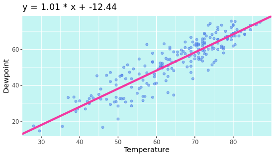
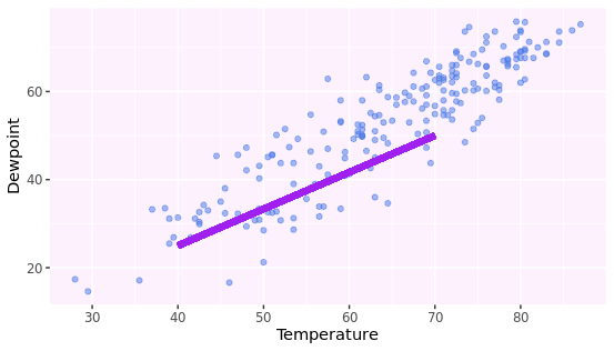
添加一条斜线
添加一条斜率不为0或1的直线,需要使用geom_abline(),比如有时候我们对数据进行回归分析,最终得到了函数方程,可以通过这种方式在图中绘制一条拟合线。
reg <- lm(dewpoint ~ temp, data = chlr)
    g +
      geom_abline(intercept = coefficients(reg)[1],
                  slope = coefficients(reg)[2],
                  color = "#F238A1", size = 1.5) +
      labs(title = paste0("y = ", round(coefficients(reg)[2], 2),
                          " * x + ", round(coefficients(reg)[1], 2)))
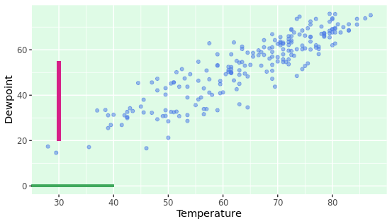
添加一个线段
在图内添加一条线突出显示给定的区域,比如设置图例或者标尺,可以通过geom_linerange函数来规定线段的显示范围。
g +
      geom_linerange(aes(x = 30, ymin = 20, ymax = 55),
                     color = "#D62087", size = 2) +
      geom_linerange(aes(xmin = -Inf, xmax = 40, y = 0),
                     color = "#3FA85B", size = 1)
添加斜线段
使用geom_segment()绘制斜率不为0和1的线段,这种方式通过制定横轴和纵轴的绘制区域,从而锁定一个多边形,可以调整尺寸、颜色、大小等参数。
g +
      geom_segment(aes(x = 40, xend = 70,
                       y = 25, yend = 50),
                   color = "purple", size = 2)
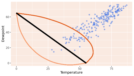
添加曲线图形
图中添加曲线和箭头用geom_curve()函数,绘制生成矢量元素,可以用于标注某些关键信息。
g +
      geom_curve(aes(x = 0, y = 65, xend = 55, yend = 0),
                 size = 1, color = "#F5A177") +
      geom_curve(aes(x = 0, y = 65, xend = 55, yend = 0),
                 curvature = -0.7, angle = 45,
                 color = "#E26426", size = 1) +
      geom_curve(aes(x = 0, y = 65, xend = 55, yend = 0),
                 curvature = 0, size = 1.5)
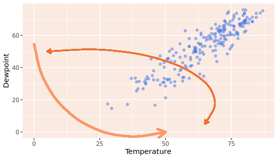
添加箭头
在ggplot2中使用geom_curve也可以用来绘制箭头,在绘制的过程中通过指定curvature和angle等参数来调整箭头线段的角度和位置,还可以自定义设置颜色的大小。
g +
      geom_curve(aes(x = 0, y = 55, xend = 50, yend = 0),
                 size = 1.5, color = "#F79869",
                 arrow = arrow(length = unit(0.07, "npc"))) +
      geom_curve(aes(x = 5, y = 50, xend = 65, yend = 5),
                 curvature = -0.7, angle = 45,
                 color = "#EC7032", size = 1,
                 arrow = arrow(length = unit(0.03, "npc"),
                               type = "closed",
                               ends = "both"))
本文由 mdnice 多平台发布


 被折叠的 条评论
为什么被折叠?
被折叠的 条评论
为什么被折叠?
 到【灌水乐园】发言


