


实现对角渐变边框
border-image-source
这种方式虽然简单但有个明显的缺陷,不支持设置border-radius ,外框想设置成圆角需要加:
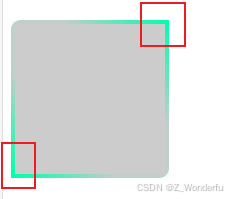
clip-path: inset(0 round 10px);
优点: 内容背景可以透明
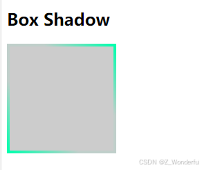
 .box{
        width: 150px;
        height: 150px;
        background: #ccc;
		border: 4px solid;
  		border-image-source: linear-gradient(to right top, #00FFAD,  #00ffae0f, #00ffae0f, #00FFAD);
 		border-image-slice: 1;
    }
background 背景
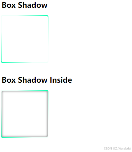
一、
<!DOCTYPE html>
<html>
<head>
<meta charset="utf-8">
<title>CSS3 box-shadow属性示例- 基础教程(cainiaojc.com)</title>
<style>
    .box{
        width: 150px;
        height: 150px;
        border: 0px solid #999;
		border-radius: 5px;
  		position: relative;
  		background-color: white;
	}
	.box::before{
  	 content: '';
 	 position: absolute;
  	 top: -2px; right: -2px; bottom: -2px; left: -2px;/* 边框宽度 */
 	 border-radius: 5px;
	 background: linear-gradient(to right top, #00FFAD,  #00ffae0f, #00ffae0f, #00FFAD);  /*对角渐变*/
  	 z-index: -1;/* 置于内容之下 */
}


	.shadow{
    }
    .shadow-inside{
        box-shadow: inset 0 0 6px 2px #999;
    }
</style>
</head>
<body>
    <h2>Box Shadow</h2>
    <div class="box shadow"></div>
    <br>
    <h2>Box Shadow Inside</h2>
    <div class="box shadow-inside"></div>
</body>
</html>
二、
<!DOCTYPE html>
<html lang="en">
<head>
<meta charset="UTF-8" />
<meta http-equiv="X-UA-Compatible" content="IE=edge" />
<meta name="viewport" content="width=device-width, initial-scale=1.0" />
<title>边框渐变色</title>
</head>
<body>
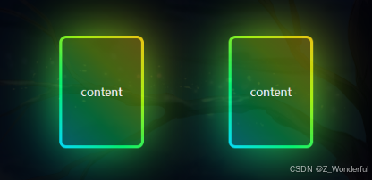
<div class="container">
<div class="box">
<span></span>
<p>content</p>
</div>
<div class="box">
<span></span>
<p>content</p>
</div>
</div>
</body>
</html>
<style>
* {
padding: 0;
margin: 0;
}
.container {
width: 100%;
height: 100vh;
display: flex;
align-items: center;
justify-content: center;
background-color: rgba(0, 0, 0, 1);
}
.box {
position: relative;
width: 120px;
height: 160px;
margin: 60px;
border-radius: 10px;
}
/* 通过伪类覆盖背景渐变色 */
.box::after {
content: '';
position: absolute;
top: 0;
left: 0;
width: 100%;
height: 100%;
border-radius: 10px;
background: linear-gradient(45deg, #00e5ff, #00ff66, #aeff00, #ffd000);
}
/* 通过伪类实现虚化渐变色 */
.box::before {
content: '';
top: 0;
left: 0;
width: 100%;
height: 100%;
position: absolute;
background: linear-gradient(45deg, #00e5ff, #00ff66, #aeff00, #ffd000);
filter: blur(40px);
}
/* 覆盖内部区域,做出边框效果 */
.box span {
position: absolute;
top: 4px;
left: 4px;
right: 4px;
bottom: 4px;
border-radius: 6px;
background-color: rgba(0, 0, 0, 0.6);
z-index: 3;
}
/* 真实的内容区 */
.box p {
position: absolute;
z-index: 5;
width: 100%;
height: 100%;
display: flex;
align-items: center;
justify-content: center;
color: #ffffff;
}
</style>


 扫一扫
扫一扫


 2827
2827

 被折叠的 条评论
为什么被折叠?
被折叠的 条评论
为什么被折叠?
 到【灌水乐园】发言


