使用方法
1.安装
npm install echarts --save
2.main.js 中引入
import Element from 'element-ui'
import './assets/styles/element-variables.scss'
Vue.use(Element, {
  size: Cookies.get('size') || 'medium' // set element-ui default size
})
3.在页面中引入
import * as echarts from "echarts";
4.使用
html:
<div
          class="echart"
          id="activePopulation"
          :style="activePopulationStyle"
        ></div>
data:
activePopulationStyle: {
        width: "95%",
        height: "95%",
        backgroundColor: "white",
      }, //图表样式
mounted:
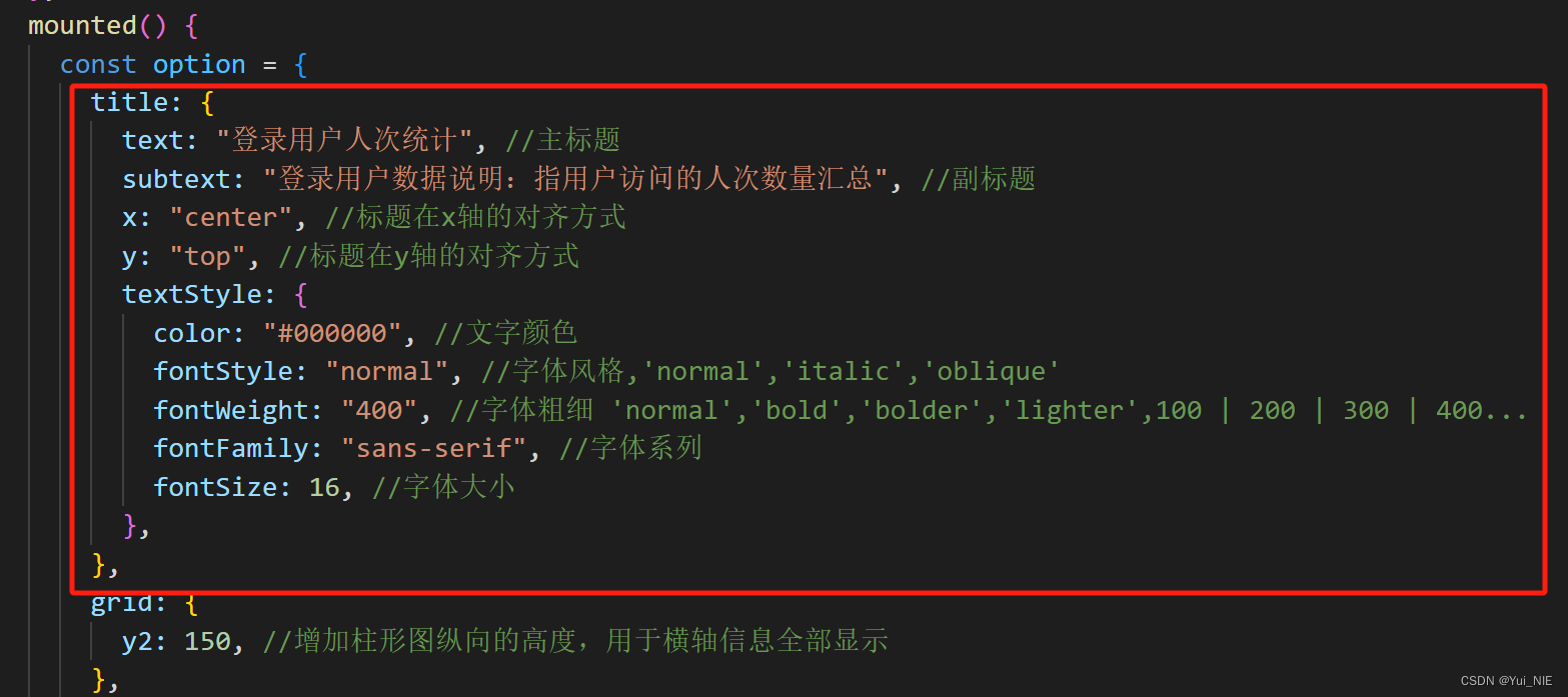
mounted() {
const option = {
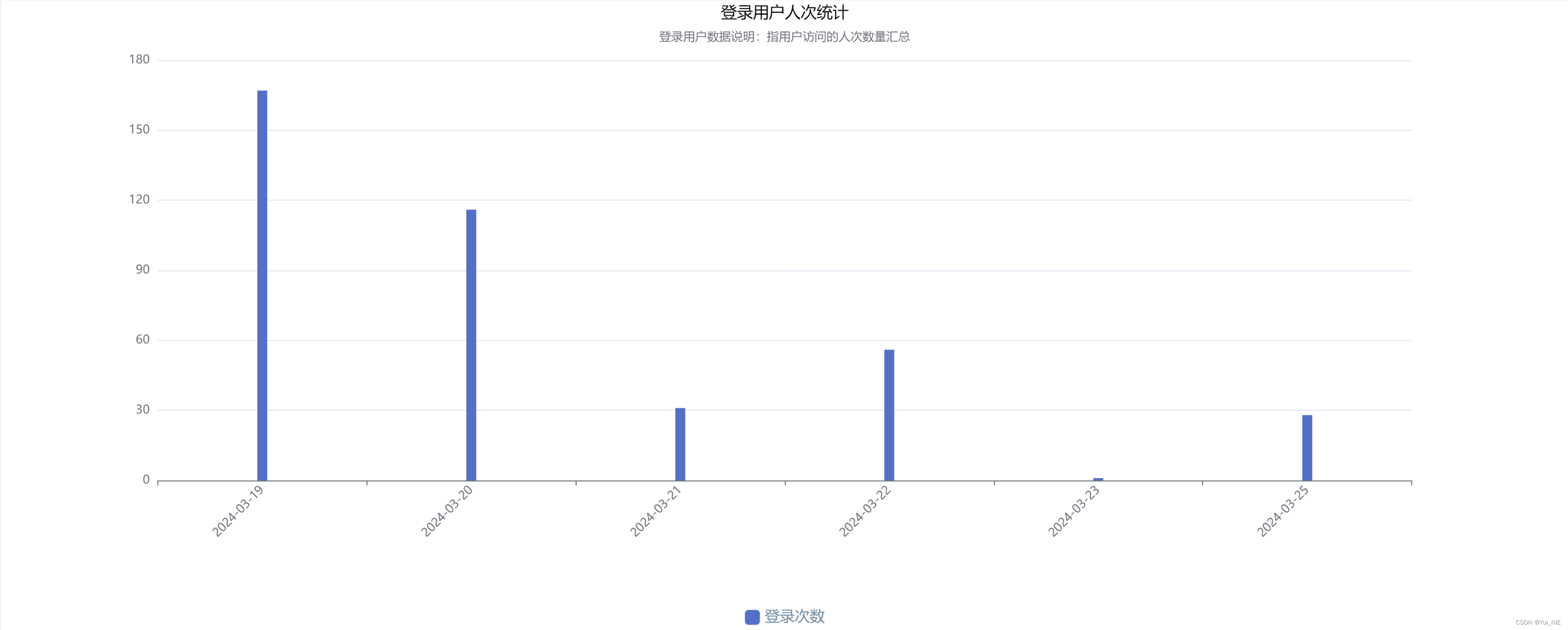
title: {
text: "登录用户人次统计",//主标题
subtext:
"登录用户数据说明:指用户访问的人次数量汇总",//副标题
x: "center",//标题在x轴的对齐方式
y: "top",//标题在y轴的对齐方式
textStyle: {
color: "#000000",//文字颜色
fontStyle: "normal", //字体风格,'normal','italic','oblique'
fontWeight: "400",//字体粗细 'normal','bold','bolder','lighter',100 | 200 | 300 | 400...
fontFamily:'sans-serif',//字体系列
fontSize: 16,//字体大小
},
},
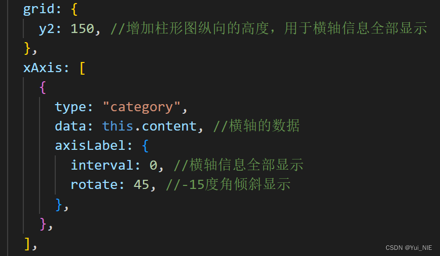
grid: {
y2: 150, //增加柱形图纵向的高度,用于横轴信息全部显示
},
xAxis: [
{
type: "category",
data: this.content,//横轴的数据
axisLabel: {
interval: 0, //横轴信息全部显示
rotate: 45, //-15度角倾斜显示
},
},
],
yAxis: {},
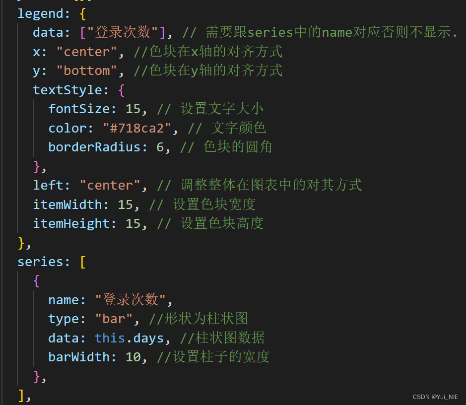
legend: {
data: ["登录次数"], // 需要跟series中的name对应否则不显示.
x: "center",//色块在x轴的对齐方式
y: "bottom",//色块在y轴的对齐方式
textStyle: {
fontSize: 15, // 设置文字大小
color: "#718ca2", // 文字颜色
borderRadius: 6, // 色块的圆角
},
left: "center", // 调整整体在图表中的对其方式
itemWidth: 15, // 设置色块宽度
itemHeight: 15, // 设置色块高度
},
series: [
{
name: "登录次数",
type: "bar", //形状为柱状图
data: this.days,//柱状图数据
barWidth: 10, //设置柱子的宽度
},
],
};
const activePopulation = echarts.init(
document.getElementById("activePopulation")
);
activePopulation.setOption(option);
//随着屏幕大小调节图表
window.addEventListener("resize", () => {
activePopulation.resize();
});
},
常用属性
1.设置柱状图的标题
2.调整x轴的标题全部显示
3.调整色块和柱状的大小


 本文详细介绍了如何在Vue项目中安装和使用ECharts库,展示了一个实例,包括安装步骤、在main.js中引入并配置图表、设置柱状图标题、调整x轴和色块大小,以及响应式地调整图表大小以适应屏幕变化。


 8308
8308

 被折叠的 条评论
为什么被折叠?
被折叠的 条评论
为什么被折叠?
 到【灌水乐园】发言


