


 本文介绍了CSS中实现圆角、阴影效果以及背景图片定位的方法。包括border-radius用于创建圆角,box-shadow设置阴影效果,以及background-size、background-origin和background-clip控制背景图片的尺寸、定位和裁剪。通过示例展示了这些属性的用法,旨在帮助开发者更好地理解和应用这些CSS特性。
border-radius: 圆角(以顺时针的顺序去设置其属性值, 左上角—右上角—右下角—左下角。)
所设置的值越大,圆角越大越圆,最多为高的一半。(要想制作圆型需满足:设置的宽度和高度必
须相同、圆角的半径为元素宽度的一半,或者设置为50%)
box-shadow: 阴影 (属性设置为: box-shadow: x-offset y-offset blur-radius color inset ;)
x-offset :X轴位移,指定阴影水平位移量、
y-offset :Y轴位移,用来指定阴影垂直位移量、
blur-radius: 阴影模糊半径阴影向外模糊的模糊范围、
color: 阴影颜色,定义绘制阴影时所使用的颜色
inset: 阴影类型内阴影,默认为outset外阴影,且不需要设置外阴影为属性值。
background-size: 设置背景图片高度和宽度。第一个值设置宽度,第二个值设置的高度(如果只给出一个值,第二个是设置为"auto"自动)。
background-size:cover; 会保持图像的纵横比并将图像缩放成将完全覆盖背景定位区域的最小大小。
background-size:contain; 会保持图像的纵横比并将图像缩放成将适合背景定位区域的最大大小。
background-origin:padding-box; 背景图像相对于内边距框来定位。
background-origin:border-box; 背景图像会贴在边框的内部来展示。
background-origin:content-box; 背景图像会贴在内容的内部来展示。
background-clip:padding-box; 背景被裁剪到内边距框。
background-clip:border-box; 背景被裁剪到边框盒。
background-clip: content-box; 背景被裁剪到内容框。
origin表示起源即表示在不动图片本身的情况下来进行图片的定位、clip表示修剪即图片的位置已固定好,再依照属性值确定裁剪的位置。
示例:
<!DOCTYPE html>
<html>
<head>
<meta charset="UTF-8">
<meta http-equiv="X-UA-Compatible" content="IE=edge">
<meta name="viewport" content="width=device-width, initial-scale=1.0">
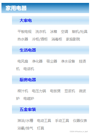
<title>家用电器分类</title>
<style>
*{padding: 0;margin: 0;}
#box{
width: 300px;
margin-left: 5px;
}
#title{
font-size: 18px;
color: white;
font-weight: 700;
padding-left: 14px;
line-height: 35px;
background: linear-gradient(to bottom,#0467ac,#63a7d6,#b6dbf5);
margin: 10px 0;
}
#box dt{
font-size: 14px;
font-weight: 700;
color: #4574BB;
line-height: 30px;
background: linear-gradient(to bottom,#e4f1fa,#bddff7,#e4f1fa);
padding-left: 26px;
margin: 10px 0;
margin-left: 36px;
}
#box dd{
font-size: 12px;
line-height: 26px;
padding-left: 50px;
}
#box dt a{
text-decoration: none;
}
#box dt a:hover{
text-decoration: underline;
}
#box dd a{
text-decoration: none;
color: #8E8E8E;
padding: 0 5px;
}
#box dd a:hover{
text-decoration: underline;
color: #952C12;
}
</style>
</head>
<body>
<div id="box">
<div id="title">家用电器</div>
<div>
<dl>
<dt><a href="#">大家电</a></dt>
<dd> <a href="#">平板电视</a> <a href="#">洗衣机</a> <a href="#">冰箱</a> <a href="#">空调</a> <a href="#">烟机/灶具</a> <a href="#">热水器</a> <a href="#">冷柜/酒柜</a> <a href="#">消毒柜</a> <a href="#">家庭影院</a></dd>
<dt><a href="#">生活电器</a></dt>
<dd> <a href="#">电风扇</a> <a href="#">净化器</a> <a href="#">吸尘器</a> <a href="#">净水设备</a> <a href="#">挂烫机</a> <a href="#">电话机</a></dd>
<dt><a href="#">厨房电器</a></dt>
<dd> <a href="#">榨汁机</a> <a href="#">电压力锅</a> <a href="#">电饭煲</a> <a href="#">豆浆机</a> <a href="#">微波炉</a> <a href="#">电磁炉</a></dd>
<dt><a href="#">五金家装</a></dt>
<dd> <a href="#">淋浴/水槽</a> <a href="#">电动工具</a> <a href="#">手动工具</a> <a href="#">仪器仪表</a> <a href="#">浴霸/排气</a> <a href="#">灯具</a></dd>
</dl>
</div>
</div>
</body>
</html>
示例2:
<!DOCTYPE html>
<html>
<head>
<meta charset="UTF-8">
<meta http-equiv="X-UA-Compatible" content="IE=edge">
<meta name="viewport" content="width=device-width, initial-scale=1.0">
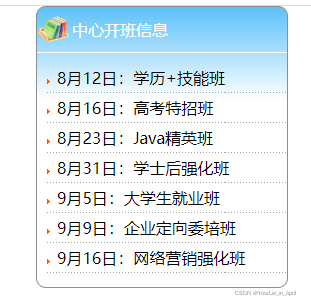
<title>中心开班信息</title>
<style>
*{padding: 0;margin: 0;}
#box{
width: 250px;
height: 280px;
margin: 0 auto;
background: linear-gradient(to bottom,#5bc1f9 ,#FFF,#FFF,#FFF);
border-radius:10px;
border: 1px solid #8E8E8E;
}
#box .title{
background: url(./素材/img/bg.gif) no-repeat 0 50%;
padding-left: 35px;
color: white;
line-height: 45px;
border-bottom: 1px solid white;
}
#box ul{
list-style: none;
padding-top: 10px;
}
#box ul li{
line-height: 30px;
padding-left: 20px;
background: url(./素材/img/dotBg.gif) no-repeat;
}
#box ul a:link{
color: black;
text-decoration: none;
}
#box ul a:hover{
color: #CC593D;
text-decoration: none;
}
</style>
</head>
<body>
<div id="box">
<div class="title">中心开班信息</div>
<ul>
<li><a href="#">8月12日:学历+技能班</a></li>
<li><a href="#">8月16日:高考特招班</a></li>
<li><a href="#">8月23日:Java精英班</a></li>
<li><a href="#">8月31日:学士后强化班</a></li>
<li><a href="#">9月5日:大学生就业班</a></li>
<li><a href="#">9月9日:企业定向委培班</a></li>
<li><a href="#">9月16日:网络营销强化班</a></li>
</ul>
</div>
</body>
</html>
总结:望大佬指正。


 扫一扫
扫一扫


 3649
3649

 被折叠的 条评论
为什么被折叠?
被折叠的 条评论
为什么被折叠?
 到【灌水乐园】发言


