


1. xAxis与 yAxis使用数组方式区分两个axisPointer看以下代码中优先记得类型“category”,这是默认的,本文写上只是提示
其中X轴中的数组两条json都配置了axisPointer,默认初始值,用于区分
重点1:xAxis数组第一条X轴默认是要显示的下面的X轴,颜色啊啥的随便改
第二条数据反而不同,使用了position 定位在bottom 且相关默认开启的属性全部关闭例如splitLine
其中两个的axisPointer并不影响,可以随意配置,例如代码中的示例
重点2:yAxis数组第二条数据show是false,因不需要额外的Y轴展示,只是用来占位补足Echarts规则
重点3:如有多条折线图,只需配置XY轴数组都是两条数据即可,如下面代码,下面会指导使用方式 裙:922473947
  xAxis: [
    {
    type: 'category',
    axisPointer: {
      value: '2016-10-7',
      lineStyle: {
        color: '#7581BD',
        width: 2
      },
      label: {
        show: true,
        formatter: function (params) {
          return echarts.format.formatTime('yyyy-MM-dd', params.value);
        },
        backgroundColor: '#7581BD'
      },
      handle: {
        show: true,
        color: '#7581BD'
      }
    },
    splitLine: {
      show: false
    }
  },
  {
    type: 'category',
    position: 'bottom',
    axisPointer: {
      value: '2016-10-9',
      lineStyle: {
        color: '#7581BD',
        width: 2
      },
      label: {
        show: true,
        formatter: function (params) {
          return echarts.format.formatTime('yyyy-MM-dd', params.value);
        },
        backgroundColor: '#7581BD'
      },
      handle: {
        show: true,
        color: '#7581BD'
      }
    },
    splitLine: {
      show: false
    },
    axisLabel: {
      show: false
    },
    axisLine: {
      show: false
    },
    axisTick: {
      show: false
    }
  }
    ],
  yAxis: [
    {
    type: 'category',
    axisTick: {
      inside: true
    },
    splitLine: {
      show: false
    },
    axisLabel: {
      inside: true,
      formatter: '{value}\n'
    },
    z: 10
  },
  {
    type: 'category',
    show: false,
    axisTick: {
      inside: true
    },
    splitLine: {
      show: false
    },
    axisLabel: {
      inside: true,
      formatter: '{value}\n'
    },
    z: 10
  }]
2. grid配置不需要数组,这个只是示例
  grid: {
    top: 110,
    left: 15,
    right: 15,
    height: 160
  },
3. 本文案例是单折线图拥有双axisPointer,所以在series中的配置也有相关的调整,请看以下代码
同理上面说法,如你是多条折线图,series你在操作所有数据push后,再手动push一条下面固定配置的series第二条数据对象,因为第二个以上的axisPointer需要占位与显示的值
首先是如多条折线图:那么你本地遍历push进series的数据都要配置 yAxisIndex: 0,xAxisIndex: 0,0指得是这些数据表对应的XY轴都是你上面配置XY轴的指定哪条,具体看文档!
第二点:本文series下面代码中第二条数据的yAxisIndex,xAxisIndex是1指得就是上面配置XY轴占位的第二个axisPointer。用于显示生效等
  series: [
    {
      name: 'Fake Data',
      type: 'line',
      smooth: true,
      symbol: 'circle',
      symbolSize: 5,
      sampling: 'average',
      yAxisIndex: 0,
      xAxisIndex: 0,
      itemStyle: {
        color: '#0770FF'
      },
      stack: 'a',
      areaStyle: {
        color: new echarts.graphic.LinearGradient(0, 0, 0, 1, [
          {
            offset: 0,
            color: 'rgba(58,77,233,0.8)'
          },
          {
            offset: 1,
            color: 'rgba(58,77,233,0.3)'
          }
        ])
      },
      data: data
    },
    {
      name: 'Fake Data',
      yAxisIndex: 1,
      xAxisIndex: 1,
      type: 'line',
      smooth: true,
      symbol: 'circle',
      symbolSize: 0,
      sampling: 'average',
      itemStyle: {
        color: 'rgba(0,0,0,0)'
      },
      areaStyle: {
        color: 'rgba(0,0,0,0)'
      },
      data: data
    }
  ]
以下就是全部代码:
let base = +new Date(2016, 9, 3);
let oneDay = 24 * 3600 * 1000;
let valueBase = Math.random() * 300;
let valueBase2 = Math.random() * 50;
let data = [];
let data2 = [];
for (var i = 1; i < 10; i++) {
var now = new Date((base += oneDay));
var dayStr = [now.getFullYear(), now.getMonth() + 1, now.getDate()].join('-');
valueBase = Math.round((Math.random() - 0.5) * 20 + valueBase);
valueBase <= 0 && (valueBase = Math.random() * 300);
data.push([dayStr, valueBase]);
valueBase2 = Math.round((Math.random() - 0.5) * 20 + valueBase2);
valueBase2 <= 0 && (valueBase2 = Math.random() * 50);
data2.push([dayStr, valueBase2]);
}
option = {
title: {
left: 'center',
text: 'Tootip and dataZoom on Mobile Device'
},
legend: {
top: 'bottom',
data: ['Intention']
},
tooltip: {
triggerOn: 'none',
position: function (pt) {
return [pt[0], 130];
}
},
toolbox: {
left: 'center',
itemSize: 25,
top: 55,
feature: {
dataZoom: {
yAxisIndex: 'none'
},
restore: {}
}
},
xAxis: [
{
type: 'category',
axisPointer: {
value: '2016-10-7',
lineStyle: {
color: '#7581BD',
width: 2
},
label: {
show: true,
formatter: function (params) {
return echarts.format.formatTime('yyyy-MM-dd', params.value);
},
backgroundColor: '#7581BD'
},
handle: {
show: true,
color: '#7581BD'
}
},
splitLine: {
show: false
}
},
{
type: 'category',
position: 'bottom',
axisPointer: {
value: '2016-10-9',
lineStyle: {
color: '#7581BD',
width: 2
},
label: {
show: true,
formatter: function (params) {
return echarts.format.formatTime('yyyy-MM-dd', params.value);
},
backgroundColor: '#7581BD'
},
handle: {
show: true,
color: '#7581BD'
}
},
splitLine: {
show: false
},
axisLabel: {
show: false
},
axisLine: {
show: false
},
axisTick: {
show: false
}
}
],
yAxis: [
{
type: 'category',
axisTick: {
inside: true
},
splitLine: {
show: false
},
axisLabel: {
inside: true,
formatter: '{value}\n'
},
z: 10
},
{
type: 'category',
show: false,
axisTick: {
inside: true
},
splitLine: {
show: false
},
axisLabel: {
inside: true,
formatter: '{value}\n'
},
z: 10
}],
grid: {
top: 110,
left: 15,
right: 15,
height: 160
},
series: [
{
name: 'Fake Data',
type: 'line',
smooth: true,
symbol: 'circle',
symbolSize: 5,
sampling: 'average',
yAxisIndex: 0,
xAxisIndex: 0,
itemStyle: {
color: '#0770FF'
},
stack: 'a',
areaStyle: {
color: new echarts.graphic.LinearGradient(0, 0, 0, 1, [
{
offset: 0,
color: 'rgba(58,77,233,0.8)'
},
{
offset: 1,
color: 'rgba(58,77,233,0.3)'
}
])
},
data: data
},
{
name: 'Fake Data',
yAxisIndex: 1,
xAxisIndex: 1,
type: 'line',
smooth: true,
symbol: 'circle',
symbolSize: 0,
sampling: 'average',
itemStyle: {
color: 'rgba(0,0,0,0)'
},
areaStyle: {
color: 'rgba(0,0,0,0)'
},
data: data
}
]
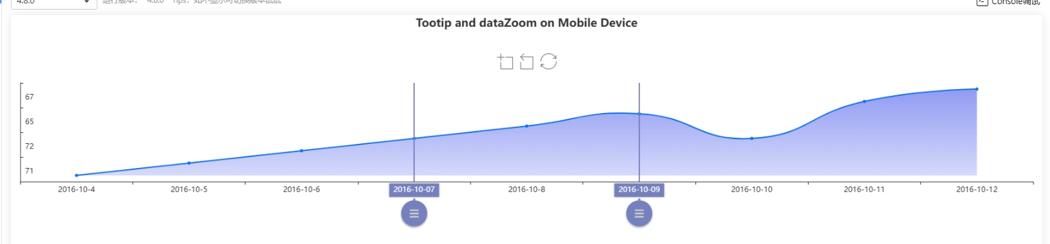
};本文主要描述特殊需求需要两个标线可以随意改变位置然后比较厚拿两线的中间值过程的实现,可以通过chart的api监听事件方法拿到前后的axisPointer值在你本地存储的这个option数据中拿到想要的数据,具体的UI调整看个人。


 1106
1106

 被折叠的 条评论
为什么被折叠?
被折叠的 条评论
为什么被折叠?
 到【灌水乐园】发言


