


 本文介绍了如何在Vue项目中安装并配置Element Plus库,包括依赖安装、全局注册图标组件,以及实战示例。重点讲解了如何正确引入和使用带有图标的el-button组件。
element-plus
1、安装依赖包
npm install element-plus --save
2、在main.js中引入并注册
import { createApp } from 'vue'
import App from './App.vue'
import router from './router'
import store from './store'
import ElementPlus from 'element-plus'
import 'element-plus/dist/index.css'

createApp(App).use(store).use(router).use(ElementPlus).mount('#app')
注意:样式文件也要单独引入
3、使用
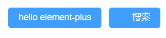
在.vue文件中使用element-plus的el-button组件试试
<el-button type="primary">hello element-plus</el-button>
按钮成功显示!!
再来整一个有图标的按钮
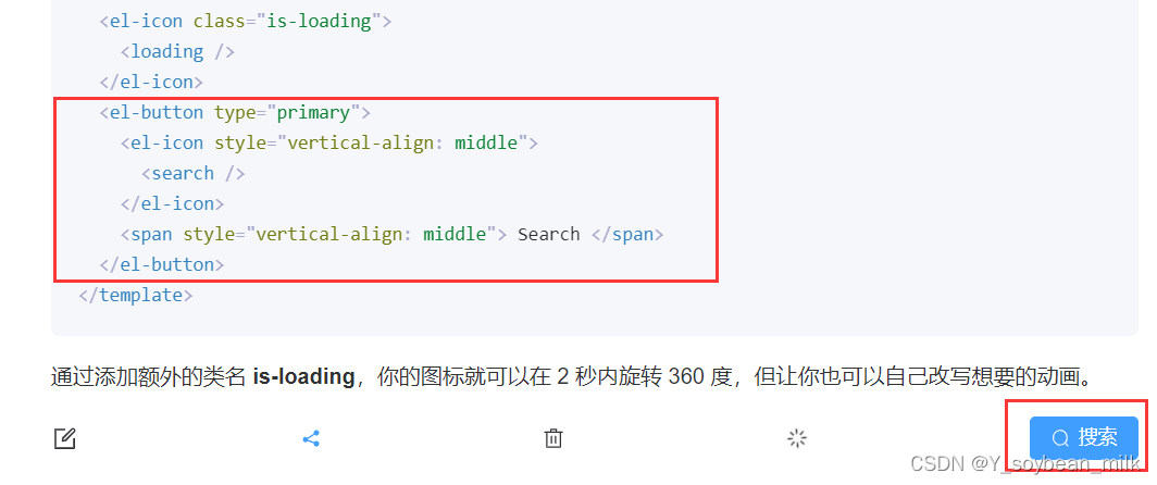
    <el-button type="primary">hello element-plus</el-button>
    <el-button type="primary">
      <el-icon style="vertical-align: middle">
        <search />
      </el-icon>
      <span style="vertical-align: middle"> Search </span>
    </el-button>
我的放大镜图标呢?

查看官方文档后发现,element-plus的icon需要单独下载及引入,具体方法如下
icon部分
1、安装icon的依赖包
npm install @element-plus/icons
2、main.js中全局注册
官方写法
import * as ElementPlusIconsVue from '@element-plus/icons-vue'

const app = createApp(App)
for (const [key, component] of Object.entries(ElementPlusIconsVue)) {
  app.component(key, component)
}
我之前是链式调用注册其它组件的,而此处icon需要循环注册多个,不适合链式调用
所以我换成了和官方相同的全局注册方式
import { createApp } from 'vue'
import App from './App.vue'
import router from './router'
import store from './store'
import ElementPlus from 'element-plus'
import 'element-plus/dist/index.css'
import * as ElementPlusIconsVue from '@element-plus/icons-vue'

// createApp(App).use(store).use(router).use(ElementPlus).mount('#app')
const app = createApp(App)
app.use(store)
app.use(router)
app.use(ElementPlus)
app.mount('#app')
for (const [key, component] of Object.entries(ElementPlusIconsVue)) {
  app.component(key, component)
}
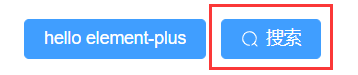
3、使用
现在我们的放大镜图标就出来了~~
end.


 扫一扫
扫一扫


 823
823

 被折叠的 条评论
为什么被折叠?
被折叠的 条评论
为什么被折叠?
 到【灌水乐园】发言


