


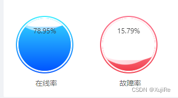
halo,小伙伴们,今天笔者分享一个关于css实现球内(圆形)波浪进度百分比效果,如下图所示:
话不多说上代码,首先是html代码:
          <div class="card1-left-bottom">
            <div class="card1-left-bottom-left">
              <div class="shop_wrap shop_wrap1">
                <div class="TheCircle">
                  <div class="Water">
                    <span class="CenteredText">{{ statisticalAnalysis.useDeviceRatio }}%</span>
                  </div>
                </div>
              </div>
              <div class="card1-left-bottom-title">在线率</div>
            </div>
            <div class="card1-left-bottom-right">
              <div class="shop_wrap shop_wrap2">
                <div class="TheCircle">
                  <div class="Water">
                    <span class="CenteredText">{{ statisticalAnalysis.repairDeviceRatio }}%</span>
                  </div>
                </div>
              </div>
              <div class="card1-left-bottom-title">故障率</div>
            </div>
          </div>
css代码:
        .card1-left-bottom{
          position: relative;
          overflow: auto;
          margin-top: 28px;

          .card1-left-bottom-right{
            width: 50%;
            float: left;
          }
          .card1-left-bottom-left{
            width: 50%;
            float: left;

          }
          .card1-left-bottom-title{
            width: 118px;
            text-align: center;
            font-size: 14px;
            margin-top: 8px;
          }

          .shop_wrap {
            width: max-content;
            padding: 3px; /* 设置外层容器的内边距 */
            background: linear-gradient(360deg, #0055ff 0%, #33eeff);
            border-radius: 50%;

            .TheCircle {
              position: relative;
              width: 106px; /* 设置圆形容器的宽度 */
              height: 106px; /* 设置圆形容器的高度 */
              //padding: 2px;
              box-sizing: border-box;
              border-radius: 50%; /* 圆形容器的圆角半径 */
              border: 2px solid #fff; /* 圆形容器的边框样式 */
              //background: linear-gradient(360deg, #0055ff 0%, #33eeff) 1.68 1.68;
              box-shadow: 0 0 0 1px #fff; /* 圆形容器的阴影样式 */
              //box-shadow: 0 0 0 1px linear-gradient(0deg, #025bff 0%, #2ec8ff 50%) 1.12 1.12; /* 圆形容器的阴影样式 */
              overflow: hidden; /* 确保容器裁剪水波纹效果 */
              cursor: pointer; /* 鼠标悬停时显示手型光标 */
            }

            .Water {
              position: absolute;
              top: 0;
              left: 0;
              width: 100%;
              height: 100%;
              //background-color: #38b973; /* 水波纹的颜色 */
              background: linear-gradient(360deg,#0055ff 0%, #33d6ff 100%, #33d6ff 91%);
              border-radius: 50%;
              overflow: hidden;
              z-index: 1; /* 确保水波纹在文字之上 */
            }

            .CenteredText {
              position: absolute;
              top: 20%;
              left: 50%;
              transform: translate(-50%, -50%); /* 居中显示文字 */
              color: #333; /* 文字颜色 */
              z-index: 2; /* 确保文字在水波纹之上 */
              height: 14px;
            }

            .Water::after {
              content: '';
              position: absolute;
              //top: 0;
              top: var(--after-top, 0);
              left: 50%;
              width: 162%;
              height: 162%;
              border-radius: 40%;
              background-color: rgb(255, 255, 255); /* 水波纹内部颜色 */
              animation: real 5s linear infinite; /* 实际水波纹的动画效果 */
            }

            @keyframes real {
              0% {
                /* 初始状态:向上平移50%、左平移65%并旋转0度 */
                transform: translate(-50%, -66%) rotate(0deg);
              }
              100% {
                /* 终止状态:向上平移50%、左平移65%并旋转360度,形成旋转一周的效果 */
                transform: translate(-50%, -66%) rotate(360deg);
              }
            }

            .Water::before {
              content: '';
              position: absolute;
              //top: 0;
              top: var(--before-top, 0); /* 使用 CSS 变量 */
              left: 50%;
              width: 150%;
              height: 150%;
              border-radius: 42%;
              //background-color: rgb(240, 228, 228, 0.2); /* 水波纹外部颜色及透明度 */
              background: linear-gradient(360deg, #a3c0ff 0%, #acecff 100%, #a1ebff 91%);
              opacity: 1;
              animation: virtual 8s linear infinite; /* 虚拟水波纹的动画效果 */
            }

            @keyframes virtual {
              0% {
                /* 初始状态:向上平移50%、左平移60%,不进行缩放,旋转0度 */
                transform: translate(-50%, -60%)  scale(1)  rotate(0deg);
              }

              100% {
                /* 终止状态:向上平移50%、左平移60%,进行1.1倍的缩放,旋转360度,
                形成旋转一周的效果并放大水波纹 */
                transform: translate(-50%, -60%) scale(1) rotate(360deg);

              }
            }
          }
          .shop_wrap2{
            background: linear-gradient(360deg, #f23e4e 1%, #fc6b86 100%);
            .Water{
              background: linear-gradient(360deg,#f23d4c 0%, #ffe0e8 100%, #fd8daa 91%);
              //background: linear-gradient(360deg,#f23d4c 34%, #fbb3c6 100%);
            }

            .Water::before {
              background: linear-gradient(360deg, #ffb4bd 0%, #ffe9ee 100%, #ffd1de 91%);
            }
          }
        }
其中球形是从shop_wrap 类开始的,波浪主要是使用伪类after 和before 来生成的。
接着JavaScript中在获取到数据(百分比的值以后),进行设置伪类的高度来实现波浪的高低
      this.$nextTick(()=>{// 获取 .Water 的引用
        var water1 = document.querySelector('.shop_wrap1 .Water');

        water1.style.setProperty('--after-top', 40-this.statisticalAnalysis.useDeviceRatio+'%');
        water1.style.setProperty('--before-top', 40-this.statisticalAnalysis.useDeviceRatio+'%');


        var water2 = document.querySelector('.shop_wrap2 .Water');

        water2.style.setProperty('--after-top', 40-this.statisticalAnalysis.repairDeviceRatio+'%');
        water2.style.setProperty('--before-top', 40-this.statisticalAnalysis.repairDeviceRatio+'%');
      })
这样就可以实现球形波浪百分比进度了,好了笔者就分享到这了,如果有更好的实现方法请告诉我哦~


 扫一扫
扫一扫


 1275
1275

 被折叠的 条评论
为什么被折叠?
被折叠的 条评论
为什么被折叠?
 到【灌水乐园】发言


