


 本文详细介绍了CSS如何控制背景,包括背景图片定位、依附方式以及CSS精灵技术,同时深入讲解了CSS浮动布局,如文档流、浮动布局和定位布局,通过实例代码演示了常见布局效果,帮助理解并掌握这些前端基础技术。
一、css控制背景
背景图片,默认情况下是平铺的,并且在左上角;、

<!doctype html>
<html lang="en">
 <head>
  <meta charset="UTF-8">
  <meta name="Generator" content="EditPlus®">
  <meta name="Author" content="">
  <meta name="Keywords" content="">
  <meta name="Description" content="">
  <title>css控制背景与css精灵</title>
  <style type="text/css">
  body,div{margin:0;padding:0;}
  body{padding:100px;}
  #tok{width:700px;
  height:700px;
  background-color:gold;
  background-image:url(images/timg.jpg);
  }
  </style>
 </head>
 <body>
  <div id="tok">div 默认是个块元素,很霸道,独占一行</div>
 </body>
</html>
background-repeat:no-repeat;
background-position:center center;(2)、除了上述用几个单词进行定位外,还可以直接用数值来定位;
/*background-position:center center;*/
  background-position:100px 200px;
(3)、设置图片是否随框移动或者固定(默认是滚动的)
图片的依附方式:固定的含义:将图片固定在屏幕(可视区域)的某个位置;用background-attachment属性实现;
/*background-position:center center;*/
  /*background-position:100px 200px;*/
   background-attachment:fixed;
兼容性:IE6只有HTML和body两个元素,支持这个属性值;
(4)、接下来介绍一种让你显得专业一点的技巧:
翻转效果:其实思路就是准备两张大小相同、内容不同的图片,正常情况下显示一张,鼠标经过的时候显示另一张。如下所示:
:link 伪类,表示一种状态
a{
		  width:88px;
		  height:44px;
		  display:block;
		 /* background:#ECECED;*/
		background:url(images/link.png) no-repeat;
  }
   a:hover{
<body>
<a href="#"></a>
<a href="#" id="btn"></a>
</body>(5)、CSS精灵进阶技术:上面我们只是说了第一种情况,下面我们讲的是第二种;
直接看概念可能看不太懂,那我们直接用代码实现:
在上面代码的基础上新增如下代码:
#btn{
  margin-top:100px;
   background:url(images/botton.png);
  }
  #btn:hover{
   background-position:0px -44px;
  }
这样操作就可以实现第二种技术,在一些大型的网站中都用的是第二种技术,比如说网易邮箱,就会用这种图片合成的方式,优点主要就是为了减少http请求;
二、CSS浮动技术
(1)首先来看看什么是文档流布局:比较好理解就是按照文档的正常结构顺序;
<!doctype html>
<html lang="en">
 <head>
  <meta charset="UTF-8">
  <meta name="Generator" content="EditPlus®">
  <meta name="Author" content="">
  <meta name="Keywords" content="">
  <meta name="Description" content="">
  <title>文档流布局</title>
  <style type="text/css">
  div{
  width:100px;
  height:100px;
  font-size:12px;
  font-weight:bold;
  }
  #one{background:red;}
   #two{background:green;}
    #three{background:blue;}
  </style>
 </head>
 <body>
  <div id="one" >1</div>
  <div id="two">2</div>
  <div id="three">3</div>
 </body>
</html>
(2)浮动布局:在上面的基础上,用float语句。
(3)定位布局:在第一个基础上用absolute语句;
(4)重点今天的笔记中会介绍 浮动布局:浮动属性就只有向左和向右两个,浮动到父元素的边框;
浮动是将,块元素的霸道属性,独占一行的行为,取消,允许别人与他同一行;
浮动其实是,这个块,从原来的文档流模式中,分离出来,它后的对象,就视它不存在。
常用的布局效果:例如,一行并列式,就是在一行中,显示几个块元素。(css把网页元素分成两种:一种是块,一种是内联。body,div,p,h1是块)要想很好的了解兼容性就要求我们在写代码的时候用不同的浏览器查看效果。
ul和li默认情况是块元素,要想让他们在同一行显示,就要用到浮动。
下面进行代码演习:
<!doctype html>
<html lang="en">
 <head>
  <meta charset="UTF-8">
  <meta name="Generator" content="EditPlus®">
  <meta name="Author" content="">
  <meta name="Keywords" content="">
  <meta name="Description" content="">
  <title>文档流布局</title>
  <style type="text/css">
  body,div,ul,li,img{margin:0;padding:0;}
		 ul{
		 width:960px;
		 height:160px;
		 border:1px solid black;
                 margin:100px auto;
                 list-style:none;}
                 li{float:left;margin:5px;}</style>
 </head>
 <body>
	  <ul>
                        <li id="one"><img src="images/1.jpg"></li>
			<li id="two"><img src="images/2.jpg"></li>
			<li id="three"><img src="images/3.jpg"></li>
			<li id="four"><img src="images/4.jpg"></li>
	  </ul>
 </body>
</html>
运行会出现以下结果:这时我们看到没有紧贴边框,这说明元素存在默认的内外边距,所以我们需要一行代码把他们都去掉。
body,div,ul,li,img{margin:0;padding:0;}
margin:100px auto;这句代码的作用就是使得ul上下100px,水平自适应。如果想让多个块,显示在同一行,可以将,这些块,都设置为浮动,并且浮动方向相同。将一切设置好之后,效果如下所示:

到这里为止:CSS控制背景、CSS精灵以及浮动技术介绍完毕,要通过更多的练习,使用起来才会更加得心应手。
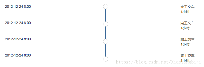
前端css实现最基本的时间轴的示例代码
本文介绍了前端css实现最基本的时间轴的示例代码,分享给大家,具体如下:<!DOCTYPE html >
<html>
<head>
<link rel="stylesheet" href="http://cdn.static.runoob.com/libs/bootstrap/3.3.7/css/bootstrap.min.css">
<script src="http://cdn.static.runoob.com/libs/jquery/2.1.1/jquery.min.js"></script>
<script src="http://cdn.static.runoob.com/libs/bootstrap/3.3.7/js/bootstrap.min.js"></script>
<meta charset="UTF-8">
<title>状态详情</title>
<style>
#timeleft div {
height: 65px;
color: #333333;
}
#timecenter div {
height: 65px;
color: #333333;
}
#timeright div {
height: 65px;
color: #333333;
}
#timeright div p {
margin: 0 0 0px;
}
.cicle1 {
position: absolute;
top: 0px;
left: -10px;
border-radius: 10px;
list-style: none;
width: 20px;
height: 20px;
border: 1px solid #cccccc;
background: #ffffff;
}
.cicle2 {
position: absolute;
top: 70px;
left: -10px;
border-radius: 10px;
list-style: none;
width: 20px;
height: 20px;
border: 1px solid #cccccc;
background: #ffffff;
}
.cicle3 {
position: absolute;
top: 140px;
left: -10px;
border-radius: 10px;
list-style: none;
width: 20px;
height: 20px;
border: 1px solid #cccccc;
background: #ffffff;
}
.cicle4 {
position: absolute;
top: 210px;
left: -10px;
border-radius: 10px;
list-style: none;
width: 20px;
height: 20px;
border: 1px solid #cccccc;
background: #ffffff;
}
</style>
<meta content='width=device-width, initial-scale=1, maximum-scale=1, user-scalable=no' name='viewport'>
</head>
<body>
<!--右侧信息-->
<div class="col-md-10 col-sm-10 col-xs-10" style="margin-top:30px;">
<div class="col-md-4 col-sm-4 col-xs-4" id="timeleft">
<div>2012-12-24 8:00</div>
<div>2012-12-24 8:00</div>
<div>2012-12-24 8:00</div>
<div>2012-12-24 8:00</div>
</div>
<div class="col-md-4 col-sm-4 col-xs-4" id="timecenter">
<div style="height:212px; border-left:1px solid #366595; position:absolute; left:65px;">
<ul>
<li class="cicle1"></li>
<li class="cicle2"></li>
<li class="cicle3"></li>
<li class="cicle4"></li>
</ul>
</div>
</div>
<div class="col-md-4 col-sm-4 col-xs-4" id="timeright">
<div>
<p>完工交车</p>
<p>1小时</p>
</div>
<div>
<p>完工交车</p>
<p>1小时</p>
</div>
<div>
<p>完工交车</p>
<p>1小时</p>
</div>
<div>
<p>完工交车</p>
<p>1小时</p>
</div>
</div>
</div>
</body>
</html>


 扫一扫
扫一扫


 2869
2869

 被折叠的 条评论
为什么被折叠?
被折叠的 条评论
为什么被折叠?
 到【灌水乐园】发言


