


 本文详细记录了CSS的学习过程,包括CSS的基本语法、选择器的使用、文本属性、背景属性、浮动、盒子模型、定位、链接的网页跳转、精灵图、响应式布局以及表单元素的进阶应用。内容涵盖了元素选择器、文本样式、背景图片、浮动、定位、宽高自适应和表单元素如单选框、复选框、文本域的使用等,是CSS初学者和复习者的重要参考资料。
关于css的学习
从零开始学习css的过程,做一下记录,复习用。
文章目录
前言
若在许我年少时,一两黄金一两风。
少年去做你想做的事情吧,别留遗憾。
一、css是什么?
层叠样式表(英文全称:Cascading Style Sheets)是一种用来表现HTML(标准通用标记语言的一个应用)或XML(标准通用标记语言的一个子集)等文件样式的计算机语言。CSS不仅可以静态地修饰网页,还可以配合各种脚本语言动态地对网页各元素进行格式化。
二、css语法
1.css表达式
内部表达式
内部表达式的写法
<!DOCTYPE html>
<html lang="en">
<head>
    <meta charset="UTF-8">
    <meta http-equiv="X-UA-Compatible" content="IE=edge">
    <meta name="viewport" content="width=device-width, initial-scale=1.0">
    <title>Document</title>
    <style>
        h1{
            color:red;
        }
        h2{
            color:blue;
        }
        h3{
            color:yellow;
        }
    </style>
</head>
<body>

    <h1>11111</h1>
    <h2>22222</h2>
    <h3>33333</h3>
</body>
</html>
外部表达式
外部表达式的两种写法
<!DOCTYPE html>
<html lang="en">
<head>
    <meta charset="UTF-8">
    <meta http-equiv="X-UA-Compatible" content="IE=edge">
    <meta name="viewport" content="width=device-width, initial-scale=1.0">
    <title>Document</title>
    <link rel="stylesheet" href="">
    <!--link  rel链接 stylsheet样式表   relation定义关联性-->
    <!-- <link rel="stylesheet" type="text/css" href="./css/0029css.css"> -->
    <!--利用import引入css文件-->
    <style>
        @import url(css/0029css.css);
    </style>

</head>
<body>
    <div><h1>11111</h1></div>
</body>
</html>
行内表达式的写法
<!DOCTYPE html>
<html lang="en">
<head>
    <meta charset="UTF-8">
    <meta http-equiv="X-UA-Compatible" content="IE=edge">
    <meta name="viewport" content="width=device-width, initial-scale=1.0">
    <title>Document</title>
</head>
<body>
    <h1 style="color: red;">11111111</h1>
</body>
</html>
样式表的优先级
优先级是行内>内部 >外部
!impprtant 是重要的强制选择
<!DOCTYPE html>
<html lang="en">
<head>
    <meta charset="UTF-8">
    <meta http-equiv="X-UA-Compatible" content="IE=edge">
    <meta name="viewport" content="width=device-width, initial-scale=1.0">
    <title>Document</title>
    <link rel="stylesheet"  href="./css/0031.css">
    <style>
        div{
            color: yellow;
        }
    </style>
</head>
<body>
    <!-- 行内>内部>外部  important重要的强制选择-->
    <div style="color: green!important;">11111</div>
</body>
</html>
2.选择器
元素选择器
<!DOCTYPE html>
<html lang="en">
<head>
    <meta charset="UTF-8">
    <meta http-equiv="X-UA-Compatible" content="IE=edge">
    <meta name="viewport" content="width=device-width, initial-scale=1.0">
    <title>Document</title>
    <style>
        div{
            background-color: orange;
            color:red;
        }
        h1{
            color: blue;
        }
        p{
            color: aqua;
        }
    </style>
</head>
<body>
    <div>111111</div>
    <div>222222</div>
    <h1>3333333</h1>
    <h1>4444444</h1>
    <p>555555</p>
</body>
</html>
类选择器class
<!DOCTYPE html>
<html lang="en">
<head>
    <meta charset="UTF-8">
    <meta http-equiv="X-UA-Compatible" content="IE=edge">
    <meta name="viewport" content="width=device-width, initial-scale=1.0">
    <title>Document</title>
    <style>
        .ibm{
            background-color: red;
        }
        .huahua{
            color: aliceblue;
        }
    </style>
</head>
<body>
    <!--class style标签里用的是.如果重复选取下面的 class能同时取值多个数据 -->
    <div>111</div>
    <div class="ibm huahua">222</div>
    <div class="ibm">333</div>
    <div class="ibm">444</div>
    <div>555</div>
    <div>666</div>
</body>
</html>
id选择器
<!DOCTYPE html>
<html lang="en">
<head>
    <meta charset="UTF-8">
    <meta http-equiv="X-UA-Compatible" content="IE=edge">
    <meta name="viewport" content="width=device-width, initial-scale=1.0">
    <title>Document</title>
    <style>
        #box1{
            color: aliceblue;
        }
        #box2{
            color:aquamarine
        }
        #box3{
            color: cadetblue;
        }
    </style>
</head>
<body>
    <!--id是用前面是用style是# id有唯一性-->
    <div id="box1">1</div>
    <div id="box2">2</div>
    <div id="box3">3</div>
</body>
</html>
通配选择器
<!DOCTYPE html>
<html lang="en">
<head>
    <meta charset="UTF-8">
    <meta http-equiv="X-UA-Compatible" content="IE=edge">
    <meta name="viewport" content="width=device-width, initial-scale=1.0">
    <title>Document</title>
    <style>
        /* 通配符改掉所有的数据 */
        *{
            /* 外边距 */
            margin: 0;
            /* 内边距 */
            padding: 0;
        }
    </style>
</head>
<body>
    <h1>标题</h1>
    <p>11111</p>
    <ul>
        <li>111</li>
        <li>222</li>
        <li>333</li>
    </ul>
</body>
</html>
群组选择器
<!DOCTYPE html>
<html lang="en">
<head>
    <meta charset="UTF-8">
    <meta http-equiv="X-UA-Compatible" content="IE=edge">
    <meta name="viewport" content="width=device-width, initial-scale=1.0">
    <title>Document</title>
    <style>
       div,p,h1{
           background-color: yellow;
       }
    </style>
</head>
<body>
    <div>111</div>
    <p>111</p>
    <h1>111</h1>
</body>
</html>
后代选择器
<!DOCTYPE html>
<html lang="en">
<head>
    <meta charset="UTF-8">
    <meta http-equiv="X-UA-Compatible" content="IE=edge">
    <meta name="viewport" content="width=device-width, initial-scale=1.0">
    <title>Document</title>
    <style>
        /* 后代选择器,包含选择器 通过空格选择 选择器是从右向左的选择 先找子标签 再找父标签*/
        div p{
            background-color: aliceblue;
        }
    </style>
</head>
<body>
    <div>
        <p>11111</p>
    </div>
    <p>2222</p>
</body>
</html>
伪类选择器
<!DOCTYPE html>
<html lang="en">
<head>
    <meta charset="UTF-8">
    <meta http-equiv="X-UA-Compatible" content="IE=edge">
    <meta name="viewport" content="width=device-width, initial-scale=1.0">
    <title>Document</title>
    <style>
        a:link{
            color: yellow;
        }
        a:visited{
            color: red;
        }
        a:hover{
            color: orange;
        }
        a:active{
            color: blue;
        }

    </style>
</head>
<body>
    <!--link(超链接的初始状态) visited(超链接被访问后的状态)hover(鼠标悬停或者划过超链接的状态)active(超链接被激活时的状态)-->
    <!--link visited hover active 四个顺序不能交换-->
    <a href="http://www.baidu.com">百度</a>

</body>
</html>
link超链接的初始状态
visited超链接被访问后的状态
hover鼠标悬停或者划过的状态
active超链接被激活后的状态
四个顺序不能互换
选择器的权重
id选择器>class选择器>元素选择器
<!DOCTYPE html>
<html lang="en">
<head>
    <meta charset="UTF-8">
    <meta http-equiv="X-UA-Compatible" content="IE=edge">
    <meta name="viewport" content="width=device-width, initial-scale=1.0">
    <title>Document</title>
    <style>
        div{
            background-color: yellow;
        }
        .adiv{
            background-color: red;
        }
        #bdiv{
            background-color: green;
        }
    </style>
</head>
<body>
    <!--id选择器>class选择器>元素选择器-->
    <div class="adiv" id="bdiv">
        <h1>11111</h1>
    </div>
</body>
</html>
3.文本属性
字体大小font-size及其字体类型font-family
<!DOCTYPE html>
<html lang="en">
<head>
<meta charset="UTF-8">
<meta http-equiv="X-UA-Compatible" content="IE=edge">
<meta name="viewport" content="width=device-width, initial-scale=1.0">
<title>Document</title>
<style>
/* font-size(字体大小) font-family(字体种类) */
.p1{
font-size: 50px;
font-family:宋体;
}
</style>
</head>
<body>
<p class="p1">终其一生 满是遗憾</p>
</body>
</html>
字体颜色color
red
rgb
rgba
#14c145
<!DOCTYPE html>
<html lang="en">
<head>
<meta charset="UTF-8">
<meta http-equiv="X-UA-Compatible" content="IE=edge">
<meta name="viewport" content="width=device-width, initial-scale=1.0">
<title>Document</title>
<style>
.p1{
/* color: red; */
/* color:rgb(89, 151, 182) */
color:#14c145;
}
/* 十进制0-9 二进制0-1 十六进制 0-9 a-f
颜色为6位十六进制的数 前两位是红色中间两位绿色后两位蓝色 两位数相同时可以省略一个如 0000ff可写为00f */
</style>
</head>
<body>
<p class="p1">终其一生 满是遗憾</p>
</body>
</html>
文本加粗font-weight与倾斜font-style
font-weight:
ligter 细体 100-400
normal 常规的 400
bolder 更粗的 400-700
bold 加粗 700-900
font-style
italic 倾斜字体
oblique 更倾斜的字体
normal 常规显示
<!DOCTYPE html>
<html lang="en">
<head>
<meta charset="UTF-8">
<meta http-equiv="X-UA-Compatible" content="IE=edge">
<meta name="viewport" content="width=device-width, initial-scale=1.0">
<title>Document</title>
<!-- font-weight加粗font-weight:ligter(细体)/bolder(更粗的)/bold(加粗)/normal(常规的)
font-weight:100-900;100细体ligter 400正常normal 700加粗bold 900更粗bolder
font-style倾斜font-style:italic(斜体字)/oblique(更倾斜的字体)/normal(常规显示); -->
<style>
.p1{
background-color: aquamarine;
color: burlywood;
font-size: 80px;
font-family: 楷书;
font-weight: bold;
font-style: italic;
}
.p2{
font-weight: 100;
font-style: oblique;
}
</style>
</head>
<body>
<p class="p1">
终其一生 满是遗憾
</p>
<h1 class="p2" >
我是标题
</h1>
</body>
</html>
水平对齐text-align单行文本居中line-height
text-algin的属性
left
right
center
justify(两端对齐)多行文本中有效果
<!DOCTYPE html>
<html lang="en">
<head>
<meta charset="UTF-8">
<meta http-equiv="X-UA-Compatible" content="IE=edge">
<meta name="viewport" content="width=device-width, initial-scale=1.0">
<title>Document</title>
<style>
/* left right center justify(两端对齐)多行文本中有效果 */
.box1{
text-align:center;
width: 200px;
background-color: yellow;
}
.box2{
width: 500px;
height: 100px;
background-color: green;
line-height: 100px;
text-align: center;
}
</style>
</head>
<body>
<div class="box1" >终其一生 满是遗憾</div>
<div class="box2" >终其一生 满是遗憾</div>
</body>
</html>
文本间距spacing和首行缩进indent
letter-spacing 字符间距
word-spacing 词间距
text-indent 首行缩进 2m是字体的两倍 只对首行生效
<!DOCTYPE html>
<html lang="en">
<head>
    <meta charset="UTF-8">
    <meta http-equiv="X-UA-Compatible" content="IE=edge">
    <meta name="viewport" content="width=device-width, initial-scale=1.0">
    <title>Document</title>
    <style>
        .p1{
            letter-spacing: 15px;
        }
        .p2{
            letter-spacing: 8px;
        }
        .p3{
            word-spacing: 15px;
        }
        .p4{
            text-indent: 32px;
        }
    </style>
</head>
<body>
    <!--letter-spacing 字符间距  word-spacing 词间距    text-indent 首行缩进 2em是当前字体两倍 只对首行生效-->
    <p class="p1">
        以前总说,海底月是天上月,眼前人是心上人。后来才懂,海底月捞不起,心上人不可及。我曾经天真的认为,用真心对任何人,就可以得到真正的友情,真正的爱情。后来,认识了一些人,经历了一些事,才知道一切都只是我以为。别去打扰那些连回你话都带着敷衍的人,别去打扰一个不愿意理你的人,难受的始终是自己。
    </p>
    <p class="p2">
        I will chorish everyonr , but i will not retain anyone .You never feel my lonliness .Grievance is like swallowing glass fragments , full of blood but can not spit out .
    </p>
    <p class="p3">
        I will chorish everyonr , but i will not retain anyone .You never feel my lonliness .Grievance is like swallowing glass fragments , full of blood but can not spit out .
    </p>
    <p class="p4">
        以前总说,海底月是天上月,眼前人是心上人。后来才懂,海底月捞不起,心上人不可及。我曾经天真的认为,用真心对任何人,就可以得到真正的友情,真正的爱情。后来,认识了一些人,经历了一些事,才知道一切都只是我以为。别去打扰那些连回你话都带着敷衍的人,别去打扰一个不愿意理你的人,难受的始终是自己。
    </p>
</body>
</html>
修改线text-decoration
text-decoration:
none 没有
underline 下划线
overline 上划线
line-through 删除线
<!DOCTYPE html>
<html lang="en">
<head>
    <meta charset="UTF-8">
    <meta http-equiv="X-UA-Compatible" content="IE=edge">
    <meta name="viewport" content="width=device-width, initial-scale=1.0">
    <title>Document</title>
    <style>
        .p2{
            font-size: 10px;
            letter-spacing: 5px;
            text-indent: 2em;
            text-decoration: underline;
            text-decoration-color: blue;
            text-decoration-style: dotted;
        }
        .p1{
            text-decoration: line-through underline ;
        }
    </style>
</head>
<body>
    <!--none没有  underline下划线  overline上划线  line-througn删除线-->
    <p class="p">
        以前总说,海底月是天上月,眼前人是心上人。后来才懂,海底月捞不起,心上人不可及。我曾经天真的认为,用真心对任何人,就可以得到真正的友情,真正的爱情。后来,认识了一些人,经历了一些事,才知道一切都只是我以为。别去打扰那些连回你话都带着敷衍的人,别去打扰一个不愿意理你的人,难受的始终是自己。
    </p>
    <a href="www.baidu.com" class="p1">百度</a>
</body>
</html>
检查大小写text-transform和font属性综合
text-transform:
capitalize 首字母大写
lowercase 全部小写
uppercase 全部大写
font:
font:style weight size/height faily 顺序不能改变
例如 font:talic 800 eopx/80px 宋体
<!DOCTYPE html>
<html lang="en">

<head>
    <meta charset="UTF-8">
    <meta http-equiv="X-UA-Compatible" content="IE=edge">
    <meta name="viewport" content="width=device-width, initial-scale=1.0">
    <title>Document</title>
    <style>
        p {
            text-transform: capitalize;
            /* text-transform: lowercase;全部小写 */
            /* text-transform: uppercase;全部大写 */
        }

        /* font是font-style font-weight font-size/font-height font-family的简写
          例如font:talic 800 eopx/80px 宋体 顺序不能改变
          必须同时指定font-size和font-family属性时才能生效*/
        p {
            font:italic bold 20px/1em songti ;
        }
    </style>
</head>

<body>
    <p>
        god is a girl
    </p>
</body>

</html>
列表属性
list-style-type:
dis实心圆
circle空心圆
square实心正方形
<!DOCTYPE html>
<html lang="en">
<head>
    <meta charset="UTF-8">
    <meta http-equiv="X-UA-Compatible" content="IE=edge">
    <meta name="viewport" content="width=device-width, initial-scale=1.0">
    <title>Document</title>
    <style>
        ul{
            list-style-type: square;
            /*  dis实心圆
                circle空心圆
                square实心正方形 */
            list-style-image: url(./img/0016/1.jpg);
            list-style-position:inside;
        }
        .box{
            list-style:none url(./img/0016/1.jpg) inside;
        }
    </style>
</head>
<body>
    <ul>
        <li>111</li>
        <li>222</li>
        <li>333</li>
    </ul>
    <ul class="box">
        <li>111</li>
        <li>222</li>
        <li>333</li>
    </ul>
</body>
</html>
4.背景background
背景属性background
background-color:背景颜色
background-image:url()背景图
background-repeat:平铺效果
repeat:默认平铺效果
no-repeat:没有平铺效果
repeat-x: x轴平铺效果
repeat-y:y轴平铺效果
background-position:背景图位置
1.20px 20px
2.10% 10%
3.left center right
top center bottom
background-size:背景图片大小
1.200px 200px
2.100% 100%
3.cover:把图片扩展至足够哒,使背景完全覆盖整个背景区域
4.contain:把图片扩张最大尺寸,使其高度宽度完全适应内容,该不满留白
<!DOCTYPE html>
<html lang="en">

<head>
    <meta charset="UTF-8">
    <meta http-equiv="X-UA-Compatible" content="IE=edge">
    <meta name="viewport" content="width=device-width, initial-scale=1.0">
    <title>Document</title>
    <style>
        .box1 {
            text-align: center;
            width: 600px;
            height: 600px;
            background-color: red;
            background-image: url(./img/0016/3.jpg);
            /* image默认是平铺效果 */
            background-repeat: no-repeat;
            /*  repeat:是默认平铺效果
                repeat-x:是x轴平铺效果
                repeat-y:是y轴平铺效果
                no-repeat:没有平铺效果 */
            background-position: center center ;
            /*  1.20px 20px
                2.10% 10%
                3.left center right
                  top  center bottom */
            background-size: cover;
            /*  1.200px 200px
                2.100% 100%
                3.cover:把背景图扩展至足够大,使背景图完全覆盖整个背景区域。
                4.contain:是图像扩张至最大尺寸,以使其高度宽度完全适应内容去与,盖不满留白。*/
        }

        .box2 {
            width: 100px;
            height: 100px;
            background-color: rgba(0, 0, 255, 0.1);
        }
    </style>
</head>

<body>
    <div class="box1">
        终其一生满是遗憾
        <div align="center"><div class="box2">1</div></div>
    </div>
</body>

</html>
背景图片大小background-size
<!DOCTYPE html>
<html lang="en">
<head>
    <meta charset="UTF-8">
    <meta http-equiv="X-UA-Compatible" content="IE=edge">
    <meta name="viewport" content="width=device-width, initial-scale=1.0">
    <title>Document</title>
    <style>
        .box1{
            text-align: center;
            width:500px;
            height: 500px;
            background-color: red;
            background-image: url(./img/0016/1.jpg);
            background-repeat: no-repeat;
            background-size: contain;
            background-position: center center;
        }
    </style>
</head>
<body>
    <div class="box1" >
        终其一生满是遗憾
    </div>
</body>
</html>
背景的固定和滚动
background-attachment: fixed;
<!DOCTYPE html>
<html lang="en">
<head>
    <meta charset="UTF-8">
    <meta http-equiv="X-UA-Compatible" content="IE=edge">
    <meta name="viewport" content="width=device-width, initial-scale=1.0">
    <title>Document</title>
    <style>
        .box1{
            width: 800px;
            height: 3000px;
            text-align:center;
            background-repeat: no-repeat;
            background-image: url(./img/0016/1.jpg);
            background-attachment:  fixed;
        }
    </style>
</head>
<body>
    <div class="box1">
        终其一生 满是遗憾
    </div>
</body>
</html>
背景属性复合
复合写法
1.用空格隔开
2.顺序可换
3.可以只取一个值,放在后面能覆盖前面的值
background-size只能单独用不能复合
<!DOCTYPE html>
<html lang="en">
<head>
    <meta charset="UTF-8">
    <meta http-equiv="X-UA-Compatible" content="IE=edge">
    <meta name="viewport" content="width=device-width, initial-scale=1.0">
    <title>Document</title>
    <style>
        /* 复合写法
            1.用空格隔开
            2.顺序可换
            3.可以只取一个值,放在后面能覆盖前面的值 */
        /* background-size只能单独用不能复合 */
            *{
                margin: 0;
                padding: 0;
            }
      div{
          width: 400px;
          height: 300px;
          text-align: center;
          /* background-color: yellow;
          background-image: url(./img/0052/0052-3.jpg);
          background-repeat: no-repeat;
          background-position: center;
          background-attachment: fixed*/
          background: yellow url(./img/0052/0052-3.jpg) center fixed;
          background-size: cover;
      }
    </style>
</head>
<body>
    <div>
        终其一生满是遗憾
    </div>
</body>
</html>
5.浮动属性-float
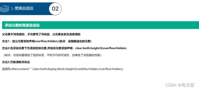
float(浮动)的作用,又叫高度塌陷:
1.定义网页中其他文本如何环绕该元素显示
2.就是让竖着东西横着来
浮动对应的种类:left、right、 none。
浮动有先后顺序,按照代码运行循序来排序,哪里有位置就出现在什么地方。
文字部分是挡不住的,会被挤出来。
浮动语法
1.红色上浮,黄色绿色顶格。
  <style>
    div{
            width: 100px;
            height: 100px;
        }
        .red{
            background: red;
            float: left;
        }
        .yellow{
            background: yellow;
            width: 300px;
            height: 200px;
        }
        .green{
            background: green;
        }
  </style>

  <div class="red"></div>
  <div class="yellow"></div>
  <div class="green"></div>
2.红色黄色绿色在同一行按顺序排列一行,满行直接折行显示。
  <style>
        div{width: 100px; height: 100px; float: left;}
        .red{background: red;}
        .yellow{background: yellow;}
        .green{background: green;}
  </style>

  <div class="red"></div>
  <div class="yellow"></div>
  <div class="green"></div>
clear的用法及各种清除浮动的方式
clear对应的种类:
none允许有浮动对象
right不允许右边有浮动
left不允许左边有浮动
both不允许有浮动对象
清除浮动只是改变元素的排列方式,该元素还是浮动的,不占据文档位置,要加给对应的非浮动对象。
3.清除浮动属性(高度塌陷)方案一:写死代码固定高度
缺点浮动过多换行就出现问题
  <style>
        .box1,.box2{
            width: 100px;
            height: 100px;
            float: left;
        }
        .box1{
            background-color: yellow;
        }
        .box2{
            background-color: blue;
        }
        .box3{
            background-color: red;
            width: 200px;
            height: 200px;
        }
        .container{
            height: 100px;
        }
     </style>

    <div class="container">
        <div class="box1"></div>
        <div class="box2"></div>
    </div>
    <div class="box3"></div>
3.清除浮动属性(高度塌陷)方案二:清浮动给外部非浮动对象
  <style>
        .box1,.box2{
            width: 100px;
            height: 100px;
            float: left;
        }
        .box1{
            background-color: yellow;
        }
        .box2{
            background-color: blue;
        }
        .box3{
            background-color: red;
            width: 200px;
            height: 200px;
            clear: left;
        }
    </style>

    <div>
        <div class="box1"></div>
        <div class="box2"></div>
    </div>
    <div class="box3"></div>
3.清除浮动属性(高度塌陷)方案二:清浮动给内部非浮动对象(clear的用法)
在同一div中新建一个元素不设置宽高,用clear清除前面带浮动的元素
缺点:增加空标签,不利于代码可读性,且降低了浏览器的性能
   <style>
        .box1,.box2{
            width: 100px;
            height: 100px;
            float: left;
        }
        .box1{
            background-color: yellow;
        }
        .box2{
            background-color: blue;
        }
        .box3{
            background-color: red;
            width: 200px;
            height: 200px;
        }
    </style>

    <div>
        <div class="box1"></div>
        <div class="box2"></div>
        <div style="clear:left"></div>
    </div>
    <div class="box3"></div>
4.清除浮动属性(高度塌陷)方案三:overflow:hidden (隐藏)
触发bfc让浮动元素计算高度
缺点:会隐藏溢出的元素
    <style>
        .box1,.box2{
            width: 100px;
            height: 100px;
            float: left;
        }
        .box1{
            background-color: yellow;
        }
        .box2{
            background-color: blue;
        }
        .box3{
            background-color: red;
            width: 200px;
            height: 200px;
        }
        .container{
            overflow:hidden
        }
     </style>

    <div class="container">
        <div class="box1"></div>
        <div class="box2"></div>
    </div>
    <div class="box3"></div>
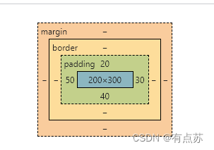
6.盒子模型
盒子模型是css中布局的基石,他规定了网页元素如何显示以及元素间相互关系。css定义所有的元素都可以拥有像盒子一样的外观和平面空间,即都包含边框、边界、补白、内容区,这就是盒模型。
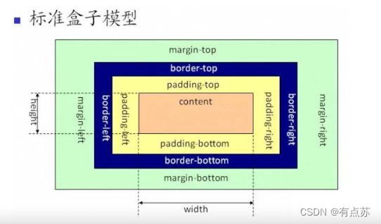
padding内边距
padding的语法:
padding表值得数量
1个值:4个方向都一样
2个值:上下 /左右
3个值:上/左右/下
4个值:上/右/下/左(顺时针)
padding的语法使用方法
    <style>
        div{
            width: 200px;
            height: 300px;
            background-color: green;
            text-align: justify;
            padding: 20px 30px 40px 50px;
        }
    </style>

    <div>
        如果不是相互喜欢,你的痴情就是别人的负担,别去打扰那些已活在你记忆中的人,也许这才是最适合你们的距离。
    </div>
padding的特性
1.背景色蔓延到内边距
2.可以设置单一方向上的 padding-方向(top bottom left right)
padding总体清零操作
   <style>
        *{
            padding:0;
        }
    </style>
border边框
border的使用方法:
bored:大小 样式 颜色;
样式包括solid(实线)double(双实线)dashed(线段线)dotted(线段线)
  <style>
        .box1{
            border: 10px solid red ;
        }
  </style>

<div class="box1"></div>
border的特性
1.背景色也能蔓延到边框
2.能够直接设置单一方向的
方法1
<style>
			border-top: 10px solid red ;
            border-right: 20px dashed blue;
            border-bottom: 30px dotted yellow ;
            border-left: 40px double green ;
 </style>
方法2
<style>
            border-width: 10px 20px 30px 40px ;
            border-color:red blue yellow green;
            border-style: solid dashed dotted double;
</style>
margin外边距
语法:margin
1.margin可以给四个值
1个值:4个方向都一样
2个值:上下 /左右
3个值:上/左右/下
4个值:上/右/下/左(顺时针)
2.可以设置单一方向上的 margin-方向(top bottom left right)
3.背景色不会蔓延到margin上
4.边框支持负值,往反方向移动
5.屏幕居中 只能水平上用auto(自动) 垂直方向的aoto是没有用的
margin 横向居中方案
<style>
	margin:0 auto;
</style>
去掉全部margin值
<style>
        *{
            margin: 0;
        }
</style>
margin特性
1.兄弟关系
垂直方向上 取最大值
水平方向上 合并处理
2.父子关系
会将margin值直接给父盒子
如何解决margin值给父盒子
方案一:子margin-top====>父padding-top
直接去掉子盒子的外边距 给父盒子一个相同大小的的内边距
重点:要注意计算 加多了父盒子的宽高值 要减去父盒子内部相应值
    <style>
        .box1{
            width: 300px;
            height: 300px;
            background: yellow;
            padding-top: 50px;

        }
        .box2{
            width: 100px;
            height: 100px;
            background: red;
            /* margin-top: 50px; */
        }
    </style>

    <div class="box1">
        <div class="box2">终其一生满是遗憾</div>
    </div>
方案二:给父盒子设计边框
重点:要注意计算 加多了父盒子的边框值 要减去父盒子内部相应属性
    <style>
        .box1{
            width: 300px;
            height: 300px;
            background: yellow;
            border: 1px solid transparent ;
        }
          /* transparent 透明的意思  */
        .box2{
            width: 100px;
            height: 100px;
            background: red;
            margin-top: 50px;
        }
    </style>

    <div class="box1">
        <div class="box2">终其一生满是遗憾</div>
    </div>
方案三:给父盒子或者子盒子加float(浮动)
重点:父子盒子都可以加浮动
    <style>
        .box1{
            width: 300px;
            height: 300px;
            background: yellow;
            float: left;
        }
        .box2{
            width: 100px;
            height: 100px;
            background: red;
            margin-top: 50px;
        }
    </style>

    <div class="box1">
        <div class="box2">终其一生满是遗憾</div>
    </div>
方案四:构建成BFC overflow:hidden
给父盒子增加 overflow:hidden
    <style>
        .box1{
            width: 300px;
            height: 300px;
            background: yellow;
            overflow:hidden;
        }
        .box2{
            width: 100px;
            height: 100px;
            background: red;
            margin-top: 50px;
        }
    </style>

    <div class="box1">
        <div class="box2">终其一生满是遗憾</div>
    </div>
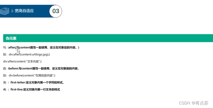
方法五:运用伪元素::after{content}
直接给浮动目标加伪元素
<style>
	.box::after{
		contert:"";
		display:block;
		clear:both;
		width:0;
		height:0;
		visibility:hidden;/*可见:隐藏*/
	}
</style>
溢出
1.溢出属性
说明:
overflow:visible / hidden(隐藏) / scroll / auto(自动)/ inherit;
visible:默认值,溢出内容会显示在元素外;
hidden:溢出内容隐藏;
scroll:滚动,溢出内容以滚动方式显示;
auto:如果有溢出会添加滚动条,没有溢出正常显示;
inherit:规定应该遵从父元素继承overflow属性的值;
overflow-x:X轴溢出 overflow-y:Y轴溢出
visible:默认值,溢出内容会显示在元素外
hidden 溢出内容隐藏
scroll 滚动,溢出内容以滚动方式显示
auto 如果有溢出会添加滚动条,没有溢出正常显示
inherit 规定应该遵从父元素继承overflow属性的值
2.white-space溢出属性案例
normal:默认值,空白会被浏览器忽略。
nowrap:文本不会换行,文本会在同一行上积雪,直到遇到
标签为止
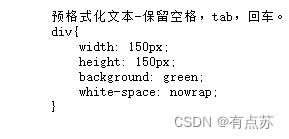
pre:预格式化文本(保留空格 tab 换行)
pre-wrap:文本会折行
pre标签用法
    <pre>
        预格式化文本-保留空格,tab,回车。
        div{
            width: 150px;
            height: 150px;
            background: green;
            white-space: nowrap;
        }
    </pre>
多文本在一行的省略号写法
1.必须有宽度:width:200px;
2.强制文本在一行内显示:white-space:nowrap;
3.溢出内容为隐藏:overflow:hidden;
4.溢出文本显示省略号:text-overflow:ellipsis;
 div{
            width: 150px;
            height: 150px;
            background: green;
            white-space: nowrap;
            overflow: hidden;
            text-overflow: ellipsis;
        }
7.元素显示类型
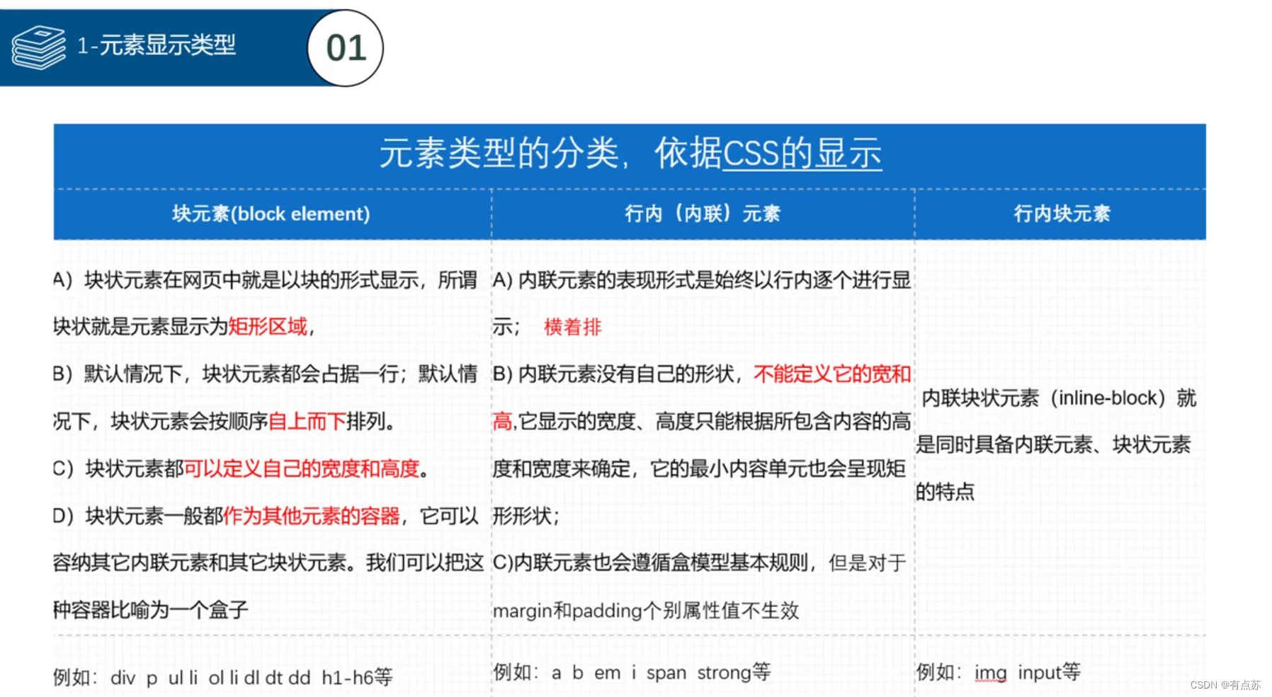
块元素:有display:block;或者display:list-item;
行内元素:display:inline;行内元素无法实现上下边距只能实现左右边距
行内块元素:display:inline-block;
元素类型之间是可以相互转换的 用来解决盒子段落之间的问题。
转换成块元素的方法
1.display:block
2.position:abslute
3.float:left
8.position定位
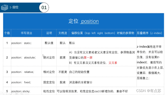
position:absolute可以将将元素变成块元素
z-index位置层级定位
父子关系:给子盒子负值,父盒子显示在上面
兄弟关系:值大的显示在上面,同层级下在下面的在最上面
position:relative相对定位:三角形案例
    <style>
        .box{
            width: 100px;
            height: 50px;
            line-height: 50px;
            text-indent: 20px;
            background: lightblue;
            color: white;
        }
        .box span{
            width: 0px;
            height: 0px;
            display: inline-block;
            border: 5px solid transparent;
            border-top: 5px solid white;
            position: relative;
            top: 2.5px;
        }
        .box:hover span{
            width: 0px;
            height: 0px;
            display: inline-block;
            border: 5px solid transparent;
            border-bottom: 5px solid white;
            top:-2.5px;
        }
</style>

<div class="box">
        导航
        <span>

        </span>
    </div>
定位居中案例
	<style>
        *{
            padding: 0;
            margin: 0;
        }
        div{
            width: 200px;
            height: 200px;
            background: yellow;
            position: absolute;
            top:50%;
            left: 50%;
            margin-top:-100px;
            margin-left: -100px;
        }
        div .child{
            width: 50px;
            height: 50px;
            background: red;
            position: absolute;
            top:50%;
            left: 50%;
            margin-top:-25px;
            margin-left: -25px;
        }
	</style>

    <div>
        <div class="child"></div>
    </div>
相对定位与浮动的区别
float:半脱离状态,能实现文字环绕效果。
position:absolute:全脱离状态,不会出现文字环绕效果。
9.描点(链接的网页跳转用法)
实现a链接在页面之间的跳转
    <style>
        *{
            margin: 0px;
            padding: 0px;
        }
        ul{
            list-style: none;
            position: fixed;
            right: 0px;
            top: 30%;

        }
        li{
            width: 100px;
            height: 50px;
            line-height: 50px;
            text-align: center;
            border: 1px solid black;
        }
        div{
            height: 600px;
            border: 1px solid black;
        }
    </style>

    <ul>
        <li>
            <a href="#a">京东秒杀</a>
        </li>
        <li>
            <a href="#b">11.11</a>
        </li>
        <li>
            <a href="#c">特色优选</a>
        </li>
        <li>
            <a href="#d">频道广场</a>
        </li>
        <li>
            <a href="#e">为你推荐</a>
        </li>
    </ul>
    <div id="a">京东秒杀</div>
    <div id="b">11.11</div>
    <div id="c">特色优选</div>
    <div id="d">频道广场</div>
    <div id="e">为你推荐</div>
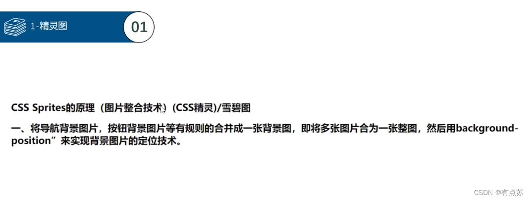
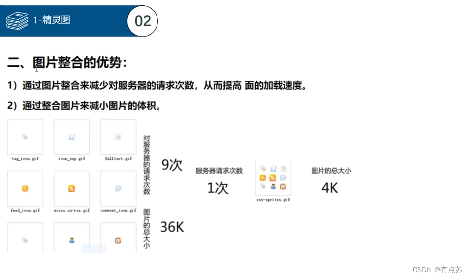
10.精灵图(background-position位置偏移的用法)
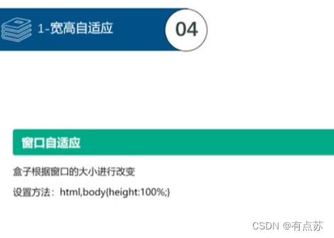
10.宽高自适应
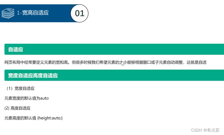
宽度自适应主要用于:导航栏 通栏布局
min-height:最小高度
max-height:最大高度
min-width:最小宽度
max-width:最大高度
两栏布局
方案一:
<!DOCTYPE html>
<html lang="en">
<head>
    <meta charset="UTF-8">
    <meta http-equiv="X-UA-Compatible" content="IE=edge">
    <meta name="viewport" content="width=device-width, initial-scale=1.0">
    <title>两栏布局</title>
    <style>
        html,body{
            height: 100%;
        }
        *{
            margin: 0;
            padding: 0;
        }
        .box1{
            width:200px;
            height: 100%;
            background: red;
            float: left;
        }
        .box2{
            margin-left: 200px;
            height: 100%;
            background: green;
        }
    </style>
</head>
<body>
    <div class="box1"></div>
    <div class="box2"></div>
</body>
</html>
方案二:
<!DOCTYPE html>
<html lang="en">
<head>
<meta charset="UTF-8">
<meta http-equiv="X-UA-Compatible" content="IE=edge">
<meta name="viewport" content="width=device-width, initial-scale=1.0">
<title>两栏布局</title>
<style>
html,body{
height: 100%;
}
*{
margin: 0;
padding: 0;
}
.box1{
width:200px;
height: 100%;
background: red;
float: left;
}
.box2{
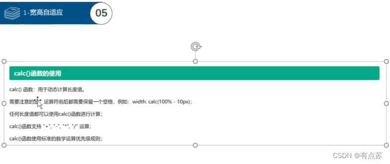
width:calc(100% - 200px);
height: 100%;
background: green;
float:left;
}
</style>
</head>
<body>
<div class="box1"></div>
<div class="box2"></div>
</body>
</html>
三栏布局
基础案例
<!DOCTYPE html>
<html lang="en">
<head>
    <meta charset="UTF-8">
    <meta http-equiv="X-UA-Compatible" content="IE=edge">
    <meta name="viewport" content="width=device-width, initial-scale=1.0">
    <title>Document</title>
</head>
    <style>
        *{
            padding: 0;
            margin: 0;
        }
        html,body{
            height: 100%;
        }
        .left{
            width: 200px;
            height: 100%;
            background: red;
            float: left;
        }
        .center{
            width: calc(100% - 400px);
            height: 100%;
            background: green;
            float: left;
        }
        .right{
            width: 200px;
            height: 100%;
            background: blue;
            float: left;
        }
    </style>
<body>
    <div class="left"></div>
    <div class="center"></div>
    <div class="right"></div>
</body>
</html>
双重案例
<!DOCTYPE html>
<html lang="en">

<head>
    <meta charset="UTF-8">
    <meta http-equiv="X-UA-Compatible" content="IE=edge">
    <meta name="viewport" content="width=device-width, initial-scale=1.0">
    <title>Document</title>
    <style>
        * {
            margin: 0;
            height: 0;
        }

        html,body {
            height: 100%;
        }

        .header,.footer{
            height: 50px;
            width: 100%;
            background: yellow;
        }
        .body{
            height: calc(100% - 100px);
            background: pink;
        }
        .left,.right{
            height: 100%;
            width: 100px;
            background: green;
            float: left;
        }
        .center{
            width: calc(100% - 200px);
            height: 100%;
            background: red;
            float: left;
        }
    </style>
</head>

<body>
    <div class="header"></div>
    <div class="body">
        <div class="left"></div>
        <div class="center"></div>
        <div class="right"></div>
    </div>
    <div class="footer"></div>
</body>
</html>
12.文本隐藏的方法
display:none;不占位隐藏(脱离文档流,下面能上来)
visibility:hidden;占位隐藏(不脱离文档流,只是单纯看不见)
13.表单进阶
单选框< input type=“radio”>
单选框案例
<!DOCTYPE html>
<html lang="en">
<head>
    <meta charset="UTF-8">
    <meta http-equiv="X-UA-Compatible" content="IE=edge">
    <meta name="viewport" content="width=device-width, initial-scale=1.0">
    <title>表单进阶</title>
</head>
<body>
    <h1>单选框</h1>
    <div>还记得我们的约定吗?</div>
    <div>
        <!-- <input type="radio" name="aaa" id="a" checked="checked"> -->
        <input type="radio" name="aaa" id="a" checked>
        <label for="a">大家都变了</label>
    </div>
    <div>
        <input type="radio" name="aaa" id="b">
        <label for="b">只有你没变</label>
    </div>
    <div>
        <input type="radio" name="aaa" id="c">
        <label for="c">你呀</label>
    </div>
    <div>
        <input type="radio" name="aaa" id="d">
        <label for="d">要学会长大</label>
    </div>
</body>
</html>
复选框
复选框案例
<!DOCTYPE html>
<html lang="en">
<head>
    <meta charset="UTF-8">
    <meta http-equiv="X-UA-Compatible" content="IE=edge">
    <meta name="viewport" content="width=device-width, initial-scale=1.0">
    <title>复选框</title>
</head>
<body>
    <h1>复选框</h1>
    <div>
        <input type="checkbox" name="aaa" id="a">
        <label for="a">喜欢</label>
        <input type="checkbox" name="aaa" id="b" checked="checked">
        <label for="b">不喜欢</label>
        <input type="checkbox" name="aaa" id="c" checked>
        <label for="c">讨厌</label>
    </div>
</body>
</html>
上传文件和隐藏字符等
案例及其写法
<!DOCTYPE html>
<html lang="en">
<head>
    <meta charset="UTF-8">
    <meta http-equiv="X-UA-Compatible" content="IE=edge">
    <meta name="viewport" content="width=device-width, initial-scale=1.0">
    <title>Document</title>
</head>
<body>
    <div>
        <div>文件上传</div>
        <input type="file" name="" id="">
    </div>
    <form action="">
        <div>图片代替提交按钮</div>
        <input type="image" src="./img/0089/footer-iocn.png">
        <input type="submit" >
        <div>
            <div>隐藏</div>
            <input type="hidden" value="给后端传递信息哒">
        </div>
        <div>禁用(disabled) 只读(readonly)</div>
        <div>
            <button disabled>注册</button>
            <br>
            <input type="radio" disabled>不满意
            <br>
            <input type="text" disabled value="禁用功能">
            <br>
            <input type="text" readonly value="只读功能">
        </div>
    </form>
</body>
</html>
下拉菜单select
下拉菜单案例
<!DOCTYPE html>
<html lang="en">
<head>
    <meta charset="UTF-8">
    <meta http-equiv="X-UA-Compatible" content="IE=edge">
    <meta name="viewport" content="width=device-width, initial-scale=1.0">
    <title>Document</title>
</head>
<body>
    <h1>表单进阶-下拉菜单</h1>
    <div>
        <!-- select可以支持的属性
        1.size 显示几个
        2.multiple 可以多选 -->
        <!-- option支持的属性
        1.value 提供给后端需要的value值
        2.selected 默认选中 -->
        <div>你的收货地址</div>
        <select name="" id="">
            <option value="">山东</option>
            <option value="">山西</option>
            <option value="" selected>河南</option>
            <option value="">河北</option>
        </select>
        <!-- 可以多选 -->
        <select name="" id="" size="4" multiple>
            <option value="">我</option>
            <option value="">喜欢</option>
            <option value="">你</option>
            <option value="">!</option>
        </select>
    </div>
</body>
</html>
select支持的属性
1.size 显示几个
2.multiple 可以多选
option支持的属性
1.vulue 提供给后端需要的value值
2.selected 默认选中
文本域textarea
文本域案例
<!DOCTYPE html>
<html lang="en">
<head>
    <meta charset="UTF-8">
    <meta http-equiv="X-UA-Compatible" content="IE=edge">
    <meta name="viewport" content="width=device-width, initial-scale=1.0">
    <title>Document</title>
    <style>
        textarea{
            width: 300px;
            height: 300px;
            resize: vertical;
        }
        /* resize 重置设置大小 vertical竖直方向能修改  horizontal水平方向上能修改 both两方向都可以修改 none都不能修改 */
    </style>
</head>
<body>
    <div>多行文本输入框-文本域-textarea</div>
    <div>
        <!-- placeholder:提示文字 -->
        <input type="text" value="提前设置好的文本">
        <textarea name="" id="" cols="30" rows="10" placeholder="请输入你想输入的内容">提前设置好的文本</textarea>
    </div>
</body>
</html>
rezise 重置大小
vertical 竖直方向修改
horizontal 水平方向上的修改
both 两方向都可以修改
none 都不能修改
字段集
<!DOCTYPE html>
<html lang="en">
<head>
    <meta charset="UTF-8">
    <meta http-equiv="X-UA-Compatible" content="IE=edge">
    <meta name="viewport" content="width=device-width, initial-scale=1.0">
    <title>字段集</title>
    <style>
        fieldset{
            width: 300px;
            height: 100px;
            background: green;
            border: 2px solid blue;
        }
        legend{
            border: 1px solid red;
            line-height:30px;
            text-align: center;
        }
    </style>
</head>
<body>
    <h1>表单进阶-字段集</h1>
    <fieldset>
        <legend>还喜欢吗</legend>
        <input type="radio" name="aaa" id="a">
        <label for="a">以前喜欢</label>
        <br>
        <input type="radio" name="aaa" id="b">
        <label for="b">现在喜欢</label>
        <br>
        <input type="radio" name="aaa" id="c">
        <label for="c">以后喜欢</label>
    </fieldset>
</body>
</html>


 扫一扫
扫一扫


 被折叠的 条评论
为什么被折叠?
被折叠的 条评论
为什么被折叠?
 到【灌水乐园】发言


