


目录
1.CSS是什么?
CSS:层叠样式表 (Cascading Style Sheets)。
CSS 能够对⽹⻚中元素位置的排版进⾏像素级精确控制,实现美化⻚⾯的效果。能够做到⻚⾯的样式和结构分离。
CSS 就是 "东⽅四⼤邪术" 之化妆术。
2.CSS基本语法
选择器 + {⼀条/N条声明}
- 选择器决定针对谁修改(找谁):选择控件(控制手段不仅可以使用像下面的类型来进行控制,还可以使用class、id(class是一个CSS中的选择器,id表示控制对象是谁)来进行控制)。
- 声明决定修改啥(干啥):针对所选控件的描述。
声明的属性是键值对。使⽤ ";" 区分键值对,使⽤ ":" 区分键和值。
<style>
    p {
        /* 设置字体颜⾊ */
        color: red;
        /* 设置字体⼤⼩ */
        font-size: 30px;
   }
</style>
<p>hello</p>
<!DOCTYPE html>
<html lang="en">
<head>
<meta charset="UTF-8">
<meta http-equiv="X-UA-Compatible" content="IE=edge">
<meta name="viewport" content="width=device-width, initial-scale=1.0">
<title>Document</title>
<style>
p {
/*设置字体颜色*/
color: red;
/*设置字体大小*/
font-size: 30px;
}
</style>
</head>
<body>
<p>hello</p>
</body>
</html>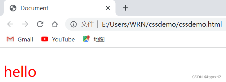
注意:
- CSS 要写到 style 标签中。(后⾯还会介绍其他写法)
- style 标签可以放到⻚⾯任意位置。⼀般放到 head 标签内。
- CSS 使⽤ /* */ 作为注释。(使⽤ ctrl + / 快速切换)
VSCode要手动保存Ctrl + S;Idea会自动保存。
3.CSS类型
- ⾏内样式
- 内部样式
- 外部样式
3.1.行内样式(适用范围最小)
通过 style 属性,来指定某个标签的样式。
只适合于写简单样式,只针对某个标签⽣效。
缺点:不能写太复杂的样式。
这种写法优先级较⾼,会覆盖其他的样式。
<div style="color:green">想要⽣活过的去, 头上总得带点绿</div><!DOCTYPE html>
<html lang="en">
<head>
<meta charset="UTF-8">
<meta http-equiv="X-UA-Compatible" content="IE=edge">
<meta name="viewport" content="width=device-width, initial-scale=1.0">
<title>Document</title>
</head>
<body>
<h3 style="color:green;">基本信息</h3>
</body>
</html>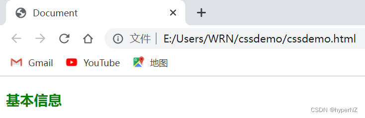
3.2.内部样式(适用范围适中)
写在 style 标签中,嵌⼊到 html 内部的样式叫做内部样式。
理论上来说 style 放到 html 的哪⾥都⾏,但是⼀般都是放到 head 标签中。
- 优点:这样做能够让样式和⻚⾯结构分离。
- 缺点:分离的还不够彻底,尤其是 css 内容多的时候。
<!DOCTYPE html>
<html lang="en">
<head>
    <meta charset="UTF-8">
    <meta http-equiv="X-UA-Compatible" content="IE=edge">
    <meta name="viewport" content="width=device-width, initial-scale=1.0">
    <title>Document</title>
    <style>
        body {
            color: aqua;
            font-size: medium;
        }
    </style>
</head>
<body>
    你好,CSS。
</body>
</html>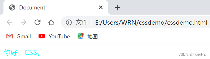
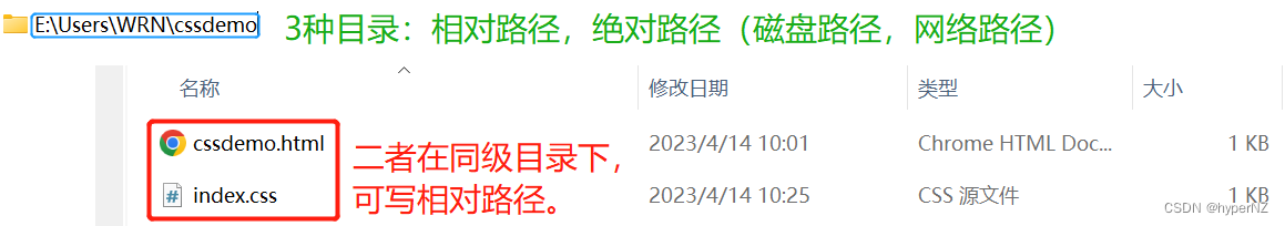
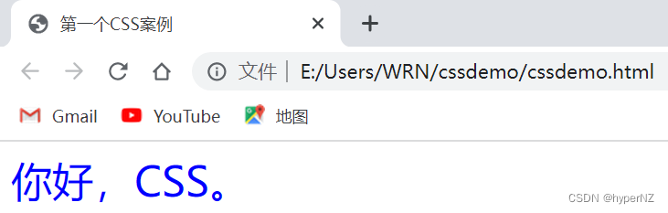
3.3.外部样式(适用范围最大)
- 创建⼀个 css ⽂件(是所有样式的汇总,会把它单独提出去)
- 使⽤ link 标签引⼊ css
- 优点:既能实现页面结构和样式的彻底分离,还能实现代码的复用。
- 缺点:受到浏览器缓存影响,修改之后不⼀定⽴刻⽣效。
<link rel="stylesheet" href="[CSS⽂件路径]">
/*rel是类型(stylesheet层叠样式);href是路径来源。*/
创建cssdemo.html
<!DOCTYPE html>
<html lang="en">
<head>
    <meta charset="UTF-8">
    <meta http-equiv="X-UA-Compatible" content="IE=edge">
    <meta name="viewport" content="width=device-width, initial-scale=1.0">
    <title>第一个CSS案例</title>
    <link rel="stylesheet" href="index.css">
</head>
<body>
    <div>
        你好,CSS。
    </div>
</body>
</html>
创建index.css
div{
    color: red;
    font-size: 30px; /*css中使用的单位有2种:px像素;%*/
}
PS:关于缓存
这是计算机中⼀种常⻅的提升性能的技术⼿段。
项目中文件,分2种:静态文件(html/css/js/图片png/视频/音频...)和动态文件。
⽹⻚依赖的资源(图⽚/CSS/JS等)通常是从服务器上获取的,如果频繁访问该⽹站,那么这些外部资源就没必要反复从服务器获取,就可以使⽤缓存先存起来(就是存在本地磁盘上了),从⽽提⾼访问效率。
->当第一次设置字体为红色,第二次进行了修改字体为绿色,由于缓存,结果还是红色,没变。
->此时清除浏览器的缓存,强制浏览器重新获取 css ⽂件:
①对于谷歌浏览器来说:刷新页面:F5;强制刷新页面:Ctrl + F5。
②或者:
③或者:
更换url地址:给当前这个url地址加上一个无足轻重的参数(后面加"?",加上一个"key-value"),这样就是2个url地址了,之前的缓存就不会生效。后面只需修改参数值,就可继续解决缓存问题。
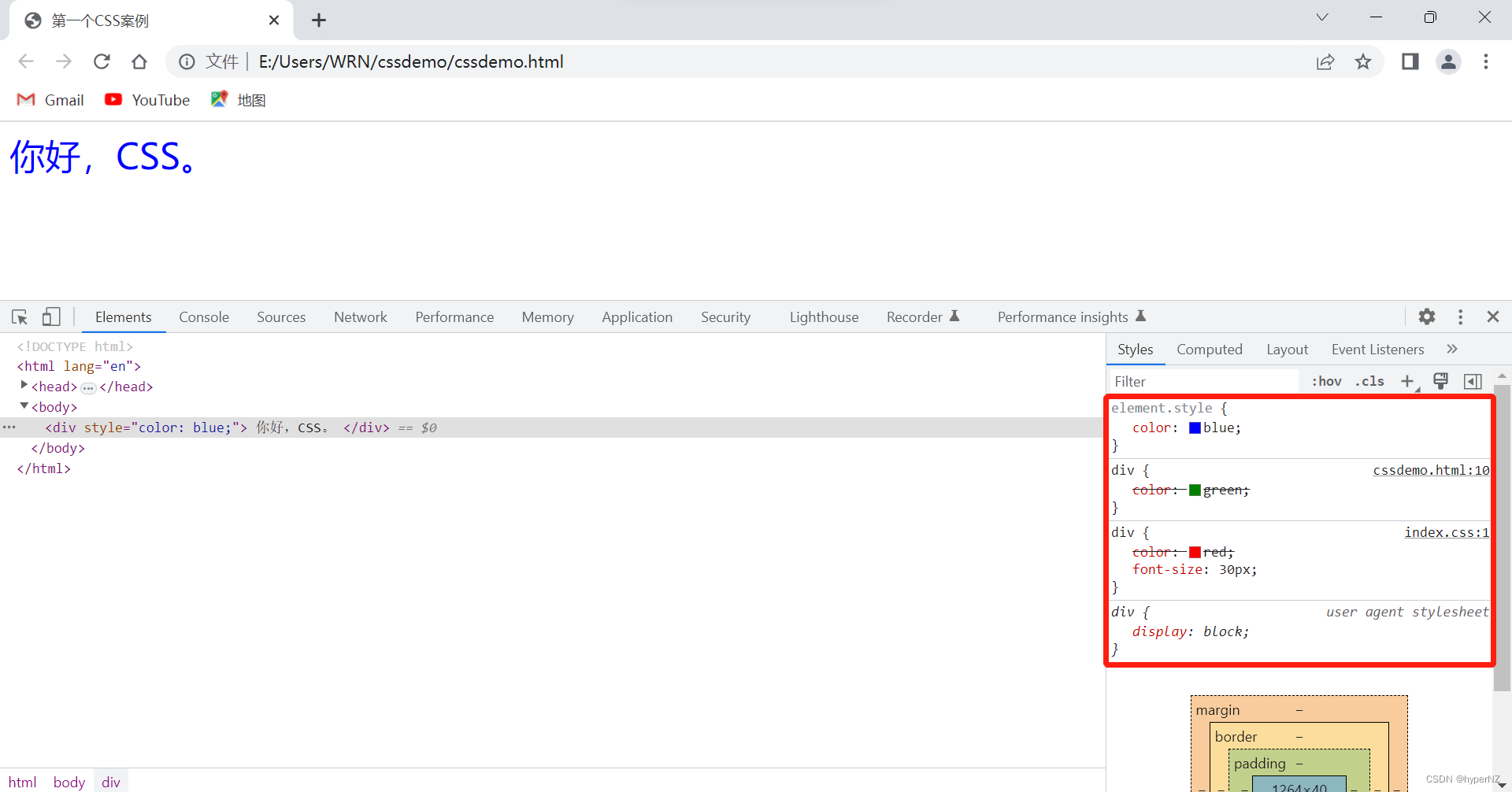
3.4.多种样式优先级
⾏内样式 > 内部样式 > 外部样式
<!DOCTYPE html>
<html lang="en">
<head>
    <meta charset="UTF-8">
    <meta http-equiv="X-UA-Compatible" content="IE=edge">
    <meta name="viewport" content="width=device-width, initial-scale=1.0">
    <title>第一个CSS案例</title>
    <link rel="stylesheet" href="index.css">
    <style>
        div{
            color: green;
        }
    </style>
</head>
<body>
    <div style="color: blue;">
        你好,CSS。
    </div>
</body>
</html>
div{
color: red;
font-size: 30px; /*css中使用的单位有2种:px像素;%*/
}
4.代码风格
4.1.样式格式
4.1.1.紧凑风格
p { color: red; font-size: 30px;}4.1.2.展开风格(推荐)
p {
    color: red;
    font-size: 30px;
}
4.2.样式大小写
虽然 CSS 不区分⼤⼩写,我们开发时统⼀使⽤小写字⺟。
5.选择器
5.1.选择器的功能
选中⻚⾯中指定的标签元素。
要先选中元素,才能设置元素的属性。
就好⽐ SC2,War3 这样的游戏,需要先选中单位,再指挥该单位⾏动。
5.2.选择器的种类
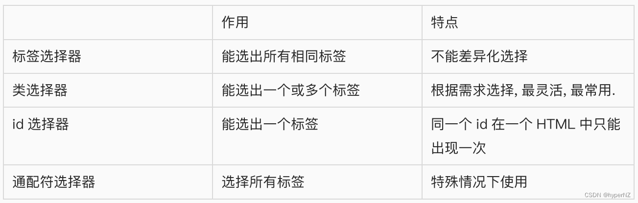
- 标签选择器
- 类选择器
- id 选择器
- 通配符选择器
参考⽂档: CSS选择器
5.2.1.标签选择器
- 能快速将同⼀类型的标签都选择出来
- 但是不能差异化选择
<style>
p {
    color: red;
}
div {
    color: green;
}
</style>
<p>咬⼈猫</p>
<p>咬⼈猫</p>
<p>咬⼈猫</p>
<div>阿叶君</div>
<div>阿叶君</div>
<div>阿叶君</div>
5.2.2.类选择器
①类样式定义
类样式名称{
......
}
②类样式使用
<div class="类样式名称"></div>
- 差异化表示不同的标签
- 可以让多个标签的都使⽤同⼀个类样式,也可以让一个标签使用多个类样式。(就相当于一个方法可以在任何地方被多次调用)
<style>
    .blue {
        color: blue;
   }
</style>

<div class="blue">咬⼈猫</div>
<div>咬⼈猫</div>- 类名⽤ . 开头的
- 下⽅的标签使⽤ class 属性来调⽤。
- ⼀个类可以被多个标签使⽤,⼀个标签也能使⽤多个类(组合使用)(多个类名要使⽤空格分割,这样做可以把相同的属性提取出来, 达到简化代码的效果,让代码更好复⽤。若产生冲突,会使用后一个覆盖前面的)
- 如果是⻓的类名,可以使⽤ - 分割。
- 不要使⽤纯数字,或者中⽂,以及标签名来命名类名。
<!DOCTYPE html>
<html lang="en">
<head>
    <meta charset="UTF-8">
    <meta http-equiv="X-UA-Compatible" content="IE=edge">
    <meta name="viewport" content="width=device-width, initial-scale=1.0">
    <title>第一个CSS案例</title>
    <link rel="stylesheet" href="index.css">
    <style>
        /* 标签选择器
        div{
            color: green;
        } */

        /*类选择器*/
        .div1{
            color: red;
        }
        .div2{
            color: green;
        }
        .fontsize30{
            font-size: 30px;
        }
    </style>
</head>
<body>
    <div class="div1 div2">
        你好,CSS。
    </div>
    <div class="div1 fontsize30">
        第二个div。
    </div>
</body>
</html>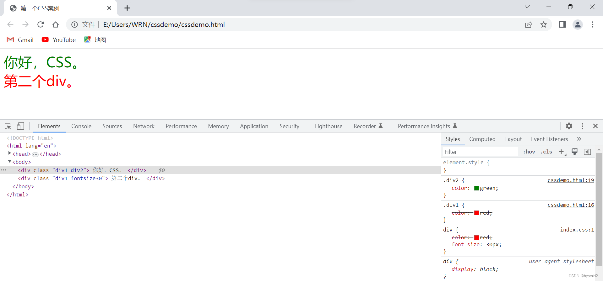
5.2.3.id选择器
- CSS 中使⽤ # 开头表示 id 选择器
- id 选择器的值和 html 中某个元素的 id 值相同
- html 的元素 id 不必带 #
- id 是唯⼀的,不能被多个标签使⽤ (是和类选择器最⼤的区别)
<style>
    #ha {
        color: red;
    }
</style>

<div id="ha">蛤蛤蛤</div>
类比:
- 姓名是类选择器,可以重复。
- 身份证号码是 id 选择器,是唯⼀的。
<!DOCTYPE html>
<html lang="en">
<head>
    <meta charset="UTF-8">
    <meta http-equiv="X-UA-Compatible" content="IE=edge">
    <meta name="viewport" content="width=device-width, initial-scale=1.0">
    <title>第一个CSS案例</title>
    <link rel="stylesheet" href="index.css">
    <style>
        #div3{
            color: blue;
        }
    </style>
</head>
<body>
    <div id="div3">
        第三个div。
    </div>
</body>
</html>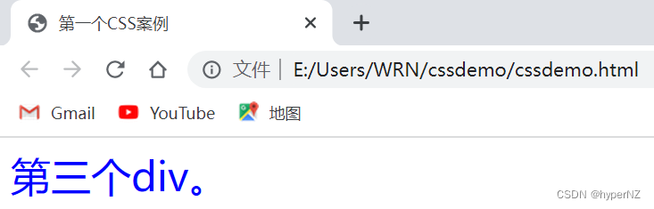
PS:类选择器 VS id选择器
- 类选择器一个页面是可以重复使用的;id选择器一个页面只使用和设置一次。
- 类选择器先定义,再使用;id选择器先有id,再定义样式。
- 类选择器的定义是以"."开头的,id选择器的定义是以"#"开头的。
5.2.4.通配符选择器
使⽤ * 的定义,选取所有的标签。
* {
 color: red;
}
⻚⾯的所有内容都会被改成红⾊,不需要被⻚⾯结构调⽤。
5.2.5.选择器小结
6.常用元素属性
CSS 属性有很多,可以参考⽂档:
6.1.字体属性
6.1.1.设置字体
body {
    font-family: '微软雅⿊';
    font-family: 'Microsoft YaHei';
}- 字体名称可以⽤中⽂,但是不建议。
- 多个字体之间使⽤逗号分隔。(从左到右查找字体,如果都找不到,会使⽤默认字体)
- 如果字体名有空格,使⽤引号包裹。
- 建议使⽤常⻅字体,否则兼容性不好。
<style>
    .font-family .one {
        font-family: 'Microsoft YaHei';
   }
    .font-family .two {
        font-family: '宋体';
   }
</style>
<div class="font-family">
    <div class="one">
       这是微软雅⿊
    </div>
    <div class="two">
       这是宋体
    </div>
</div>
6.1.2.字体大小
p {
    font-size: 20px;
}- 不同的浏览器默认字号不⼀样,最好给⼀个明确值(chrome 默认是 16px)
- 可以给 body 标签使⽤ font-size
- 要注意单位 px 不要忘记
-
标题标签需要单独指定⼤⼩
注意: 实际上它设置的是字体中字符框的⾼度;实际的字符字形可能⽐这些框⾼或矮。
<style>
    .font-size .one {
        font-size: 40px;
   }
    .font-size .two {
        font-size: 20px;
   }
</style>
<div class="font-size">
    <div class="one">
       ⼤⼤⼤
    </div>
    <div class="two">
       ⼩⼩⼩
    </div>
</div>
6.1.3.字体粗细
p {
    font-weight: bold;
    font-weight: 700;
}- 可以使⽤数字表示粗细
- 700 == bold,400 是不变粗,== normal
- 取值范围是 100 -> 900(值越大越粗)
<style>
    .font-weight .one {
        font-weight: 900;
   }
    .font-weight .two {
        font-weight: 100;
   }
</style>
<div class="font-weight">
    <div class="one">
       粗粗粗
    </div>
    <div class="two">
       细细细
    </div>
</div>
6.1.4.文字样式
/* 设置倾斜 */
font-style: italic;
/* 取消倾斜 */
font-style: normal;
很少把某个⽂字变倾斜,但是经常要把 em / i 改成不倾斜。
<style>
    .font-style em {
        font-style: normal;
   }
    .font-style div {
        font-style: italic;
   }
</style>
<div class="font-style">
    <em>
       放假啦
    </em>
    <div class="one">
       听说要加班
    </div>
</div>
6.1.5.文本属性
①文本颜色
认识 RGB
我们的显示器是由很多很多的 "像素" 构成的,每个像素视为⼀个点,这个点就能反映出⼀个具体的颜⾊。 我们使⽤ R (red), G (green), B (blue) 的⽅式表示颜⾊(⾊光三原⾊)。三种颜⾊按照不同的⽐例搭配,就能混合出各种五彩斑斓的效果。
计算机中针对 R, G, B 三个分量,分别使⽤⼀个字节表示(8个⽐特位,表示的范围是 0-255,⼗六进制表示为 00-FF)。
数值越⼤,表示该分量的颜⾊就越浓。255, 255, 255 就表示⽩⾊;0, 0, 0 就表示⿊⾊。
设置文本颜色
color: red;
color: #ff0000;
color: rgb(255, 0, 0);
⿏标悬停在 vscode 的颜⾊上,会出现颜⾊选择器,可以⼿动调整颜⾊。
color 属性值的写法:
- 预定义的颜⾊值(直接是单词)
- [最常⽤] ⼗六进制形式
- RGB ⽅式
⼗六进制形式表示颜⾊,如果两两相同,就可以⽤⼀个来表示。
#ff00ff =>#f0f
<style>
    .color {
        color: red;
        /* color: rgb(255, 0, 0); */
        /* color: #ff0000; */
   }
</style>
<div class="color">这是⼀段话</div>
<!DOCTYPE html>
<html lang="en">
<head>
<meta charset="UTF-8">
<meta http-equiv="X-UA-Compatible" content="IE=edge">
<meta name="viewport" content="width=device-width, initial-scale=1.0">
<title>第一个CSS案例</title>
<style>
.myfont .one{
font-family: '宋体';
font-size: 40px;
}
.myfont .two{
font-family: '宋体';
font-size: 40px;
font-weight: 900;
font-style: italic;
color: rgb(191, 225, 39);
}
</style>
</head>
<body>
<div class="myfont">
<div class="one">
这是宋体
</div>
<div class="two">
这是宋体
</div>
</div>
</body>
</html>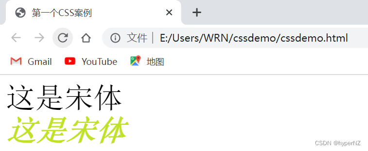
②文本对齐
控制⽂字⽔平⽅向的对⻬。
不光能控制⽂本对⻬,也能控制图⽚等元素居中或者靠右。
text-align: [值];- center: 居中对⻬
- left: 左对⻬
- right: 右对⻬
<!DOCTYPE html>
<html lang="en">
<head>
    <meta charset="UTF-8">
    <meta http-equiv="X-UA-Compatible" content="IE=edge">
    <meta name="viewport" content="width=device-width, initial-scale=1.0">
    <title>第一个CSS案例</title>
    <style>
        .text-align .one{
            text-align: left;
        }
        .text-align .two{
            text-align: right;
        }
        .text-align .three{
            text-align: center;
        }
    </style>
</head>
<body>
    <div class="text-align">
        <div class="one">左对齐</div>
        <div class="two">右对齐</div>
        <div class="three">居中对齐</div>
    </div>
</body>
</html>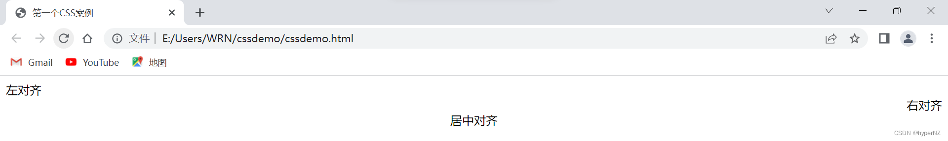
6.2.背景属性
6.2.1.背景颜色
background-color: [指定颜⾊]默认是 transparent (透明) 的,可以通过设置颜⾊的⽅式修改。
<!DOCTYPE html>
<html lang="en">
<head>
    <meta charset="UTF-8">
    <meta http-equiv="X-UA-Compatible" content="IE=edge">
    <meta name="viewport" content="width=device-width, initial-scale=1.0">
    <title>第一个CSS案例</title>
    <style>
            body {
                background-color: #f3f3f3;
            }
            .bgc .one {
                background-color: red;
            }
            .bgc .two {
                background-color: #0f0;
            }
            .bgc .three {
                /* 背景透明 */
                background-color: transparent;
            }
       </style>
</head>
<body>
    <div class="bgc">
        <div class="one">红色背景</div>
        <div class="two">绿色背景</div>
        <div class="three">透明背景</div>
    </div>
</body>
</html>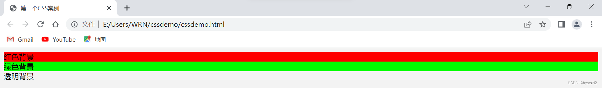
6.2.2.背景图片
background-image: url(...);⽐ image 更⽅便控制位置(图⽚在盒⼦中的位置)
- url 不要遗漏。
- url 可以是绝对路径,也可以是相对路径。
- url 上可以加引号,也可以不加。
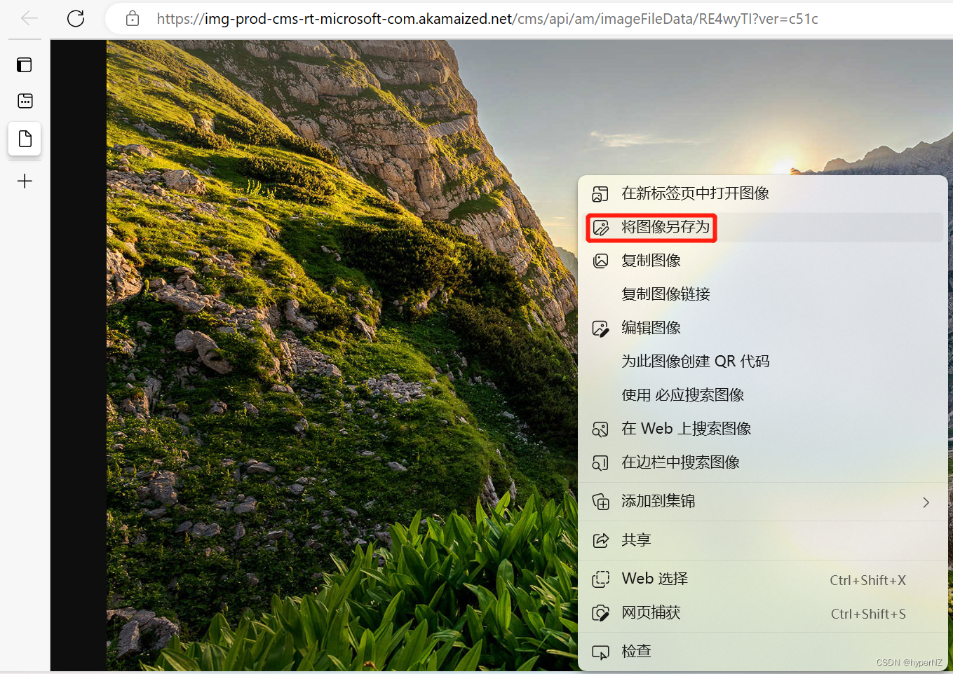
获取前端图片:
<!DOCTYPE html>
<html lang="en">
<head>
    <meta charset="UTF-8">
    <meta http-equiv="X-UA-Compatible" content="IE=edge">
    <meta name="viewport" content="width=device-width, initial-scale=1.0">
    <title>第一个CSS案例</title>
    <style>
            .bgi .one {
                background-image: url(imgs/login-background.jpg);
                height: 600px;
            }
    </style>
</head>
<body>
    <div class="bgi">
        <div class="one">背景图⽚</div>
    </div>
</body>
</html>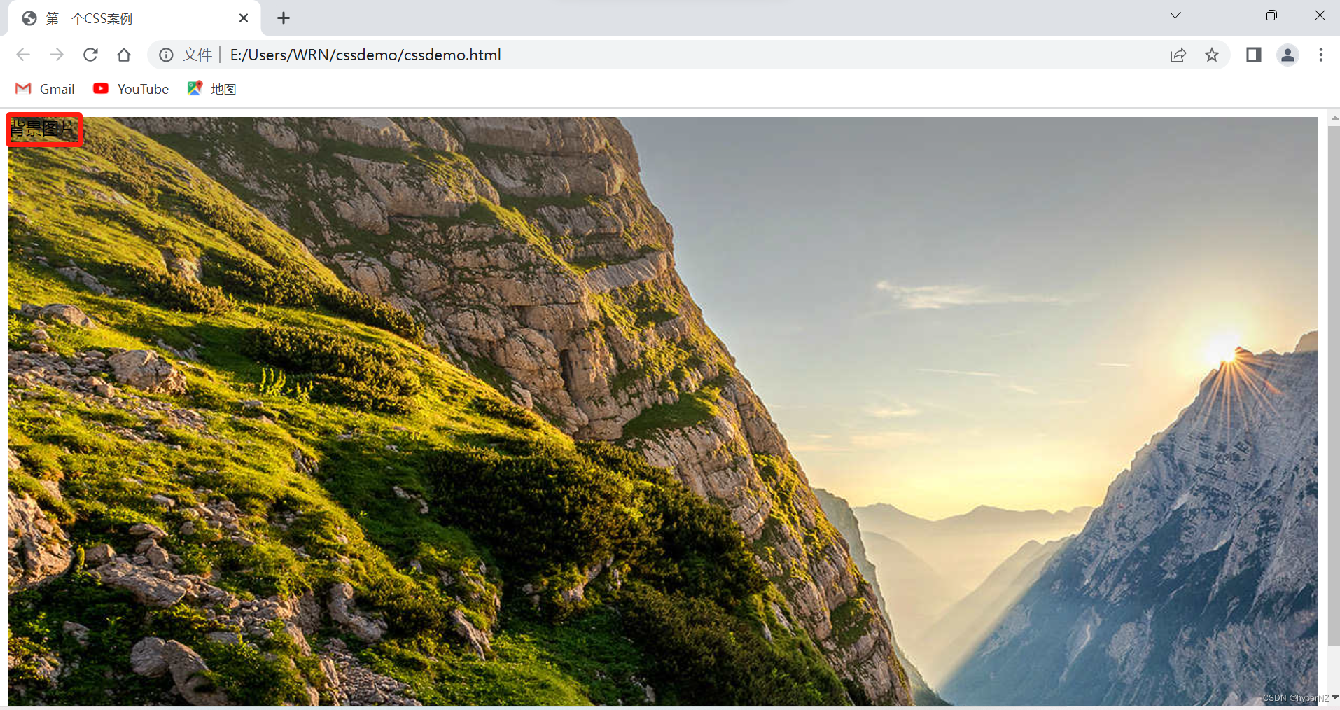
6.2.3.背景平铺
background-repeat: [平铺⽅式]- repeat: 平铺
- no-repeat: 不平铺
- repeat-x: ⽔平平铺
- repeat-y: 垂直平铺
默认是 repeat。背景颜⾊和背景图⽚可以同时存在。背景图⽚在背景颜⾊的上⽅。
<!DOCTYPE html>
<html lang="en">
<head>
    <meta charset="UTF-8">
    <meta http-equiv="X-UA-Compatible" content="IE=edge">
    <meta name="viewport" content="width=device-width, initial-scale=1.0">
    <title>第一个CSS案例</title>
    <style>
            .bgr .one {
                color: red;
                background-image: url(imgs/login-background.jpg);
                background-repeat: no-repeat;
                height: 150px;
            }
            .bgr .two {
                color: red;
                background-image: url(imgs/login-background.jpg);
                background-repeat: repeat-x;
                height: 150px;
            }
            .bgr .three {
                color: red;
                background-image: url(imgs/login-background.jpg);
                background-repeat: repeat-y;
                height: 150px;
            }
            .bgr .four {
                color: red;
                background-image: url(imgs/login-background.jpg);
                background-repeat: repeat;
                height: 150px;
            }
       </style>
</head>
<body>
    <div class="bgr">
        <div class="one">不平铺</div>
        <div class="two">⽔平平铺</div>
        <div class="three">垂直平铺</div>
        <div class="four">平铺</div>
    </div>
</body>
</html>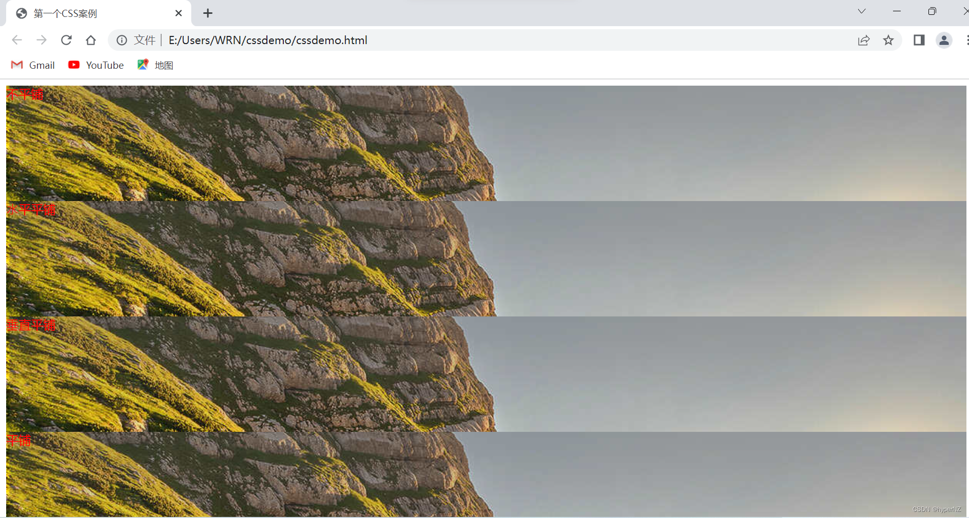
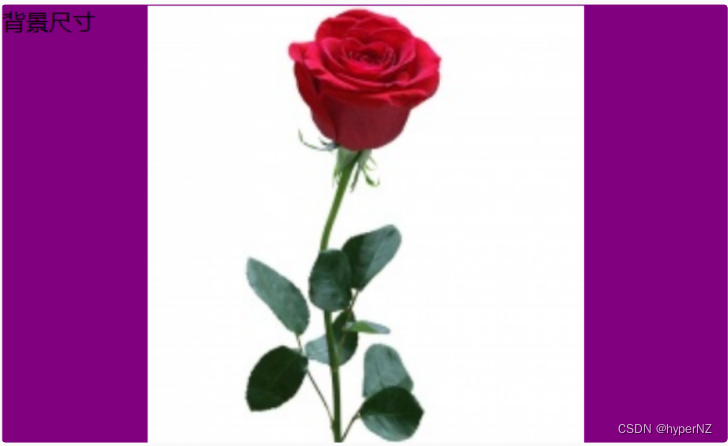
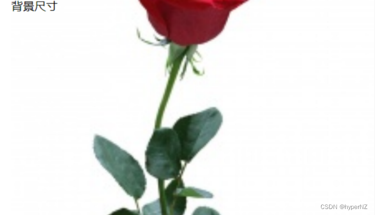
6.2.4.背景尺寸
background-size: length|percentage|cover|contain;- 可以填具体的数值: 如 40px 60px 表示宽度为 40px,⾼度为 60px。
- 也可以填百分⽐: 按照⽗元素的尺⼨设置。
- cover: 把背景图像扩展⾄⾜够⼤,以使背景图像完全覆盖背景区域。背景图像的某些部分也许⽆法显示在背景定位区域中。
- contain: 把图像图像扩展⾄最⼤尺⼨,以使其宽度和⾼度完全适应内容区域。
<!DOCTYPE html>
<html lang="en">
<head>
    <meta charset="UTF-8">
    <meta http-equiv="X-UA-Compatible" content="IE=edge">
    <meta name="viewport" content="width=device-width, initial-scale=1.0">
    <title>第一个CSS案例</title>
    <style>
        .bgs .one {
            width: 500px;
            height: 300px;
            background-image: url(imgs/login-background.jpg);
            background-repeat: no-repeat;
            background-position: center;
            background-size: contain;
        }
       </style>
</head>
<body>
    <div class="bgs">
        <div class="one">背景尺⼨</div>
    </div>
</body>
</html>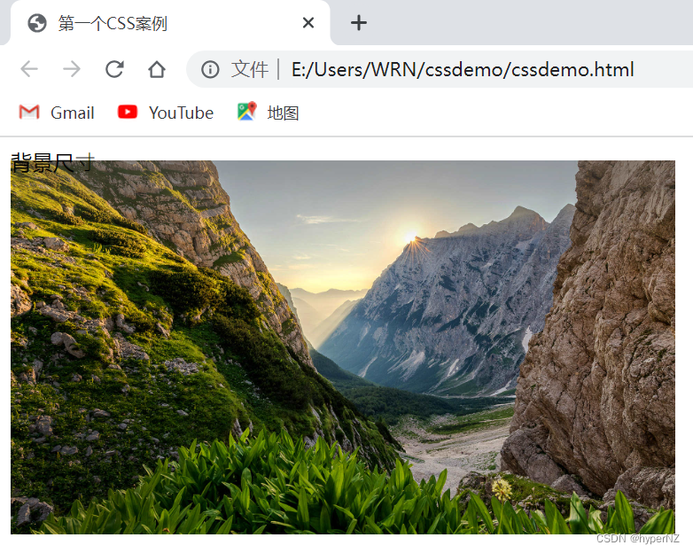
注意体会 contain 和 cover 的区别,当元素为矩形(不是正⽅形) 时,区别是很明显的。
contain:
cover:
7.Chrome调试工具——查看CSS属性
7.1.打开调试工具
- 直接按 F12 键
- ⿏标右键⻚⾯ => 检查元素
7.2.标签页含义
- elements 查看标签结构
- console 查看控制台
- source 查看源码+断点调试
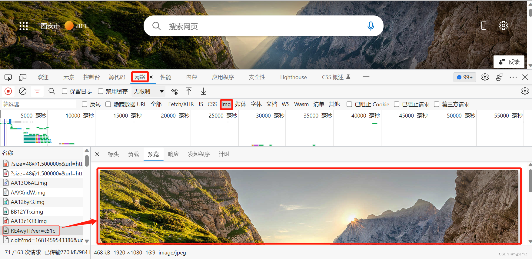
- network 查看前后端交互过程
- application 查看浏览器提供的⼀些扩展功能(本地存储等)
- Performance, Memory, Security, Lighthouse 暂时不使⽤, 先不深究
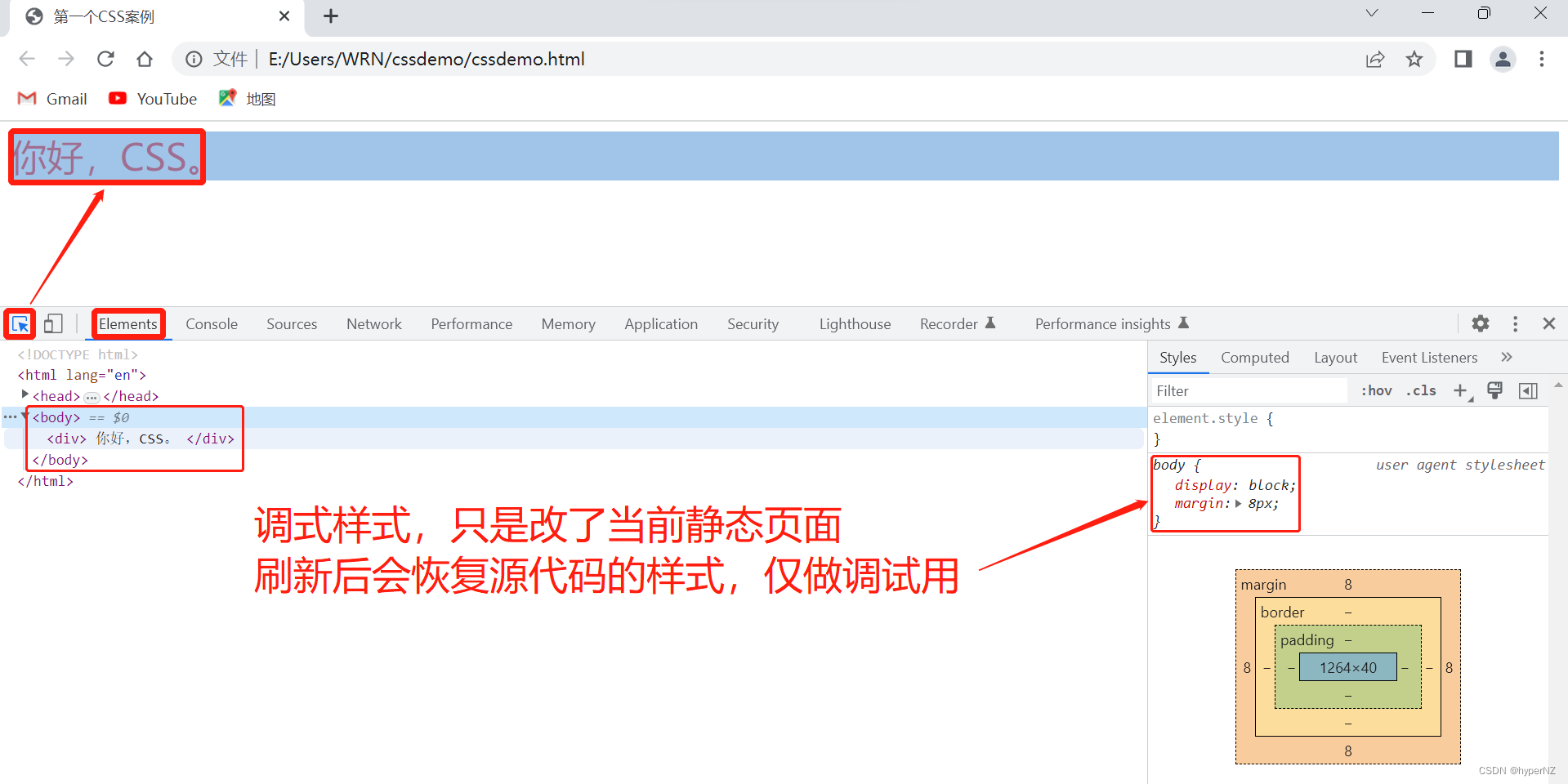
7.3.elements标签页使用
- ctrl + 滚轮进⾏缩放,ctrl + 0 恢复原始⼤⼩
- 使⽤左上⻆箭头选中元素
- 右侧可以查看当前元素的属性,包括引⼊的类
- 右侧可以修改选中元素的 css 属性。例如颜⾊,可以点击颜⾊图标,弹出颜⾊选择器,修改颜⾊。例如字体⼤⼩,可以使⽤⽅向键来微调数值。
- 此处的修改不会影响代码,刷新就还原了~
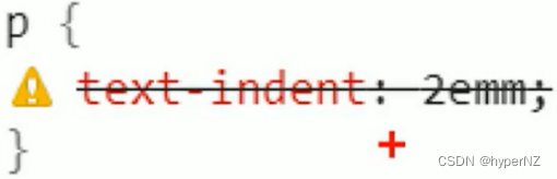
- 如果 CSS 样式写错了,也会在这⾥有提示。(⻩⾊感叹号)
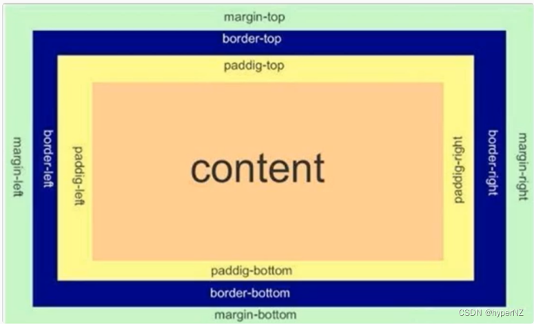
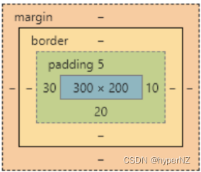
8.页面布局——盒模型
- 边框 border
- 内容 content
- 内边距 padding
- 外边距 margin
8.1.边框
基础属性
- 粗细: border-width
- 样式: border-style, 默认没边框. solid 实线边框 dashed 虚线边框 dotted 点线边框
- 颜⾊: border-color
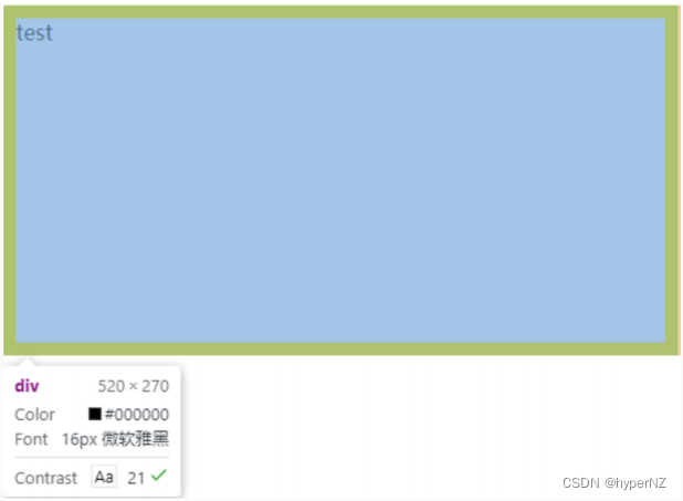
<div>test</div>div {
width: 500px;
height: 250px;
border-width: 10px;
border-style: solid;
border-color: green;
}⽀持简写,没有顺序要求。
border: 1px solid red;可以改四个⽅向的任意边框。
border-top/bottom/left/right以下的代码只给上边框设为红⾊,其余为蓝⾊。利⽤到的层叠性,就近原则的⽣效。
border: 1px solid blue;
border-top: red;
边框会撑大盒子
可以看到width,height 是 500,250, ⽽最终整个盒⼦⼤⼩是 520,270。边框10个像素相当于扩⼤了⼤⼩。
买房⼦时:
建筑⾯积 = 套内⾯试 + 公摊⾯试(电梯间)
套内⾯积 = 使⽤⾯积 + 墙占据的空间
蓝⾊区域就是 "使⽤⾯积",绿⾊区域就是 "套内⾯积"。
通过 box-sizing 属性可以修改浏览器的⾏为,使边框不再撑⼤盒⼦。
* 为通配符选择器。
* {
    box-sizing: border-box;
}
8.2.内边距
padding 设置内容和边框之间的距离。
默认内容是顶着边框来放置的,⽤ padding 来控制这个距离。
可以给四个⽅向都加上边距 。
- padding-top
- padding-bottom
- padding-left
- padding-right
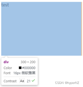
<div>
    test
</div>
div {
height: 200px;
width: 300px;
}
加上 padding 之后
div {
    height: 200px;
    width: 300px;
    padding-top: 5px;
    padding-left: 10px;
}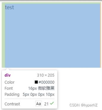
此时可以看到带有了⼀个绿⾊的内边距。
- 整个盒⼦的⼤⼩从原来的 300、200 => 310、205,说明内边距也会影响到盒⼦⼤⼩(撑⼤盒⼦)。
- 使⽤ box-sizing: border-box 属性也可以使内边距不再撑⼤盒⼦。(和上⾯ border 类似)
复合写法
可以把多个⽅向的 padding 合并到⼀起。[四种情况都要记住,都很常⻅]
padding: 5px; 表示四个⽅向都是 5px
padding: 5px 10px; 表示上下内边距 5px, 左右内边距为 10px
padding: 5px 10px 20px; 表示上边距 5px, 左右内边距为 10px, 下内边距为 20px
padding: 5px 10px 20px 30px; 表示 上5px, 右10px, 下20px, 左30px (顺时针)
控制台中选中元素,查看右下⻆,是很清楚的。
8.3.外边距
基础写法
- margin-top
- margin-bottom
- margin-left
- margin-right
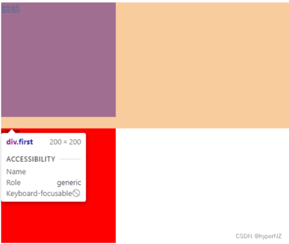
<div class="first">蛤蛤</div>
<div>呵呵</div>
div {
background-color: red;
width: 200px;
height: 200px;
}
.first {
margin-bottom: 20px;
}
复合写法
规则同 padding
margin: 10px; // 四个⽅向都设置
margin: 10px 20px; // 上下为 10, 左右 20
margin: 10px 20px 30px; // 上 10, 左右 20, 下 30
margin: 10px 20px 30px 40px; // 上 10, 右 20, 下 30, 左 40
块级元素水平居中
前提:
-
指定宽度(如果不指定宽度,默认和⽗元素⼀致)
-
把⽔平 margin 设为 auto
三种写法均可。
margin-left: auto; margin-right: auto;
margin: auto;
margin: 0 auto;<div>蛤蛤</div>div {
width: 500px;
height: 200px;
background-color: red;
margin: 0 auto;
}注意:
- 这个⽔平居中的⽅式和 text-align 不⼀样。
- margin: auto 是给块级元素⽤得到。
- text-align: center 是让⾏内元素或者⾏内块元素居中的。
另外,对于垂直居中,不能使⽤ "上下 margin 为 auto" 的⽅式。
去除浏览器默认样式
浏览器会给元素加上⼀些默认的样式,尤其是内外边距。不同浏览器的默认样式存在差别。 为了保证代码在不同的浏览器上都能按照统⼀的样式显示,往往我们会去除浏览器默认样式。使⽤通配符选择器即可完成这件事情。
* {
    marign: 0;
    padding: 0;
}


 扫一扫
扫一扫


 2367
2367

 被折叠的 条评论
为什么被折叠?
被折叠的 条评论
为什么被折叠?
 到【灌水乐园】发言


