


在css中父元素高度确定,使用flex,设置了换行属性之后,元素自动换行。换行之后每行的间距变大,自动撑满了父元素,见下图:
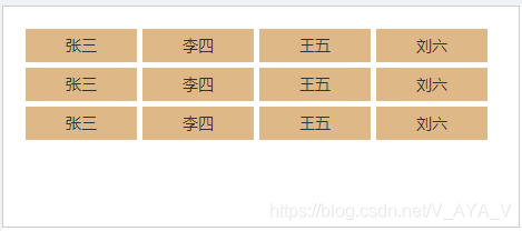
预想中的效果:
实际效果:
使用flex属性之后,子元素并没有按照预想的排列方式在页面显示,样式代码如下(less)
.list{
    height: 200px;
    width: 465px;
    border: 1px solid #ccc;
    display: flex;
    flex-wrap: wrap;
    box-sizing: border-box;
    padding: 20px;
    .list-item{
      width: 100px;
      height: 30px;
      line-height: 30px;
      text-align: center;
      box-sizing: border-box;
      background:burlywood;
      margin-right: 5px;
      margin-bottom: 5px;
    }
  }
问题原因:当元素不只一行意味着flex容器在交叉轴上有多行,此时align-content属性生效,align-content默认属性为stretch导致flex容器将交叉轴上的多余空间按行数平均分给每行。处理此问题解决方法也很简单,直接给父元素设置align-content: flex-start即可。
.list{
    height: 200px;
    width: 465px;
    border: 1px solid #ccc;
    display: flex;
    flex-wrap: wrap;
    box-sizing: border-box;
    padding: 20px;
    align-content: flex-start;
    .list-item{
      width: 100px;
      height: 30px;
      line-height: 30px;
      text-align: center;
      box-sizing: border-box;
      background:burlywood;
      margin-right: 5px;
      margin-bottom: 5px;
    }
  }
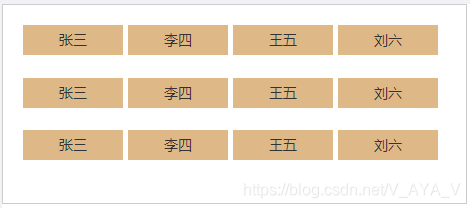
最终效果:
笔者这里仅简单给出解决方案,若果想了解详细的设置属性可移步css教程–>
codepen flex-box游乐场


 扫一扫
扫一扫


 973
973

 被折叠的 条评论
为什么被折叠?
被折叠的 条评论
为什么被折叠?
 到【灌水乐园】发言


