


如何使用css动画属性实现以下情况呢?
1.1基础布局
 <div class="wrapper">

        <div class="container" id="c0">

          <img src="./img/07ecd202415044889ce69497c1b187f0.jpeg" alt="">
        </div>
        <div class="container" id="c1">

          <img src="./img/28812041_162237730103_2.jpg" alt="">
        </div>
        <div class="container" id="c2">

          <img src="./img/images.jpg" alt="">
        </div>

      </div>
.wrapper {
position: absolute;
top: 10%;
left: 40%;
width: 300px;
height: 500px;
perspective: 900px;
}
.container {
position: absolute;
top: 0%;
width: 100%;
height: 100%;
perspective: 900px;
box-shadow: 0px 20px 50px #555;
}
.container>img {
width: 100%;
height: 100%;
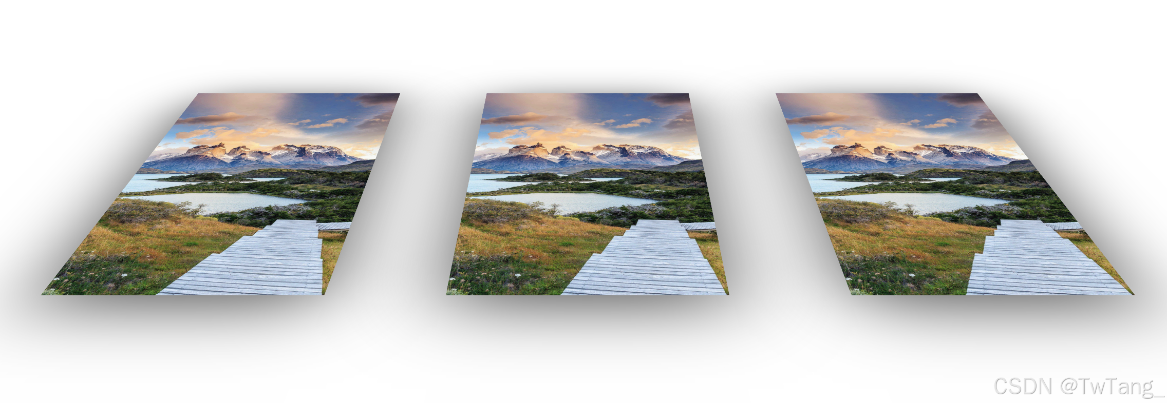
}1.2 有个问题?三个盒子叠在一块怎么整
1.3要分别给每个盒子添加定位属性
    #c0 {
      position: absolute;
      top: 0%;
      width: 100%;
      height: 100%;
      z-index: 300;
      box-shadow: 0px 20px 100px #555;
    }

    #c1 {
      box-shadow: 0px 20px 100px #555;
      left: 100%;
      z-index: 0;
    }

    #c2 {
      left: -100%;
      z-index: 0;
      box-shadow: 0px 20px 100px #555;
    }
效果如下:
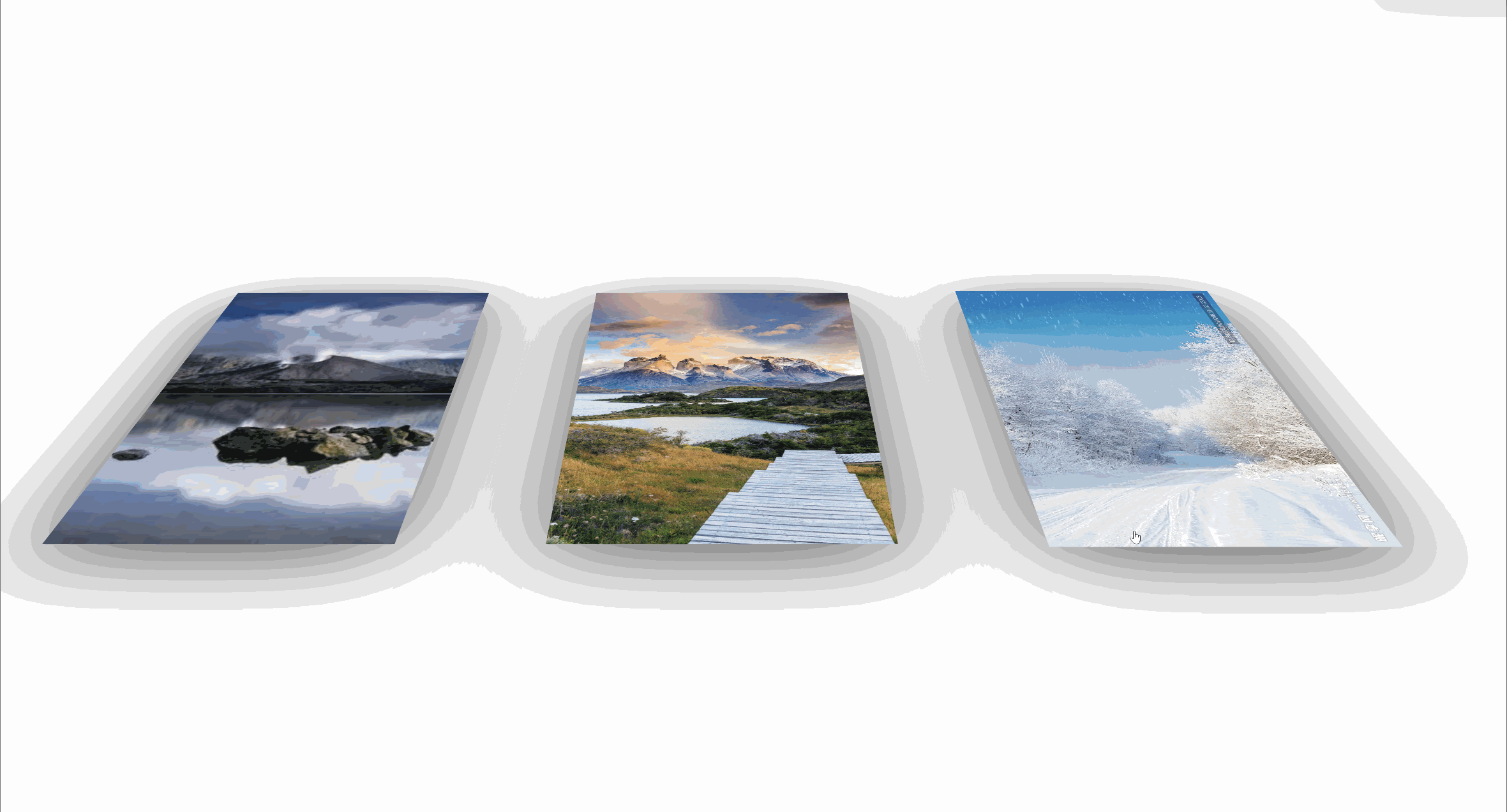
1.4如何让他变成最终效果呢?我们要给container盒子加入transform属性
让他沿着X轴旋转60°且缩小0.7
 .container {
      position: absolute;
      top: 0%;
      width: 100%;
      height: 100%;
      transition: .5s all ease;  /*添加过度*/
      transform: rotateX(60deg) scale(0.7);  /*旋转+缩小*/
      perspective: 900px;
      box-shadow: 0px 20px 50px #555;
    }
效果如下:
1.5最后添加hover效果
  .container:hover {
      cursor: pointer;
      transform: rotate(0deg) scale(1) translateY(10px);
      transition: .5s all ease;
      z-index: 400;
    }
完整代码从如下:
<!DOCTYPE html>
<html lang="en">
<head>
    <meta charset="UTF-8">
    <meta name="viewport" content="width=device-width, initial-scale=1.0">
    <title>Document</title>
    <style>
    .wrapper {
      position: absolute;
      top: 10%;
      left: 40%;
      width: 300px;
      height: 500px;
      perspective: 900px;
    }

    .container {
      position: absolute;
      top: 0%;
      width: 100%;
      height: 100%;
      transition: .5s all ease;
      transform: rotateX(60deg) scale(0.7);
      perspective: 900px;
      box-shadow: 0px 20px 50px #555;
    }

    #c0 {
      position: absolute;
      top: 0%;
      width: 100%;
      height: 100%;
      z-index: 300;
      box-shadow: 0px 20px 100px #555;
    }

    #c1 {
      box-shadow: 0px 20px 100px #555;
      left: 100%;
      z-index: 0;
    }

    #c2 {
      left: -100%;
      z-index: 0;
      box-shadow: 0px 20px 100px #555;
    }

    .container:hover {
      cursor: pointer;
      transform: rotate(0deg) scale(1) translateY(10px);
      transition: .5s all ease;
      z-index: 400;
    }

    .container>img {
      width: 100%;
      height: 100%;
    }
    </style>
</head>
<body>
    <div class="wrapper">

        <div class="container" id="c0">

          <img src="./img/07ecd202415044889ce69497c1b187f0.jpeg" alt="">
        </div>
        <div class="container" id="c1">

          <img src="./img/28812041_162237730103_2.jpg" alt="">
        </div>
        <div class="container" id="c2">

          <img src="./img/images.jpg" alt="">
        </div>

      </div>
</body>
</html>


 扫一扫
扫一扫


 被折叠的 条评论
为什么被折叠?
被折叠的 条评论
为什么被折叠?
 到【灌水乐园】发言


