<!DOCTYPE html>
<html>
<head>
<style>
body {
background: #000;
overflow: hidden;
margin: 0;
}
.matrix {
position: fixed;
top: 0;
left: 0;
width: 100%;
height: 100%;
z-index: -1;
}
/* 中央图片爱心 */
.center-heart {
position: fixed;
left: 50%;
top: 50%;
transform: translate(-50%, -50%);
width: 280px;
height: 280px;
background-size: cover;
mask-image: url("data:image/svg+xml,%3Csvg viewBox='0 0 100 100' xmlns='http://www.w3.org/2000/svg'%3E%3Cpath d='M50 30 C50 30 35 0 15 0 C-5 0 0 30 0 30 C0 30 0 70 50 90 C100 70 100 30 100 30 C100 30 105 0 85 0 C65 0 50 30 50 30 Z'/%3E%3C/svg%3E");
-webkit-mask-image: url("data:image/svg+xml,%3Csvg viewBox='0 0 100 100' xmlns='http://www.w3.org/2000/svg'%3E%3Cpath d='M50 30 C50 30 35 0 15 0 C-5 0 0 30 0 30 C0 30 0 70 50 90 C100 70 100 30 100 30 C100 30 105 0 85 0 C65 0 50 30 50 30 Z'/%3E%3C/svg%3E");
mask-size: contain;
-webkit-mask-size: contain;
mask-repeat: no-repeat;
-webkit-mask-repeat: no-repeat;
animation: centerHeartBeat 2s infinite ease-in-out;
z-index: 1000;
}
.heart-container {
position: absolute;
transform-origin: center;
}
.heart-svg {
position: absolute;
filter: drop-shadow(0 0 10px rgba(255,255,255,0.3));
}
.heart-outline {
stroke-width: 3;
stroke-linecap: round;
fill: none;
stroke-dasharray: 1000;
stroke-dashoffset: 1000;
animation: drawHeart 0.5s ease-out forwards;
}
.heart-fill {
fill-opacity: 0;
animation: fillHeart 0.3s ease-in forwards 0.5s;
}
.inner-heart {
transform-origin: center;
animation: pulseInnerHeart 0.8s infinite;
}
/* 粒子效果 */
.particle {
position: absolute;
pointer-events: none;
opacity: 0;
}
.spiral-particle {
position: absolute;
width: 8px;
height: 8px;
border-radius: 50%;
}
.star-particle {
position: absolute;
clip-path: polygon(50% 0%, 61% 35%, 98% 35%, 68% 57%, 79% 91%, 50% 70%, 21% 91%, 32% 57%, 2% 35%, 39% 35%);
}
/* 动画定义 */
@keyframes centerHeartBeat {
0% { transform: translate(-50%, -50%) scale(1); }
50% { transform: translate(-50%, -50%) scale(1.2); }
100% { transform: translate(-50%, -50%) scale(1); }
}
@keyframes drawHeart {
to { stroke-dashoffset: 0; }
}
@keyframes fillHeart {
to { fill-opacity: 0.8; }
}
@keyframes pulseInnerHeart {
0% { transform: scale(0.3); opacity: 0.3; }
50% { transform: scale(0.8); opacity: 0.8; }
100% { transform: scale(0.3); opacity: 0.3; }
}
@keyframes particleFade {
0% { transform: translate(0, 0) scale(1); opacity: 1; }
100% { transform: translate(var(--tx), var(--ty)) scale(0); opacity: 0; }
}
@keyframes spiralMove {
0% { transform: translate(0, 0) rotate(0deg) scale(1); opacity: 1; }
100% { transform: translate(var(--tx), var(--ty)) rotate(720deg) scale(0); opacity: 0; }
}
@keyframes starFloat {
0% { transform: translate(0, 0) rotate(0deg) scale(1); opacity: 1; }
100% { transform: translate(var(--tx), var(--ty)) rotate(360deg) scale(0); opacity: 0; }
}
</style>
</head>
<body>
<canvas class="matrix"></canvas>
<div class="center-heart"></div>
<script>
// 渐变色生成
function createGradientColor() {
const gradients = [
'linear-gradient(45deg, #ff6b6b, #ff0844)',
'linear-gradient(45deg, #ff1493, #ff69b4)',
'linear-gradient(45deg, #ff4500, #ff8c00)',
'linear-gradient(135deg, #d500f9, #ff1744)',
'linear-gradient(to right, #ff758c, #ff7eb3)'
];
return gradients[Math.floor(Math.random() * gradients.length)];
}
// 设置中央图片爱心
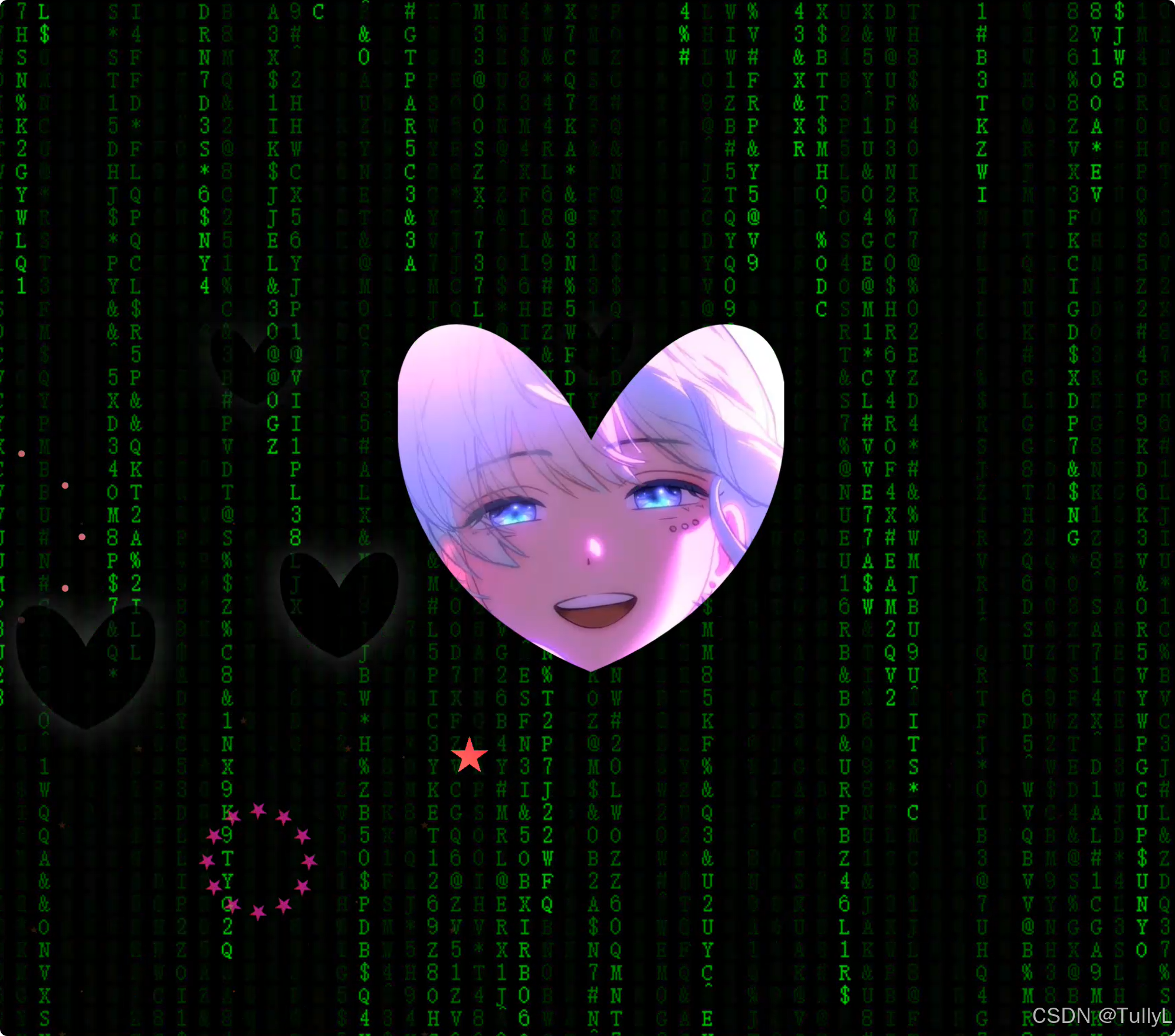
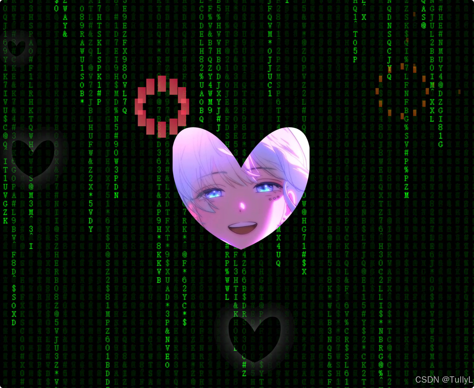
function setCenterHeartImage() {
const centerHeart = document.querySelector('.center-heart');
centerHeart.style.backgroundImage = "url('E:/Cusor/Heart_for_HUI/微信图片_20241210223722.jpg')";
}
// 创建随机爱心
function createHeart() {
const size = Math.random() * 100 + 50;
const pos = {
x: Math.random() * (window.innerWidth - size),
y: Math.random() * (window.innerHeight - size)
};
const container = document.createElement('div');
container.className = 'heart-container';
container.style.width = size + 'px';
container.style.height = size + 'px';
container.style.left = pos.x + 'px';
container.style.top = pos.y + 'px';
const gradient = createGradientColor();
const innerGradient = createGradientColor();
const svg = document.createElementNS('http://www.w3.org/2000/svg', 'svg');
svg.setAttribute('class', 'heart-svg');
svg.setAttribute('viewBox', '0 0 100 100');
svg.style.width = '100%';
svg.style.height = '100%';
// 外层轮廓
const outline = document.createElementNS('http://www.w3.org/2000/svg', 'path');
outline.setAttribute('class', 'heart-outline heart-fill');
outline.setAttribute('d', 'M50 30 C50 30 35 0 15 0 C-5 0 0 30 0 30 C0 30 0 70 50 90 C100 70 100 30 100 30 C100 30 105 0 85 0 C65 0 50 30 50 30 Z');
outline.style.stroke = gradient;
outline.style.fill = gradient;
// 内层动态心形
const inner = document.createElementNS('http://www.w3.org/2000/svg', 'path');
inner.setAttribute('class', 'inner-heart');
inner.setAttribute('d', 'M50 30 C50 30 35 0 15 0 C-5 0 0 30 0 30 C0 30 0 70 50 90 C100 70 100 30 100 30 C100 30 105 0 85 0 C65 0 50 30 50 30 Z');
inner.style.fill = innerGradient;
svg.appendChild(outline);
svg.appendChild(inner);
container.appendChild(svg);
document.body.appendChild(container);
// 随机选择爆炸效果
setTimeout(() => {
const effectType = Math.floor(Math.random() * 3);
switch(effectType) {
case 0:
explodeIntoPetals(container, pos.x, pos.y, size, gradient);
break;
case 1:
explodeIntoSpiral(container, pos.x, pos.y, size, gradient);
break;
case 2:
explodeIntoStars(container, pos.x, pos.y, size, gradient);
break;
}
}, 800);
}
// 花瓣爆炸效果
function explodeIntoPetals(container, x, y, size, gradient) {
const petalCount = 12;
const centerX = x + size/2;
const centerY = y + size/2;
for(let i = 0; i < petalCount; i++) {
const petal = document.createElement('div');
petal.className = 'particle';
petal.style.width = (size/6) + 'px';
petal.style.height = (size/3) + 'px';
petal.style.background = gradient;
petal.style.left = centerX + 'px';
petal.style.top = centerY + 'px';
const angle = (i / petalCount) * Math.PI * 2;
const distance = size;
const tx = Math.cos(angle) * distance;
const ty = Math.sin(angle) * distance;
petal.style.setProperty('--tx', tx + 'px');
petal.style.setProperty('--ty', ty + 'px');
petal.style.animation = 'particleFade 1s ease-out forwards';
document.body.appendChild(petal);
setTimeout(() => petal.remove(), 1000);
}
container.remove();
}
// 螺旋爆炸效果
function explodeIntoSpiral(container, x, y, size, gradient) {
const particleCount = 20;
const centerX = x + size/2;
const centerY = y + size/2;
for(let i = 0; i < particleCount; i++) {
const particle = document.createElement('div');
particle.className = 'spiral-particle';
particle.style.background = gradient;
particle.style.left = centerX + 'px';
particle.style.top = centerY + 'px';
const angle = (i / particleCount) * Math.PI * 4;
const distance = size * 1.5;
const tx = Math.cos(angle) * distance;
const ty = Math.sin(angle) * distance;
particle.style.setProperty('--tx', tx + 'px');
particle.style.setProperty('--ty', ty + 'px');
particle.style.animation = 'spiralMove 1.2s ease-out forwards';
document.body.appendChild(particle);
setTimeout(() => particle.remove(), 1200);
}
container.remove();
}
// 星星爆炸效果
function explodeIntoStars(container, x, y, size, gradient) {
const starCount = 12;
const centerX = x + size/2;
const centerY = y + size/2;
for(let i = 0; i < starCount; i++) {
const star = document.createElement('div');
star.className = 'star-particle';
star.style.width = (size/5) + 'px';
star.style.height = (size/5) + 'px';
star.style.background = gradient;
star.style.left = centerX + 'px';
star.style.top = centerY + 'px';
const angle = (i / starCount) * Math.PI * 2;
const distance = size * 1.2;
const tx = Math.cos(angle) * distance;
const ty = Math.sin(angle) * distance;
star.style.setProperty('--tx', tx + 'px');
star.style.setProperty('--ty', ty + 'px');
star.style.animation = 'starFloat 1s ease-out forwards';
document.body.appendChild(star);
setTimeout(() => star.remove(), 1000);
}
container.remove();
}
// 数据流背景
const canvas = document.querySelector('.matrix');
const ctx = canvas.getContext('2d');
canvas.width = window.innerWidth;
canvas.height = window.innerHeight;
const chars = 'ABCDEFGHIJKLMNOPQRSTUVWXYZ0123456789@#$%^&*';
const fontSize = 14;
const columns = canvas.width/fontSize;
const drops = Array(Math.floor(columns)).fill(1);
function drawMatrix() {
ctx.fillStyle = 'rgba(0, 0, 0, 0.05)';
ctx.fillRect(0, 0, canvas.width, canvas.height);
ctx.fillStyle = '#0F0';
ctx.font = fontSize + 'px monospace';
drops.forEach((drop, i) => {
const text = chars[Math.floor(Math.random() * chars.length)];
ctx.fillText(text, i * fontSize, drop * fontSize);
if(drop * fontSize > canvas.height && Math.random() > 0.975) {
drops[i] = 0;
}
drops[i]++;
});
}
// 维持屏幕上的爱心数量
function maintainHearts() {
const minHearts = 5;
const currentHearts = document.querySelectorAll('.heart-container').length;
if(currentHearts < minHearts) {
createHeart();
}
}
// 初始化
function init() {
setCenterHeartImage();
setInterval(drawMatrix, 33);
setInterval(maintainHearts, 200);
}
window.addEventListener('resize', () => {
canvas.width = window.innerWidth;
canvas.height = window.innerHeight;
});
init();
</script>
</body>
</html>


 扫一扫
扫一扫


 162
162

 被折叠的 条评论
为什么被折叠?
被折叠的 条评论
为什么被折叠?
 到【灌水乐园】发言


