css 使用径向渐变实现卡券效果

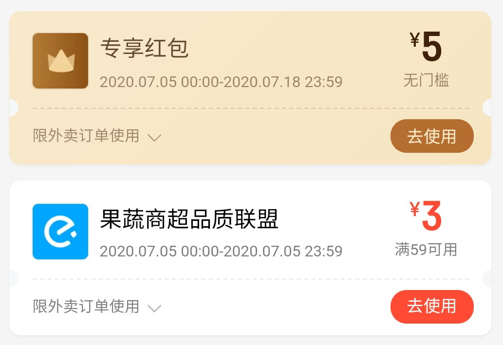
本文介绍如何运用LESS预处理器的伪元素和混合选择器来创建复杂的票务UI样式,包括水平和垂直边框效果,以及阴影和渐变背景。通过详细代码示例,展示了如何调整参数以适应不同需求。

摘要生成于 C知道 ,由 DeepSeek-R1 满血版支持, 前往体验 >


image.png


使用伪元素实现(Less 版本)

.ordinary-mixins-ticket-horizontal(@width,@height,@r,@top, @color) {
  position: relative;
  box-sizing: border-box;
  padding: 0 @r;
  width: @width;
  height: @height;
  background-clip: content-box;
  background-color: @color;

  &::before {
    position: absolute;
    top: 0;
    left: 0;
    content: "";
    display: block;
    width: @r + 1px;
    height: 100%;
    background: radial-gradient(@r circle at left @top, transparent @r, @color @r + 1px);
  }

  &::after {
    position: absolute;
    top: 0;
    right: 0;
    content: "";
    display: block;
    //这里的 @r + 1px 是为了避免某些百分百比缩放页面时,出现空隙
    width: @r + 1px;
    height: 100%;
    //这里的 @r + 1px 是为了防止出现锯齿
    background: radial-gradient(@r circle at right @top, transparent @r, @color @r + 1px);
  }
}

.parent {
  .ordinary-mixins-ticket-horizontal(200px, 200px, 10px, 150px, #fc3a28);
}
.child {
  line-height: 200px;
}
import React from 'react';
import './App.css';
import './ticket.less';

function App() {
    return (
        <div className="App" style={
            {
                display: "flex",
                justifyContent: "center",
                alignItems: "center",
                height: 600
            }
        }>
            <div className={'parent'}>
                <div className="child">666</div>
            </div>
        </div>
    );
}

export default App;

升级版样式(Less 版本)

image.png

.mixins-ticket-horizontal-line(@width, @height, @r, @top, @l-color, @r-color,@border-offset,@border-color) {
  width: @width;
  height: @height;
  background: radial-gradient(circle at left top, transparent @r, @l-color @r + 1px) left @top - 1px ~'/' 51% 100% no-repeat,
  radial-gradient(circle at left bottom, transparent @r, @l-color @r + 1px) left -(@height - @top) ~'/' 51% 100% no-repeat,
  radial-gradient(circle at right top, transparent @r, @r-color @r + 1px) right @top - 1px ~'/' 51% 100% no-repeat,
  radial-gradient(circle at right bottom, transparent @r, @r-color @r + 1px) right -(@height - @top) ~'/' 51% 100% no-repeat;
  filter: drop-shadow(2px 2px 2px rgba(0, 0, 0, .2));

  &::after {
    position: absolute;
    left: 0;
    right: 0;
    top: @top;
    margin: auto;
    content: '';
    width: calc(~"100%" - 2*@r - @border-offset);
    border-top: 1px dashed @border-color;
  }
}

.parent {
  .mixins-ticket-horizontal(200px, 200px, 10px, 150px, #fc3a28,#fc3a28);
  //.mixins-ticket-horizontal-two(200px, 200px, 10px, 150px, #fc3a28,#fc3a28);
}
.child {
  line-height: 200px;
}

image.png

.mixins-ticket-vertical-three(@width, @height, @r, @left, @l-color, @r-color,@sm-r,@sm-offset,@sm-color) {
  width: @width;
  height: @height;
  // @left - 1px 是为了避免某些百分百比缩放页面时,出现空隙
  // @r + 1px 是为了防止出现锯齿
  // 51% 是为了防止出现元素中间会有一小段空白区域的情况
  background: radial-gradient(circle at left top, transparent @r, @l-color  @r + 1px) @left - 1px top ~'/' 100% 51% no-repeat,
  radial-gradient(circle at left bottom, transparent @r, @l-color  @r + 1px) @left - 1px bottom ~'/' 100% 51% no-repeat,
    radial-gradient(circle at  right top, transparent @r, @r-color  @r + 1px ) -(@width - @left) top ~'/' 100% 51% no-repeat,
    radial-gradient(circle at right bottom , transparent @r, @r-color  @r + 1px )  -(@width - @left) bottom ~'/' 100% 51% no-repeat;

  filter: drop-shadow(2px 2px 2px rgba(0, 0, 0, .2));

  &::after {
    content: '';
    position: absolute;
    top: 0;
    right: -@sm-r;
    width: @sm-r;
    height: 100%;
    background-image: radial-gradient(circle at @sm-r, transparent @sm-r, @r-color @sm-r + 1px);
    //background-size: @sm-r;
    background-size: @sm-r @sm-offset;
  }
}

.parent {
  .mixins-ticket-vertical-three(200px, 200px, 10px, 150px, #fc3a28, #fc3a28,5px,20px,#fc3a28);
}

.child {
  line-height: 200px;
}

注意事项

// ticket.less

//background: radial-gradient(circle at top right, transparent @r, @lcolor 0) -(@width - @left) top ~'/' 100% 55% no-repeat;
// 将上面的这行代码拆解如下:
//background-image: radial-gradient(circle at top right, transparent @r, @lcolor 0);
//background-position:-(@width - @left) top ;
//background-size:100% 55% ;
//background-repeat: no-repeat;

/*注意:这里先是有 50px 的透明区域,紧接着第二个区域设置了 0 ,可以理解为从这里开始重新设置样式区间*/
/*background: radial-gradient(circle at top right, transparent 50px, red 0, #66a8ff 50%);*/

/*在Chrome下,如果两个区域之间颜色直接以 0 偏差过渡,会有比较严重的锯齿*/
/*background: radial-gradient(10px at left,transparent 50%,#F6327C 50%);*/
/*background: radial-gradient(10px at left,transparent 50%,#F6327C 55%);*/

/*加阴影效果*/
/*filter: drop-shadow(2px 2px 2px rgba(0,0,0,.2));*/

/*多个径向渐变累加*/
/*background: 
radial-gradient(50px 100px ellipse, transparent 40px, yellow 41px, red 49px, transparent 50px),
radial-gradient(30px circle, red, red 29px, transparent 30px);*/


评论
添加红包

请填写红包祝福语或标题

红包个数最小为10个

红包金额最低5元

当前余额3.43前往充值 >
需支付:10.00
成就一亿技术人!
领取后你会自动成为博主和红包主的粉丝 规则
hope_wisdom
发出的红包
实付
使用余额支付
点击重新获取
扫码支付
钱包余额 0

抵扣说明:

1.余额是钱包充值的虚拟货币,按照1:1的比例进行支付金额的抵扣。
2.余额无法直接购买下载,可以购买VIP、付费专栏及课程。

余额充值