


背景样式
<body><P>中皆可放
颜色
<body style="background -color: pink">
-
颜色
-
#FF0000 红色 RRGGBB
-
rgb(255,0,0) 红色
-
rgba(255,0,0,0.5) 红色 +透明度 (越小越透明)
图片
 <body style="background-image:url( );
              background-repeat:no repeat/repeat-x;
              background-position:center/top/right/right top/
              100px 100px;
               background-attachment:fixed ;">
<!--图片较小会重复出现,可设置不重复出现。图片固定,默认是scroll滚动-->
</body>
-
可加同一文件下的图片名
-
网站上图片地址
注:可直接全部写出 background:(按照color,image,repeat,attachment,position的顺序)
段落
缩进text-indent
<p style="text-indent: 2em(字符数)/% /in/cm/mm/px/pt (可为负)">
</p>
与浏览器边框间距 padding
<p style="padding:2em">
</p>
行间距line-height
<p style="line-height:2em/1.5/normal">
</p>
对齐方式line-aline
<p style="text-align:justify/right/left/center">
</p>
空格分隔的大小word-spacing
<p style="word-spacing: 30px">
</p>
<!--(对英文和空格有用)-->
字符间间距letter-spacing
<p style="letter-spacing: 10px">
</p>
字符变形 text-transform
<p style="text-transform: capitalize(首字母大写)、uppercase、lowercase">
</p>
字符装饰text-decoration
<p style="text-decoration: underline overline line-through;" >
</p>
空格white-space
white-space:1. normal(连续空格都当作一个)
-
pre(空格不变且不卷绕) pre-wrap(空格不变且卷绕)
-
no-wrap:不卷绕 就一行
-
pre-line(合并空格,保留换行)
文字方向direction
<p style="direction: rtl;">
    哦!Sofiya and a baby,你为什么穿成这样?你的礼服呢?还有那些
     奇怪的人是谁?”还没等苏菲亚回答,安柏就抢先回答道“苏菲亚她打败
      的声音“什么!苏菲亚自己     打败了沃尔?沃尔可是最邪恶的女巫”那个人是
        祖伊,“我妈妈曾经和我讲过沃尔的故事,苏菲亚你太厉害了!
</p>

字体
字体系列font-family
font-family:
-
serif 大多数英文字体
-
sans-serif
-
monospace 等宽字符
-
cursive 手写字体
-
fantasy 符号
-
详细字体(hei)
如果字体浏览器无法找到,将采用浏览器默认字体
font-family:Times,TimesNR,serif #存在备选字体
<p style="font-family:Times,TimesNR,serif;">
</p>
字体倾斜font-style
<p style="font-style:italic/ obique [厂家做好的斜体和浏览器计算得到的斜体]">
</p>
字体小大写font-variant
<p style="font-variant:samll-caps">
</p>
字母加粗font-weight
<p style="font-weight:bold/100/900">
</p>
字体大小font-size
<p style="font-size:2em/40%/2px">
</p>
阴影text-shadow
<p style="text-shadow:3px 5px 5px rgba(0,255,0,0.5) (x,y,扩散范围,颜色)">
</p>
多块阴影用","隔开
外边框outline
<p style="outline-style:solid、dotted、dashed、double、groove(3D凹槽)、ridge(3D凸槽)、inset(凹的边)
outline-width:10">
</p>
列表
点的类型list-style-type
<ul style="list-style-type: disc;">
</ul>
list-style-type:disc(实心圆)、circle(空心圆)、square(方)、罗马数字
list-style-image:url() 自制点符号
文本内容位置list-style-position
<ul style="list-style-position:outside;">
</ul>
list-style-position:inside (内容回卷后,最左端与小圆点左端对齐)
outside(内容回卷后,文字最左端与小圆点右端对齐)
合并
list-style:inside circle
表格
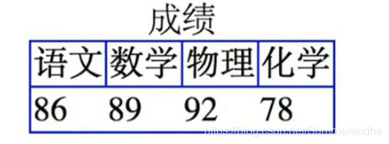
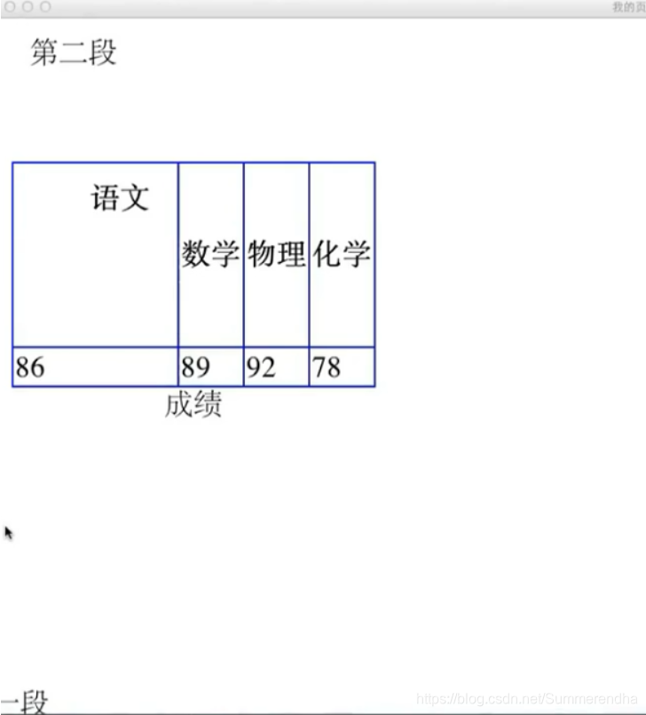
边框border
<table style="border: 10px dotted  pink;
        border-collapse: collapse;
        caption-side:bottom;
        table-layout: auto/fixed;">
</table>
border:1px solid blue
border-collapse:collapse (合并两条靠近的表格线)、seperate[table中]
宽度width
width:50px (同列共同变化) height:100px (同行共同变化)
文字对齐align
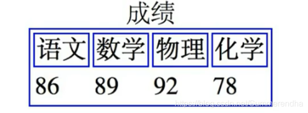
<th style="border: 10px solid pink;width: 50px ;
                height: 100px;vertical-align: top;
                text-align: right;padding: 10px;">语文</th>
#默认居中
垂直vertical-align:top
水平text-align:right
标题caption
<caption>标题</caption>
caption-side:bottom
布局table-layout
table-layout:automatic (全部内容输入后 自动根据读入的内容变换表格大小)
table-laayout:fixed(根据第一行的列宽 计算整个表格列宽)
框模型
内边距
padding:10 (与四周的边线距离>=10)
padding: 10 15 20 25 (top,right,bottom,left)
边距
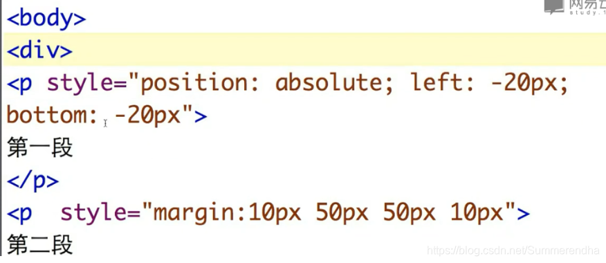
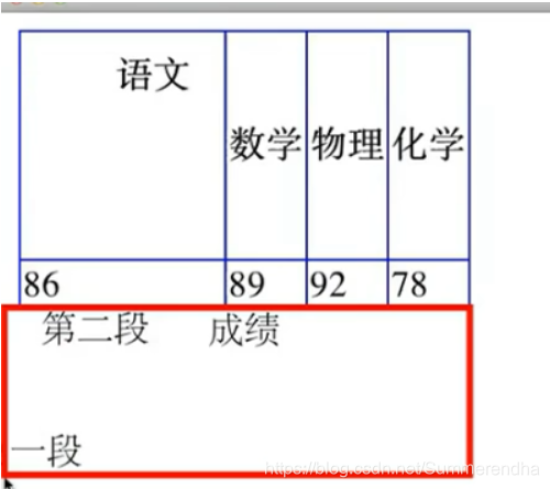
<p style="margin: 10 20 20 10;">
            第二段
</p>
#段落间也可使用
margin:50
margin:10 50 50 10
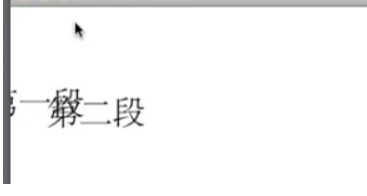
边距合并:第一段下边距50,第二段上边距10-->边距取大
CSS定位
块元素
<body>
    <div>
        <p>
            <span>
            </span>
        </p>
    </div>
</body>
<foot>
<side>
相对定位
position: relative;left: -20px;bottom: -30px;
相对位置调整会与其他元素重叠,因为是保留原来的位置,再移动。
绝对定位
position: absolute;left: -20px;bottom: -30px;
从原来的位置拿走,所以下一行会上移 ,根据从里到外定位过的块元素的相对位置
div未定位,所以相对于body进行left:-20;bottom:-30
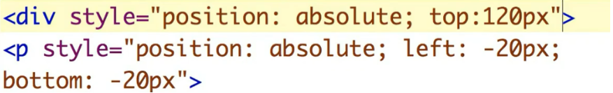
div 定位后,根据div进行移动
浮动定位
<img src="1.jpg" width=200
style="float:left"></image>
图片浮在浏览器左边,浏览器拉动后,图片跟着移动
样式选择器
元素选择器
在head中统一样式
<style>
    th,td,p {border: 1px solid blue}
    p {background-color:red}
</style>
类选择器
<style>
    *.important {color :green}
    *.warning
</style>
属性选择器
<style>
    *[title] {color:red}   #有title属性的html应用了样式
</style>
后代选择器
<style>
    p em  {color:red}      #p中em的部分应用样式 p与em中隔着<i>也实行
    p>em  {color:red}      #p与em必须紧挨着
</style>
兄弟选择器
<style>
        h1+p  {color:red}      #h1后面紧邻着的p应用样式
</style>
超链选择器
<style>
    a:visited {color:#FF0000}   #访问过的
    a:link
    a:hover     #鼠标移上去变色
    a:active    #活动的,点上去的时候变色
    a.red
</style>


 扫一扫
扫一扫


 被折叠的 条评论
为什么被折叠?
被折叠的 条评论
为什么被折叠?
 到【灌水乐园】发言


