


- 单特征可视化:连续变量箱线图和核密度直方图,以及离散特征的直方图。
- 可视化特征与标签之间的关系。
- 对箱线图进行美化,转换为直方图。
作业要求:绘制其他特征的单特征图和特征与标签的关系图,并且尝试观察出一些有趣的结论。
1单特征可视化
首先我们得查看这份数据有哪些特征,并打印;其次我们的找到其中的连续变量
import pandas as pd
data = pd.read_csv(r'C:\Users\许兰\Desktop\打卡文件\python60-days-challenge-master\data.csv')
continuous_features = []
for i in data.columns:
    if data[i] != 'object':
    continuous_features.append(i)
print(continuous_features)
还有第二种方法
continuous_features = data.select_dtypes(include = ['float'],['int']).columns.tolist()连续变量的箱线图
需要使用matplotlib库和seaborn库进行完成,可以改变maeplotlib的内参改变负号显示异常和中文显示异常的问题。
import matplotlib.pyplot as plt
import seaborn as sns
import pandas as pd
plt.rcparams['font.sans-serif'] = ['SimHei']
plt.rcparams['axes.unicode_minus'] = False
sns.boxplot(x=['Years of Credit History'])
plt.title('信用历史年限箱线图')
plt.xlabel('信用历史年限')
plt.show()
连续变量的核密度直方图
plt.rcparams['font.sans-serif'] = ['SimHei']
plt.rcparams['axes.unicode_minus'] = False
sns.hisplot(data['Years of Credit History'],Kde = True,element = "step")
plot.title('信用历史年限直方图']
plot.xlabel('信用历史年限']
plot.ylabel('count')
plot.show()
离散特征直方图
plt.rcparams['font.sans-serif'] = ['SimHei']
plt.rcparams['axes.unicode_minus'] = False
sns.hisplot(data['Home Ownership'])
plt.title('房屋所有权直方图')
plt.xlabel('房屋所有权')
plt.show()
可视化特征和标签之间的关系
标签是离散的,特征是连续的
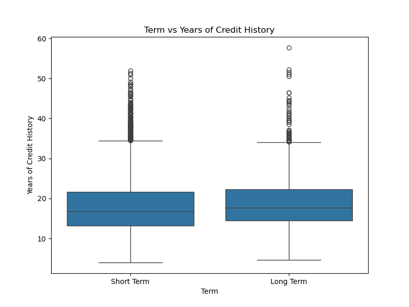
plt.figure(figsize=(8, 6))
sns.boxplot(x='Term',y='Years of Credit History',data=data)
plt.title('Term vs Years of Credit History')
plt.xlabel('Term')
plt.ylabel('Years of Credit History')
plt.show()
这个图片跑出来的时候差点喜极而泣,折磨了我好长时间,一直报错,一会儿又配置了环境,一会儿又是标点符号打错,一会儿又是定义了两遍库,都会导致报错,卡住,图片跑不出来的情况,真是太太太顶了。
标签和特征都是离散的
plt.figure(figsize=(8, 6))
sns.countplot(x='Home Ownership',hue='Term',data=data)
plt.title('Home Ownership vs Term')
plt.xlabel('Home Ownership')
plt.ylabel('count')
plt.show()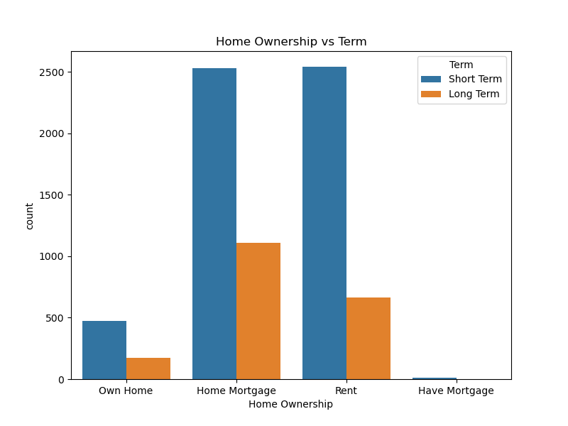
将箱线图进行美化为直方图
这个题目有坑,因为直方图和箱线图的x轴和y轴的选取方式不同,跑了个乱七八糟的东西出来。
现在是箱线图
plt.figure(figsize=(8, 6))
sns.boxplot(x='Credit Default',y='Years of Credit History',data=data)  # sns.boxplot(x='Term',y='Years of Credit History',data=data)plt.figure(figsize=(8, 6))sns.boxplot(x='Term',y='Years of Credit History',data=data)
plt.title('Credit Default vs Years of Credit History')
plt.xlabel('Credit Default')
plt.ylabel('Years of Credit History')
plt.show()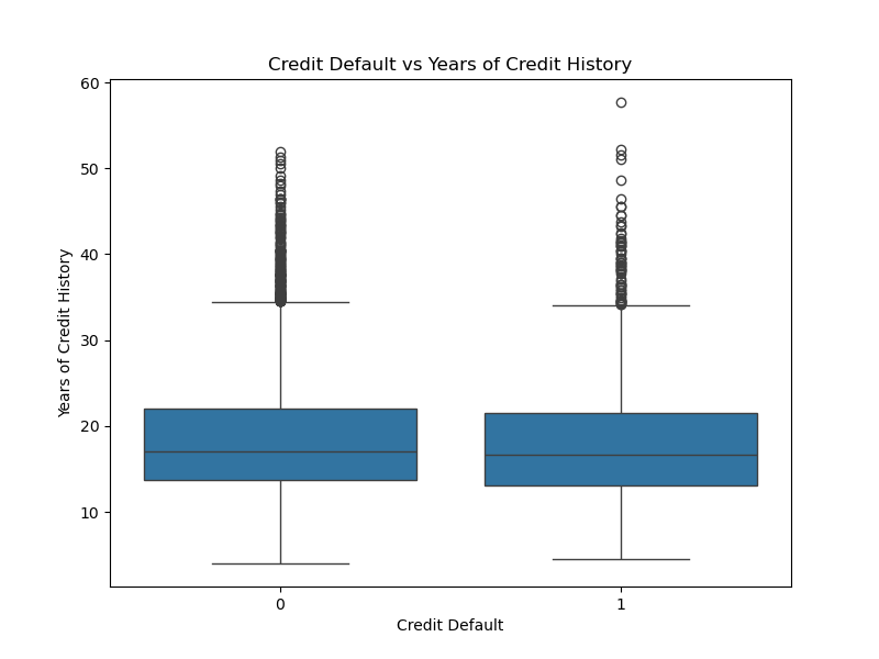
接下来是直方图
plt.figure(figsize=(8, 6))
sns.histplot(x='Years of Credit History',y='Credit Default',data=data)  # sns.boxplot(x='Term',y='Years of Credit History',data=data)plt.figure(figsize=(8, 6))sns.boxplot(x='Term',y='Years of Credit History',data=data)
plt.title('Credit Default vs Years of Credit History')
plt.xlabel('Years of Credit History')
plt.show()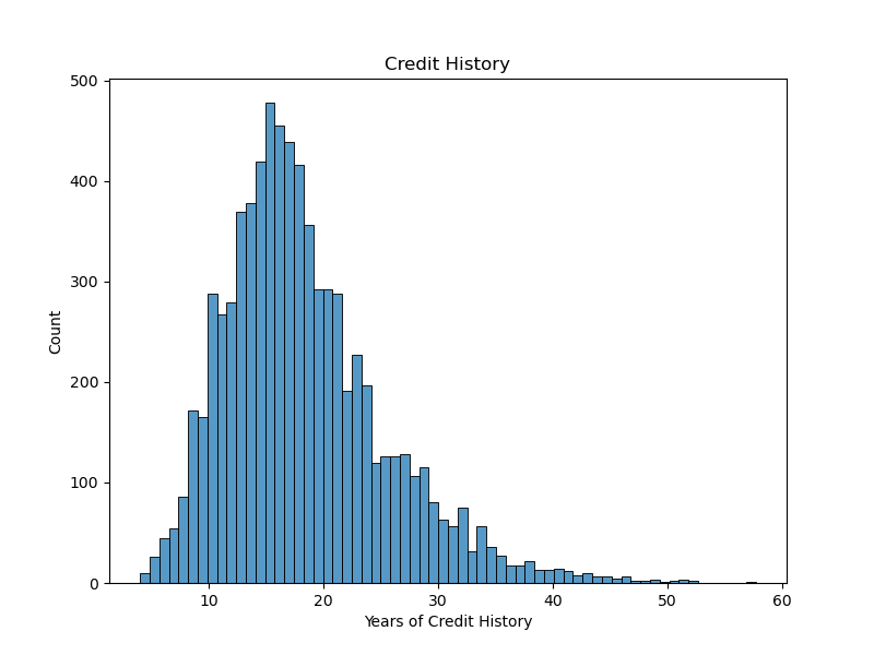
这里有点小问题,因为直方图可以不用选取y轴,而我的箱线图有x轴和y轴,然后我尝试在直方图中指定了y轴,跑出来的图特别丑,根本就不算美化


 161
161

 被折叠的 条评论
为什么被折叠?
被折叠的 条评论
为什么被折叠?
 到【灌水乐园】发言


