


 本文介绍了Android平台中的ToggleButton、Switch、CheckBox和RadioButton四种基础控件的概念、用法、布局示例、代码实现以及应用场景,帮助开发者理解和使用这些控件构建用户界面。
目录
ToggleButton
概念
ToggleButton(切换按钮)是Android中的一个基础控件,它可以在两种状态之间进行切换,常用于表示开关、启用/禁用等功能。
ToggleButton的一些重要特点和用法:
-
布局:在XML布局文件中,可以使用
<ToggleButton>标签来创建一个ToggleButton。可以设置其文本、样式、大小、颜色等属性,以及为其指定唯一的ID。 -
切换状态:ToggleButton有两种状态,分别是选中状态和未选中状态。用户可以通过点击ToggleButton来切换其状态。初始状态可以通过设置
setChecked()方法来指定。 -
监听状态变化:可以通过为ToggleButton设置
OnCheckedChangeListener接口来监听状态的变化。当ToggleButton的状态发生改变时,会触发相应的回调方法,可以在回调方法中执行相应的操作。 -
获取状态:可以使用
isChecked()方法来获取ToggleButton的当前状态。如果返回true,表示选中状态;如果返回false,表示未选中状态。 -
自定义样式:可以通过自定义ToggleButton的样式来改变其外观和行为。可以使用属性和样式来修改其背景、文本颜色、大小、图标等,以满足设计需求。
-
应用场景:ToggleButton常用于需要切换开关状态的功能,例如启用/禁用某项设置、开启/关闭某个功能、切换视图显示模式等。它提供了一种直观的用户界面元素,方便用户进行状态切换操作。
效果图
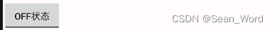
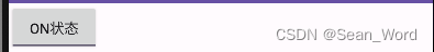
利用这个逻辑,也能实现以下效果图
代码实现
    <!--    xml文件-->

    <ToggleButton
        android:layout_width="wrap_content"
        android:layout_height="wrap_content"
        android:id="@+id/toggleButton"
        android:textOn="on状态"
        android:textOff="off状态" />
public class MainActivity extends AppCompatActivity implements View.OnClickListener ,CompoundButton.OnCheckedChangeListener{
private static final String TAG = "MainActivity";
ToggleButton toggleButton;
@Override
protected void onCreate(Bundle savedInstanceState) {
super.onCreate(savedInstanceState);
setContentView(R.layout.activity_main);
Log.d("MainActivity","onCreate execute");
toggleButton = findViewById(R.id.toggleButton);
toggleButton.setOnCheckedChangeListener(new CompoundButton.OnCheckedChangeListener() {
@Override
public void onCheckedChanged(CompoundButton compoundButton, boolean isCheck) {
if (isCheck)
System.out.println();
else
System.out.println();
}
});
Switch
概念
Switch控件是Android平台提供的一个用于表示二选一状态的开关按钮控件。它通常用于用户界面中需要表示两种状态切换的功能,比如开关某个选项、启用或禁用某个功能等。
Switch控件提供了一个可滑动的滑块(Thumb)和一个背景轨道(Track),用于表示两种状态的切换。滑块可以水平滑动,并根据用户的操作来切换开关的状态。当滑块位于左侧时,表示关闭状态,而当滑块位于右侧时,表示打开状态。
Switch常用的属性有
android:typeface="normal":设置字体类型
android:track="":设置开关的轨迹图片
android:textOff="开":设置开关checked的文字
android:textOn="关":设置开关关闭时的文字
android:thumb="":设置开关的图片
android:switchMinWidth="":开关最小宽度
android:switchPadding="":设置开关 与文字的空白距离
android:switchTextAppearance="":设置文本的风格
android:checked="":设置初始选中状态
android:splitTrack="true":是否设置一个间隙,让滑块与底部图片分隔(API 21及以上)
android:showText="true":设置是否显示开关上的文字(API 21及以上)
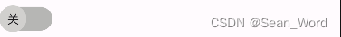
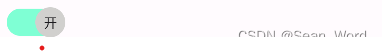
效果图
代码实现
<!--    xml文件-->

    <Switch
        android:layout_width="wrap_content"
        android:layout_height="wrap_content"
        android:id="@+id/switch_"
        android:layout_margin="10dp"
        android:textColor="#fff"
        android:typeface="normal"
        android:switchMinWidth="60dp"
        android:switchPadding="10dp"
        android:showText="true"
        android:textOn="开"
        android:textOff="关"
        android:track="@drawable/switch_track"
        android:thumb="@drawable/switch_thumb"/>
switch_track.xml
<?xml version="1.0" encoding="utf-8"?>
<selector xmlns:android="http://schemas.android.com/apk/res/android">
    <item android:state_checked="true">
        <shape android:shape="rectangle">
            <solid android:color="#7FFFD4"/>
            <stroke android:width="3dp"
                android:color="#00000000"/>
            <corners android:radius="15dp"/>
            <size android:height="32dp"/>
        </shape>
    </item>
    <item android:state_checked="false">
        <shape android:shape="rectangle">
            <solid android:color="#B6B6B4" />
            <stroke android:width="3dp"
                android:color="#00000000"/>
            <corners android:radius="15dp"/>
            <size android:height="32dp"/>
        </shape>
    </item>
</selector>
switch_thumb.xml
<?xml version="1.0" encoding="utf-8"?>
<selector xmlns:android="http://schemas.android.com/apk/res/android">
    <item android:state_checked="true">
        <shape android:shape="oval">
            <size
                android:width="32dp"
                android:height="32dp"/>
            <solid android:color="#D1D0CE"/>
        </shape>
    </item>
    <item android:state_checked="false">
        <shape android:shape="oval">
            <size
                android:width="32dp"
                android:height="32dp"/>
            <solid android:color="#D1D0CE"/>
        </shape>
    </item>
</selector>
public class MainActivity extends AppCompatActivity implements View.OnClickListener ,CompoundButton.OnCheckedChangeListener{
Switch aSwitch;
@Override
protected void onCreate(Bundle savedInstanceState) {
super.onCreate(savedInstanceState);
setContentView(R.layout.activity_main);
Log.d("MainActivity","onCreate execute");
aSwitch = (Switch) findViewById(R.id.switch_);
aSwitch.setOnCheckedChangeListener(new CompoundButton.OnCheckedChangeListener() {
@Override
public void onCheckedChanged(CompoundButton compoundButton, boolean check) {
if (check)
System.out.println("switch is checked!");
else
System.out.println("switch is not checked!");
}
});CheckBox
概念
CheckBox(复选框)是Android平台提供的一种常见的用户界面控件,用于表示多选或单选的选项。
CheckBox控件通常以一个方框和一个可选中的标记(对勾)的形式呈现。用户可以通过点击CheckBox来选择或取消选择选项。与Switch控件不同,CheckBox控件可以表示多个选项的状态,而不仅仅是两种状态的切换。
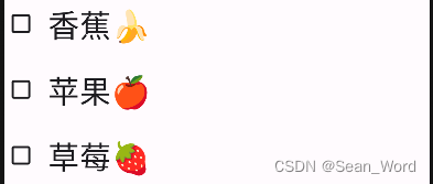
效果图
代码实现
<!--    xml文件-->
<CheckBox
        android:id="@+id/banana"
        android:layout_width="match_parent"
        android:layout_height="wrap_content"
        android:padding="10dp"
        android:text="香蕉🍌"
        android:textSize="30sp">
    </CheckBox>

    <CheckBox
        android:id="@+id/apple"
        android:layout_width="match_parent"
        android:layout_height="wrap_content"
        android:padding="10dp"
        android:text="苹果🍎"
        android:textSize="30sp">
    </CheckBox>

    <CheckBox
        android:id="@+id/strawberry"
        android:layout_width="match_parent"
        android:layout_height="wrap_content"
        android:padding="10dp"
        android:text="草莓🍓"
        android:textSize="30sp">
    </CheckBox>
public class MainActivity extends AppCompatActivity implements View.OnClickListener ,CompoundButton.OnCheckedChangeListener{
private static final String TAG = "MainActivity";
CheckBox cb1;
CheckBox cb2;
CheckBox cb3;
Button btn_send;
@Override
protected void onCreate(Bundle savedInstanceState) {
super.onCreate(savedInstanceState);
setContentView(R.layout.activity_main);
Log.d("MainActivity","onCreate execute");
cb1 = (CheckBox) findViewById(R.id.banana);
cb2 = (CheckBox) findViewById(R.id.apple);
cb3 = (CheckBox) findViewById(R.id.strawberry);
@Override
public void onClick(View view) {
String choose = " ";
if(cb1.isChecked())
choose += cb1.getText().toString() + " ";
if (cb2.isChecked())
choose += cb2.getText().toString() + " ";
if(cb3.isChecked())
choose += cb3.getText().toString() + " ";
Toast.makeText(this,choose,Toast.LENGTH_SHORT).show();
}
@Override
public void onCheckedChanged(CompoundButton compoundButton, boolean b) {
if(compoundButton.isChecked())
Toast.makeText(this,compoundButton.getText().toString(),Toast.LENGTH_LONG).show();
}
}RadioButton
概念
RadioButton(单选按钮)是Android中的基础控件之一,它是一种具有两种状态(选中和未选中)的按钮。在一组RadioButton中,只能选择其中的一个选项,选中一个RadioButton会自动取消其他RadioButton的选中状态。
以下是RadioButton的一些重要特点和用法:
-
布局:在XML布局文件中,可以使用
<RadioButton>标签来创建一个RadioButton。可以设置其文本、样式、大小、颜色等属性,以及为其指定唯一的ID。 -
单选组:为了确保在一组RadioButton中只能选择一个选项,需要将它们放置在同一个RadioGroup中。RadioGroup是一个容器,它会管理其中的RadioButton,并自动处理选中和取消选中的逻辑。
-
选中状态:通过设置RadioButton的
setChecked(true)方法可以将其设置为选中状态。当用户点击一个RadioButton时,它会自动选中,并取消其他RadioButton的选中状态。 -
监听选中事件:可以通过为RadioButton设置
OnCheckedChangeListener接口来监听选中状态的变化。当RadioButton的选中状态发生改变时,会触发相应的回调方法,可以在回调方法中执行相应的操作。 -
获取选中项:通过RadioGroup的
getCheckedRadioButtonId()方法可以获取当前选中的RadioButton的ID。进一步可以通过该ID获取选中的RadioButton,并获取其文本或其他属性。 -
自定义样式:可以通过自定义RadioButton的样式来改变其外观和行为。可以使用属性和样式来修改其背景、文本颜色、大小、图标等,以适应不同的设计需求。
RadioButton在应用程序中广泛用于需要从多个互斥选项中进行选择的场景,例如性别选择、选项卡切换、调查问卷等。它提供了一种简单而直观的用户界面元素,方便用户进行单选操作。
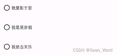
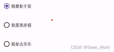
效果图
这个和我们的CheckBox是十分类似的,不同的点在于,这个控件可以由非选中状态通过点击事件转为选中状态,但是不能通过点击实现逆向的状态转换,一个默认样式RadioButton控件的非选中和选中状态如下:
代码实现
需要借助RadioGroup实现
<!--    xml文件-->
<RadioGroup
        android:layout_width="wrap_content"
        android:layout_height="wrap_content"
        android:id="@+id/radioGroup">
        <RadioButton
            android:layout_width="wrap_content"
            android:layout_height="wrap_content"
            android:id="@+id/r1"
            android:layout_margin="10dp"
            android:text="我是彭于晏"/>
        <RadioButton
            android:layout_width="wrap_content"
            android:layout_height="wrap_content"
            android:id="@+id/r2"
            android:layout_margin="10dp"
            android:text="我是吴彦祖"/>
        <RadioButton
            android:layout_width="wrap_content"
            android:layout_height="wrap_content"
            android:id="@+id/r3"
            android:layout_margin="10dp"
            android:text="我是古天乐"/>
    </RadioGroup>
public class MainActivity extends AppCompatActivity implements View.OnClickListener ,CompoundButton.OnCheckedChangeListener{
private static final String TAG = "MainActivity";
RadioButton radioButton1;
RadioButton radioButton2;
RadioButton radioButton3;
RadioGroup radioGroup;
@Override
protected void onCreate(Bundle savedInstanceState) {
super.onCreate(savedInstanceState);
setContentView(R.layout.activity_main);
Log.d("MainActivity","onCreate execute");
radioButton1 = (RadioButton) findViewById(R.id.r1);
radioButton2 = (RadioButton) findViewById(R.id.r2);
radioButton3 = (RadioButton) findViewById(R.id.r3);
radioGroup = (RadioGroup) findViewById(R.id.radioGroup);
radioGroup.setOnCheckedChangeListener(new RadioGroup.OnCheckedChangeListener() {
@Override
public void onCheckedChanged(RadioGroup radioGroup, int i) {
if (i == R.id.r1)
System.out.println();
}
});
}


 扫一扫
扫一扫


 1466
1466

 被折叠的 条评论
为什么被折叠?
被折叠的 条评论
为什么被折叠?
 到【灌水乐园】发言


