


 本文介绍了如何使用Python将测量数据转化为地图并进行颜色填充,根据测试数据展示颜色梯度,便于观察趋势。通过设置标准值,实现不同颜色表示不同测试结果。详细步骤包括数据转化、颜色设定、文件操作等,最终生成直观的测量值分布图。
最近想把特定的测量数据转化为map图后,进行上色,即不同的测试数据能够呈现不同的颜色,以便于直观的观察其趋势。
数据样式:
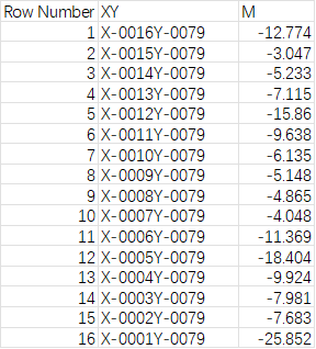
左边列是序号,中间列是XY,X-0016Y0079表示的是(X,Y)坐标为(16,79),最右行是测试数据。序号最大值为13278,即这个wafer有13278粒完成测试,得到了cp的测试数据。
我的思路:
1,将现有数据按照坐标,转化为map图,并将测试数值一一对应填入map图中。
2,有时测试标准是不一样的,所以可以手动设置标准值,这个在运行程序时能够弹出对话框,让使用者能够随意更改标准。低于标准值的测量值单元格呈现浅红色到红色的渐变,高于标准值的测量值呈现浅绿到紫色的渐变。
做出的效果:
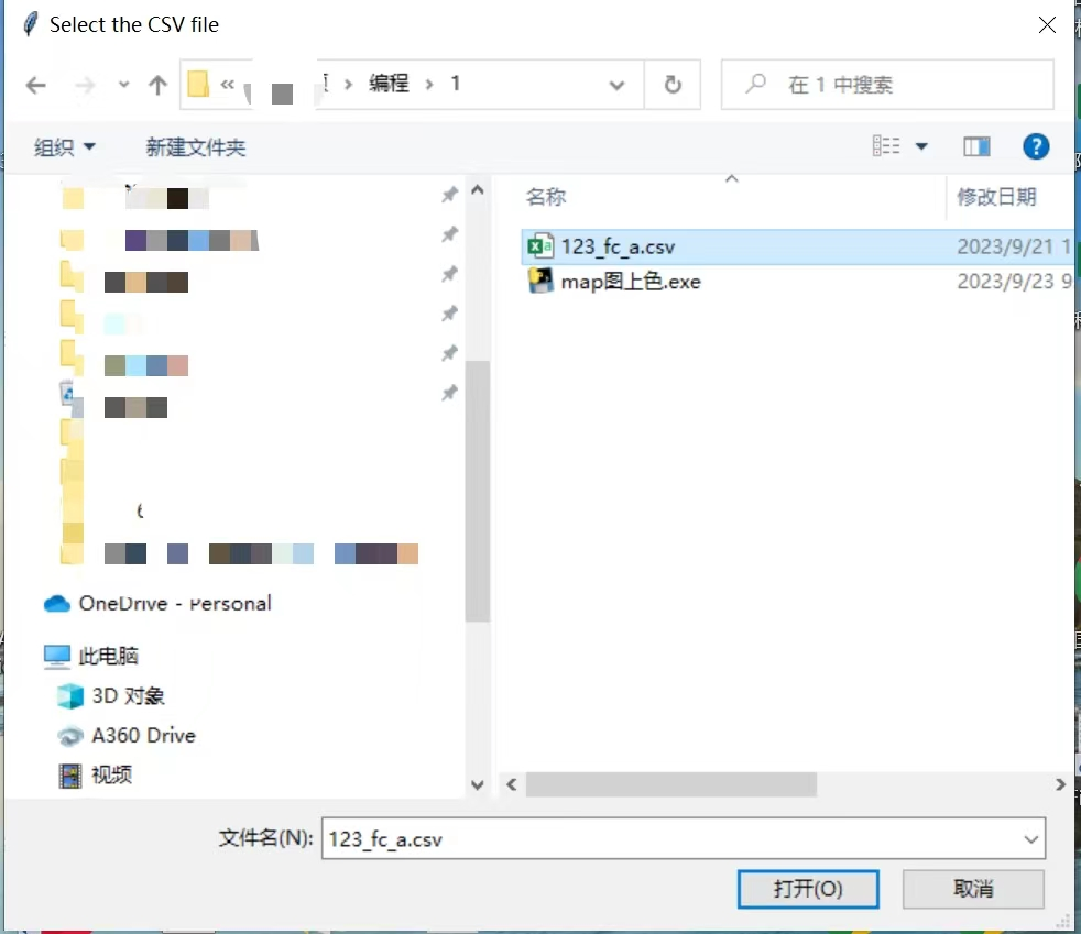
1,双击“map上色.exe”运行程序
2,选择要上色的测试数据文件
3,手动设置标准值

4,设置文件名
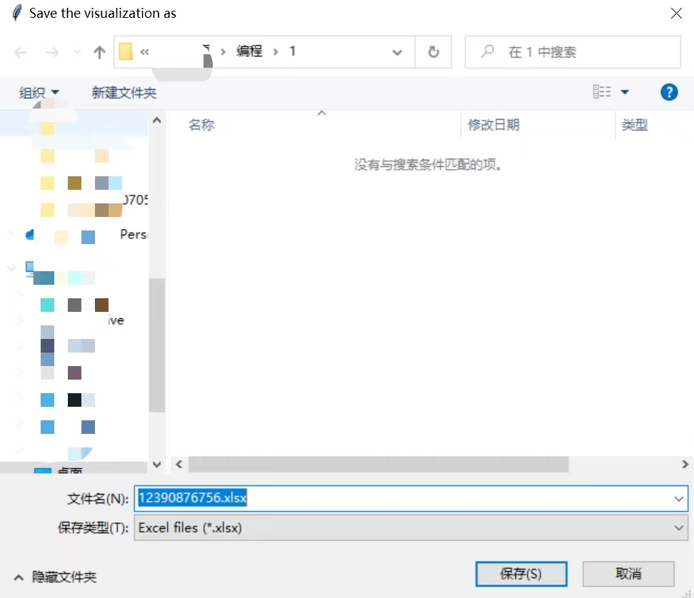
5,在原文件地址下输出包含map图的文件

6,打开文件
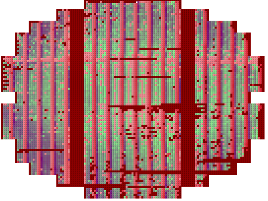
这样就很直观地看出测量值的分布图来了。
原代码如下,欢迎参考:
import pandas as pd
import numpy as np
import matplotlib.pyplot as plt
from openpyxl import Workbook
from openpyxl.utils.dataframe import dataframe\_to\_rows
from openpyxl.styles import PatternFill
from tkinter.simpledialog import askfloat
from tkinter import Tk
from tkinter import filedialog
import colorsys
from tkinter.simpledialog import askstring
def get\_threshold(threshold\_type):
    print(f"Getting threshold for {threshold\_type}...")
    root = Tk()
    root.withdraw()

    if threshold\_type == "IL":
        threshold = askfloat(f"Input {threshold\_type} Threshold", f"Enter the {threshold\_type} threshold:")
        return thres
最低0.47元/天 解锁文章


 2392
2392

 被折叠的 条评论
为什么被折叠?
被折叠的 条评论
为什么被折叠?
 到【灌水乐园】发言


