 低代码开源项目Designable应用与源码解析


 本文详细介绍了低代码开源项目 Designable,包括页面示例、集成代码、组件嵌套图及基础和复杂组件的实现。核心逻辑中探讨了 @designable/core 和 @formily/reactive 的应用,解析了事件处理、数据结构和组件拖拽的逻辑。此外,还分享了微前端自动化部署的相关架构知识。
使用说明
页面示例
集成代码
import React from "react";
import {
Designer, //设计器根组件,用于下发上下文
Workbench, //用于创建 Workspace 组件,工作区组件,核心组件,用于管理工作区内的拖拽行为,树节点数据等等...
ViewPanel, //视图布局面板
DesignerToolsWidget, //画板工具挂件
ViewToolsWidget, //视图切换工具挂件
OutlineTreeWidget, //大纲树组件,它会自动识别当前工作区,展示出工作区内树节点
ResourceWidget, // 资源组件,可拖拽组件展示区
StudioPanel, // Designer 子组件
CompositePanel, //左侧组合布局面板
WorkspacePanel, //工作区布局面板
ToolbarPanel, //工具栏布局面板
ViewportPanel, //视口布局面板
SettingsPanel, //右侧配置表单布局面板
ComponentTreeWidget, //组件树渲染器
HistoryWidget, // 历史记录组件
IconWidget, //图标挂件,用于获取各种系统内置图标
} from "@designable/react";
import { SettingsForm } from "@designable/react-settings-form";
import { createDesigner, GlobalRegistry } from "@designable/core";
import "antd/dist/antd.less";
import "@designable/react/esm/theme.less";
import Field from "./components/Field";
import FormCollapse from "./components/FormCollapse";
import Root from "./components/Root";
GlobalRegistry.registerDesignerLocales({
"zh-CN": {
sources: {
Inputs: "输入控件",
Groups: "分组控件",
},
settings: {
value: "控件值",
header: "标题",
field: "字段",
style: {
width: "宽度",
},
},
},
});
const engine = createDesigner({ rootComponentName: "Root" });
const App = () => {
return (
<Designer engine={engine}>
<Workbench>
<StudioPanel>
<CompositePanel>
{/* eslint-disable-next-line */}
{/* @ts-ignore */}
<CompositePanel.Item title="panels.Component" icon="Component">
<ResourceWidget title="sources.Inputs" sources={[Field]} />
<ResourceWidget title="sources.Groups" sources={[FormCollapse]} />
</CompositePanel.Item>
{/* eslint-disable-next-line */}
{/* @ts-ignore */}
<CompositePanel.Item title="panels.OutlinedTree" icon="Outline">
<OutlineTreeWidget />
</CompositePanel.Item>
{/* eslint-disable-next-line */}
{/* @ts-ignore */}
<CompositePanel.Item title="panels.History" icon="History">
<HistoryWidget />
</CompositePanel.Item>
</CompositePanel>
<WorkspacePanel>
<ToolbarPanel>
<DesignerToolsWidget />
<ViewToolsWidget />
</ToolbarPanel>
<ViewportPanel>
<ViewPanel type="DESIGNABLE">
{() => (
<ComponentTreeWidget
components={{
Root,
Field,
FormCollapse,
}}
/>
)}
</ViewPanel>
<ViewPanel type="JSONTREE">
{(tree) => (
<div style={{ overflow: "hidden", height: "100%" }} />
)}
</ViewPanel>
</ViewportPanel>
</WorkspacePanel>
<SettingsPanel title="panels.PropertySettings">
<SettingsForm uploadAction="https://www.mocky.io/v2/5cc8019d300000980a055e76" />
</SettingsPanel>
</StudioPanel>
</Workbench>
</Designer>
);
};
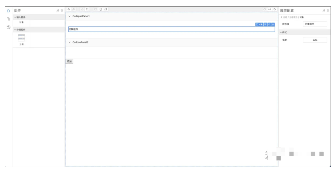
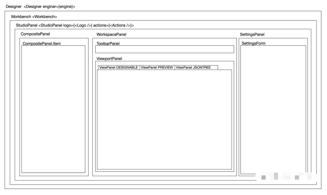
export default App;组件嵌套图
基础组件实现
说明:
createResource 创建资源基础信息,用于左侧拖拽组件
createBehavior 创建组件的行为,locals 信息、propsSchema 可修改属性
import React from "react";
import { observer } from "@formily/reactive-react";
import { createBehavior, createResource } from "@designable/core";
import { DnFC } from "@designable/react";
interface FieldProps {
style?: React.CSSProperties;
value?: string;
}
const Field: DnFC<FieldProps> = observer(
({ value, children, style, ...rest }) => {
return (
<div {...rest} style={{ ...style, padding: "5px 0" }}>
{value}
</div>
);
}
);
export default Field;
Field.Behavior = createBehavior({
name: "Field",
selector: (node) => !!node.props && node.props["x-component"] === "Field",
designerProps: {
droppable: true,
propsSchema: {
type: "object",
properties: {
value: {
type: "string",
"x-decorator": "FormItem",
"x-component": "Input",
"x-component-props": {
placeholder: "请输入要展示的文本",
},
},
"component-styles": {
type: "void",
title: "样式",
"x-component": "CollapseItem",
properties: {
"style.width": {
type: "string",
"x-decorator": "FormItem",
"x-component": "SizeInput",
},
},
},
},
},
},
designerLocales: {
"zh-CN": {
title: "对象",
},
},
});
Field.Resource = createResource({
// icon: 'TextSource',
elements: [
{
componentName: "Field",
props: {
type: "object",
"x-component": "Field",
},
},
],
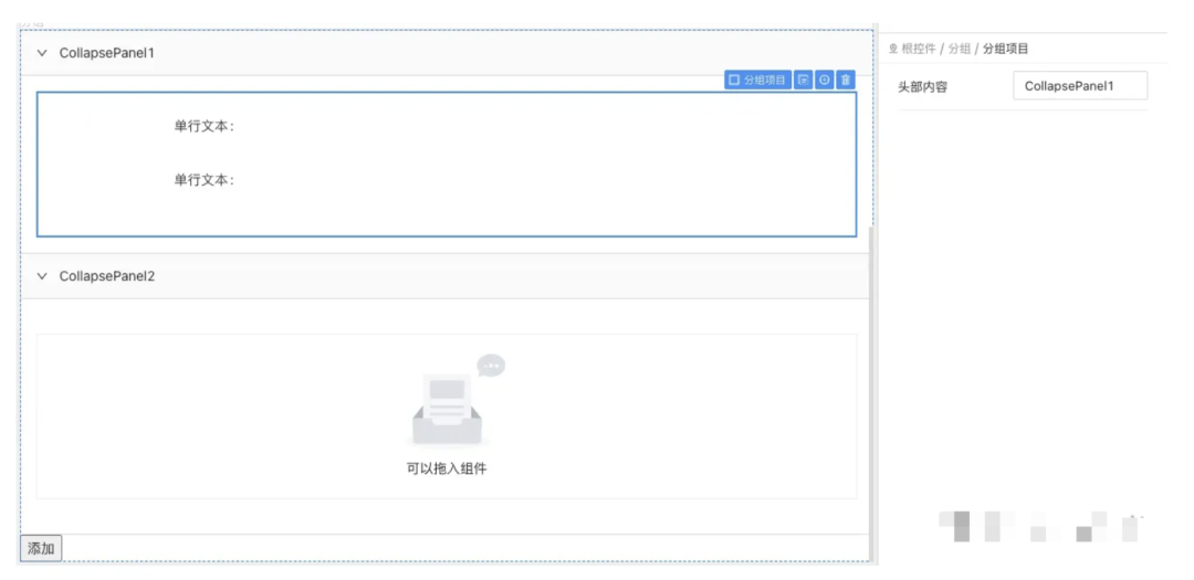
});复杂组件实现 FormCollapse
说明:支持在 FormCollapse 中添加 CollapsePanel,并且支持拖拽子组件到 CollapsePanel 中
效果如下:
import React, { Fragment } from "react";
import { Collapse } from "antd";
import { observer } from "@formily/react";
import { createBehavior, createResource, TreeNode } from "@designable/core";
import { CollapseProps, CollapsePanelProps } from "antd/lib/collapse";
import {
  DnFC,
  useTreeNode,
  useNodeIdProps,
  TreeNodeWidget,
  useDesigner,
  DroppableWidget,
} from "@designable/react";

const FormCollapse: DnFC<CollapseProps> & {
  CollapsePanel?: React.FC<CollapsePanelProps>;
} = observer((props) => {
  const node = useTreeNode();
  const nodeId = useNodeIdProps();
  const designer = useDesigner();

  const panels = node.children;
  const renderCollapse = () => {
    if (!node.children?.length) return <DroppableWidget />;
    return (
      <Collapse {...props}>
        {panels.map((panel) => {
          const props = panel.props || {};
          return (
            <Collapse.Panel
              {...props}
              style={{ ...props.style }}
              header={
                <span
                  data-content-editable="x-component-props.header"
                  data-content-editable-node-id={panel.id}
                >
                  {props.header}
                </span>
              }
              key={panel.id}
            >
              {React.createElement(
                "div",
                {
                  [designer.props.nodeIdAttrName || ""]: panel.id,
                  style: {
                    padding: "20px 0",
                  },
                },
                panel.children.length ? (
                  <TreeNodeWidget node={panel} />
                ) : (
                  <DroppableWidget />
                )
              )}
            </Collapse.Panel>
          );
        })}
      </Collapse>
    );
  };
  const onAdd = () => {
    const tabPane = new TreeNode({
      componentName: "CollapsePanel",
      props: {
        type: "object",
        "x-component": "CollapsePanel",
        header: `Unnamed Title`,
      },
    });
    node.append(tabPane);
  };

  return (
    <div {...nodeId}>
      {renderCollapse()}
      <button onClick={onAdd}>添加</button>
    </div>
  );
});

export default FormCollapse;

FormCollapse.CollapsePanel = (props) => {
  return <>{props.children}</>;
};

FormCollapse.Behavior = createBehavior(
  {
    name: "FormCollapse",
    selector: (node) =>
      !!node.props && node.props["x-component"] === "FormCollapse",
    designerProps: {
      droppable: true,
      allowAppend: (target: any, source: any) => {
        if (source[0].componentName === "CollapsePanel") {
          return true;
        }
        return false;
      },
      propsSchema: {
        type: "object",
        properties: {
          field: {
            type: "string",
            "x-decorator": "FormItem",
            "x-component": "Input",
          },
          value: {
            type: "string",
            "x-decorator": "FormItem",
            "x-component": "Input",
          },
        },
      },
    },
    designerLocales: {
      "zh-CN": {
        title: "分组",
      },
    },
  },
  {
    name: "CollapsePanel",
    selector: (node) =>
      !!node.props && node.props["x-component"] === "CollapsePanel",
    designerProps: {
      droppable: true,
      draggable: false,
      allowDrop: (node) =>
        !!node.props && node.props["x-component"] === "FormCollapse",
      propsSchema: {
        type: "object",
        properties: {
          header: {
            type: "string",
            "x-decorator": "FormItem",
            "x-component": "Input",
          },
        },
      },
    },
    designerLocales: {
      "zh-CN": {
        title: "分组项目",
      },
    },
  }
);

FormCollapse.Resource = createResource({
  icon: "CollapseSource",
  elements: [
    {
      componentName: "FormCollapse",
      props: {
        type: "void",
        "x-component": "FormCollapse",
      },
    },
  ],
});
备注:
根组件配置,在 createDesigner 时指定 rootComponentName
const engine = createDesigner({ rootComponentName: 'Root' })JSON Schema TreeNode 互转
To JSON,将 TreeNode 转换为 JSON Schema,DFS
To TreeNode,将 JSON 数据转换为 ITreeNode 数据结构,然后调用 tree.from() 进行生成
源码浅析
项目总览
Designable 项目基于 Lerna 的 monorepo,packages 中有多个项目,主要有 core/react/playgroud/react-settings-form/shared
packages 目录结构
├── packages
│   ├── core                // 核心逻辑
│   ├── playground          // Demo
│   ├── react               // 组件
│   ├── react-sandbox       // 沙盒
│   ├── react-settings-form // 右侧设置组件
│   └── shared              // 通用方法
核心逻辑介绍
@designable/core
├── src
│   ├── drivers          // 添加监听 Dom 层事件,转化为自定义事件
│   ├── effects          // 监听相关自定义事件,实现对应的业务逻辑
│   ├── events           // 自定义事件类,每个类实现了统一的接口 ICustomEvent 都有一个 type 类型
│   ├── externals.ts
│   ├── index.ts
│   ├── internals.ts
│   ├── models            // 模型,所有核心类的实现都在此目录中,TreeNode/Viewport/Workspace 等
│   │   ├── Engine.ts    // 核心引擎
│   │   ├── TreeNode.ts  // 组件对应的节点类,核心
│   ├── presets.ts
│   ├── registry.ts       // 全局对象,用于注册 behaviors/locals 等
@formily/reactive
designable 中大量的使用到了 reactive 库,相关知识需要看官方文档了解
models 中的类基本都通过 define 定义为响应式数据
import { action, define, observable, toJS } from '@formily/reactive'
...


export class TreeNode {
...
  makeObservable() {
    define(this, {
      componentName: observable.ref,
      props: observable,
      hidden: observable.ref,
      children: observable.shallow,
      designerProps: observable.computed,
      designerLocales: observable.computed,
      wrap: action,
      prepend: action,
      append: action,
      insertAfter: action,
      insertBefore: action,
      remove: action,
      setProps: action,
      setChildren: action,
      setComponentName: action,
    })
  }
...
}
React 组件通过 @formily/reactive-react observer方法将组件的变成响应式的,每次视图重新渲染就会收集依赖,依赖更新会自动重渲染
SettingForm
export const SettingsForm: React.FC<ISettingFormProps> = observer(
(props) => {
...
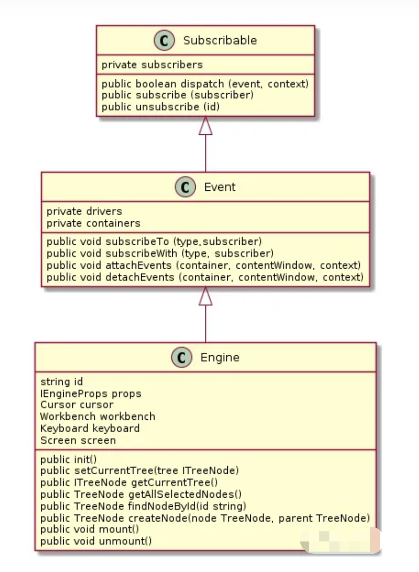
}订阅发布类 Subscribable
没有记录任何事件项目的名称之类的,只是把事件处理函数记录下来,并且在发布时循环调用所有的事件处理函数,将事件对象传入处理函数,由事件处理函数自己决策是否匹配。
数据结构 subscribers 是以整数为 key 函数为 value 的对象,同时还有一个 index 属性用于记录当前订阅函数数量(index 初始值为 0)
subscribe 方法,传入事件处理函数,this.subscribe[subscribers.index+1] = hanldeFn,将事件处理函数保存下来,并且返回 取消绑定函数 unsubscribe。
dispatch 方法,传入 event,循环执行 this.subscribe 对象中所有事件函数,并传入参数 event(event 示例:new DragMoveEvent())。
unsubscribe 方法,传入 id
如果没有传入 id 的话,遍历所有的 key ,删除所有的事件处理函数;
传入 id 的话,delete this.subscribers[id],删除对应的事件处理函数。
Event.subscribeTo,绑定单个事件,通过 type && event instanceof type 进行判断
Event.subscribeWith,绑定单个或者多个事件名称,通过 type.includes(event?.type) 判断并且执行所有匹配的事件
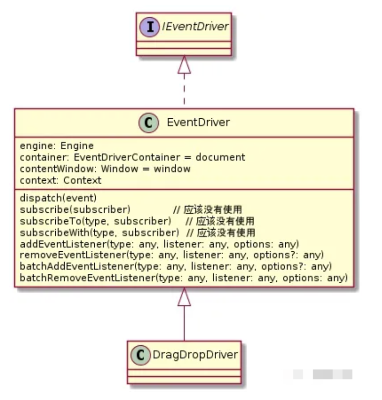
Engine 类图
DragDropDriver 图
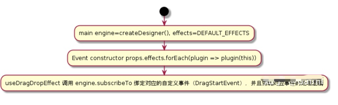
effect 初始化流程
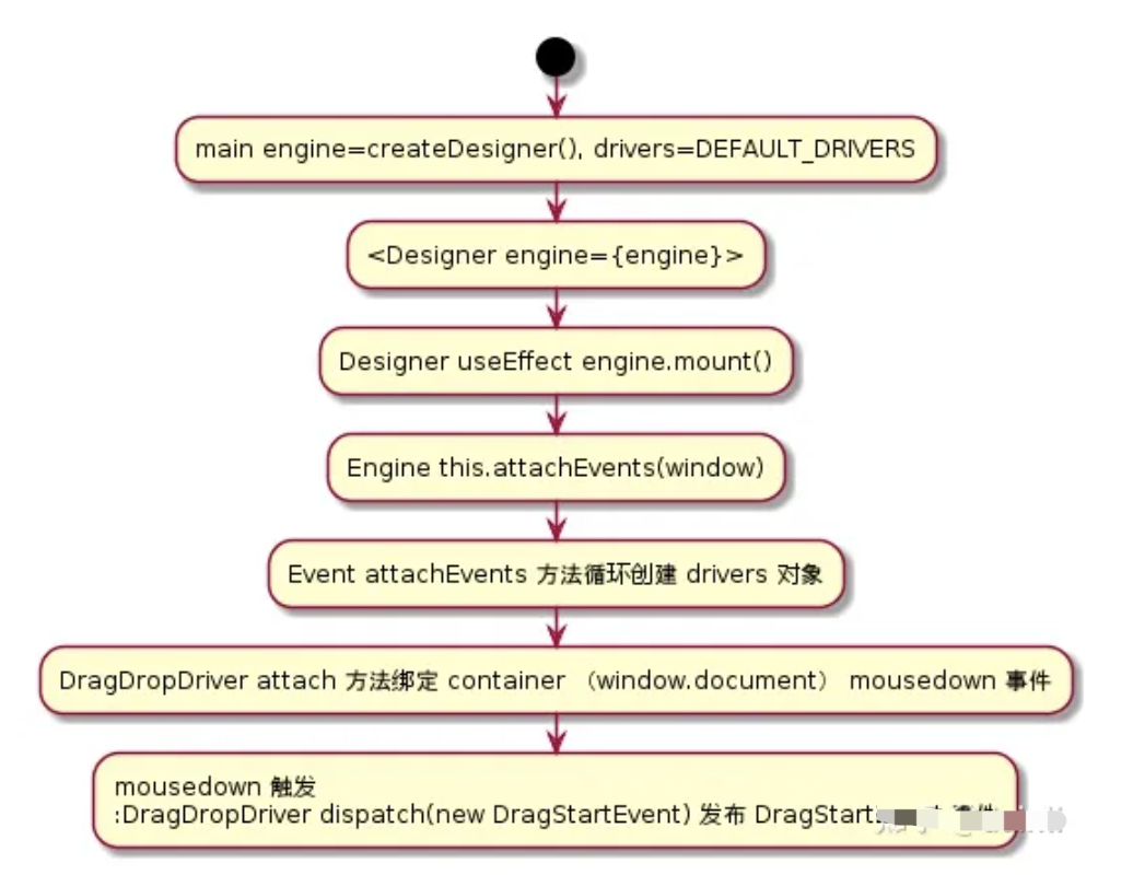
driver 初始化流程
拖拽一个组件
拖拽业务事件处理都在 useDragDropEffect.ts 文件中
createResource 时创建 TreeNode,isSourceNode: true,创建 TreeNode 时会将 elements 传给 children,new TreeNode 时会基于 children 自动创建子 TreeNode
DragStartEvent
通过 Dom 的 sourceIdAttrName 属性获得 sourceID,然后通过 engine.findNodeById 获取 sourceNode
调用 operation.setDragNodes,从 sourceNode.children 中找到真正需要添加组件的 TreeNode,viewportDragon.setDragNodes(TreeNode)
DragMoveEvent
获取 touchNode,move 事件得到 Dom 对象,然后通过 nodeIdAttrName 获取 nodeID 然后转为 TreeNode,
调用 operation.dragWidth(Point, touchNode),进行 viewportDragon 对象的运算,更新 closestNode closestDirection closestRect closestOffsetRect
AuxToolWidget 组件中的 Cover Insertion 组件会基于 viewportDragon 数据进行 UI 更新
在 useCursorEffect 文件中也绑定了 DragMoveEvent,用于设置 cursor 状态,CursorStatus.Dragging,定时 1000ms 后 重置为 CursorStatus.Normal
DragStopEvent
判断不同的 ClosestPosition 将 TreeNode 添加到对应的节点下 注:
AuxToolWidget 组件实现了 Cover Insertion 等 UI 样式,因为都是通过 observer 方式,所以找起来比较困难
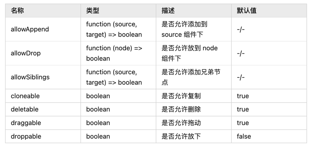
组件拖拽判断属性说明
原文: https://zhuanlan.zhihu.com/p/431263711
修改组件属性
鼠标点击业务事件处理在 useSelectionEffect.ts 文件中
通过 Dom 的 nodeIdAttrName 属性获得 nodeD,然后通过 tree.findById 获取 node
然后 selection.select(node, true),selection 中将当前选择的节点 id 记录在 selected 数组
SettingsForm 组件通过 useSelected 获取当前选中的节点
最后, 送人玫瑰,手留余香,觉得有收获的朋友可以点赞,关注一波 ,我们组建了高级前端交流群,如果您热爱技术,想一起讨论技术,交流进步,不管是面试题,工作中的问题,难点热点都可以在交流群交流,为了拿到大Offer,邀请您进群,入群就送前端精选100本电子书以及 阿里面试前端精选资料 添加 下方小助手二维码或者扫描二维码 就可以进群。让我们一起学习进步.

推荐阅读
(点击标题可跳转阅读)
[面试必问]-你不知道的 React Hooks 那些糟心事
[面试必问]-全网最全 React16.0-16.8 特性总结
[架构分享]- 微前端qiankun+docker+nginx自动化部署
[架构分享]-石墨文档 Websocket 百万长连接技术实践
觉得本文对你有帮助?请分享给更多人
关注「React中文社区」加星标,每天进步

点个赞👍🏻,顺便点个 在看 支持下我吧!


 扫一扫
扫一扫


 被折叠的 条评论
为什么被折叠?
被折叠的 条评论
为什么被折叠?
 到【灌水乐园】发言


