


 本文介绍了如何通过组合控件创建一个自定义进度条。包括创建布局文件、修改进度条样式、继承布局根节点、创建自定义属性标签、在布局中使用这些属性以及设置和获取属性值的过程。
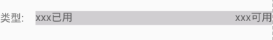
先看效果图

在这里先不考虑这个控件的实用性,主要是为了学习组合控件的方法。
1.创建布局文件
barlaout.xml
<?xml version="1.0" encoding="utf-8"?>
<LinearLayout xmlns:android="http://schemas.android.com/apk/res/android"
              android:layout_width="match_parent"
              android:layout_height="match_parent">

    <TextView
        android:id="@+id/tv_name"
        android:layout_marginTop="30dp"
        android:layout_width="50dp"
        android:layout_height="20dp"
        android:gravity="center_vertical"
        android:text="类型:"
        android:textSize="15sp"/>

    <FrameLayout
        android:layout_marginTop="30dp"
        android:layout_width="match_parent"
        android:layout_height="wrap_content">

        <ProgressBar
            android:id="@+id/pb"
            style="?android:attr/progressBarStyleHorizontal"
            android:layout_width="match_parent"
            android:layout_height="20dp"
            android:progressDrawable="@drawable/pb_bg_style"/>

        <TextView
            android:id="@+id/tv_right"
            android:layout_width="wrap_content"
            android:layout_height="wrap_content"
            android:text="xxx已用"
            android:textSize="15sp"/>

        <TextView
            android:id="@+id/tv_left"
            android:layout_width="wrap_content"
            android:layout_height="wrap_content"
            android:layout_gravity="right"
            android:text="xxx可用"
            android:textSize="15sp"/>
    </FrameLayout>

</LinearLayout>
2.修改进度条样式
pb_bg_style.xml
<?xml version="1.0" encoding="utf-8"?>
<layer-list xmlns:android="http://schemas.android.com/apk/res/android" >
    <!-- 背景颜色 -->
    <item android:id="@android:id/background">
        <shape>
            <solid android:color="#D0CED1" />
        </shape>
    </item>
    <!-- 进度颜色 -->
    <item android:id="@android:id/progress">
        <!-- clip标签不能少了,使用它和背景区分,设置进度 -->
        <clip>
            <shape>
                <solid android:color="@android:color/holo_red_light" />
            </shape>
        </clip>
    </item>
</layer-list>
效果:
3.创建类继承布局的根节点
public class CustomProgress extends LinearLayout {
    public ProgressView2(Context context) {
        this(context,nul);
    }
    public CustomProgress (Context context, AttributeSet attrs) {
        super(context, attrs);
        //注意这里使用打气筒的第三个参数要使用this,相当于把加载的这个view对象传给父类
        View.inflate(context, R.layout.testtest, this);
    }
}
4.创建自己的属性标签
<?xml version="1.0" encoding="utf-8"?>
<resources>
    <!-- 进度条属性 -->
    <declare-styleable name="CustomProgress">
        <attr name="pgText" format="reference|string" />
    </declare-styleable>
</resources>
5.在布局文件中使用自定义属性标签
<?xml version="1.0" encoding="utf-8"?>
<LinearLayout
        xmlns:android="http://schemas.android.com/apk/res/android"
        xmlns:tools="http://schemas.android.com/tools"
        android:layout_width="match_parent"
        xmlns:mypb="http://schemas.android.com/apk/res-auto"
        android:orientation="vertical"
        android:layout_height="match_parent"
        tools:context=".MainActivity">

    <com.test.kotlintest.CustomProgress
            android:id="@+id/custombar"
            android:layout_width="match_parent"
            mypb:pgText = "标题"
            android:layout_height="wrap_content"/>

</LinearLayout>
6.获取属性值,并给控件对外提供方法,设置值
public class CustomProgress extends LinearLayout {

    private final TextView tv_name,tv_left,tv_right;
    private final ProgressBar pb;

    public CustomProgress(Context context) {
        this(context,null);
    }

    public CustomProgress (Context context, AttributeSet attrs) {
        super(context, attrs);
        //注意这里使用打气筒的第三个参数要使用this,相当于把加载的这个view对象传给父类
        View.inflate(context, R.layout.bar_layout, this);

        TypedArray ta = context.obtainStyledAttributes(attrs, R.styleable.CustomProgress);
        String name = ta.getString(R.styleable.CustomProgress_pgText);

        tv_name = (TextView) findViewById(R.id.tv_name);
        tv_left = (TextView) findViewById(R.id.tv_left);
        tv_right = (TextView) findViewById(R.id.tv_right);
        pb = (ProgressBar) findViewById(R.id.pb);

        tv_name.setText(name);

        ta.recycle();
    }

    // 设置进度条左边的信息
    public void setTextLeft(String text) {
        tv_left.setText(text);
    }
    // 设置进度条右边的信息
    public void setTextRight(String text) {
        tv_right.setText(text);
    }
    // 设置进度条最大值
    public void setPbMax(int max) {
        pb.setMax(max);
    }
    // 设置进度条进度值
    public void setProgress(int progress) {
        pb.setProgress(progress);
    }
}
7.使用
CustomProgress pb = (CustomProgress) findViewById(R.id.custombar);
pb.setPbMax(100);
pb.setProgress(20);
pb.setTextLeft("已使用 20%");
pb.setTextRight("未使用 80%");


 扫一扫
扫一扫


 8629
8629

 被折叠的 条评论
为什么被折叠?
被折叠的 条评论
为什么被折叠?
 到【灌水乐园】发言


