


前言:3d坐标系
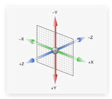
X 轴 往右为正值, 否则反之
Y 轴 往下为正值,否则反之
Z轴 指向我们为正值,否则反之
代码案例:
<!DOCTYPE html>
<html lang="en">

<head>
    <meta charset="UTF-8">
    <meta http-equiv="X-UA-Compatible" content="IE=edge">
    <meta name="viewport" content="width=device-width, initial-scale=1.0">
    <title>Document</title>
    <style>
        .box {
            position: relative;
            width: 300px;
            height: 300px;
            margin: 100px auto;
            background-color: skyblue;
            perspective: 800px;
        }

        .box1 {
            position: absolute;
            left: 0;
            top: 0;
            right: 0;
            bottom: 0;
            margin: auto;
            width: 200px;
            height: 200px;
            transition: all 5s;
        }

        .box1 img {
            width: 100%;
            height: 100%;
        }

        .box:hover .box1 {
            transform: rotateX(360deg);
        }
    </style>
</head>

<body>
    <div class="box">
        <div class="box1">
            <img src="./OIP-C.jfif" alt="">
        </div>
    </div>
</body>

</html>
1、rotateX(X轴正值旋转-头先着地):
360°:
transform: rotateX(360deg);1圈:
transform: rotateX(1turn);
2、rotateY(Y轴正值旋转-从左到右):
transform: rotateY(360deg);
3、rotateZ(Z轴正值旋转-顺时针旋转):
transform: rotateZ(360deg);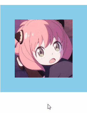
4、立体呈现
给box开启3d模式:
transform-style: preserve-3d;3d连写:
大于1为放大,小于1为缩小;角度正值为正方向。
transform:rotate3d(1,1,1,360deg);完整代码:
<!DOCTYPE html>
<html lang="en">

<head>
    <meta charset="UTF-8">
    <meta http-equiv="X-UA-Compatible" content="IE=edge">
    <meta name="viewport" content="width=device-width, initial-scale=1.0">
    <title>Document</title>
    <style>
        .box {
            position: relative;
            width: 300px;
            height: 300px;
            margin: 100px auto;
            perspective: 800px;
            transform-style: preserve-3d;
        }

        .box1 {
            position: absolute;
            left: 0;
            top: 0;
            right: 0;
            bottom: 0;
            margin: auto;
            width: 200px;
            height: 200px;
            transition: all 5s;
        }

        .box1 img {
            width: 100%;
            height: 100%;
        }

        .box:hover .box1 {
            transform:rotate3d(1,1,1,360deg);
        }
    </style>
</head>

<body>
    <div class="box">
        <div class="box1">
            <img src="./OIP-C.jfif" alt="">
        </div>
    </div>
</body>

</html>
演示效果:


 扫一扫
扫一扫


 981
981

 被折叠的 条评论
为什么被折叠?
被折叠的 条评论
为什么被折叠?
 到【灌水乐园】发言


