


QML语言使用可视元素(Visual Elements)来描述图形化用户界面,每个可视元素都是一个对象,具有几何坐标,在屏幕上占据一块显示区域。Qt Quick预定义了一些基本的可视元素,用户编程可以直接使用它们来创建程序界面。
1、Rectangle(矩形)元素
Qt Quick提供了Rectangle类型来绘制矩形,矩形可以使用纯色或渐变色来填充,可以为它添加边框并指定颜色和宽度,还可以设置透明度、可见性、旋转和缩放等效果。
(1)创建MainForm.qml
(2)MainForm.qml
import QtQuick 2.7

Rectangle {
    property alias mouseArea: mouseArea
    property alias topRect: topRect
    property alias rotationRect: rotationRect

    MouseArea {
        id: mouseArea
        anchors.fill: parent
    }
    Rectangle {
        id: rotationRect
        rotation: 0
        x: 40; y: 60
        width: 100; height: 100
        color: "red"
    }
    Rectangle {
        id: topRect
        opacity: 0.6
        scale: 0.8
        x: 135; y: 60
        width: 100; height: 100
        radius: 8
        gradient: Gradient {  //(a)
            GradientStop {position: 0.0; color: "aqua"}
            GradientStop {position: 1.0; color: "teal"}
        }
        border {width: 3; color: "blue"}
    }

}
(a) gradient: Gradient {…}:以垂直方向的渐变色填充矩形,gradient属性要求一个Gradient对象,该对象需要一个GradientStop的列表。可以这样理解渐变:渐变指定在某个位置上必须是某种颜色,这期间的过渡色则由计算而得。GradientStop对象就是用于这种指定的,它需要两个属性:position和color。前者是一个0.0~1.0的浮点数,说明y轴方向的位置,例如元素的顶部是0.0,底部是1.0,介于顶部和底部之间的位置可用这样一个浮点数表示,也就是一个比例:后者是这个位置的颜色值,例如上面的GradientStop { position: 1.0; color: "teal"}说明在从上往下到矩形底部位置范围内都是蓝绿色。
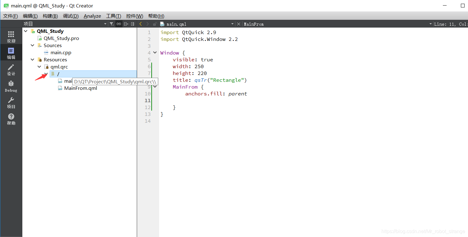
(3)main.qml
import QtQuick 2.9
import QtQuick.Window 2.2

Window {
    visible: true
    width: 250
    height: 220
    title: qsTr("Rectangle")
    MainFrom {
        anchors.fill: parent
        mouseArea.onClicked: {
            topRect.visible = !topRect.visible
            rotationRect.rotation = rotationRect.rotation + 15
        }
    }
}
由于已经在MainForm.qml文件中定义了属性别名,故在这里可以直接用矩形对象的标识符topRect和rotationRect访问其内部属性来达到控制的目的。在程序运行中,单击窗体内任意位置,矩形topRect会将隐将现,矩形rotationRect会旋转15°
(4)运行结果

2、Image(图形)元素
Qt Quick提供了Image类型来显示图像,Image类型有一个source属性。该属性的值可以是远程或本地URL,也可以是嵌入已编译的资源文件中的图像文件URL。
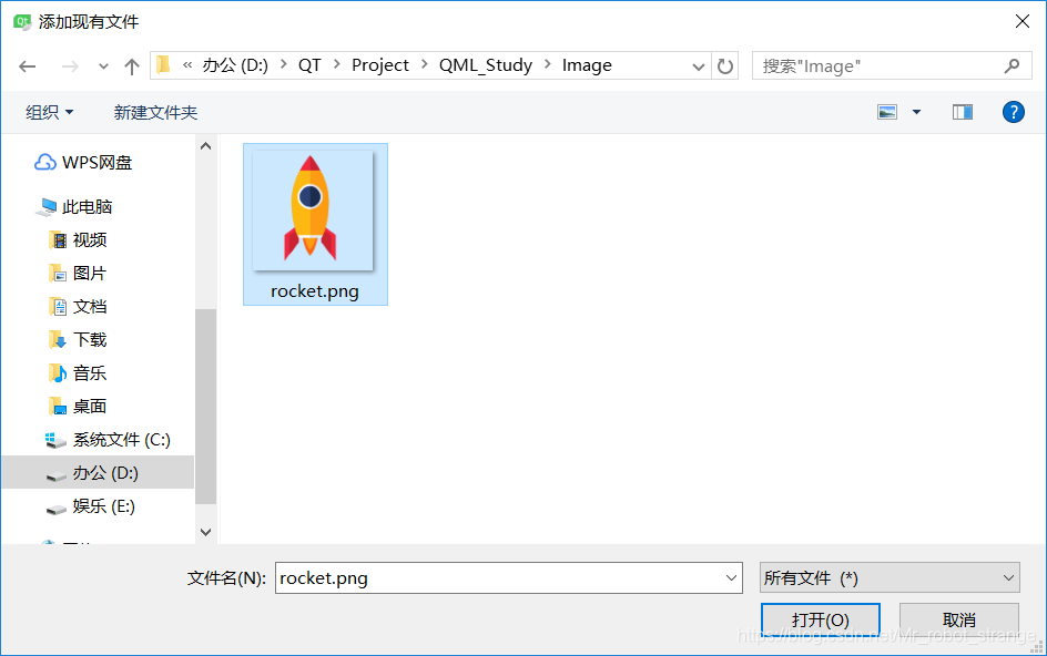
(1)添加资源
右键->添加现有文件
(2)MainFrom.qml
import QtQuick 2.7

Rectangle {
    width: 360; height: 360

    Image {
        id: image
        source: "Image/rocket.png"
        x: 20; y: 20
        width: parent.width/2; height: parent.height/2  //(a)
        fillMode: Image.PreserveAspectCrop  //(b)
        clip: true
    }
}
(a)width: parent.width/2; height: parent.height/2:Image的width和height属性用来设定图元的大小,如果没有设置,则Image会使用图片本身的尺寸;如果设置了,则图片就会拉伸来适应这个尺寸。本例设置它们的宽、高均为父控件的一半。
(b)fillMode: Image.PreserveAspectCrop:fillMode属性设置图片的填充模式,它支持如下模式:
| 模式 | 说明 |
|---|---|
| Image.Stretch | 拉伸 |
| Image.PreserveAspectFit | 等比缩放 |
| Image.PreserveAspectCrop | 等比缩放,最大化填充Image,必要时裁剪图片 |
| Image.Tile | 在水平和垂直两个方向平铺 |
| Image.TileVerticakky | 垂直平铺 |
| Image.TileHorizontally | 水平平铺 |
| Image.Pad | 保持图片原样不做变换 |
(3)main.qml
import QtQuick 2.9
import QtQuick.Window 2.2

Window {
    visible: true
    width: 250
    height: 220
    title: qsTr("Rectangle")
    MainFrom {
        anchors.fill: parent
    }
}
(4)运行效果

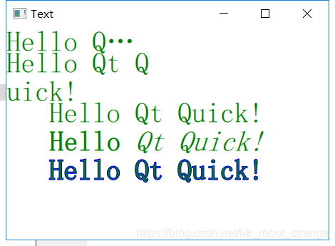
3、Text(文本)元素
为了用QML显示文本,要使用Text元素,它提供了很多属性,包括颜色、字体、字号、加粗和倾斜等,这些属性可以被设置应用于整块文本段,获得想要的文字效果。Text元素还支持富文本显示、文本样式设计,以及长文本省略和换行等功能。
(1)MainForm.qml
import QtQuick 2.7

Rectangle {
    width: 360; height: 360

    Text {
        x: 60; y: 100
        color: "green"
        font.family: "Helvetica"
        font.pointSize: 24
        text: "Hello Qt Quick!"
    }

    Text {
        x: 60; y: 140
        color: "green"
        font.family: "Helvetica"
        font.pointSize: 24
        text: "<b>Hello</b> <i>Qt Quick!</i>" //(a)
    }

    Text {
        x: 60; y:180
        color: "green"
        font.family: "Helvetica"
        font.pointSize: 24
        style: Text.Outline; styleColor: "blue"  //(b)
        text: "Hello Qt Quick!"
    }
    Text {
        width: 200
        color: "green"
        font.family: "Helvetica"
        font.pointSize: 24
        horizontalAlignment: Text.AlignLeft
        verticalAlignment: Text.AlignTop
        elide: Text.ElideRight  //(c)
        text: "Hello Qt Quick!"
    }

    Text
    {
        width: 200
        y: 30
        color: "green"
        font.family: "Helvetica"
        font.pointSize: 24
        horizontalAlignment: Text.AlignLeft
        wrapMode: Text.WrapAnywhere  //(d)
        text: "Hello Qt Quick!"
    }
}
(a)text: "<b>Hello</b> <i>Qt Quick!</i>":Text元素支持用HTML类型标记定义富文本,它有一个textFormat属性,默认值为Text.RichText(输出富文本);若显示地指定为Text.PlainText,则会输出纯文本(连同HTML标记一起作为字符输出)。
(b)style: Text.Outline; styleColor: "blue":style属性设置文本的样式,支持的文本样式有Text.Normal、Text.Outline、Text.Raised和Text.Sunken;styleColor属性设置样式的颜色,这里是蓝色。
(c)elide: Text.ElideRight:设置省略文本的部分内容来适合Text的宽度,若没有对Text明确设置width值,则elide属性将不起作用。elide可取的值有Text.ElideNone(默认,不省略)、Text.ElideLeft(从左边省略)、Text.ElideMiddle(从中间省略)和Text.ElideRight(从右边省略)。
(d)wrapMode: Text.WrapAnywhere:如果不希望使用elide省略显示方式,还可以通过wrapMode属性指定换行模式,本例中设为Text.WrapAnywhere,即只要达到边界(哪怕在一个单词的中间都会进行换行);若不想这么做,可设为Text.WordWrap只在单词边界换行。
(2)main.qml
import QtQuick 2.9
import QtQuick.Window 2.2

Window {
    visible: true
    width: 800
    height: 640
    title: qsTr("Text")
    MainFrom {
        anchors.fill: parent

    }
}
(3)运行效果
4、自定义元素(组件)
前面简单地介绍了几种QML的基本元素。在实际应用中,用户可以由这些基本元素再加以组合,自定义一个较互砸的元素,以方便重用,这种自定义的组合元素也被称为组件。QML提供了很多方法来创建组件,其中最常用的是基于文件的组件,它将QML元素放置在一个单独的文件中,然后给该文件一个名字,便于用户日后通过这个名字来使用这个组件。
示例:自定以创建一个Button组件,并在主窗口中使用它:
(1)Button.qml
import QtQuick 2.0

Rectangle {
    id: btn
    width: 100; height: 62
    color: "teal"
    border.color: "aqua"
    border.width: 3
    property bool check: true
    Text {
        id: lable
        anchors.centerIn: parent
        font.pointSize: 16
        text: "开始"
    }
    MouseArea {
        anchors.fill: parent
        onClicked: {
            lable.text = "按钮已按下"
            lable.font.pointSize = 11
            btn.color = "aqua"
            btn.border.color = "teal"
            check = !check
        }
    }
}
该文件将一个普通的矩形元素“改造”成按钮,并封装了按钮的文本、颜色、边界等属性,同时定义了它在响应用户单击时的行为。
(2)main.qml
import QtQuick 2.7

Rectangle {
    width: 360; height: 360

    MouseArea {
        id: mouseArea
        anchors.fill: parent
    }
    Button {
        x:25; y: 25
    }
}
由于已经编写好了Button.qml文件,此处就可以像用QML基本元素一样直接使用这个组件。
(3)效果展示


 扫一扫
扫一扫


 5025
5025

 被折叠的 条评论
为什么被折叠?
被折叠的 条评论
为什么被折叠?
 到【灌水乐园】发言


