


 本文介绍如何使用Flex布局实现页面元素的居左、居右及居中对齐,包括使用margin:auto和justify-content、align-items属性,以及如何处理内容溢出。
我们在布局的时候通常会在导航栏上有居左和居右显示,中间留白,这样页面伸缩的时候不会影响效果。形如下图

以往我们可能更多会使用float浮动布局来实现这种效果,但是flex得到广泛支持以后就可以更方便和快捷的实现这种效果了:
代码如下:
<div class="wrap">
<div class="item">标题1</div>
<div class="item">标题2</div>
<div class="item">标题3</div>
<div class="item">标题4 标题5</div>
</div>
<style>
.wrap {
width: 600px;
height: 42px;
background-color: green;
color: #fff;
display: flex;
align-items: center;
}
.item {
padding: 0 10px;
}
.item:last-child {
margin-left: auto;
margin-right: 20px;
}
</style>
上面的最后(标题4,标题5)是在最后一个item中然后居右显示,当然也可以把这两个元素放到a标签或者span标签中再放入item中效果一样(可以把最后看似好几个元素居右显示)。关键代码:父元素wrap中需要声明:display:flex。然后最后一个元素即.item:last-child{margin-left:auto;}即可。
flex 布局中,如果想让内容超出显示...(ellipsis)不成功,需要改为display:block。如果想在flex中这样显示... 可以给元素加上 min-width:0就可以了
使用flex实现居中对齐
方式一
利用margin:auto;属性值还可以极方便的设置我们常用的上下左右居中,效果如下:
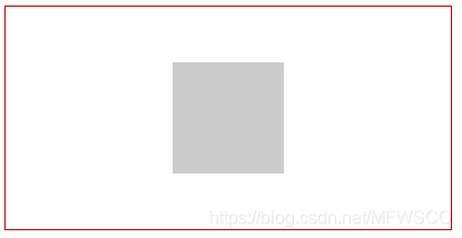
代码如下:
    <div class="wrap">
        <div class="item"></div>
    </div>
    <style>
        .wrap {
            width: 400px;
            height: 200px;
            border: 1px solid #c00;
            display: flex;
        }

        .item {
            width: 100px;
            height: 100px;
            background-color: #ccc;
            margin: auto;
        }
    </style>
如果你曾经用过把容器的左右外边距都设置为 auto 以让页面布局显示在视口中间的方法的话,你肯定知道自动外边距能够消化掉全部的多余空间。当把两侧的外边距都设置为 auto 时,块元素就会被挤到中间,多余的空间则被留到两侧。
关键代码:父元素的display:flex;要据中的元素:margin:auto;
方式二
flex中还有一种方式可以实现同样的效果,代码如下:
    <div class="wrap">
        <div class="item"></div>
    </div>
    <style>
        .wrap {
            width: 400px;
            height: 200px;
            border: 1px solid #c00;
            display: flex;
            justify-content: center;
            align-items: center;
        }

        .item {
            width: 100px;
            height: 100px;
            background-color: #ccc;
        }
    </style>
关键代码:父元素wrap上同时设置:display:flex;justify-content:center;align-items:center;利用align-items:center;还可以实现文字上下居中显示。
使用grid布局实现相同效果代码类似使用flex。
上面提到了flex实现上下左右居中对齐的方式,利用这种方式我们会发现我们可以不用在意要居中的元素的大小,可以让其随内容自增长也能让其居中显示。同样的效果(不用在意居中元素大小)还可以利用transform以及绝对定位来实现:
    <div class="wrap">
        <div class="item">123123123</div>
    </div>
    <style>
        .wrap {
            width: 400px;
            height: 200px;
            border: 1px solid #c00;
            position: relative;
        }

        .item {
            position: absolute;
            left: 50%;
            top: 50%;
            transform: translate(-50%, -50%);
        }
    </style>
关键代码:父元素relative,子元素绝对定位,并且left:50%;top:50%;transform:translate(-50%,-50%);
最后提一下常用的使用绝对定位,但是需要有宽度和高度值,并设置:margin-left:-width/2;margin-top:-height/2;即可居中。


 扫一扫
扫一扫


 3万+
3万+

 被折叠的 条评论
为什么被折叠?
被折叠的 条评论
为什么被折叠?
 到【灌水乐园】发言


